The network for creativity
Join 1.25M professional creatives like you
Connect with clients, get discovered, and run your business 100% commission-free
Creatives on Contra have earned over $150M and we are just getting started
Back to feedPost

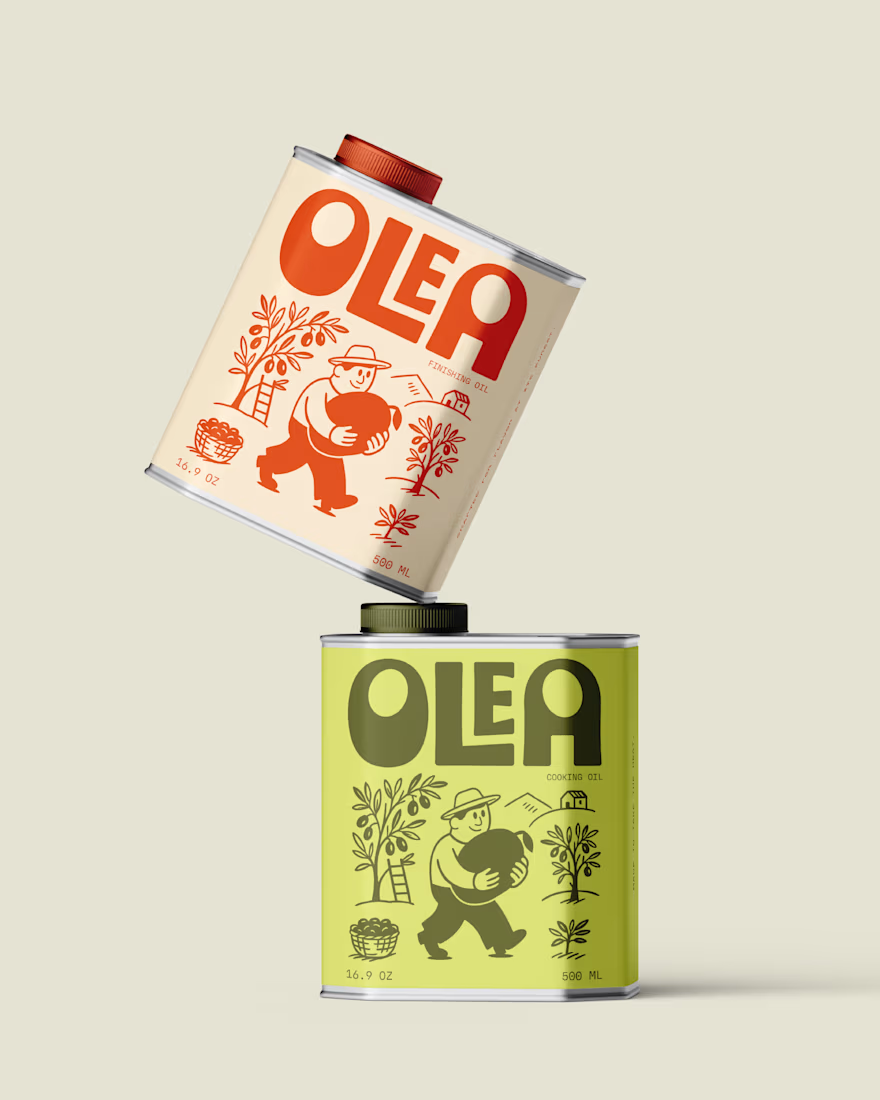
Olea - Visual Identity and Packaging
Olea is not just about olive oil, but about the simple joy of food and the story behind it. The brand feels warm and human less about luxury and more about being approachable, playful, and real.
The logo is bold and chunky, super friendly at first glance. The colors earthy reds and greens, keep it grounded in nature while also helping split the oils apart visually. The type has this handcrafted vibe that pairs perfectly with the rustic story. And the little illustrated farmer carrying the big olive? That’s the heart of it all. He adds personality, humor, and instantly makes the brand stand out on a shelf.
The tins are designed to do more than just look nice. They tell you a story. The finishing oil leans into flavor and delicacy, while the cooking oil focuses on strength and everyday use.
The network for creativity
Join 1.25M professional creatives like you
Connect with clients, get discovered, and run your business 100% commission-free
Creatives on Contra have earned over $150M and we are just getting started
Related posts


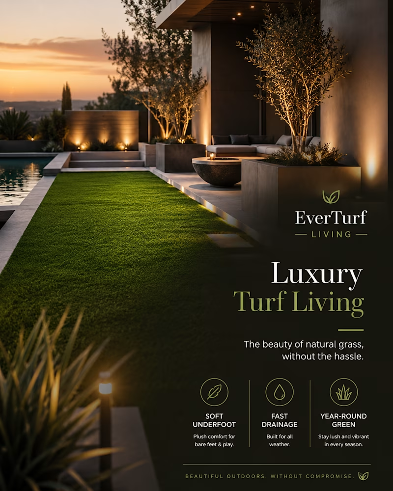
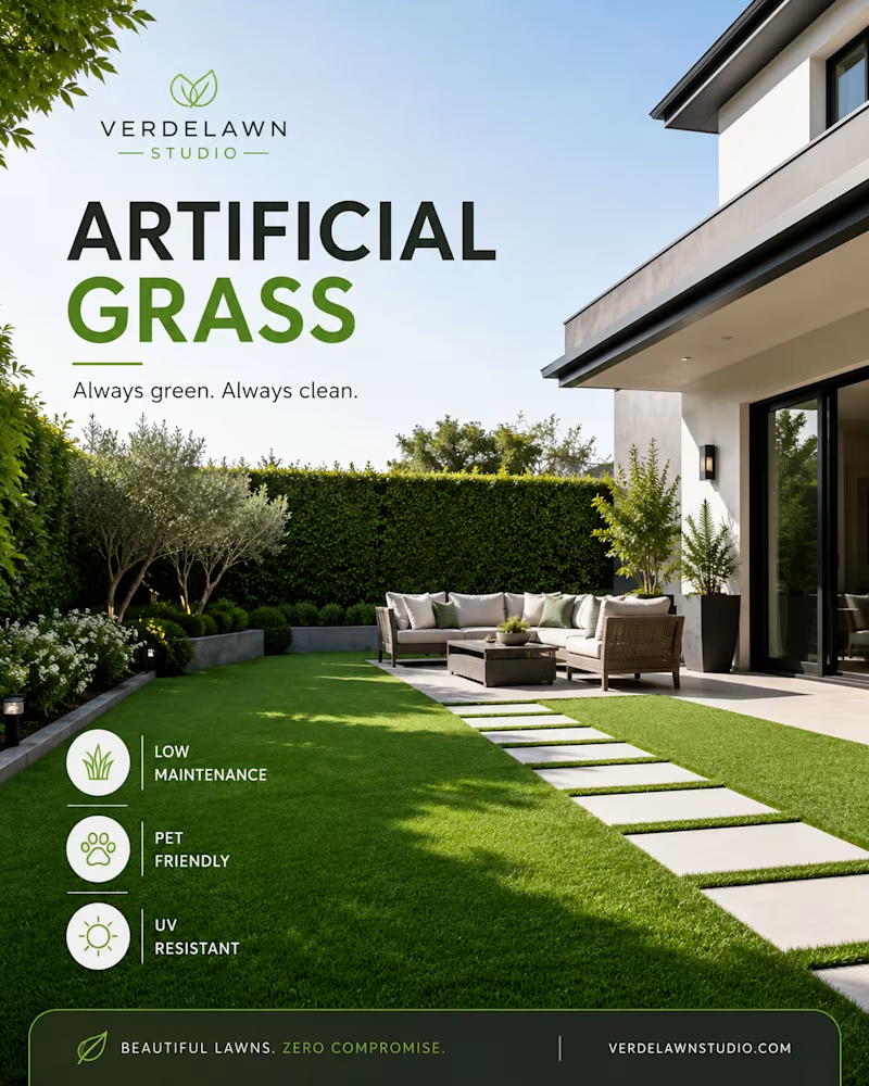
Bright and practical. Or warm and irresistible. One sells the lawn. The other sells the evening you'll spend on it.
Same product, two completely different reasons to want it. Which one wins you over? 👇
#brandidentity #designstudio #marketingdesign
5 voted
42%
7 voted
58%
12 votes
Closed

Verdelawn is better

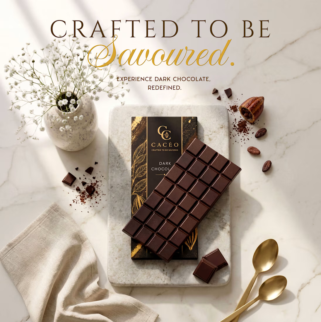
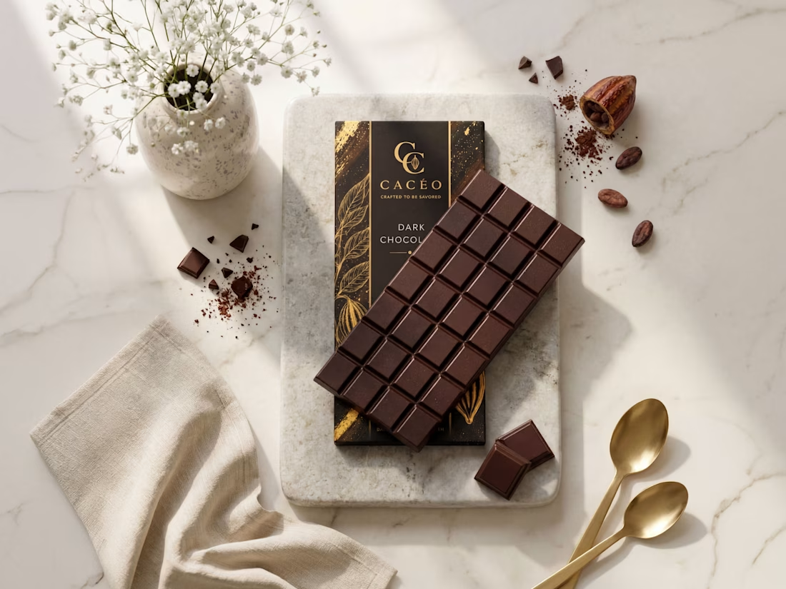
CACÉO – Premium Chocolate Brand Identity & Product Visualization 🍫
The project includes the complete visual identity, from logo design and packaging label development to realistic product presentation. Every element was designed to create a cohesive luxury brand, using refined typography, a warm color palette, and minimalist layouts that reflect the quality of an artisanal chocolate product.
To bring the brand to life, I created high-end product visuals and marketing imagery that showcase the packaging in a sophisticated lifestyle setting, demonstrating how thoughtful branding can extend beyond the logo into a complete visual experience.
💼 Services Provided
- Brand identity design
- Premium logo design
- Chocolate packaging & label design
- Brand color palette & typography
- Product visualization
- Marketing & social media visuals
🛠️ Tools Used
Kittl
Adobe Illustrator
🤎 Bringing CACÉO to life was an exciting collaboration, from crafting the brand identity to designing the packaging and final product visuals. This project reflects my commitment to creating cohesive, premium branding that not only looks refined but also helps brands make a lasting impression.


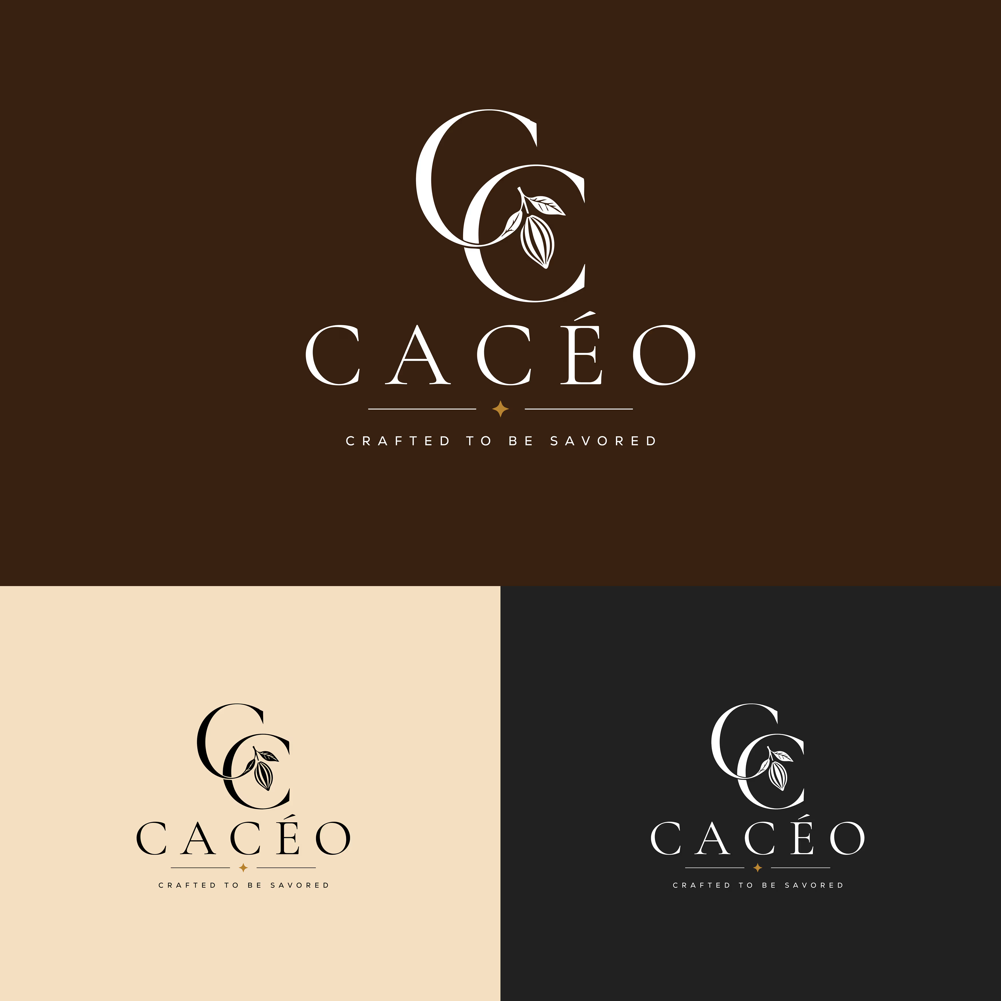


The logo is brilliant! This looks soo premium and elegant. Cocoa is should looks like this. Your client must be happy getting this quality! I wonder what the font of "Crafted to" is this Trajan Pro?

The best brand touchpoints are the ones people don't want to throw away.
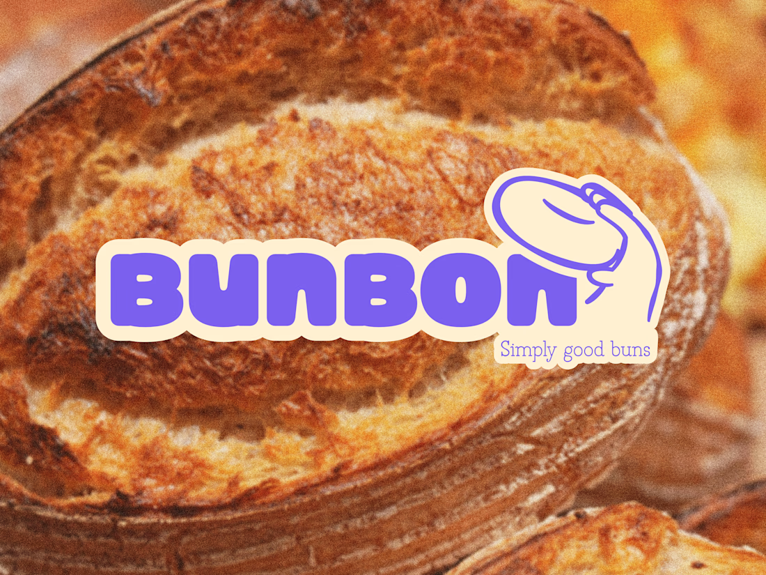
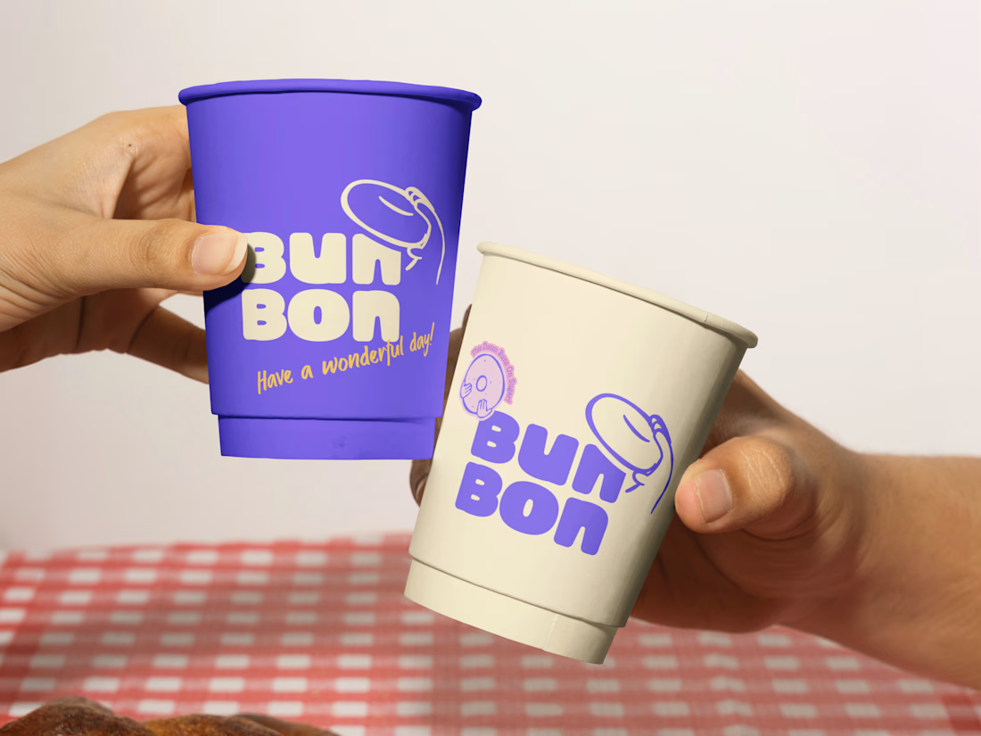
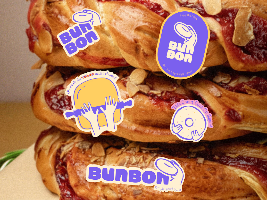
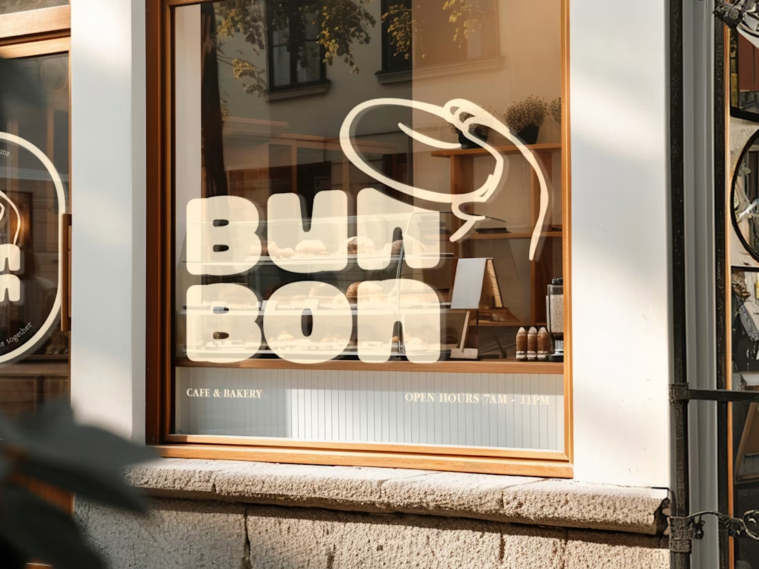
Bun Bon is a bakery and café brand built around warmth, playfulness, and the kind of identity that makes a paper cup feel like a keepsake. Bold purple, soft cream, a bouncy donut character mark, and a wordmark that feels as soft as the product it represents.
Two cups. Two colorways. One brand that works just as hard in purple as it does in cream.
"Have a wonderful day!" four words on a cup that do more brand work than most taglines ever manage.
This is packaging design that turns every coffee order into a brand moment.
Does this make you want to grab one? 👇
Tools: Figma , Illustrator
#PackagingDesign #BrandIdentity #CafeBranding #LogoDesign #FoodBranding #ContraFreelance #BrandDesign #VisualIdentity
This is topnotch








Trending

Claude
Claude has entered the design space. How are you using Claude Design?

Contra University
Learn from expert creatives how to earn more using next-gen AI tools.
fifaworldcup2026
The World Cup is here and the whole world's watching. How are you designing for the world stage?
creativeaiflow
Creative AI workflows are evolving. What tools do you use, and what are their strengths and weaknesses?
freelancerlife
Freelancer life is wins, pivots, and everything in between. What’s yours right now?