The network for creativity
Join 1.25M professional creatives like you
Connect with clients, get discovered, and run your business 100% commission-free
Creatives on Contra have earned over $150M and we are just getting started
Back to feedPost
Taste Test


Just published a new case study on Behance 🙈
This time it’s ARDEN — a data & AI platform we designed from the product UX to the final visual system.
Would love to hear what the Contra community thinks — which cover works better, Option 1 or Option 2, and why? 🫶
26 voted
31%
59 voted
69%
85 votes
Closed

Pro 😍
thanks!

Niceee. Love it!

Option 1's grid of screens sells the product complexity better, but option 2's hero shot feels more premium at first glance, which matters more for a case study cover imo. What's tipping the community's votes so far?
Thanks Maty, pleasure for such detailed thinking.

Great work!
thanks, Bella!

Option 1 is amazing. Modern design

Option 2 for me. It feels more expressive and gives a much stronger sense of the brand.


I love option 2, NGL. But option 1 may bring you better clients ;)

Option 1🔥


Premium look !

1 looks dynamic and better

Impressive

visually Op 2 is good, Op 1 just contains a lot of text

The answer depends. If you are looking to show a Brand, option 2 is better, but if you are looking to show the UX design, option 1 is more likely. Either way, it's great.

Nice work as usual! Option 1 frames the product UI depth so cleanly, which makes a massive difference for case study covers.


option 2 for me, the type reads better small

option 2 for sure


Curious, which platform do you use for both animations, @Yevheniy Kladov?

Option 2 has a premium feel

Option 2

Amazing job!👍

Supreme work 🧡
The network for creativity
Join 1.25M professional creatives like you
Connect with clients, get discovered, and run your business 100% commission-free
Creatives on Contra have earned over $150M and we are just getting started








Related posts

This week client came to me with a new idea for their app's share feature. They were trying something with Claude... But let's simplify this thingy:)
Let's remove all the buttons that confused me already - imagine what they'd do to a user...
Take our predefined bottom sheet and give our users 3 simple choices.
GOALS:
make it as simple as possible for our target persona (35-55 y/olds that aren't necessarily as modern and advanced in tech)
Create an aesthetically pleasing UI frame for stories, that makes people want the app & their lifestyle.
Which one would you go with?
SPOILER ALERT 🚨 we absolutely went with the after result😆
0 voted
0%
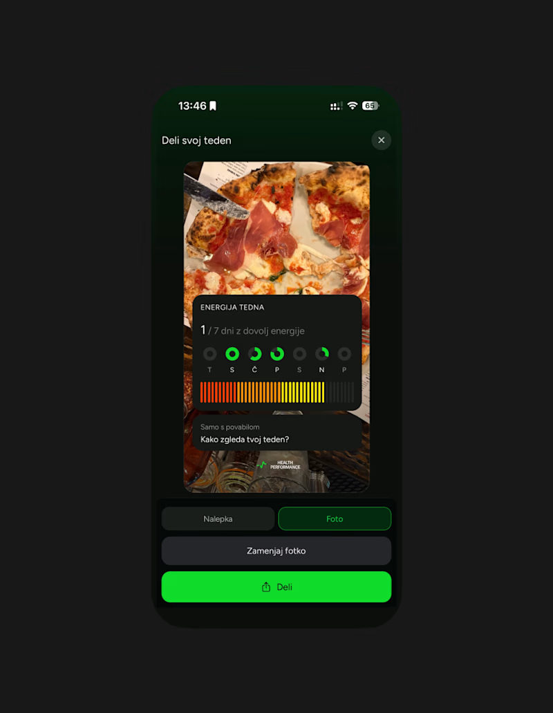
5 voted
100%
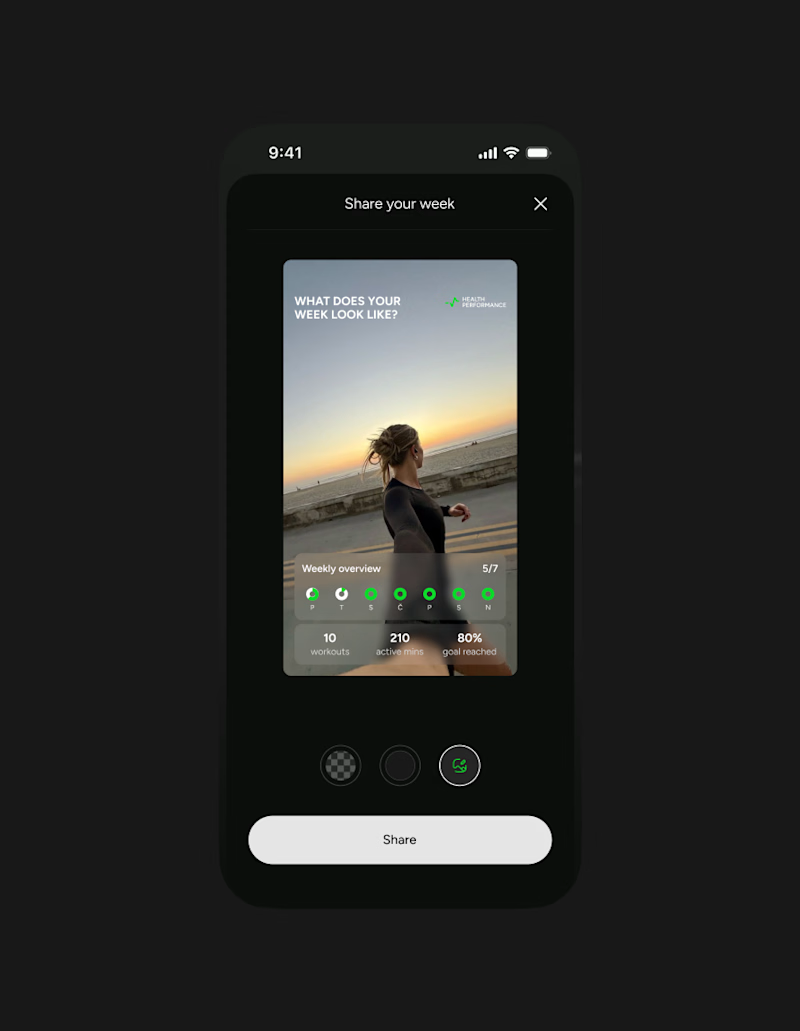
5 votes
Closed

Afterrrrr😊


Which Kajabi direction would stop your scroll?
Meet ODD HOURS, a creative-business academy concept.
A / Acid Play: electric yellow, oversized type and a sculptural blue knot.
B / Velvet Rebellion: oxblood, chrome and velvet with fashion-editorial typography.
Two original AI-generated concepts. Same offer. Completely different energy.
Which one pulls you in, and why?

15 voted
65%
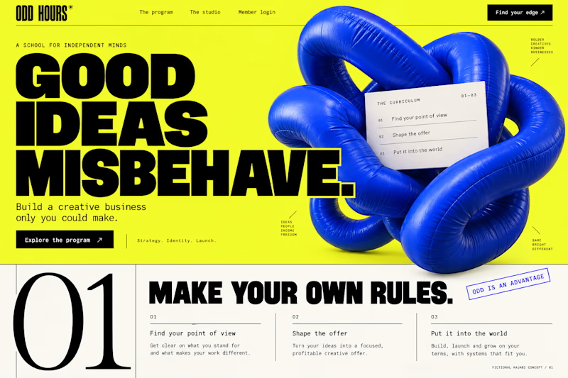
8 voted
35%
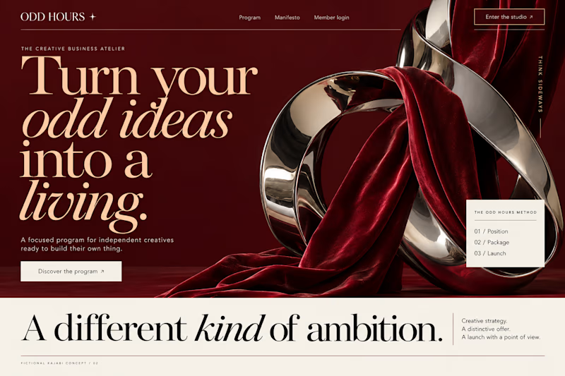
23 votes
Closed

It's only Acid Play it's unbelievable 🔥🔥🔥🔥
Great job Kraig🎉🎉
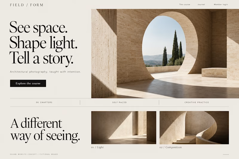
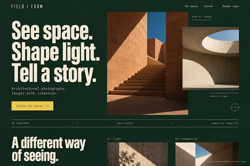
Which Kajabi photography-course design makes you want to explore?
Two original AI-generated concepts for FIELD / FORM, a fictional architectural-photography school. Gallery Study pairs expressive serif type with warm stone and generous space. Field Journal uses forest green, bold condensed type and a layered photo study.
Same course, two directions. Which would you choose, and why?
15 voted
75%
5 voted
25%
20 votes
Closed
Galary study Hits better to me❤️❤️
great job Kraig🔥🔥