The network for creativity
Join 1.25M professional creatives like you
Connect with clients, get discovered, and run your business 100% commission-free
Creatives on Contra have earned over $150M and we are just getting started
Back to feedPost

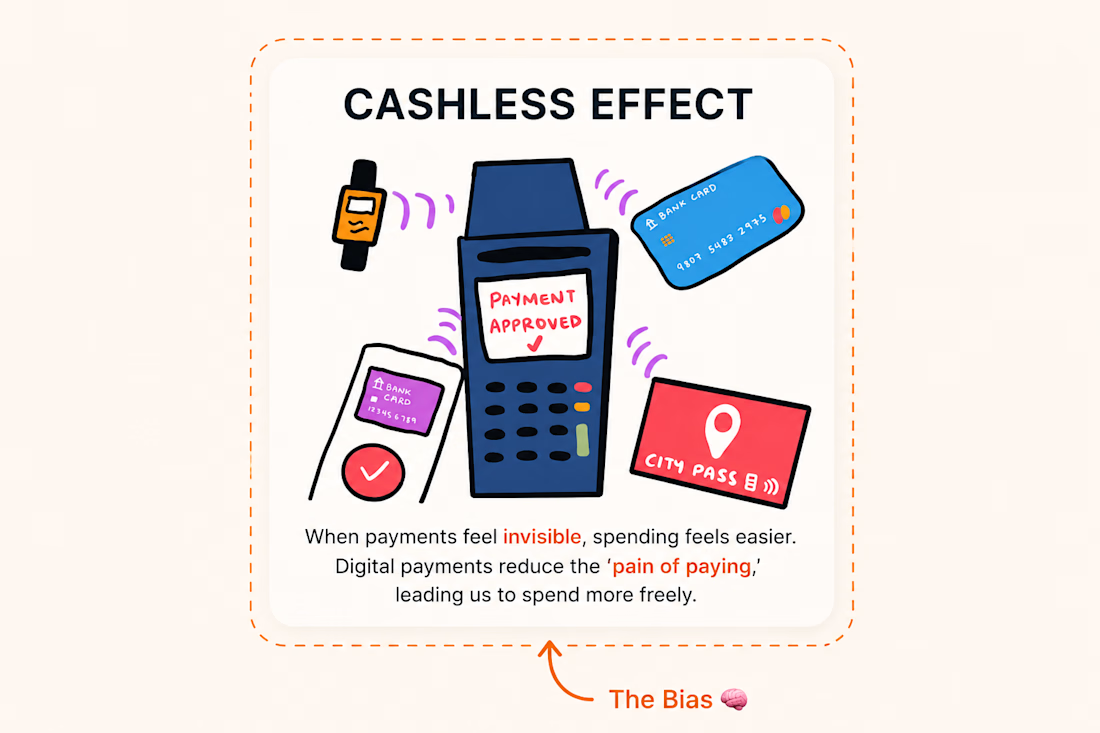
Day 5 of 30-day UX Law: The Cashless Effect 💸
The Cashless Effect is a cognitive bias where people tend to spend more when paying digitally than with physical cash.
Why? Because swiping a card, using UPI, or tapping a digital wallet doesn't feel as "real" as handing over cash. The physical act of spending disappears, making purchases feel less significant.
⸻
📃 Real-world example: Amazon's One-Click Checkout
Imagine you're shopping online for a new pair of shoes and you hesitate for a moment because of the price.
But the checkout process is effortless:
✅ your address is already saved
✅ your payment method is stored
✅ one click later, the order is confirmed
You didn't have to pull out your wallet or count your money.
This is exactly why Amazon's One-Click Checkout has been so effective, it removes friction and makes purchasing almost effortless.
⸻
Design & Product Tips
- Reduce payment friction: Save user preferences, autofill information, and simplify checkout without sacrificing security.
- Maintain transparency: Clearly show the total price, taxes, shipping, and recurring charges before users pay.
- Build trust, not impulse: Make payments effortless, but always give users confidence and control over their purchases.
The network for creativity
Join 1.25M professional creatives like you
Connect with clients, get discovered, and run your business 100% commission-free
Creatives on Contra have earned over $150M and we are just getting started
Related posts


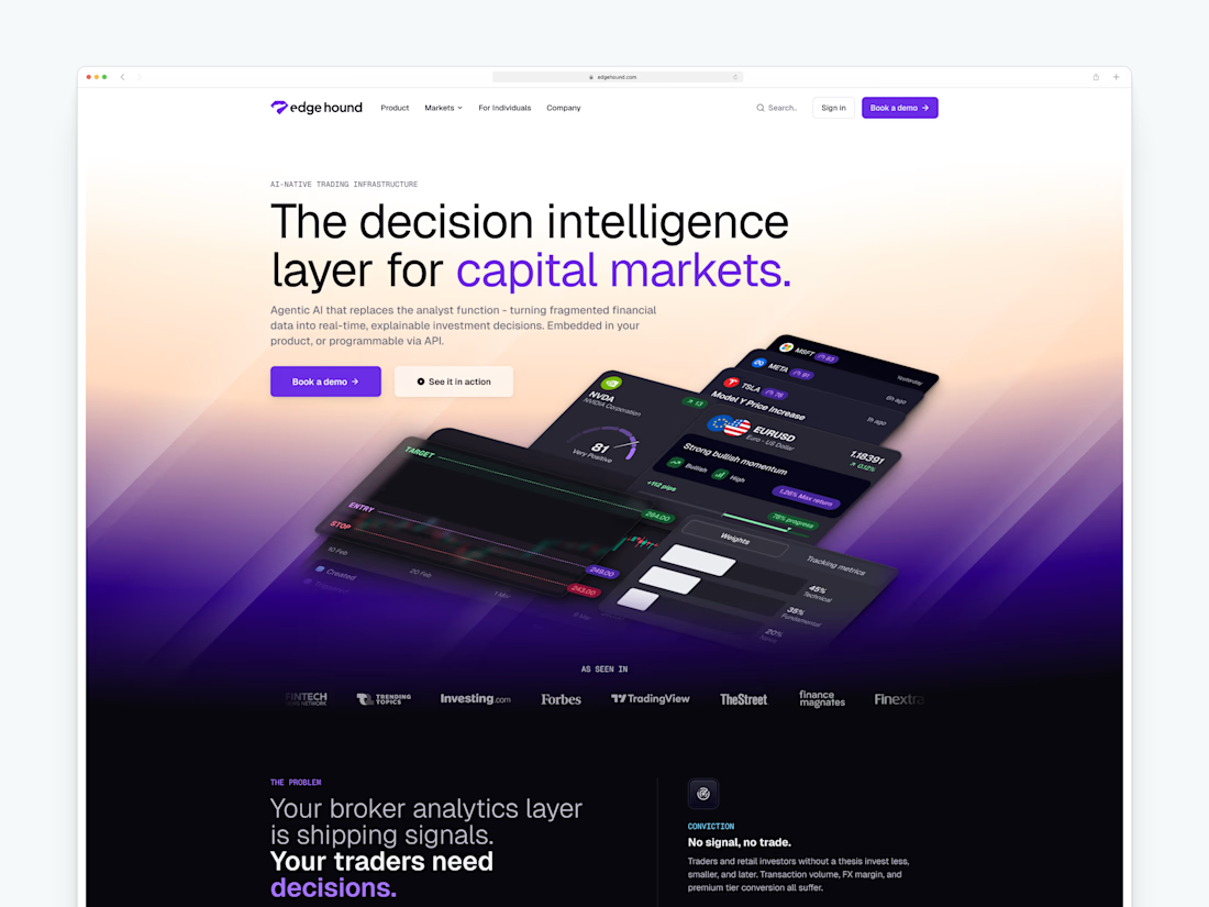
🚀 The new Edge Hound website is live. Not Framer this time, but the dev team did a stellar job with the implementation.
Most AI fintech sites explain the tech. This one had to explain the category.
Decision intelligence for capital markets - agentic AI that replaces the analyst function for brokers, neo banks, and investing platforms.



I think you did the right call by explaining the category here. This whole space is so new and different, and taking advantage of it is definitely the right call from your end.


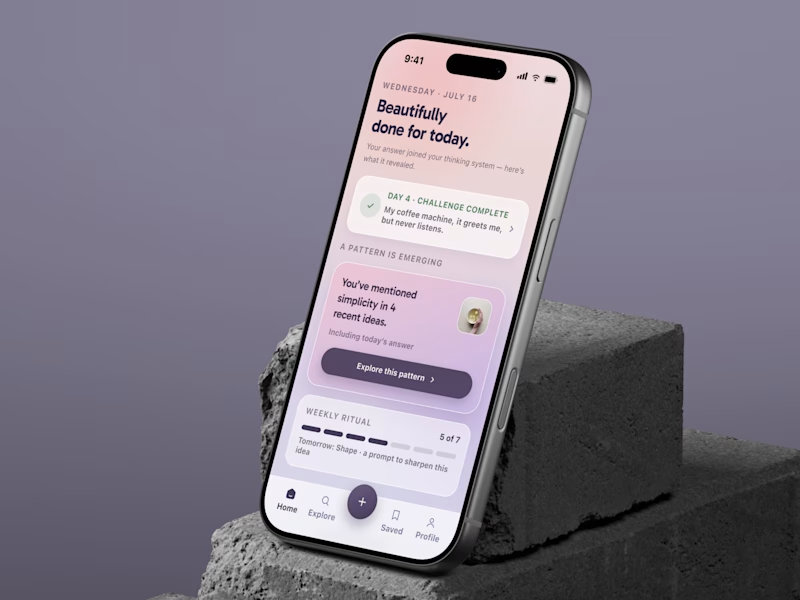
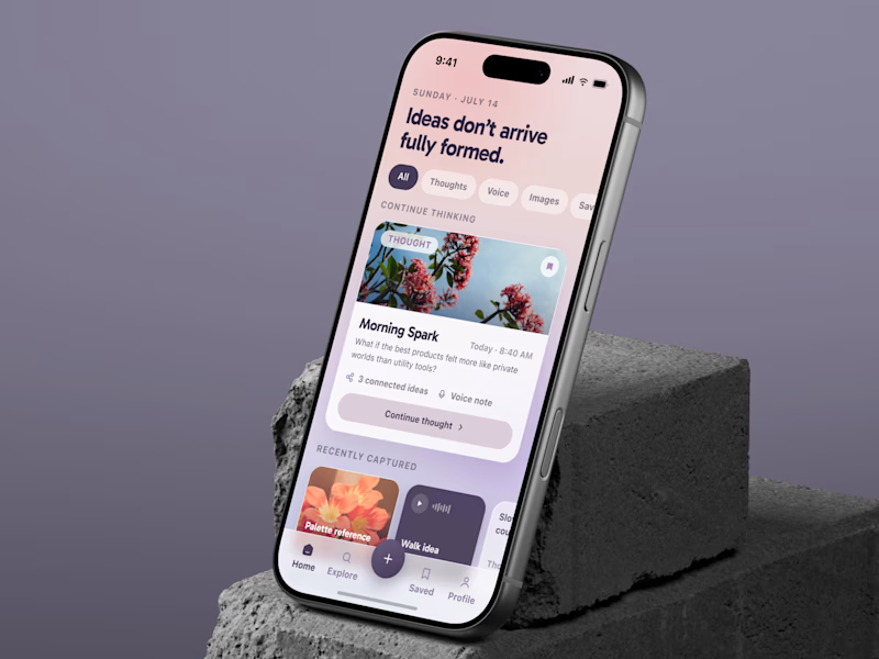
SAME APP. TWO RETENTION LOOPS.
Most note apps help users save ideas.
That is not the hard part.
The hard part is making them come back.
💜 A brings users back to unfinished thoughts.
🔥 B creates a daily prompt, reward, and progress loop.
Same product.
Different behavior.
Different growth potential.
Which one would win on D7 retention: A or B?
👉 BOOK A MOBILE APP STRATEGY SESSION
https://calendly.com/asol_design/book-diagnostic-call-linkedin-clone
#MobileAppDesign #GrowthDesign #RetentionDesign #ProductStrategy #UXUIDesign #AsolDesign

13 voted
35%
24 voted
65%
37 votes
Closed

A 🔥


Outstanding Work!











Trending

Claude
Claude has entered the design space. How are you using Claude Design?

Contra University
Learn from expert creatives how to earn more using next-gen AI tools.
creativeaiflow
Creative AI workflows are evolving. What tools do you use, and what are their strengths and weaknesses?
freelancerlife
Freelancer life is wins, pivots, and everything in between. What’s yours right now?