The network for creativity
Join 1.25M professional creatives like you
Connect with clients, get discovered, and run your business 100% commission-free
Creatives on Contra have earned over $150M and we are just getting started
Back to feedPost


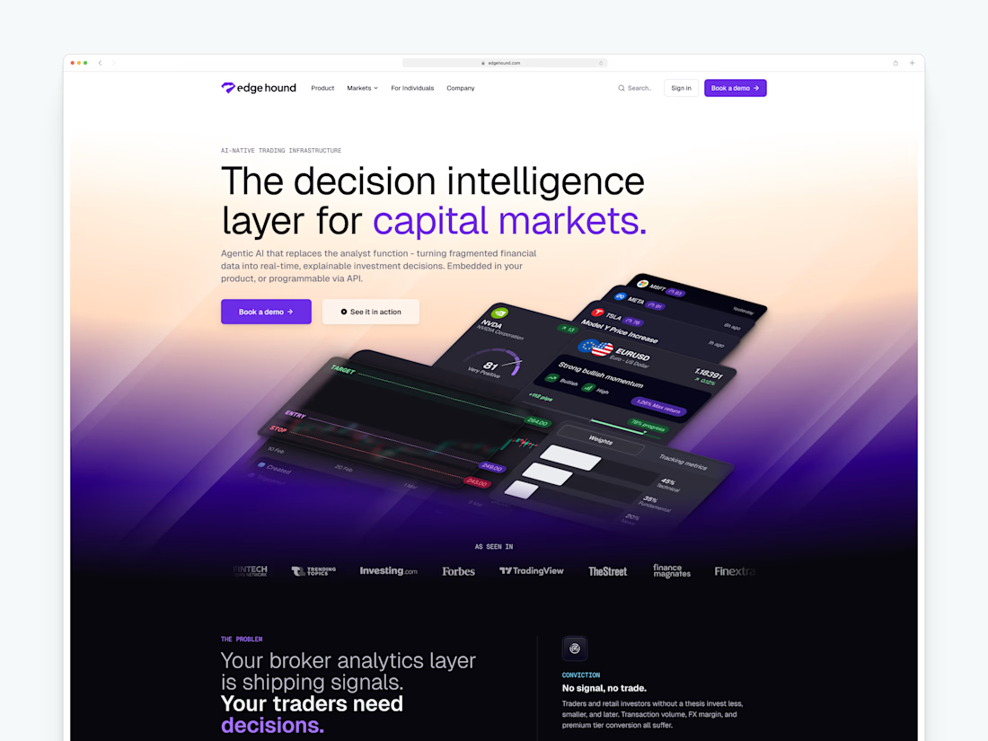
🚀 The new Edge Hound website is live. Not Framer this time, but the dev team did a stellar job with the implementation.
Most AI fintech sites explain the tech. This one had to explain the category.
Decision intelligence for capital markets - agentic AI that replaces the analyst function for brokers, neo banks, and investing platforms.


Amazing work!


Creative work !

Congrats on the launch! Defining a category while keeping the experience simple is no easy task. Wishing the team a successful rollout.


I think you did the right call by explaining the category here. This whole space is so new and different, and taking advantage of it is definitely the right call from your end.
Thanks man!


Skipping Framer for this one is interesting given how much of the design community defaults to it now. Was that a client call or did the dev team push for more custom interaction than Framer could handle for the analyst-replacement flows?

This is where UX becomes strategy. When users have no existing frame of reference, every word, interaction, and visual has to reduce uncertainty before it can build excitement.

Wow, congratulations on your latest milestone, more to come! 🚀 A brilliant category-explaining layout that deserves an equally crisp web execution.


Wow

Very elegant!

Amazing


This looks clean and well thought out. How long did it take you to bring everything together?

Wonderful work!

Amazing Work, Ivo.
Can you tell us about the design process behind it.

Love this direction

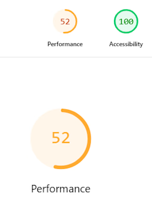
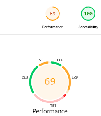
The website is perfect but you should work on the website performance little bit. On both Mobile and Desktop performance. Everything else is working fine.

Amazing 😍

Leading with explaining the category instead of the tech is the right instinct for something this new, most fintech sites just assume the visitor already knows what "decision intelligence" means. The purple to warm gradient in that hero also keeps it from looking like every other dark mode SaaS site.

Great job delivering a cohesive experience.

Now that is some great design. Good job.
The network for creativity
Join 1.25M professional creatives like you
Connect with clients, get discovered, and run your business 100% commission-free
Creatives on Contra have earned over $150M and we are just getting started











Related posts

Final hero section for TealSites, a web design & development agency.
Designed in Figma.
The thinking behind the design was simple:
Clear messaging that communicates the agency's value right away.
A project showcase directly below the headline, letting the work speak for itself.
Subtle grid lines, corner brackets, and teal accents to create a distinct visual identity.
Two clear CTAs, one for potential clients ready to connect and another for those who want to explore the work.
The goal was to balance visual appeal with clarity, structure, and usability.
Clean design, thoughtful details, and a clear purpose behind every element.
What do you think?


Excellent

A little peek at the brand work we did for Elio Mortgage.
A warm, approachable identity full of warm vibrant colors paired with soft sun rising inspired gradients, inner glows and custom illustrations & more. Loved this direction!
Full case study coming soon, from process to final identity.
Plenty of logo explorations to share too!


That color palette takes the whole identity to a different level!! I loove it.

Brand Expressions -- Olivir



Thats so crazy!!!!!! Seeing this I feel we humans are still far better than AI