The network for creativity
Join 1.25M professional creatives like you
Connect with clients, get discovered, and run your business 100% commission-free
Creatives on Contra have earned over $150M and we are just getting started
Back to feedPost

Hey creatives 👋
I'm looking for brutally honest design feedback on a landing page I'm currently building for Patex.
Note: This is a work in progress—not all sections are finalized, and content is still being refined.
I'd love feedback on things like:
Overall visual direction & first impression
Layout and hierarchy
Typography and spacing
Scroll experience & pacing
Interactions and animations
Brand consistency
Anything that feels weak, distracting, or unnecessary
Please don't hold back I prefer specific criticism over compliments. If something feels off, tell me what, why, and how you'd improve it.
Thanks in advance! 🙌


patex-new-sections.netlify.app
Create Next App
Generated by create next app
The network for creativity
Join 1.25M professional creatives like you
Connect with clients, get discovered, and run your business 100% commission-free
Creatives on Contra have earned over $150M and we are just getting started





Related posts

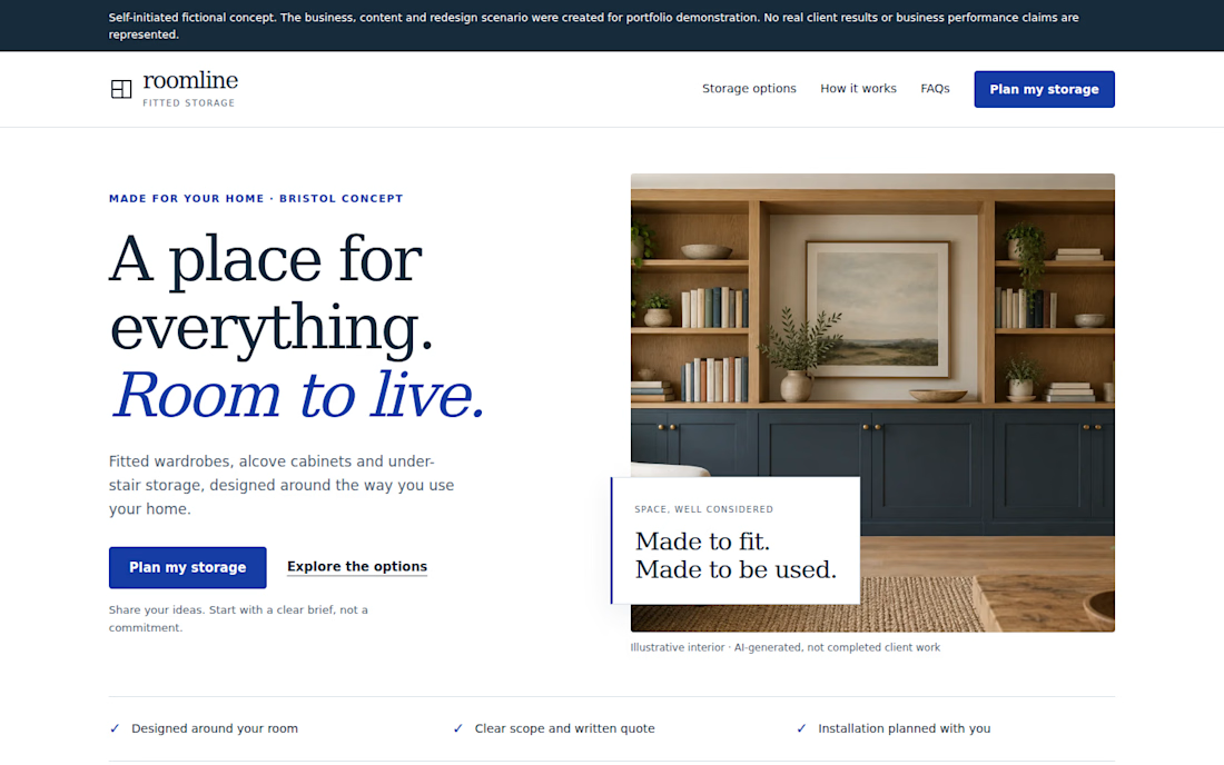
Your landing page doesn't need more sections. It needs a clearer next step.
Self-initiated fictional concept. Roomline is a fictional fitted-storage business created for portfolio demonstration. No real client results or conversion data are represented.
I redesigned a fictional landing page around a simple question:
Can a visitor quickly understand the offer, see the relevant options, trust the next step, and know what to do?
The redesign focuses on:
• A clearer value proposition
• More focused service choices
• Stronger CTA hierarchy
• A simpler enquiry path
• Responsive mobile behavior
• FAQ content that addresses common questions
• A practical demonstration enquiry flow
I deliberately avoided claiming conversion improvements because this is a portfolio concept with no real traffic or A/B testing.
For landing pages, the useful work is often less about adding more sections and more about making the existing decision path easier to understand.

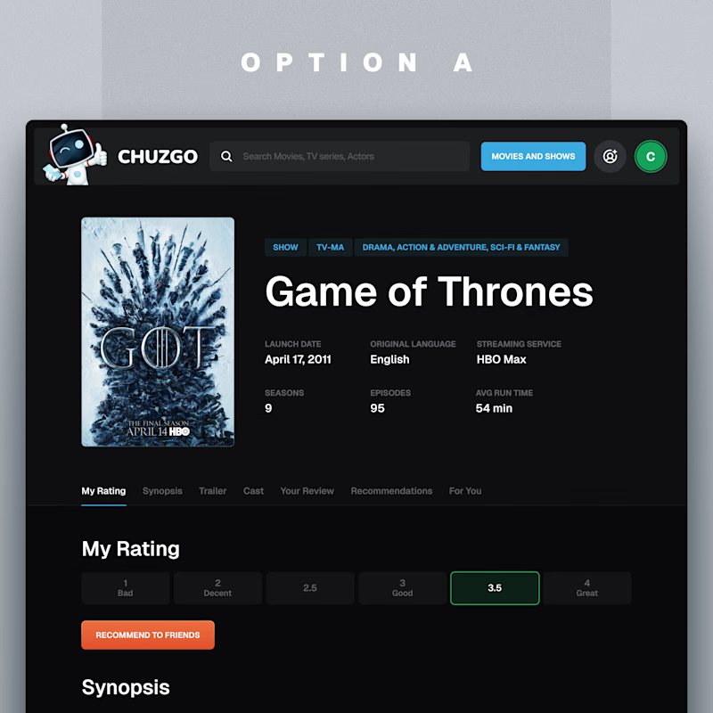
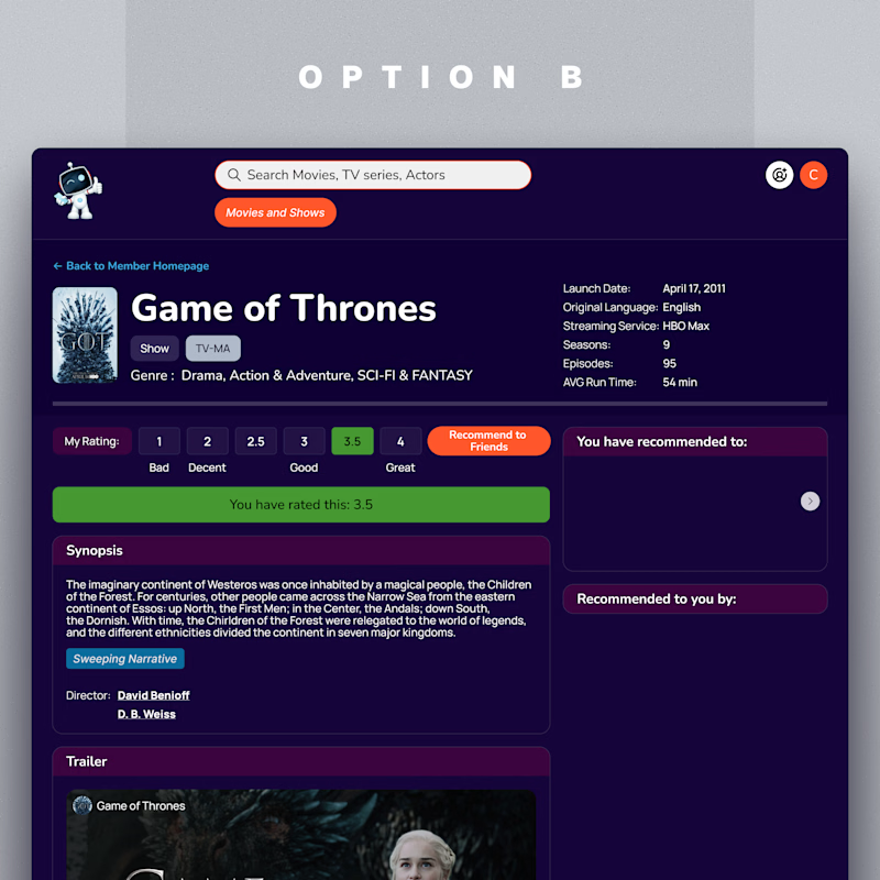
One of these show pages got a 5-star review from the client.
Which one would you rather land on?
11 voted
100%
0 voted
0%
11 votes
Closed

A is better it's more attractive ❤️


Collage