The network for creativity
Join 1.25M professional creatives like you
Connect with clients, get discovered, and run your business 100% commission-free
Creatives on Contra have earned over $150M and we are just getting started
Back to feedPost


Every project in this video taught me something new. From design to launch, here's a quick tour of the websites I've built. Take a look and let me know what you think.


The network for creativity
Join 1.25M professional creatives like you
Connect with clients, get discovered, and run your business 100% commission-free
Creatives on Contra have earned over $150M and we are just getting started








Related posts


A few pieces of the website we recently created for Kodilion. Com check the complete website at https://kodilion.hr/


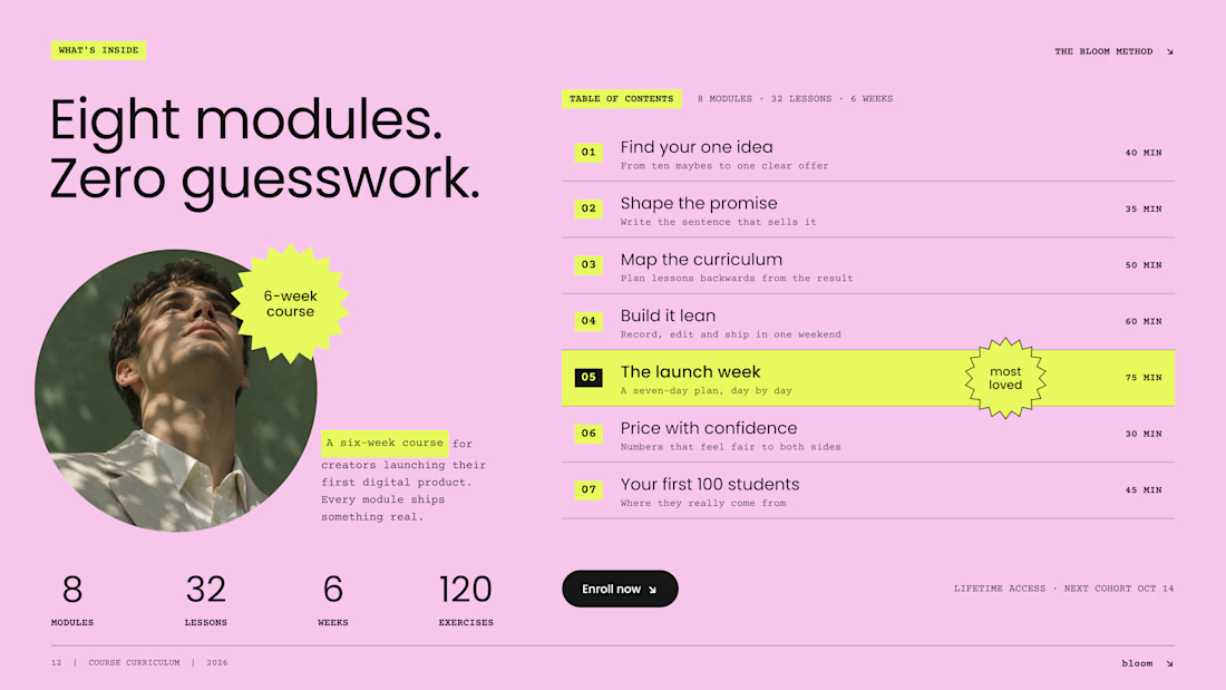
Would you buy a course if you couldn't see what's inside?
On most Kajabi sales pages, the curriculum sits in a collapsed accordion, and most visitors never open it. So we designed it as an open table of contents: the whole course, readable at a glance.
Three decisions make it work:
1. Numbers you can scan. Big module numbers on a highlight turn eight modules into a path, not a wall of text.
2. Time next to every module. Effort is part of the price. "75 min" answers a question buyers are shy to ask.
3. One module in the spotlight. The signature lesson gets the star. The rest stay calm, so the eye knows where the value peaks.
And one quiet fix: neon lime on pink looks bold but reads at about 1.1:1 contrast. We keep lime as a marker behind dark text, never as the text itself.
A curriculum is the product. Show it like one.
Do you open course accordions, or scroll right past them?

Beautiful Kajabi work execution and presentation.


A little behind the scenes of a site launch video I'm working on 👀

