The network for creativity
Join 1.25M professional creatives like you
Connect with clients, get discovered, and run your business 100% commission-free
Creatives on Contra have earned over $150M and we are just getting started
Back to feedPost

The highest-converting product pages don't convince people to buy.
They remove every reason to keep thinking.
By the time someone lands on your PDP, they've already shown intent.
Your job isn't to overwhelm them with more information.
It's to make the next decision feel effortless.
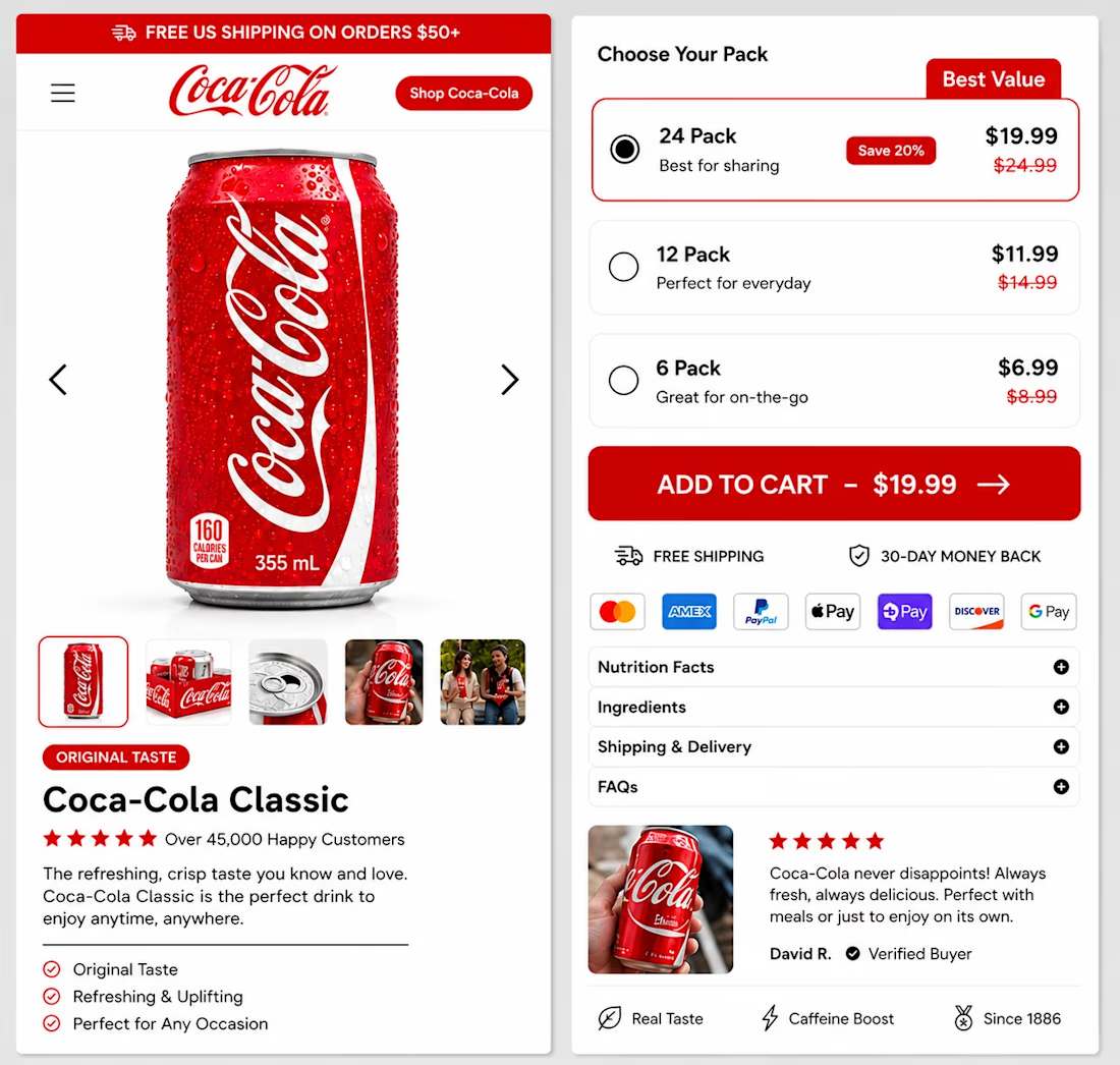
Notice how this page quietly removes friction:
One product. Three clear quantity options.
The best-value bundle is obvious without feeling forced.
Trust signals stay close to the CTA.
FAQs answer objections without cluttering the page.
Nothing competes for attention.
Everything supports the purchase.
That's what great conversion design does.
It reduces mental effort until buying feels like the easiest option.
Whether I'm designing in Figma or Replo, that's always the objective.
What adds the most unnecessary thinking to your product pages today?


The network for creativity
Join 1.25M professional creatives like you
Connect with clients, get discovered, and run your business 100% commission-free
Creatives on Contra have earned over $150M and we are just getting started
Trending

Claude
Claude has entered the design space. How are you using Claude Design?

Contra University
Learn from expert creatives how to earn more using next-gen AI tools.
creativeaiflow
Creative AI workflows are evolving. What tools do you use, and what are their strengths and weaknesses?
freelancerlife
Freelancer life is wins, pivots, and everything in between. What’s yours right now?










Related posts

Just wrapped Risen Strategic.
The site had to match that energy. Dark, cinematic, premium. A brand that feels like it belongs next to the big players even at launch stage.
Live site: https://www.risenstrategic.ai/



Upgoating this..... nice work man

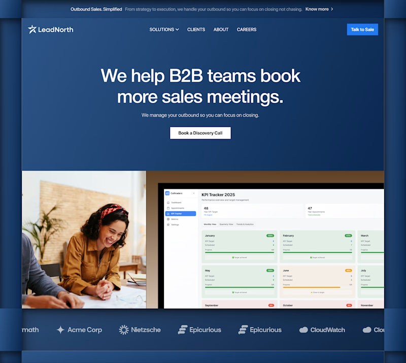
Bit hard to choose which look more appealing? 🤔

24 voted
50%
24 voted
50%
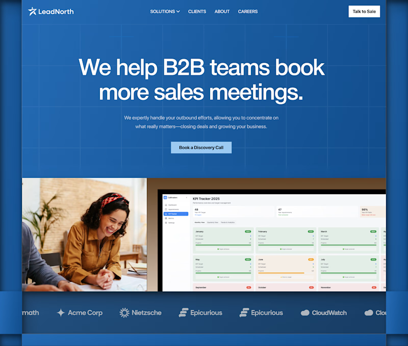
48 votes
Closed

Hero 1 for me

Giving a fresh feel to my client's website with @Envato at the forefront of my workflow. 👩🎨🍋
Combining my client's brand design and creative assets from Envato, I animated the product using Envato's AI toolkit.
AI is still falling short on delivering a stand alone hero-section-ready output, this is where the human creativity comes in.
AI video was good but flat so I layered in depth, image and texture I got from Envato, giving it fresh, creative, brand-aligned look the raw AI output could not deliver.
Is "technically good", "actually good"?
I think it's a distinction AI can't tell. What do you think?
See the full workflow and the part AI can't deliver in the video. 🎬

Agree with the distinction. Technically good usually means the output is coherent and error free, actually good means it fits the brand and makes the client's product feel like theirs. That second part is still very much a taste call, not something a model can judge for itself yet.