The network for creativity
Join 1.25M professional creatives like you
Connect with clients, get discovered, and run your business 100% commission-free
Creatives on Contra have earned over $150M and we are just getting started
Back to feedPost

Good food deserves good branding. 🌭
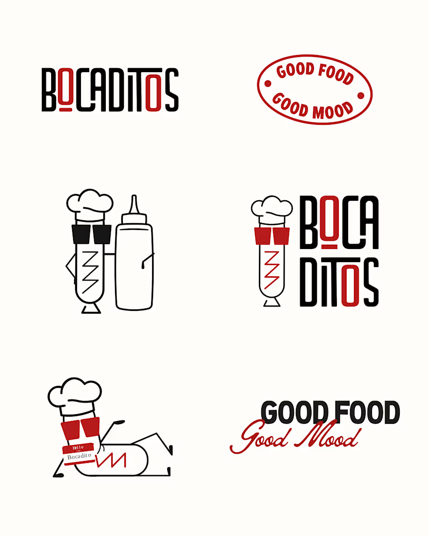
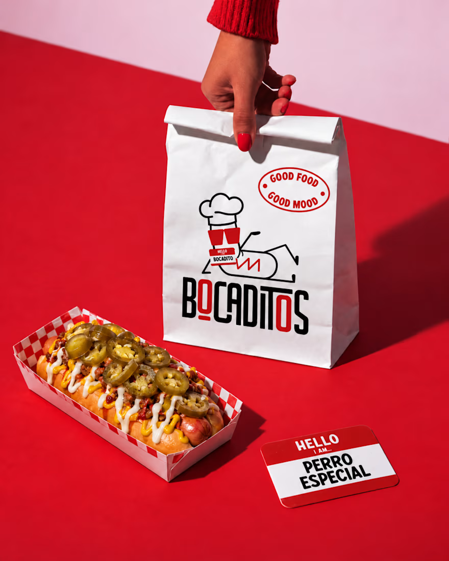
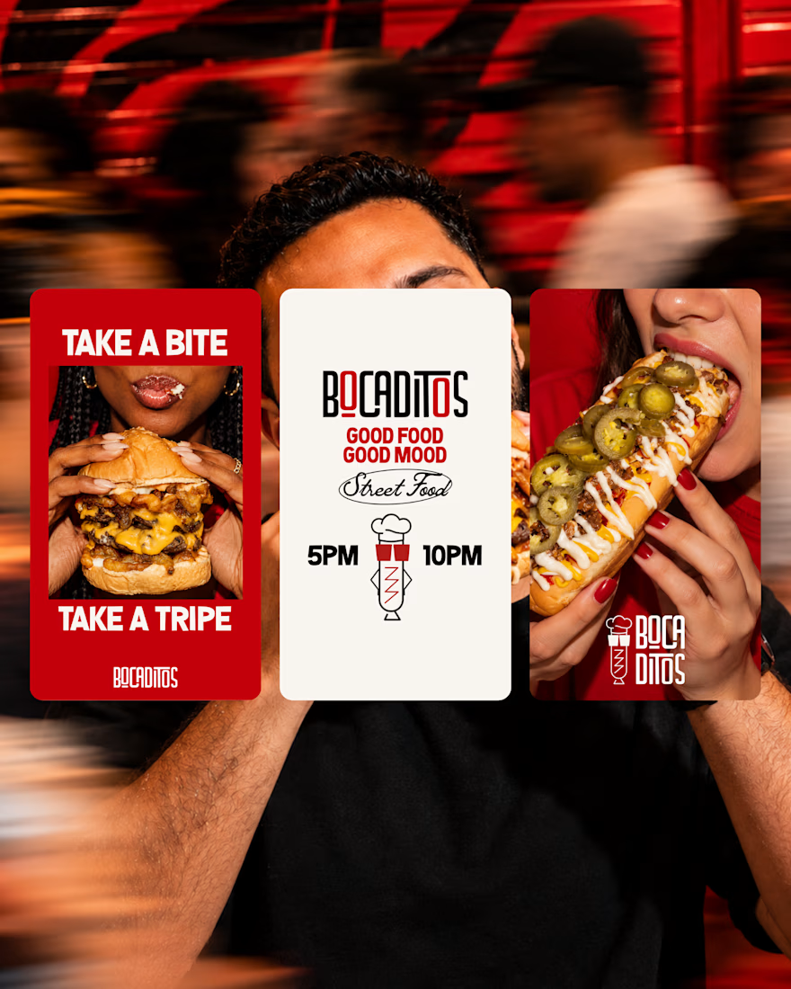
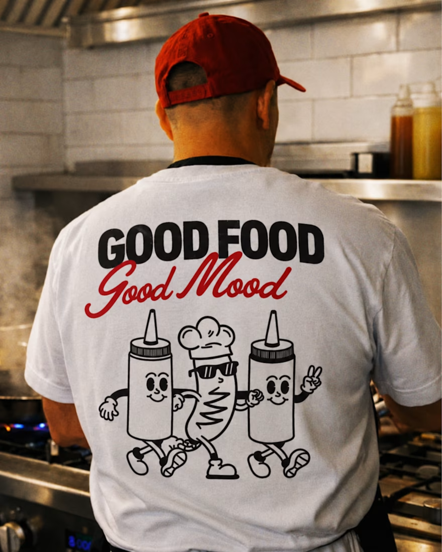
Meet Bocaditos: a playful visual identity I designed to bring bold flavor and a little attitude to the table.
Expressive typography, a punchy red, black, and white palette, and a hot dog mascot with plenty of personality—all brought together across packaging, stickers, and storefront design.
Every detail serves the same idea: good food, good mood.
Have a brand that needs its own personality? Let’s create it.

The network for creativity
Join 1.25M professional creatives like you
Connect with clients, get discovered, and run your business 100% commission-free
Creatives on Contra have earned over $150M and we are just getting started



Related posts

Putting a set of eyes on a logo👀 doesn't give it personality or make it a mascot.
Give it some attitude, a bit of weirdness, something people actually remember. That's what I try to do when I build a brand around a mascot.
Here's some of my work from last month 👇

the innovation in your work is so inspiring, you can tell how much care you pour into the artistic visions.

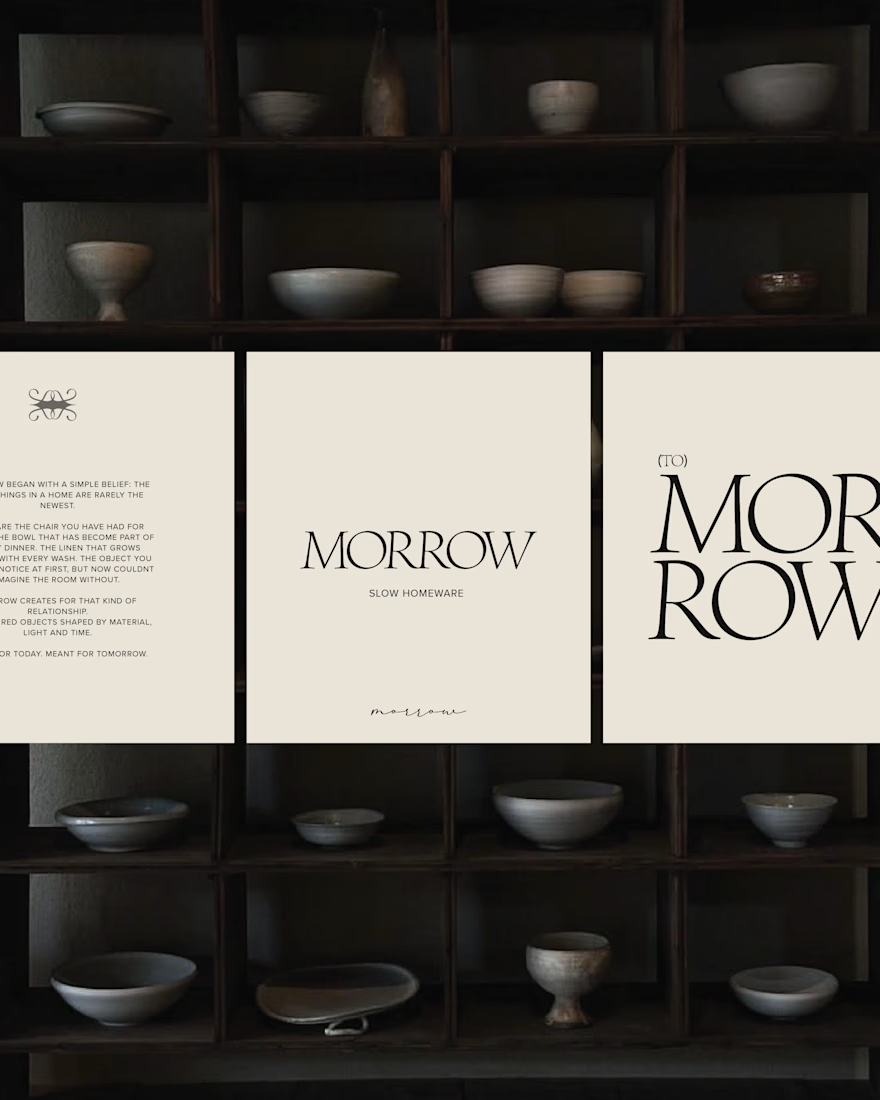
MORROW | Brand Identity & Art Direction
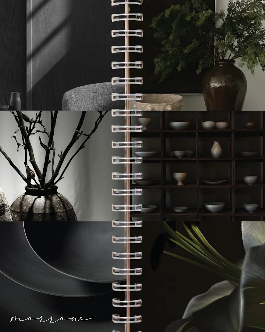
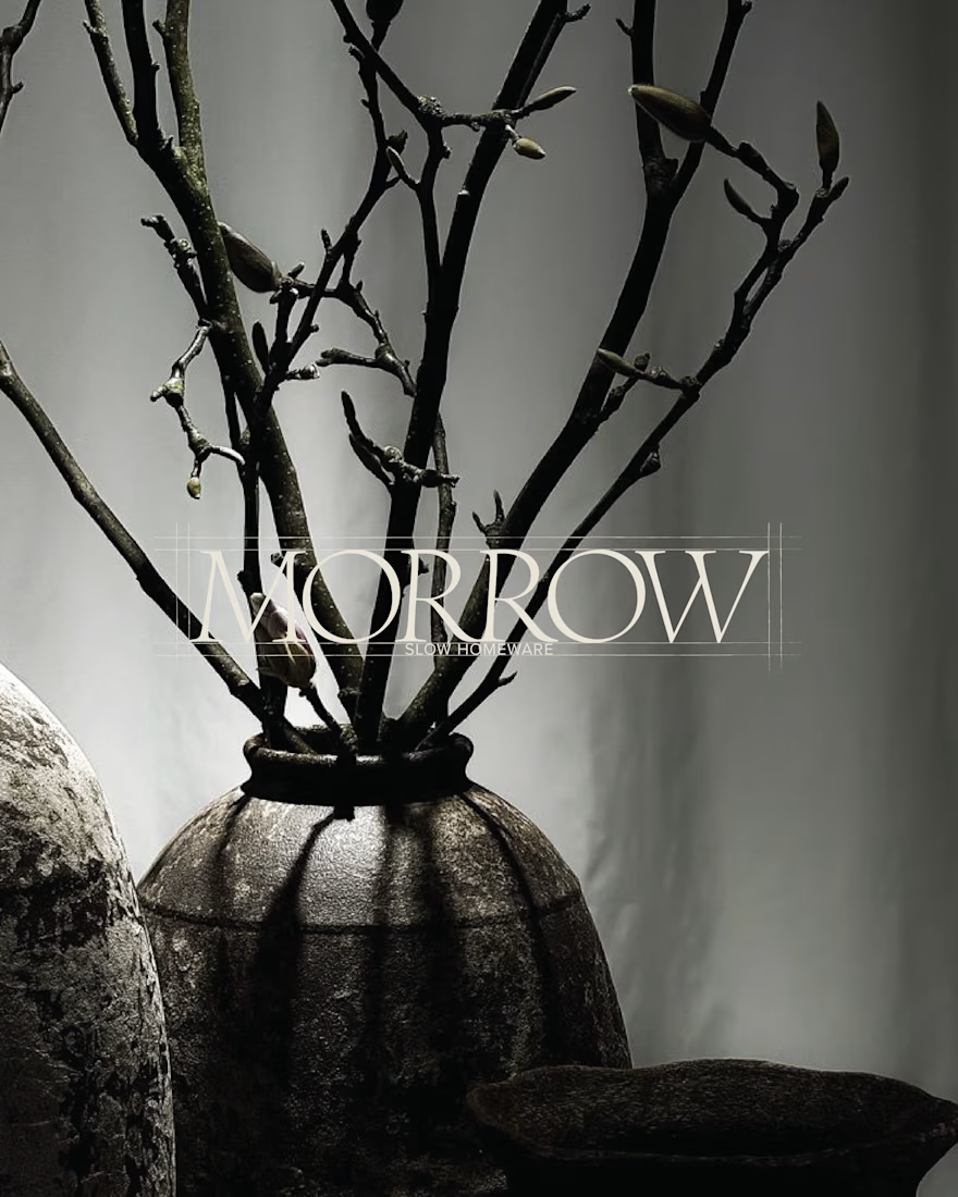
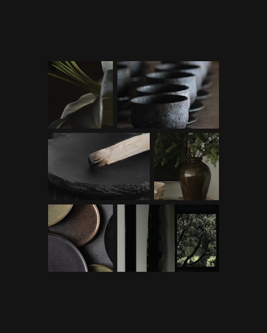
MORROW is a self-directed homeware brand concept built around a slower approach to living. Thoughtful objects, natural materials and a sense of permanence, brought together through a brand designed to feel as considered as the pieces it represents.
The visual direction combines deep greens, warm browns and soft ivory, balancing rustic character with understated luxury. The goal was to create an identity that feels collected rather than overly polished, with a quiet sense of permanence running through every detail.
From the visual identity to the overall art direction, I developed the branding from start to finish, building a cohesive visual world around the idea of slow-made living.
MORROW. Design made to stay.



Love this concept May! MORROW - slower approach to living with thoughtful objects and natural materials. The name itself feels calm and permanent. Brand identity looks so considered and minimal, perfectly matching the homeware philosophy. Beautiful art direction!