The network for creativity
Join 1.25M professional creatives like you
Connect with clients, get discovered, and run your business 100% commission-free
Creatives on Contra have earned over $150M and we are just getting started
Back to feedPost
Taste Test

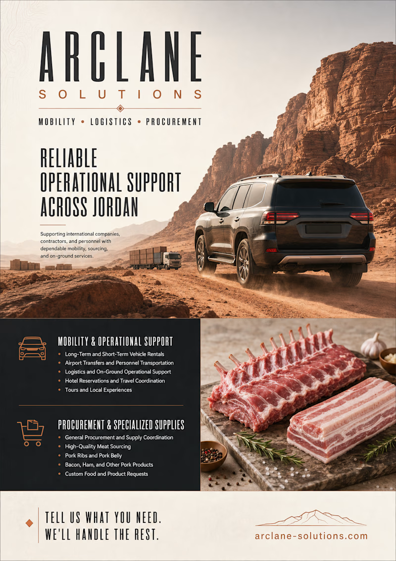
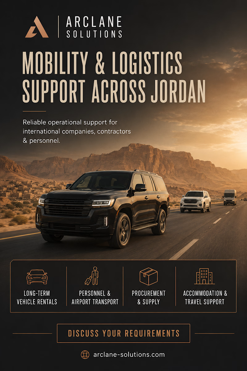
I recently designed two different flyer concepts for Arclane Solutions, and I’d love to hear your honest opinion.
Arclane Solutions provides on-the-ground support for international companies, contractors, and personnel operating in Jordan. Our services include vehicle rentals and transportation, logistics coordination, accommodation and hotel bookings, tours, procurement, and the sourcing of specialty food products, including high-quality meats.
The two flyers take different approaches, and I’m curious:
Which one catches your attention first. Flyer 1 or Flyer 2?
Which design explains the business more clearly?
Any feedback on the layout, wording, colors, or overall feel is welcome. Don’t worry about being polite I’m looking for honest opinions that can help me improve the final version.
1 voted
17%
5 voted
83%
6 votes
Closed


Option 2 feels cleaner and gives the information stronger hierarchy.

Flyer 2 catches my eye first, that convoy shot at night feels more in motion, which matches 'mobility' in the headline. But Flyer 1 explains the business better since that sourcing shot hints there's more than just transport happening. Ever thought about pulling a detail from Flyer 1 into Flyer 2's layout?
The network for creativity
Join 1.25M professional creatives like you
Connect with clients, get discovered, and run your business 100% commission-free
Creatives on Contra have earned over $150M and we are just getting started







Related posts

A little design exploration for practice ✨
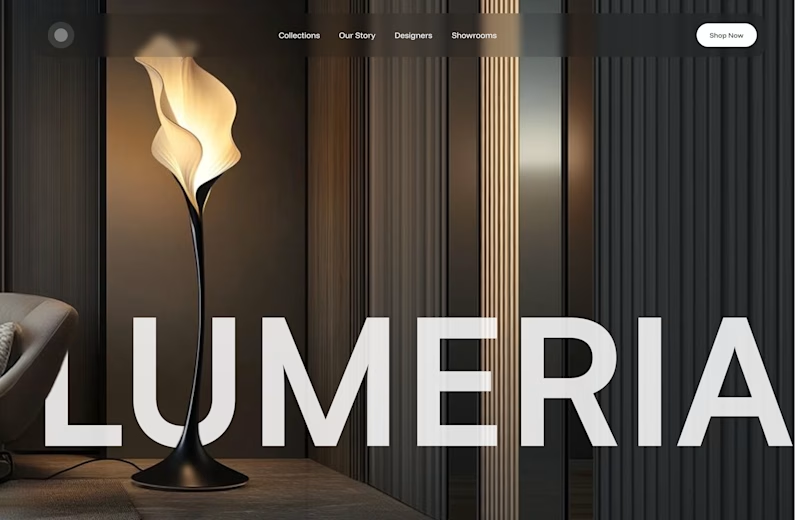
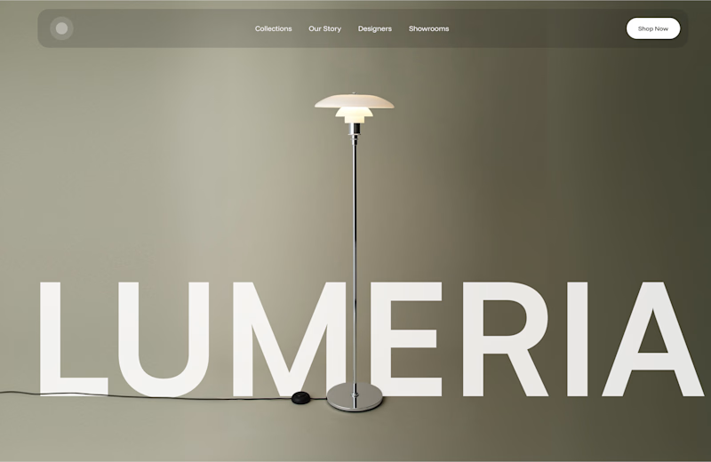
This time, I’m working on a concept for a lighting brand.
Which direction do you prefer?

74 voted
70%
31 voted
30%
105 votes
Closed

Atmospheric, for a lighting brand it feels almost unfair not to show the product actually doing its job in a real room. The minimal version reads more like a furniture catalog to me. Is Lumeria leaning toward a specific price point or market that would push this one way or the other?

Two footer treatments for the same badges.
Texture alone changes how trustworthy vs. how fun a brand feels.
Which one would make you stop scrolling? 👇

19 voted
54%
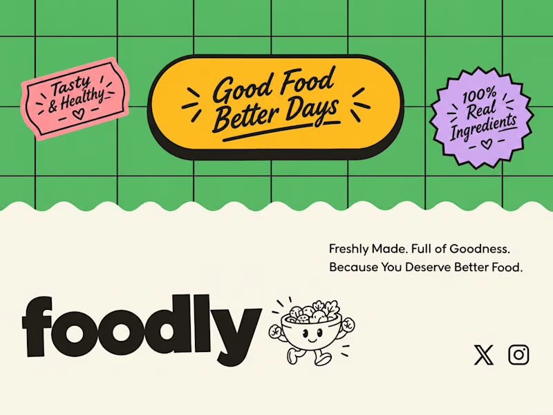
16 voted
46%
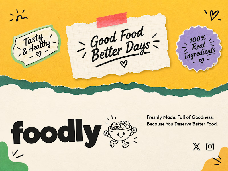
35 votes
Closed

torn-paper version is really good .

Being an independent designer means you're also your own toughest critic – no one else is going to catch it if you don't.
Self-initiated projects give you all the freedom, meaning you can create close-to-perfect work that you think people would love to use. Vela is an app for making doctor appointments and getting insurance guidance with AI assistant. When I started designing it, I wanted it to feel trustworthy and knowledgeable, but also warm, like a friend who explains things without judging you.
Looking back at the initial teal version, I think it landed closer to "doctor's office" than that. Tried a version with less clinical colour, more personality, leaning towards "tech" rather than "health".
Curious what actually reads as more trustworthy to you: A or B?
7 voted
50%
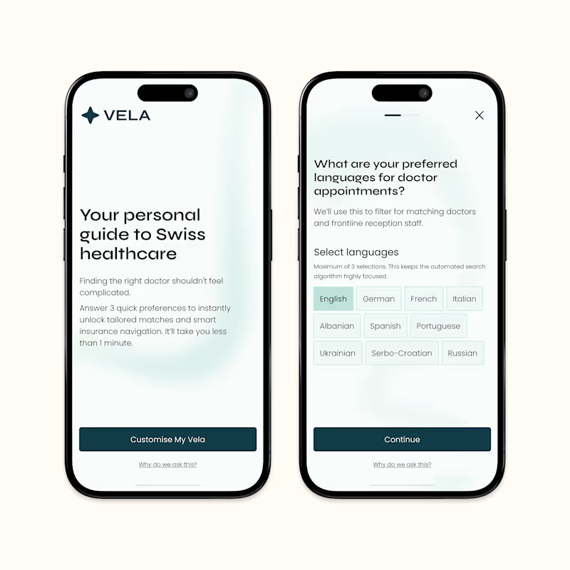
7 voted
50%
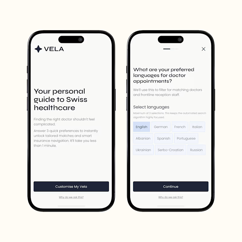
14 votes
Closed

version B