The network for creativity
Join 1.25M professional creatives like you
Connect with clients, get discovered, and run your business 100% commission-free
Creatives on Contra have earned over $150M and we are just getting started
Back to feedPost
Taste Test
Need your honest feedback 👇
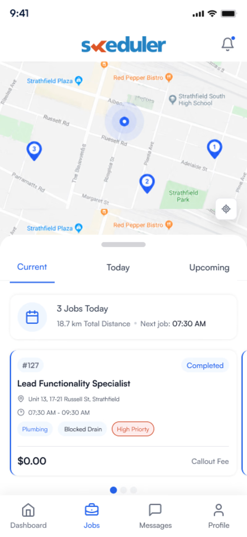
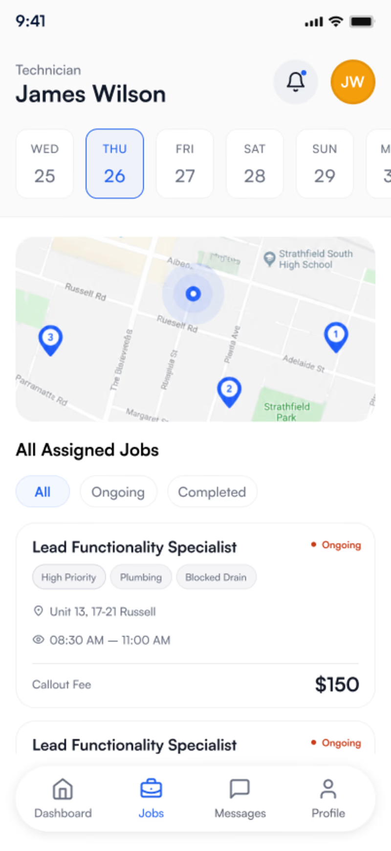
Which version looks more professional and trustworthy?
I'd love to hear your thoughts before finalizing the design.
A or B? And why?
Your feedback is greatly appreciated. 🙌
#UIUX #DesignFeedback #Figma #WebDesign #ProductDesign
0 voted
0%
6 voted
100%
6 votes
Closed

i like the B one!

Thanks

For me it's B (on the Left)
thanks

I like Version B. The weekly calendar at the top makes it super easy for the technician to plan ahead. It feels less crowded and lets you see your job times instantly.
good choice thanks

B gets my vote. The hierarchy feels clearer, and the overall composition looks more confident.
great choice thanks
The network for creativity
Join 1.25M professional creatives like you
Connect with clients, get discovered, and run your business 100% commission-free
Creatives on Contra have earned over $150M and we are just getting started











Related posts

Same content, different experience. A few thoughtful design choices can completely change how a presentation feels, flows, and communicates. Which version would you choose?

11 voted
31%
24 voted
69%
35 votes
Closed

Verde Vista 1 is more modern and futuristic specially with blue colors and robotic hand❤️
Great job Rasid🎉🎉🔥🔥

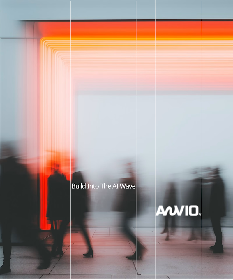
Which creative direction better communicates a Tech-Forward AI Brand Identity for anvio.online ?
25 voted
44%

32 voted
56%
57 votes
Closed

Fast vibrant energy gets my vote. The warm glow feels more human, which is nice for an AI brand.


Three weeks into building the Pasted website, after the design was approved, an 11-page document arrived with a whole new vision.
It was beautiful work, and it described a different project at the agreed price.
I asked them to decide: keep the approved scope, or pause and price the new idea separately. On day six, they chose the original. We shipped two weeks later.


Offering to price the new vision as its own phase also lets the client see what the idea costs without it feeling like a no. Was a change-order process already written into your contract, or did you build that path on the spot?