The network for creativity
Join 1.25M professional creatives like you
Connect with clients, get discovered, and run your business 100% commission-free
Creatives on Contra have earned over $150M and we are just getting started
Back to feedPost
Taste Test

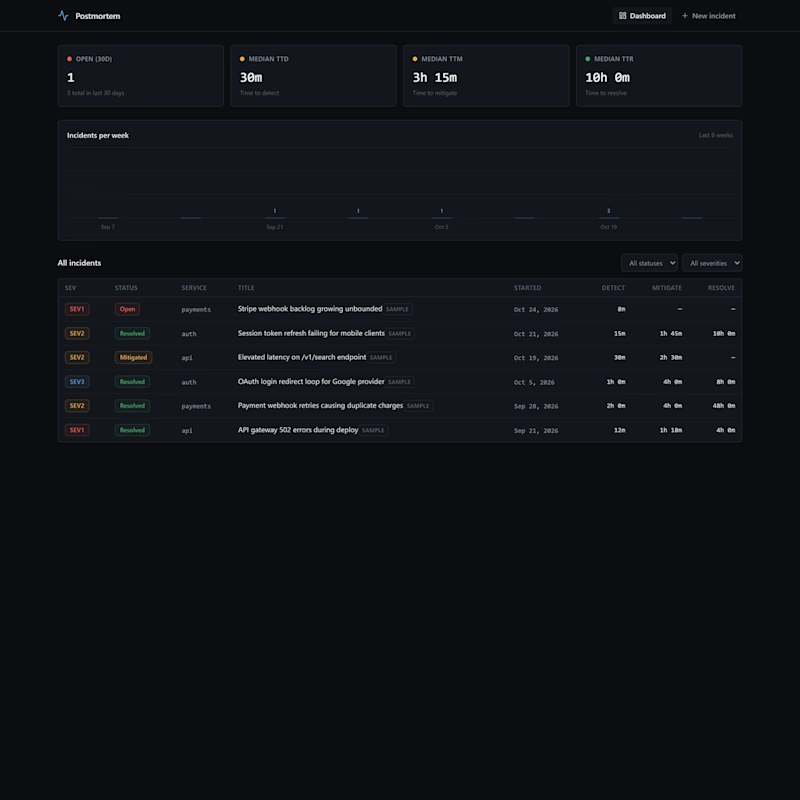
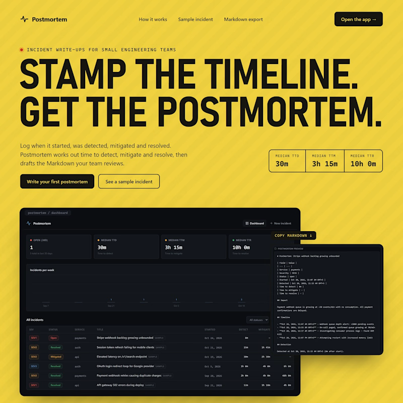
Real screens beat the 3D rack in last week's Postmortem vote, so I built the landing page around them.
Left is what visitors got until now, straight into the dashboard. Right is the new first screen.
Which one would make you try it, and what would you change on the right?
0 voted
0%
1 voted
100%
1 vote
Closed

Right one 100% Ali! Left was too direct into dashboard, Right builds context first. That yellow + bold headline STAMP THE TIMELINE is fire. I would try it for sure! Maybe just add a small social proof line under CTA on the right?
The network for creativity
Join 1.25M professional creatives like you
Connect with clients, get discovered, and run your business 100% commission-free
Creatives on Contra have earned over $150M and we are just getting started



Related posts

i built a semi-3D interactive website with @Base44 for a Creative Production Studio, called STORM STUDIO,. that drafts 3D Digital unique experience for Brands.
STROM STUDIO specializes indesign, motion, 3D and Technology, working together to turn ambitious ideas into immersive digital experiences.
At STORM STUDIO, We create 3D visual storytelling and interactive web experiences that help brands stand out.
STORM STUDIO - https://stormstudio.base44.app
also, check it out on mobile, to get the full mobile experience
my walkthrough process will be below in my comment section

my walkthrough process
PS; if you opened the STORM STUDIO website on a Mobile phone, Shaking the phone rattles the rubik cubes like a shaken jar.
and,
on PC/DESKTOP, moving the cursor rattles the rubik cubes, also slowly scroll through the home page to have a full experience of the scroll animate effects, etc.
try it out 😊

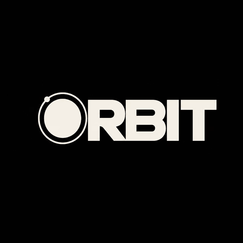
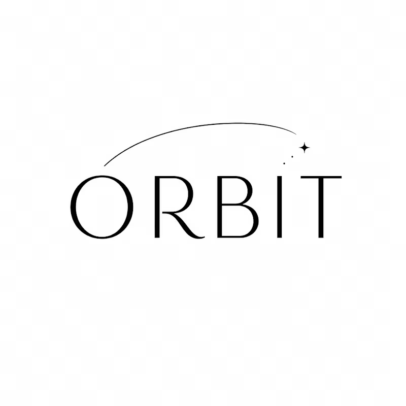
Which ORBIT pulls you in: the quiet one or the loud one? ✨
One name, two directions. Same idea, an object in motion around a center.
A → Heavy extended sans on black. The orbit is built into the O, a ring with a single satellite. Compact, graphic, impossible to ignore.
B → Light, high-contrast serif with a hairline arc and a tiny spark. The orbit is a gesture, a trail you almost miss. Elegant, airy, a little mysterious.
If you ask me, I'd pick A.

36 voted
80%
9 voted
20%
45 votes
Closed


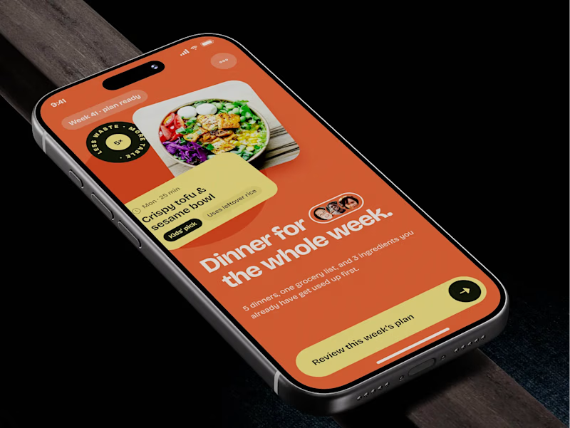
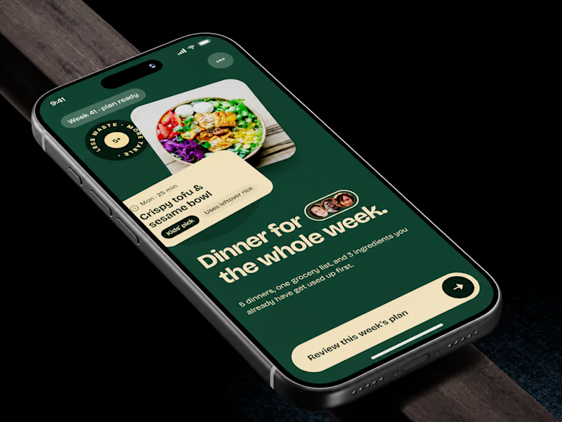
🧪 TASTY TEST: WHICH ONE MAKES NEXT WEEK FEEL SORTED?
Meal planner mobile app design. Same UX, two palettes.
🍊 A · Citrus Energy
Orange + buttery yellow. Appetite first.
🌿 B · Forest Calm
Deep green + cream. A calmer weekly ritual.
💡 GROWTH THINKING
Users want dinner handled, not another planning task.
My hypothesis: orange could win the first tap; green could signal less effort. I’d test plan-open rate AND grocery-list completion. More taps mean little if people abandon the next step.
🗳️ A OR B — WHICH WOULD YOU TRUST WITH NEXT WEEK’S DINNERS?
Vote and tell me why.
📩 BUILDING A MOBILE APP? LET’S FIND WHAT’S HOLDING GROWTH BACK.
https://calendly.com/asol_design/demo
#MobileAppDesign #AsolDesign
15 voted
68%
7 voted
32%
22 votes
Closed