The network for creativity
Join 1.25M professional creatives like you
Connect with clients, get discovered, and run your business 100% commission-free
Creatives on Contra have earned over $150M and we are just getting started
Back to feedPost


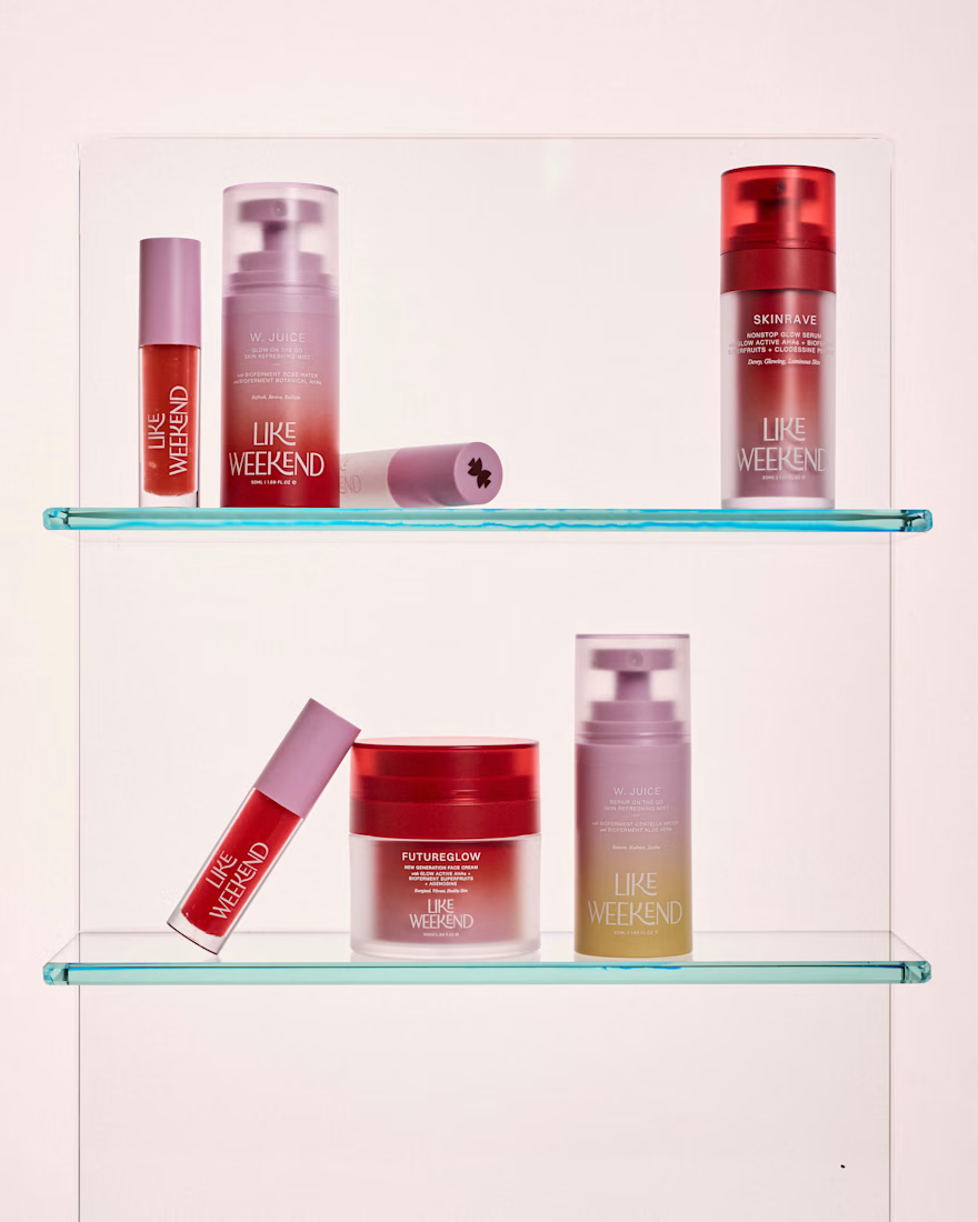
We partnered with the LIKE WEEKEND team to build a brand that captures the feeling of the Mediterranean, warm, effortless, and quietly optimistic, without relying on the usual visual clichés.
The challenge was translating an atmosphere into a system. Sunlight, salt air, ease, all expressed through a refined, contemporary lens that could sit credibly within skincare while still feeling distinctive and alive.
We developed a full brand universe rooted in skinimalism: fewer steps, smarter formulations, and a more intuitive relationship with skincare. This thinking guided everything from the visual identity to the packaging system.
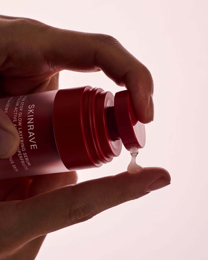
Color became a key asset, not decorative, but structural. A considered palette was used to bring energy and differentiation across the range, while maintaining clarity and cohesion. The overall tone balances playfulness with restraint, creating a brand that feels fresh yet grounded.
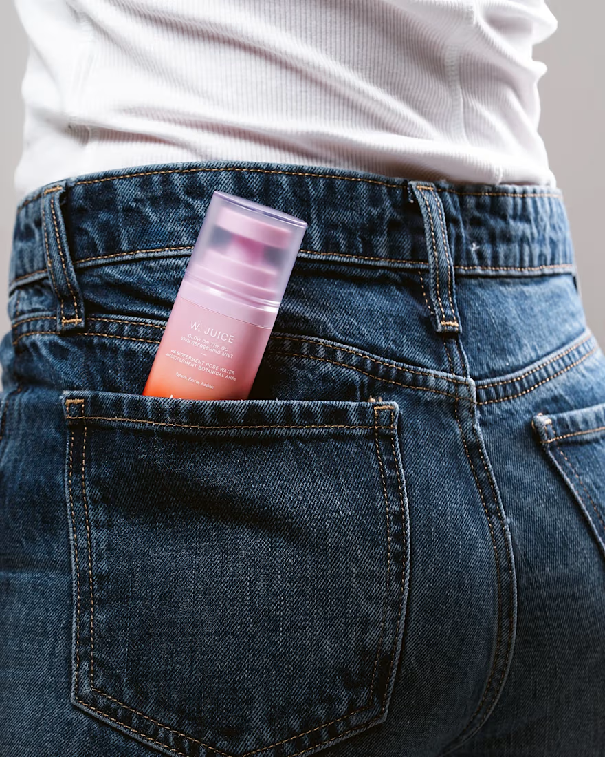
The result is an identity that moves seamlessly between science and sensoriality, modern, lightweight, and designed to fit naturally into everyday rituals. A brand that feels as good as it performs.

So fun! Also love the term "skinimalism."

Amazing work! The design is very subtle and the gradients give the product a lot of personality. I would love to buy this product!!

This is not just branding, it’s a whole vibe system.
Execution feels effortless but clearly very thought-through 🔥

Excellent and very creative work!

Love this art direction!
The network for creativity
Join 1.25M professional creatives like you
Connect with clients, get discovered, and run your business 100% commission-free
Creatives on Contra have earned over $150M and we are just getting started
Related posts
Having fun testing how brands I use could look like with a goth redesign for Halloween using Adobe Firefly.
Requested by @Aly W

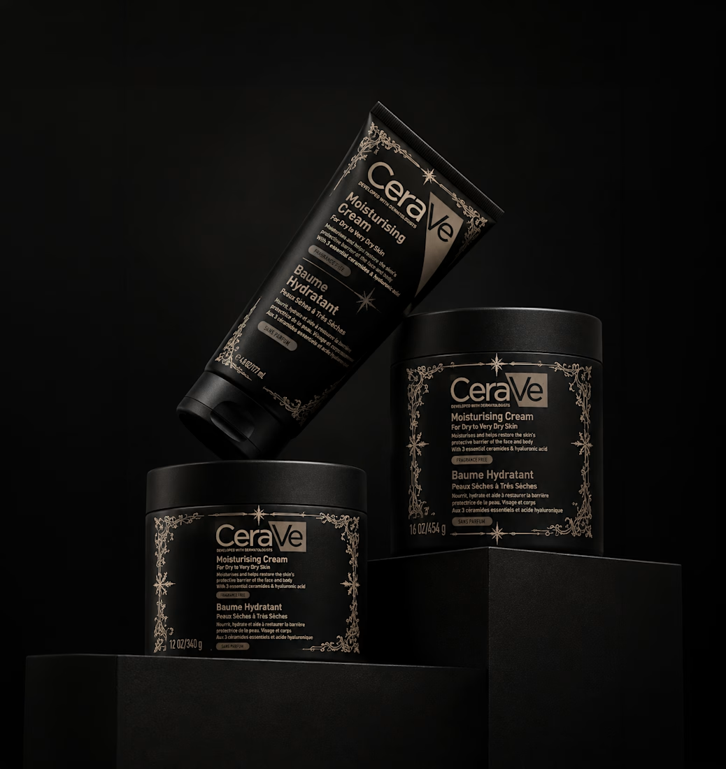


Ooh another spooky take on a classic. Love it Anita!!

A little more about the inspiration behind Tindara.
I wanted the identity to have a connection to Tindari, Sicily. The Madonna di Tindari statue was the starting point for the symbol, while Sicilian decorative patterns inspired the graphics around it.
For the colors, I chose mustard yellow, deep green, and burgundy, balanced with cream. I wanted to bring some of that warmth and richness into the packaging, while keeping the different elements comfortable together.
For me, these references are what give the project its character and sense of place.



Packaging design collection across skincare, food and beverage.
Each label designed to stop someone mid-shelf and make them pick it up. Different products, different moods, same intention.
Botanical lotions. Fruit jams. Herb teas. A bourbon that means business. 🎨

Great Presentation of Packaging 🙌