The network for creativity
Join 1.25M professional creatives like you
Connect with clients, get discovered, and run your business 100% commission-free
Creatives on Contra have earned over $150M and we are just getting started
Back to feedPost
Taste Test

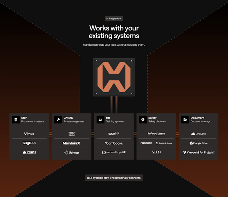
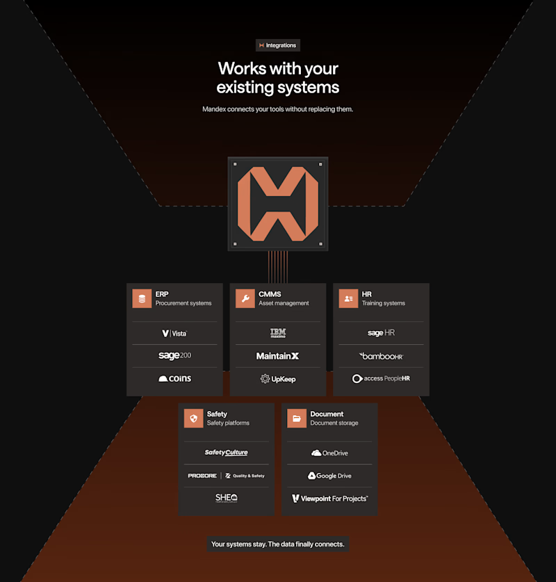
This is kind of an experimental integration section.
I just want to make sure which one will actually work 😅


12 voted
86%
2 voted
14%
14 votes
Closed

Option 1's warm gradient pulls the eye to the center node faster, but Option 2 feels calmer for a longer read. Is this more of a gut call before you ship, or are you actually running it past users first?
Shared with actual stakeholders, awaiting their decision.

I think option 2creates visual juggling
Thanks, appreciate the input.

Great work
Thanks

Voted Option 1, the single row layout gives the integration cards more room to breathe. Option 2's stacked grouping feels a bit cramped next to that centered logo.
Thanks, I agree and appreciate the input.
The network for creativity
Join 1.25M professional creatives like you
Connect with clients, get discovered, and run your business 100% commission-free
Creatives on Contra have earned over $150M and we are just getting started
Trending

Claude
Claude has entered the design space. How are you using Claude Design?

Contra University
Learn from expert creatives how to earn more using next-gen AI tools.
creativeaiflow
Creative AI workflows are evolving. What tools do you use, and what are their strengths and weaknesses?
freelancerlife
Freelancer life is wins, pivots, and everything in between. What’s yours right now?











Related posts

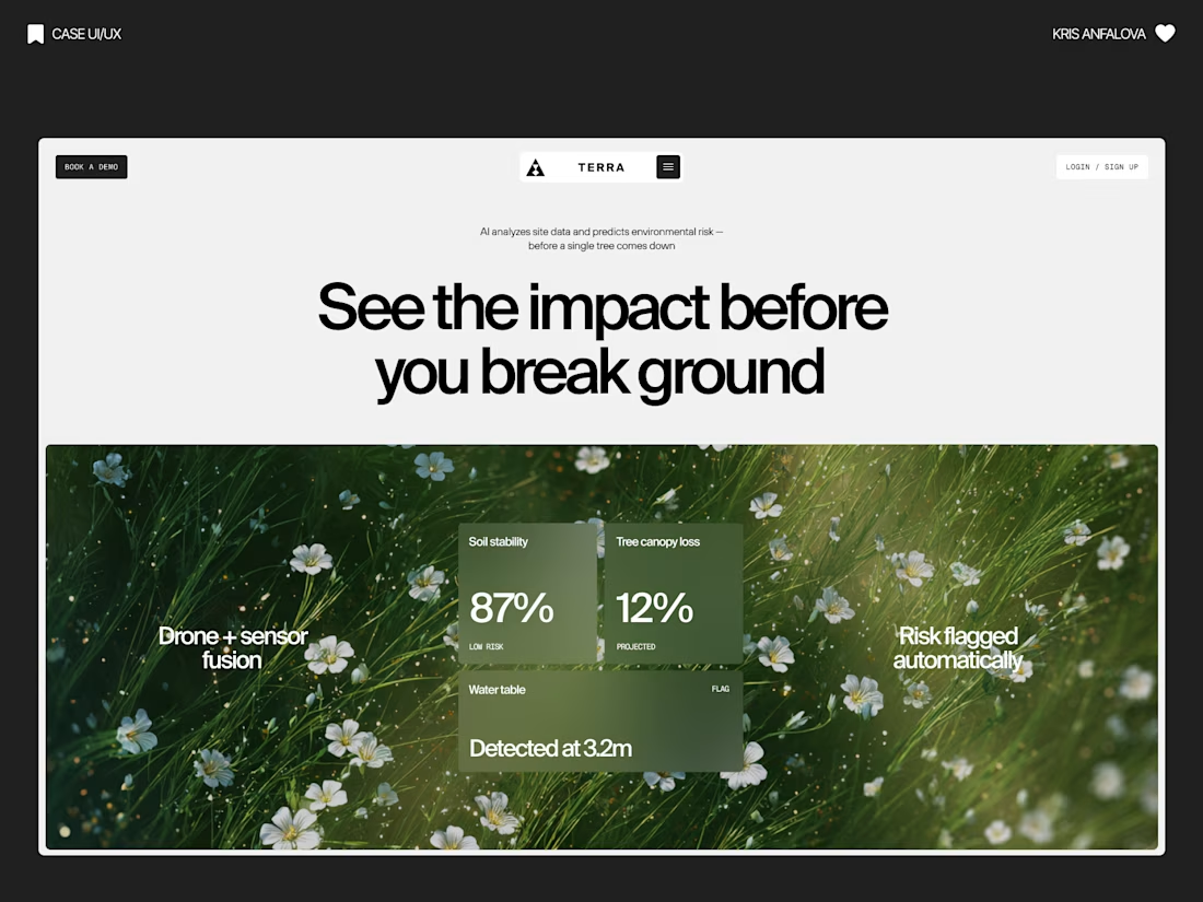
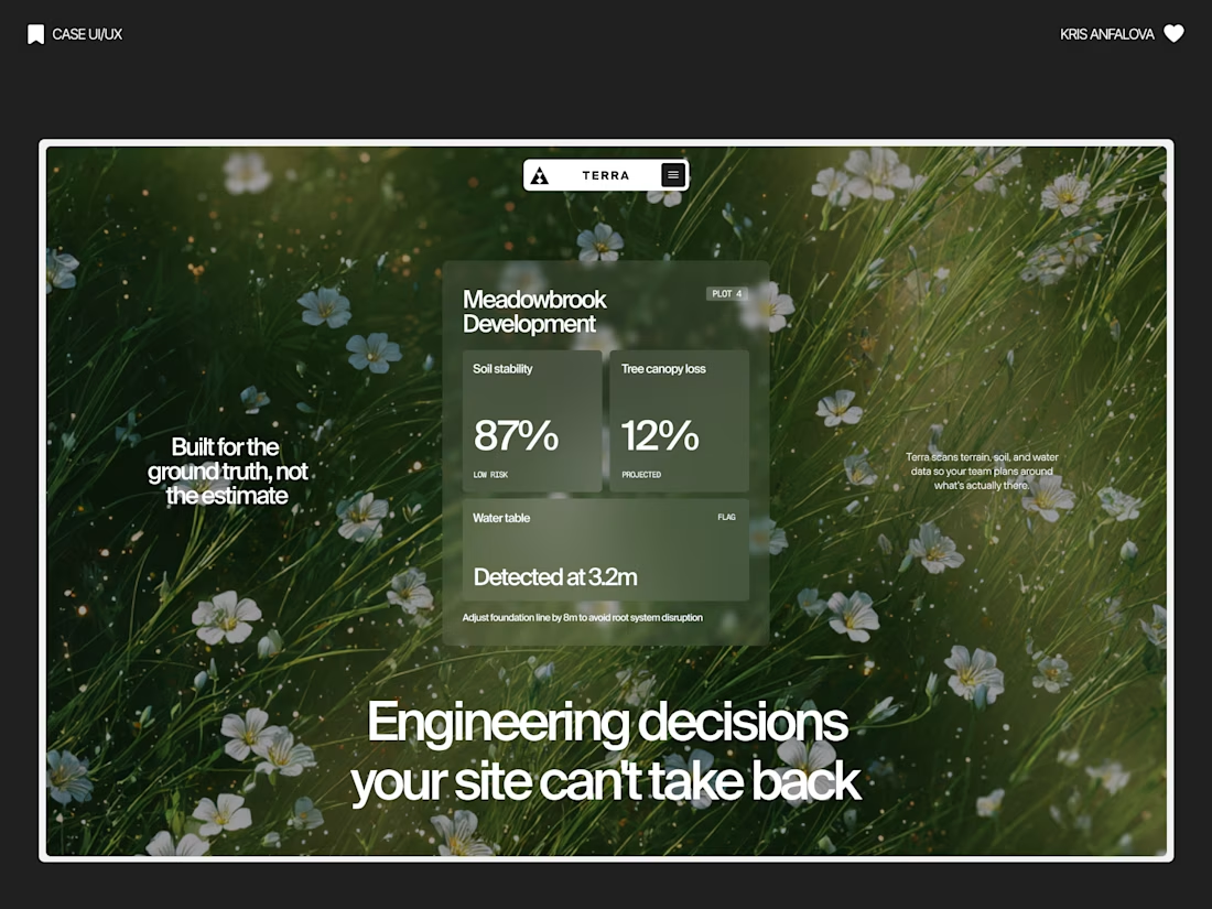
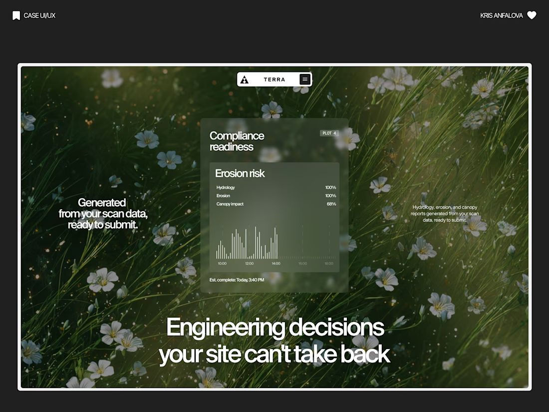
Terra — AI Environmental Risk Platform
Designed the landing page and product UI for Terra — a platform that helps land developers and engineering teams see environmental risk (soil stability, tree canopy loss, water table depth) before breaking ground.
The challenge:
Development decisions are usually based on estimates, not real ground data — and by the time issues show up, it’s often too late to reverse them. The interface needed to make complex sensor/AI data feel immediate and trustworthy, without losing emotional weight.
The solution:
Raw, organic photography (wildflowers, grass, natural terrain) paired with clean glass-panel data cards — creating a visual tension between “nature” and “precision engineering.” Bold editorial typography carries the emotional message, while translucent metric cards surface real numbers: soil stability, canopy loss %, water table depth.
A strong example of turning dense environmental data into something a non-technical stakeholder can understand in seconds.



Nice one

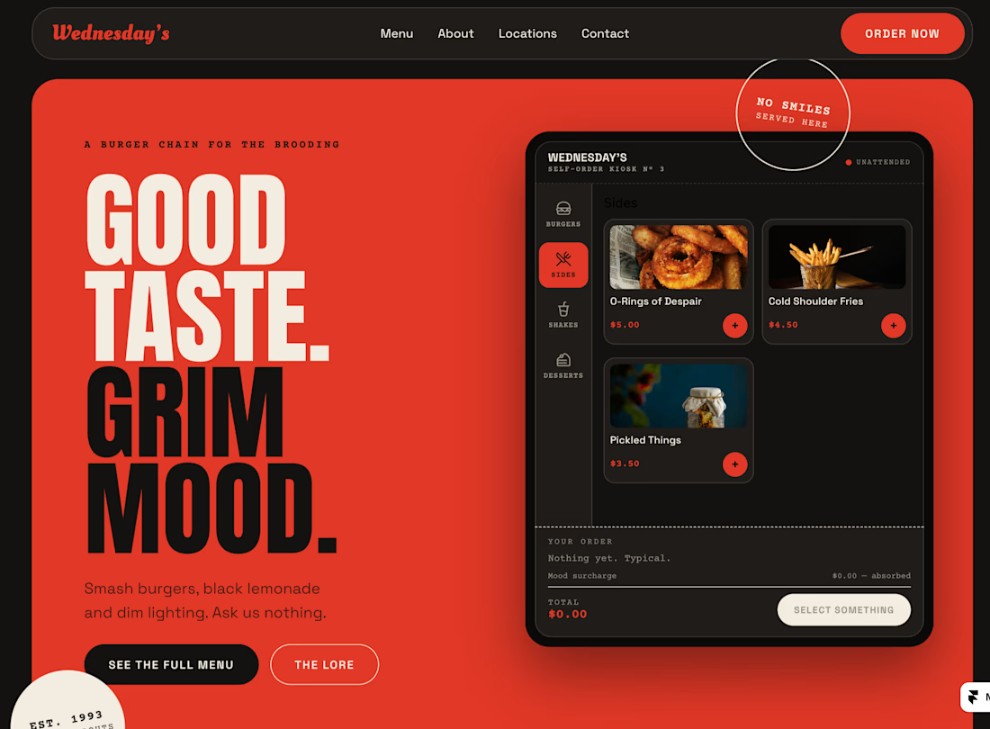
Half a year later I returned to Wednesday's idea
It's just like Wendy's, but Wednesday's and it's kind of grim



Love this!