The network for creativity
Join 1.25M professional creatives like you
Connect with clients, get discovered, and run your business 100% commission-free
Creatives on Contra have earned over $150M and we are just getting started
Back to feedPost
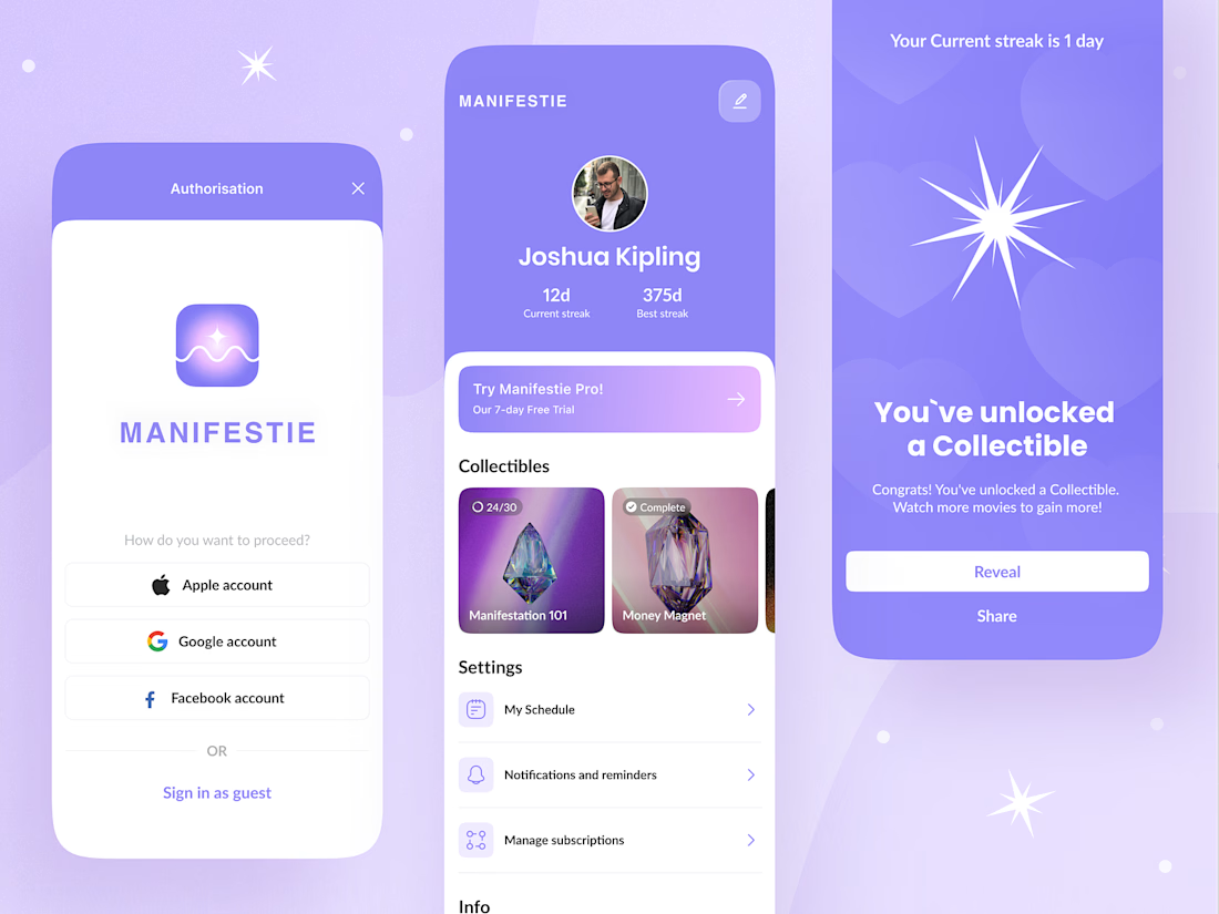
Manifestation apps have an audience problem most teams don't talk about: the same interface has to work for a teenager building a vision board and a retiree tracking daily affirmations. Design for one and you alienate the other.
For Manifestie, that meant treating the visual language as functional, not decorative. The color palette and animation aren't there to look calm they're there to lower the barrier to a daily habit that most people abandon within a week. Progress tracking and feature navigation had to stay simple enough that neither age group hits friction, while the aesthetic still signals "this is a space for reflection," not a productivity tool wearing soft colors.
The harder design question wasn't the interface it was building something that feels personal to two very different life stages without splitting into two products.
Anyone else designed for an audience that spans generations in one build? Curious how you handled the tone split. Check it out.

It was clearly a tricky task, but you did great! I'm sure interface will work well for different age groups!


Yes, it was task with *

Love how the UI feels personal, calming, and still engaging.
Thank you, Shubhang 🙌

this is sooooo dreamy, i love the collectible aspect you've incorporated!
Thank you so much! 🥹 I’m really glad you noticed the collectible aspect that was one of my favorite parts to explore!

Nice designs..

This work is so cool ❤️ I love it!

Treating the visual language as functional instead of decorative is a smart way to frame it, that's the kind of distinction that's easy to miss when everything just looks like a mood board. Did the retiree side of testing surface anything you hadn't expected, or did the teenager assumptions mostly hold up across both groups?

Designing for two completely different age groups is such a tough balance. Cool insight, Yurii😍
The network for creativity
Join 1.25M professional creatives like you
Connect with clients, get discovered, and run your business 100% commission-free
Creatives on Contra have earned over $150M and we are just getting started



Related posts


We partnered with SaphoBio, a biotechnology company developing a rapid microbiological release platform for precision sterility testing, to build its brand identity and digital presence from the ground up.
Our work included brand strategy, visual identity, website design, Framer development, and investor-facing materials. The result is a cohesive brand and digital experience that clearly communicates its products, services, and technology.
Explore the full case study here.

This is nice

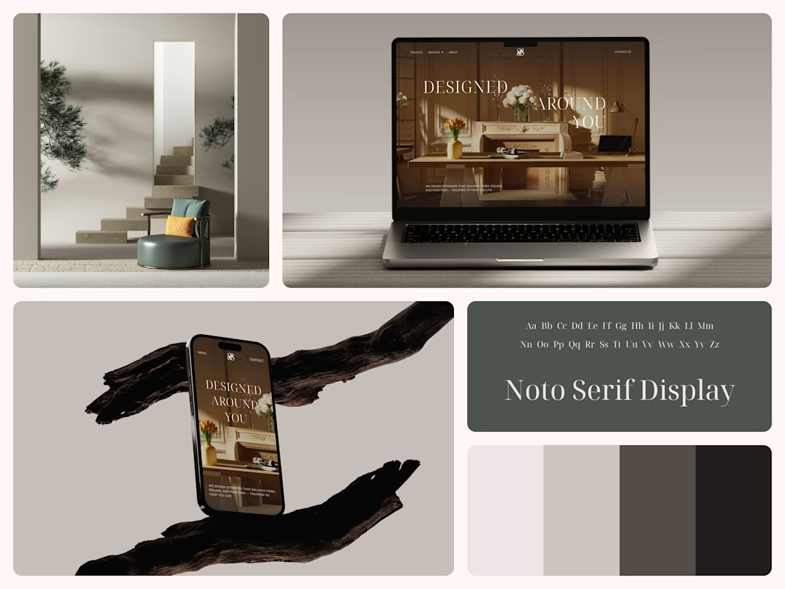
Interior Design Website
The white flowers on the mantel overlap the headline.
Thin Noto Serif Display capitals step down across one warm photo of a paneled room, so the space stays in view between the words. On the phone, the three words stack in a centered column, with Menu and Contact on either side of the monogram.
The palette runs from soft white to near black, which leaves the color to the photo: orange tulips and warm light on the walls.
The headline reads "Designed Around You", and the hero takes it literally, with the wall behind the type and the flowers in front of it.
Designed by the Hue & Machine team.
#InteriorDesign #InteriorStudio #WebsiteDesign #HomepageDesign #WebDesign #ResponsiveDesign #Typography #EditorialDesign #UIDesign #FigmaDesign


Nice!

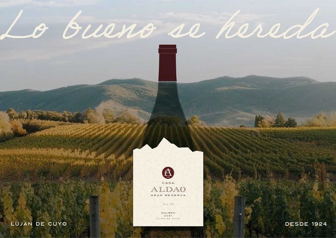
Label Design · Wine Branding · Malbec Gran Reserva · Mendoza


looks great