The network for creativity
Join 1.25M professional creatives like you
Connect with clients, get discovered, and run your business 100% commission-free
Creatives on Contra have earned over $150M and we are just getting started
Back to feedPost
Taste Test
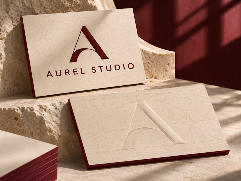
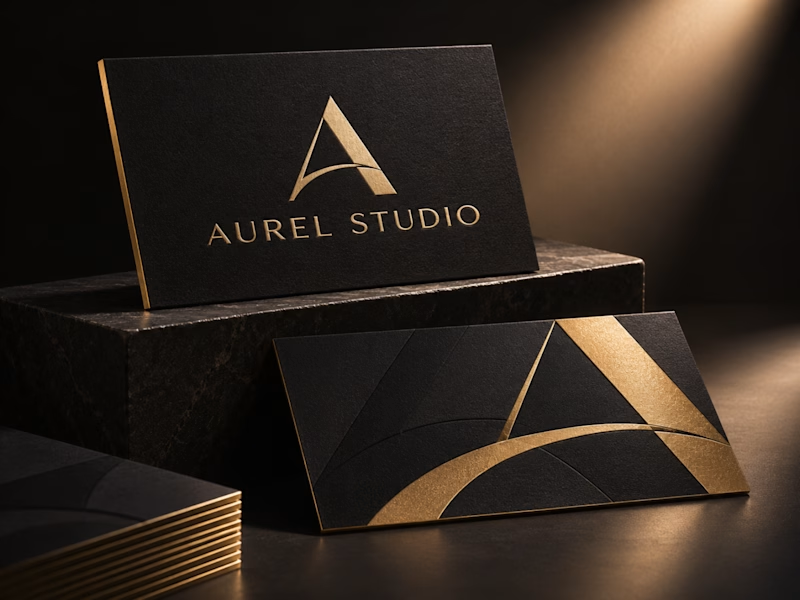
Aurel Studio · Luxury Business Card Concept
I have explored two print finishes for the same monogram. Black & Gold pairs champagne foil with gilded edges, while Ivory & Oxblood uses a raised monogram and deep red edges to highlight the paper’s texture.
Which finish would you choose for your brand?
0 votes
Ends in 1d

Lvory & oxblood is batter looks 👌🏻

Purely aggred 🧞♂️

I'd go Ivory & Oxblood. Black & Gold reads as luxury at first glance, but it's the category default, while the raised monogram with those red edges feels more ownable and rewards being held in the hand.
Apprreciate attention on details & constructive feedback.
The network for creativity
Join 1.25M professional creatives like you
Connect with clients, get discovered, and run your business 100% commission-free
Creatives on Contra have earned over $150M and we are just getting started


Related posts

Very close to finish a website project! Help me out!
Blue or orange scheme?
38 voted
47%
43 voted
53%
81 votes
Closed

The orange scheme was stunning 😍

Another category comparison, and this one's going to make you look twice.
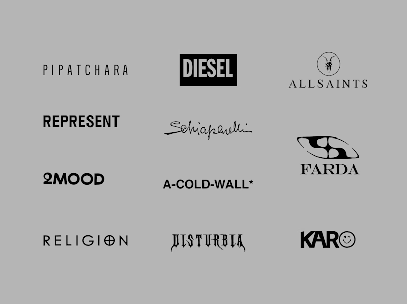
The fashion category needed a fresh point of view. Most established players relied on functional wordmarks and relatively restrained visual identities.
With Ru’asā, we took a different route. We challenged those conventions and built an identity designed to stand apart, be remembered and give the brand a world of its own.
Distinctive by design. Unconventional by nature.
Which would you choose?
Familiar category conventions
A fresh point of view
1 voted
11%
8 voted
89%
9 votes
Closed


Motion wins


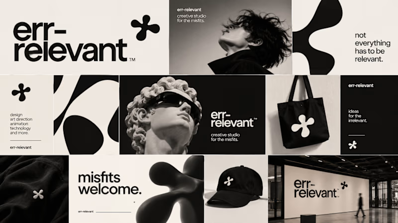
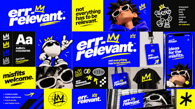
Before we begin working on any branding project, we use Curative Intelligence to explore ideas, challenge conventional thinking, and establish the creative direction.
Err-relevant is something particularly fun that we're developing at The RLVNT Studios.
Now, I'd love your inputs. Which visual direction do you think we should take forward into the main production stage?
8 voted
67%
4 voted
33%
12 votes
Closed