The network for creativity
Join 1.25M professional creatives like you
Connect with clients, get discovered, and run your business 100% commission-free
Creatives on Contra have earned over $150M and we are just getting started
Back to feedPost
Patch Bakery Brand Identity Design
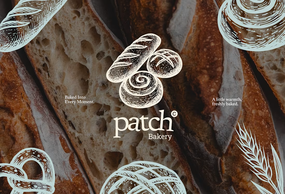
Patch is a warm, artisanal bakery brand built around one simple feeling: "A little warmth, freshly baked." Every detail is designed to make everyday moments feel special.
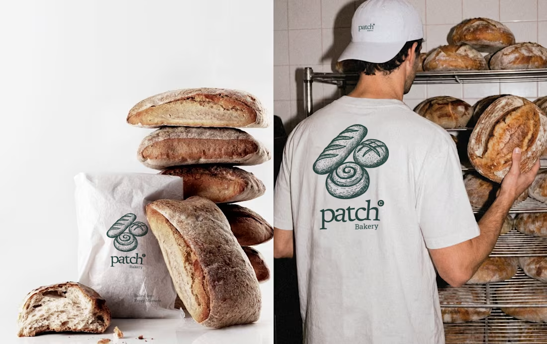
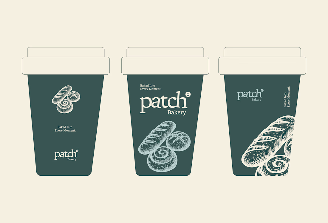
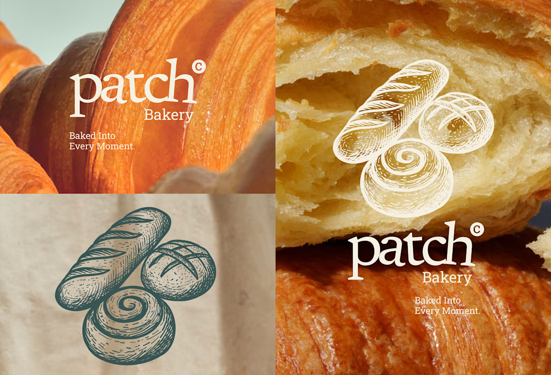
I developed Patch's brand identity — including logo, hand-illustrated iconography, typography, and color palette — combining a soft sage color scheme with detailed vintage-style bread illustrations to reflect the brand's handcrafted, cozy character.
The goal was to create a visual identity that feels nostalgic and inviting, communicating warmth and quality in every element — from the custom logotype to the intricate line-art details.
Art Director
Ussama Ahmed




Thank you so much! 😊
Thank you so much

Sage instead of the usual warm terracotta/brown is the choice that keeps this from reading as generic rustic-bakery — the hand-drawn bread line art carries the handcrafted feel while the palette stays contemporary.
Thank you so much! 😊


the sage green with the bread drawings is nice. did you draw the bread by hand?

Bakery brands get judged on packaging long before anyone looks at the logo, and detailed line art is exactly the thing that behaves differently on a kraft bag than on a printed cup. Curious which touchpoint made you redraw the illustrations the most.
Thank you so much! 😊

Nice work
Thank you so much! 😊

so nicce
Thank you so much

Love the illustrations!
Thank you so much! 😊

This brand positioning feels calm, soothing and at lastly gives the feel of bakery exactly. The hand drawn bread and font is what fits best for artisanal bakery.
Thank you so much

Thank you so much

In my humble opinion, the combination of muted dark teal/slate green with pale off-white/cream feels way too cold. If you want to maintain a premium green feel, shift toward warm olive, deep forest green, or a warm sage.
Keep the good work. Thank you.

Amazing 👏 🤩
The network for creativity
Join 1.25M professional creatives like you
Connect with clients, get discovered, and run your business 100% commission-free
Creatives on Contra have earned over $150M and we are just getting started





Related posts

Brand identity work for WesoftAI




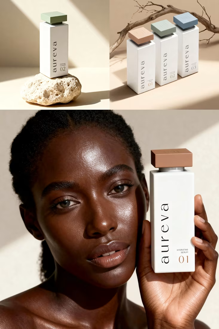
A closer look at Aureva, a Paris-based skincare brand I worked on.
The brief was to create a brand identity and packaging that felt premium yet approachable. I paired distinctive typography with soft earth tones, using color to give each product its own place within the range.
The full case study is now on my profile.

Premium branding

Solene: skincare e commerce website, built in Framer
Skincare shopping should feel as good as the routine itself. For Solene, I designed and built a full online store with a soft, warm identity: a bold maroon and pink palette, big expressive type and real-skin photography.
What's inside:
A hero that sets the brand tone straight away
A Bestsellers section for quick browsing
Category pages for Cleanse, Hydrate and Protect
A shop page with price slider, filters, sorting and hover image previews
An Our Story page with brand values
A clean, confident footer
Need a website for your beauty or lifestyle brand? Let's talk.


The hover image previews on the shop page caught my eye - they let shoppers sense texture instantly without an extra click.