The network for creativity
Join 1.25M professional creatives like you
Connect with clients, get discovered, and run your business 100% commission-free
Creatives on Contra have earned over $150M and we are just getting started
Back to feedPost

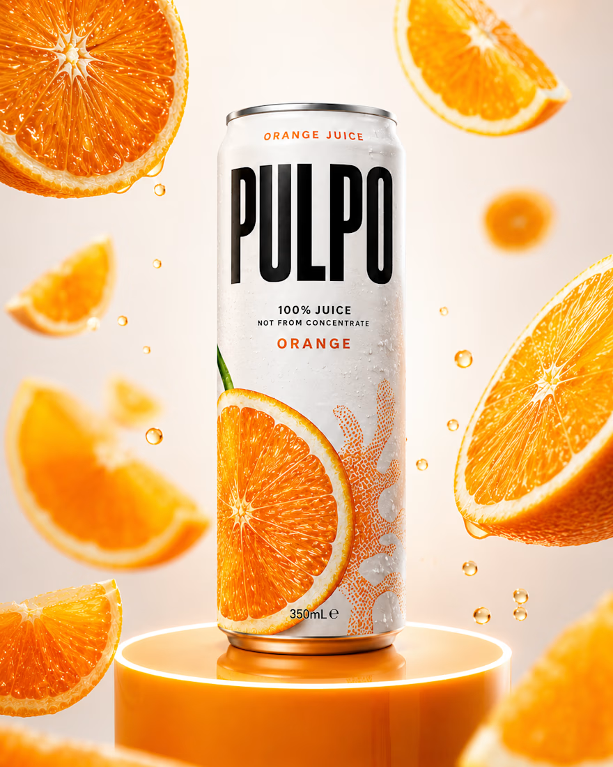
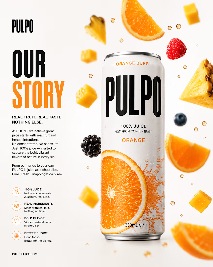
PULPO™ is a premium juice brand concept built to celebrate the freshness, vibrancy, and authenticity of real fruit.
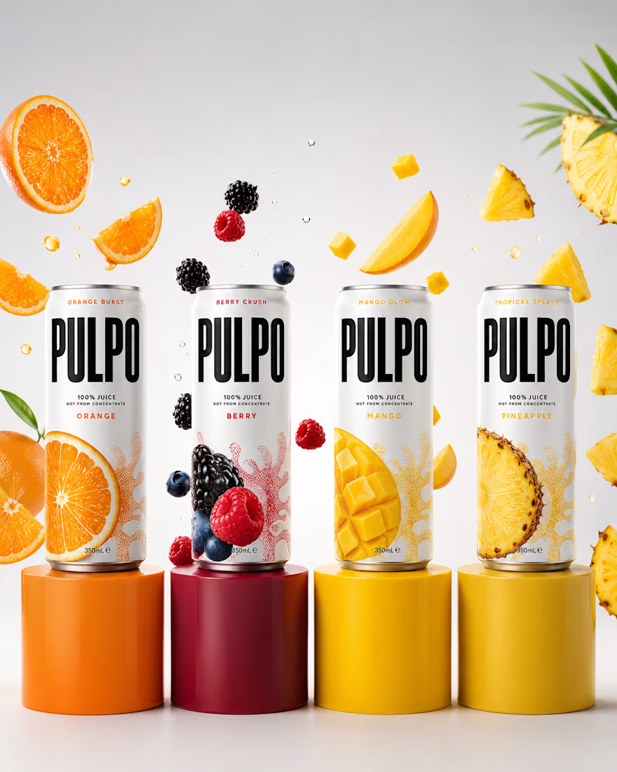
The goal was to create a beverage brand with strong shelf presence through bold typography, a clean visual system, and fruit-forward packaging. The identity focuses on simplicity, clarity, and emotional connection, with the tagline "Real Fruit. Real Pulp."
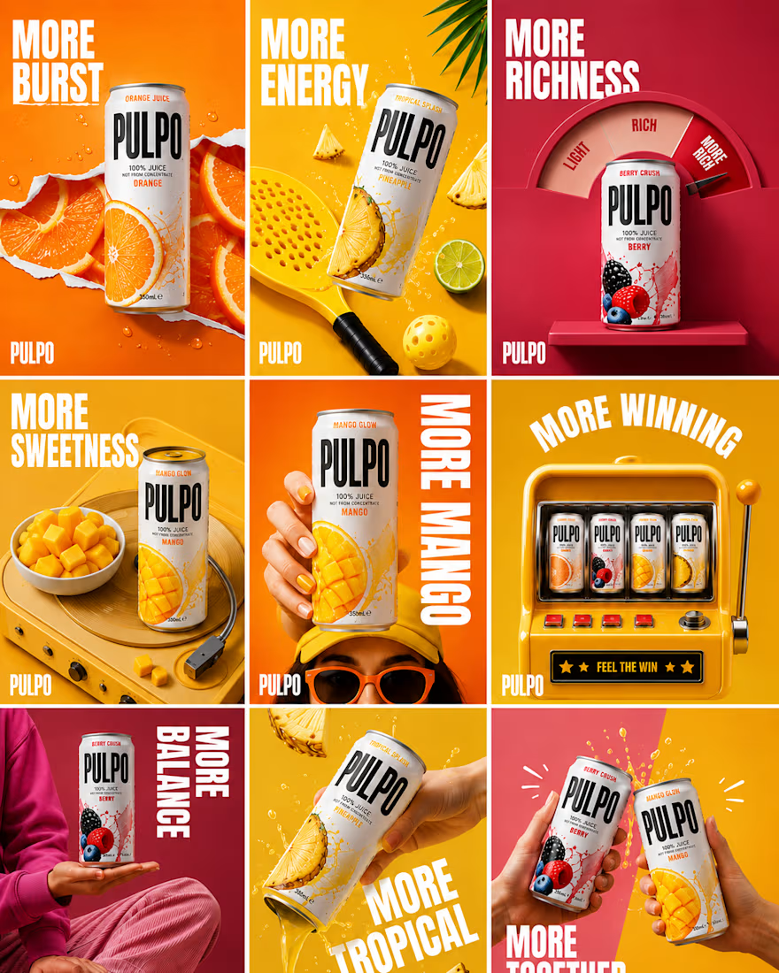
The system extends across packaging, flavor variants, social media applications, and lifestyle visuals, creating a cohesive, scalable brand experience that feels refreshing, approachable, and premium on both physical and digital touchpoints.
Scope: Brand Strategy · Naming & Positioning · Visual Identity · Packaging Design · Social Media Design · Lifestyle Mockups
Independent Concept Project


The network for creativity
Join 1.25M professional creatives like you
Connect with clients, get discovered, and run your business 100% commission-free
Creatives on Contra have earned over $150M and we are just getting started





Related posts

Done with the branding work for Yuzu! 🙌
This was so much more fun than I ever expected, I'm definitely going to be doing more beverage brands in the future.🙌


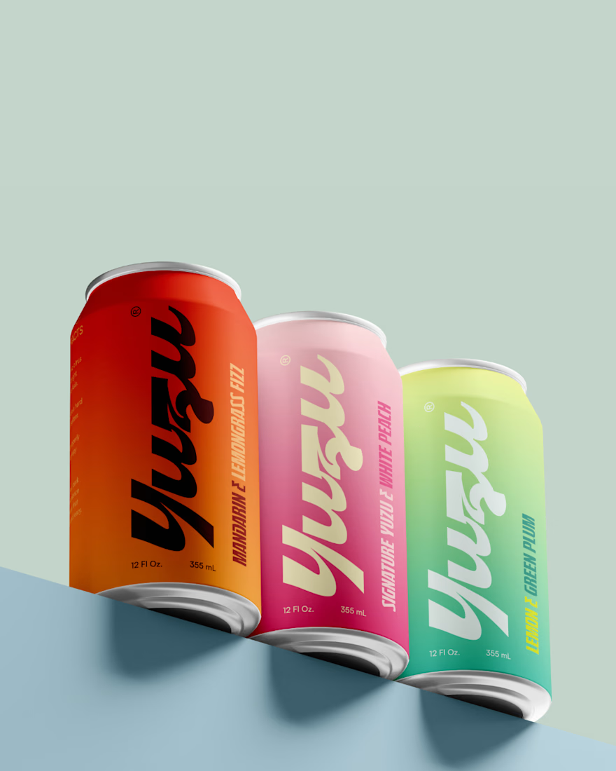
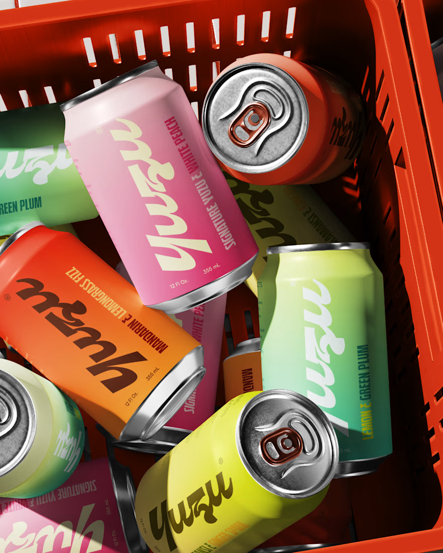
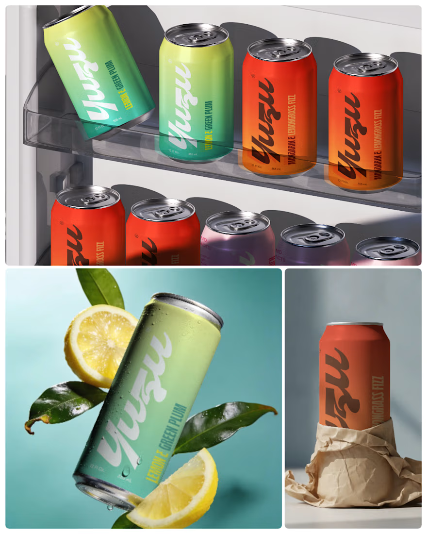

Amazing work! Love your design style, very creative and clean 👌

Long Shot, brand identity case study drops soon.
Dice, cash, and a bar light that never quite turns off.
We built a spirits brand out of the moment right before you find out if you won.
Case study coming this week. 🎲

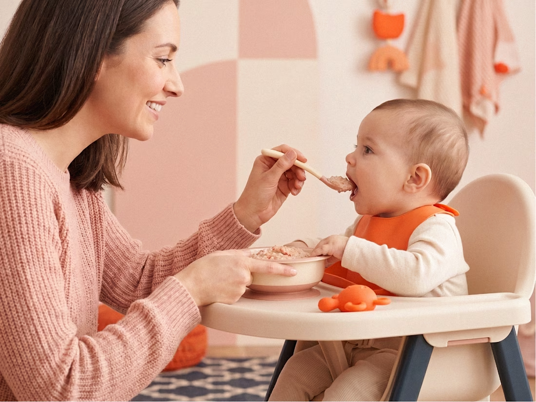
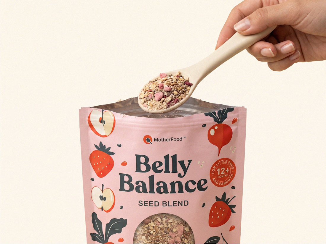
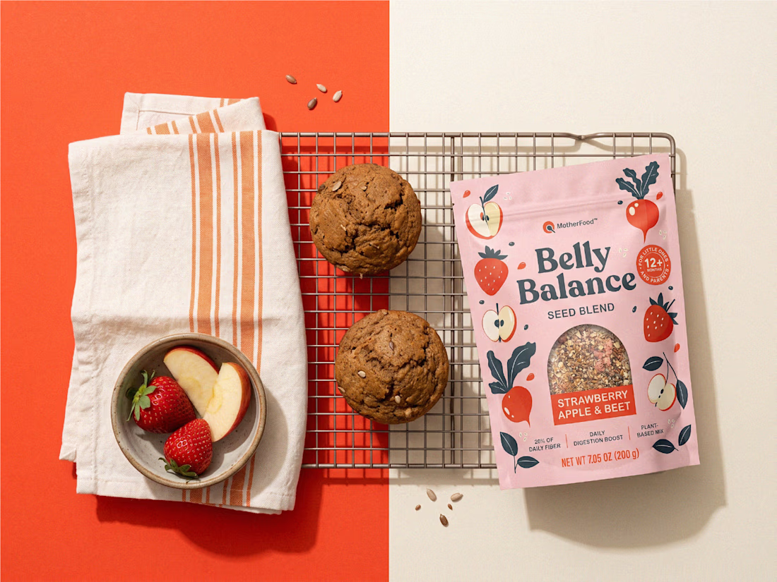
Digestive health for little ones doesn’t need to look clinical to feel credible.
For Belly Balance, I took the brand in a more joyful, approachable direction — using soft colors, playful illustrations, and a clean packaging system to make the product feel friendly without losing clarity.
The goal was simple: turn a functional product for babies and toddlers into something parents would feel good choosing every day.


premium work