The network for creativity
Join 1.25M professional creatives like you
Connect with clients, get discovered, and run your business 100% commission-free
Creatives on Contra have earned over $150M and we are just getting started
Back to feedPost
Taste Test

In 2026, great design is about more than looking good. The real challenge is creating something that stands out in a world where AI can generate polished layouts in seconds.
Strong UX and structure are the foundation, but the details make the difference: bold typography, unique compositions, subtle accents, and thoughtful visual rhythm.
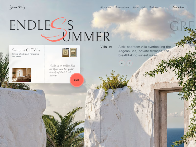
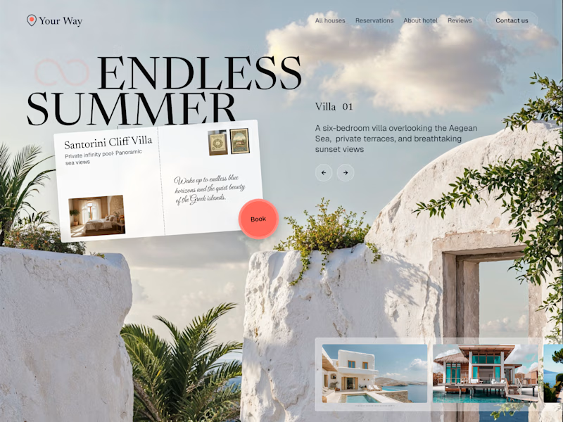
For these two hero sections, we explored two different directions. Version 1 is clean and typography-driven, while Version 2 adds supporting cards and decorative elements for more depth and personality.
Which one do you prefer: 1 or 2?


41 votes
Ends in 1d

Loved both. Voted for v1 only because of the unobstructed view of the ocean through the door frame!

2 is soo cool

Both are very amazing Serge

Arguably the best Kajabi design concept I've seen.
A every tough call to make

2 for sure!

Nice design !

Great insights, Serge! Both versions have such unique character. I love the bold typography in version 1! 🚀✨

Id vote for version 2 because it resonates best with me, but... Version one is amazing 🔥. I love the way the "s" merged into the second letter "s". Absolutely wonderful 🔥

Version 2

2 feels clearer & cleaner!

Version 1 for me, that clean typography-driven look feels more premium for a villa rental brand. Did the supporting cards in v2 actually help conversion in testing, or was it more of a gut call?

Both look good but would definitely combine elements from both. Like implementing the carousel from the 2nd into the 1st and centering it would look good.

Version 2, amazing work
The network for creativity
Join 1.25M professional creatives like you
Connect with clients, get discovered, and run your business 100% commission-free
Creatives on Contra have earned over $150M and we are just getting started
Related posts

How do you capture the essence of a brand and communicate it visually?
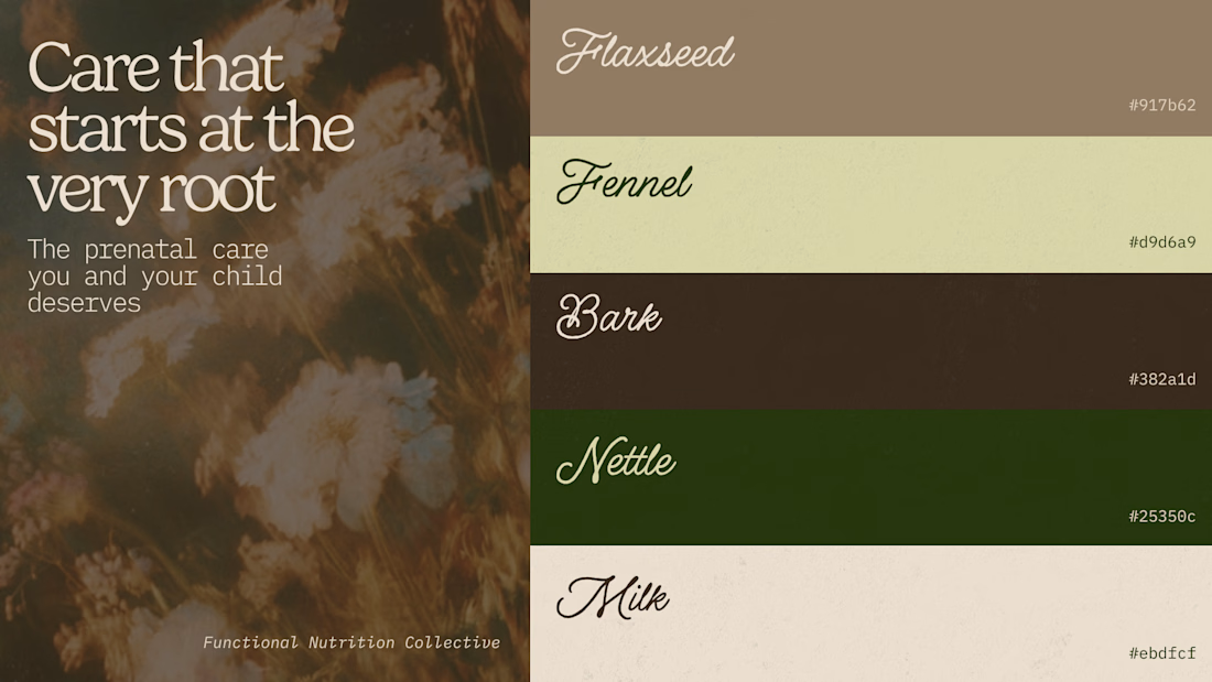
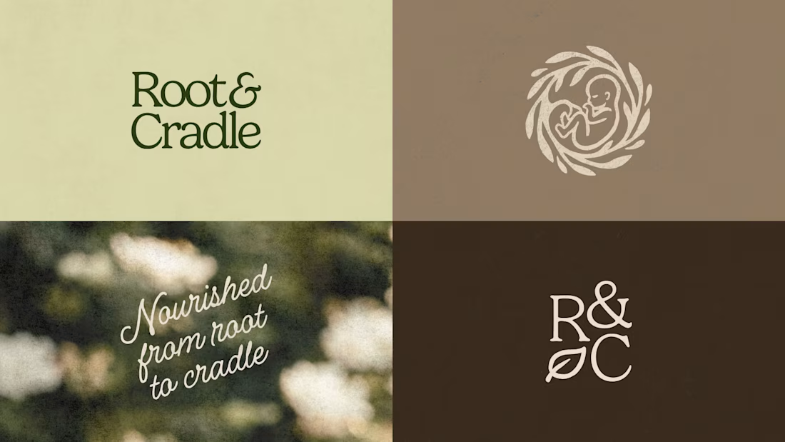
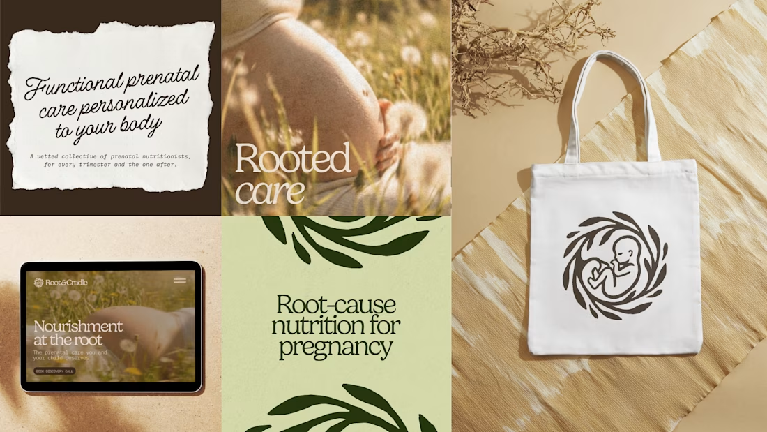
Prenatal care nutrition tends to either fall into an overly clinical or overly childish direction, and both felt unaligned to Root & Cradle, which is a functional nutrition collective for pregnant women.
Their approach is root-cause focused and more holistic than typical prenatal nutritionists. To make them stand out we hone into this strength and express it through their visual identity, through earthy tones, cozy textures and approachable typography.
For this project I used Illustrator to create the logo, pair the colors and fonts, and Flora to create the logomark and imagery that would bring life to the brand.
How do you make sure your brands feel unique while staying true to the industry they're in?

Very kind! 💛


loved it

Question for the Contra community, if I were to start learning one of these two, which one would you pick and why?
My background is in brand design, specially for apparel, lifestyle, outdoor companies. I don't really have any background in web development or programming in general.
Thanks in advance!

27 voted
77%
8 voted
23%
35 votes
Closed

i did not use webflow but framer is the best with disgn






Trending

Claude
Claude has entered the design space. How are you using Claude Design?

Contra University
Learn from expert creatives how to earn more using next-gen AI tools.
fifaworldcup2026
The World Cup is here and the whole world's watching. How are you designing for the world stage?
creativeaiflow
Creative AI workflows are evolving. What tools do you use, and what are their strengths and weaknesses?
freelancerlife
Freelancer life is wins, pivots, and everything in between. What’s yours right now?