The network for creativity
Join 1.25M professional creatives like you
Connect with clients, get discovered, and run your business 100% commission-free
Creatives on Contra have earned over $150M and we are just getting started
Back to feedPost

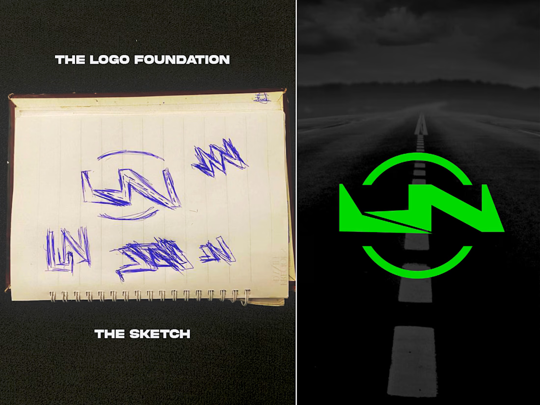
Every brand I build starts as a messy page of sketches.
On the left is where the Luxenuel Autos logo began: a lot of scribbled LN shapes and arcs I kept redrawing. On the right is the finished mark, with the road running through the center. The sketch is where I figure out what the brand should feel like, and the screen is where I polish it.
That's how I work with every client. I take the time to understand your business first, so the logo looks right and actually means something.
I'm Kachi, creative director at Kachiart Designs. I design logos and full brand identities for business owners, startups, churches, and CEOs.
Now I'm curious: looking at the sketch and the final logo, what's the first thing you notice, the letters, the road, or the circle?
And if you're starting a business or your brand needs a fresh look, send me a message here on Contra and tell me about it.
Other questions you can swap in:
Do you think a logo should be simple or detailed?
Sketch first or straight to the computer? What's your process?
Which do you like more, the rough sketch or the final logo?

The network for creativity
Join 1.25M professional creatives like you
Connect with clients, get discovered, and run your business 100% commission-free
Creatives on Contra have earned over $150M and we are just getting started

Challenges
View all


Related posts

I just joined Contra and I’m still figuring out how things work around here, so I thought I’d introduce myself instead of quietly lurking.
I’m Mariya, founder, strategist and lead designer behind Mariya Design. I’ve worked internationally since 2015, and today I run a boutique branding studio focused on brand identity systems for premium and luxury-led brands.
Most of my work sits somewhere between identity, packaging and the wider system around them. I’m particularly interested in what happens after the logo: how typography, color, packaging, digital applications and brand rules actually hold together as the business grows.
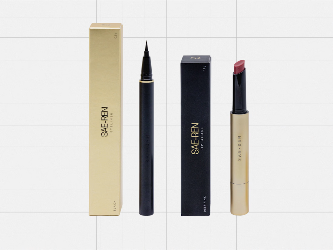
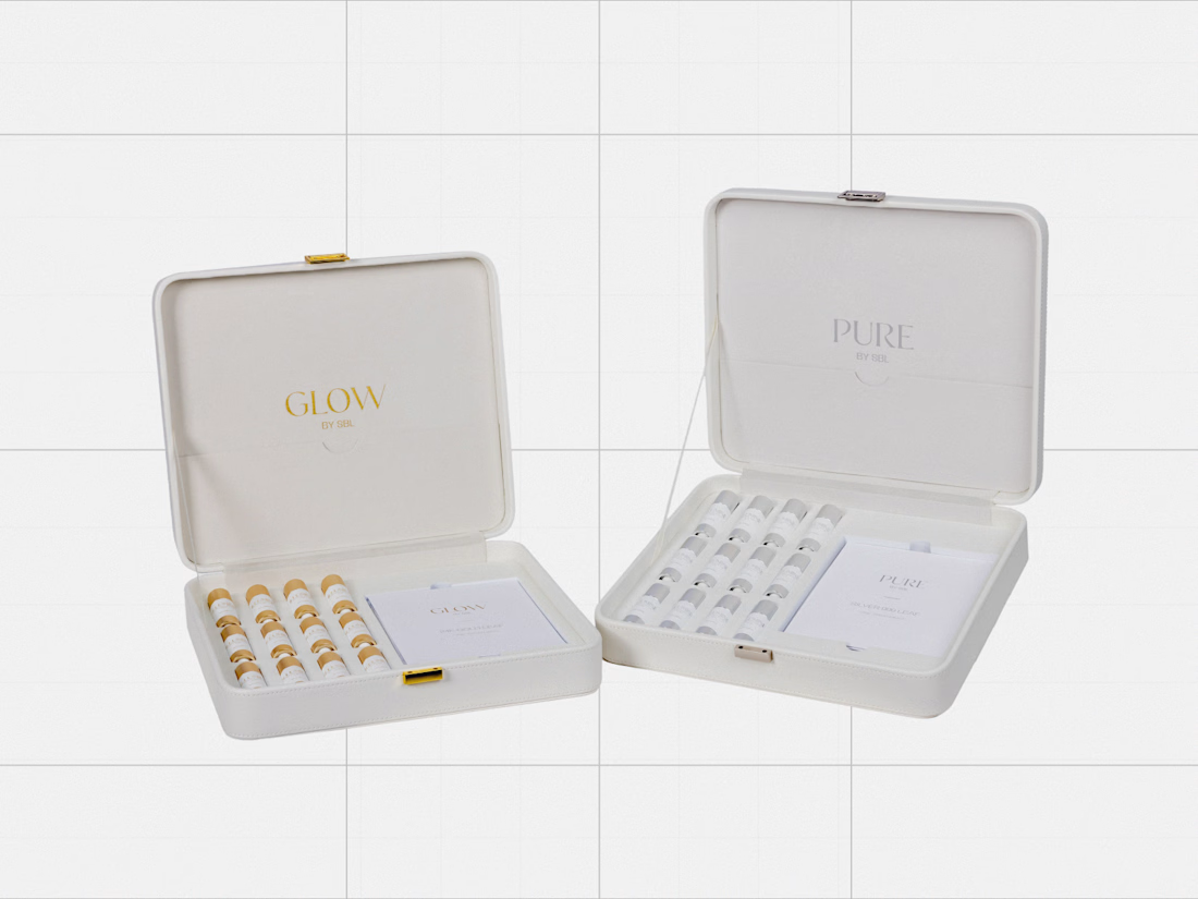
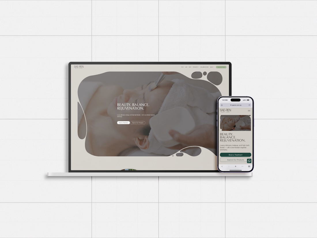
One project I’ve been revisiting recently is SAE-REN, a premium beauty and wellness identity system. I’m currently rebuilding some of my case-study presentation system, so it felt like a good one to share here first.
And since I’m genuinely new to Contra, I’d love to hear from people who have been active here for a while:
What actually helped you become part of the community here?
Was it sharing work regularly, joining conversations, applying to opportunities, or something else entirely?
Any early mistakes worth avoiding are welcome too.



great designs..


A look at the identity I’ve been working on for Sync, a car rental platform in Greece.
You pick the car you want and a local provider brings it to you. Pretty good starting point.
The goal was to give them a brand that could sit comfortably next to the big rental companies and still feel like people you’d actually want to rent from.
I kept their pink and built the layouts around a shape inspired by a car’s side mirror with real cars and Greek scenery inside it.
Big Greek headlines, plenty of space and a system their team can keep easily.

Impressive work, colors are great in use.

Can AI understand your rough sketches?
ChatGPT just added a new sketch feature to its new Images 2.5 model, so I tried it with extremely simple sketches and short prompts to see how well it could understand my intention.
And honestly, I actually like it!
This can be helpful especially when you already have a specific pose or composition in mind and want to quickly turn that rough idea into something more refined.
If you’re curious, I included a quick process video in the comments.
Do you think this new feature could be useful in your workflow?

So cool