The network for creativity
Join 1.25M professional creatives like you
Connect with clients, get discovered, and run your business 100% commission-free
Creatives on Contra have earned over $150M and we are just getting started
Back to feedPost

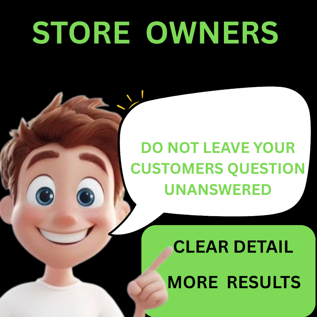
SHOPIFY STORE OWNERS 👀
🚫 DON’T leave customers with unanswered questions.
Your product page should tell them what they need to know before they buy.
Clear details = More confidence.
Check your product page today:
✓ What is it?
✓ What does it do?
✓ How does it fit/work?
✓ How much is shipping?
Would you buy from your own product page?
#shopify #shopifytips #ecommerce #shopifystore #productpage

The network for creativity
Join 1.25M professional creatives like you
Connect with clients, get discovered, and run your business 100% commission-free
Creatives on Contra have earned over $150M and we are just getting started


Related posts

Four luxury black-and-gold skincare packaging and gift box concepts with label design, brand styling, and product mockups.


Nice mockup!

Sharing a website migration and redesign project I completed for Dr. Mark Hoch a few months ago!
His website was migrated from WordPress to Kajabi, with a fresh, streamlined design focused on improving user experience, simplifying content management, and supporting future business growth.
From website migration to Kajabi setup and integrations, every detail was designed with functionality and growth in mind.
Curious to see the finished project? Check it out
#KajabiExpert #WebsiteMigration #KajabiWebsiteDesign #WebDesign


Moving the site and its integrations together makes the handoff worth testing as one journey. I’d include the old WordPress URLs in that check: follow a saved link through to the right Kajabi page, then test its form and confirmation email. Existing visitors can arrive through very different routes from the new homepage.

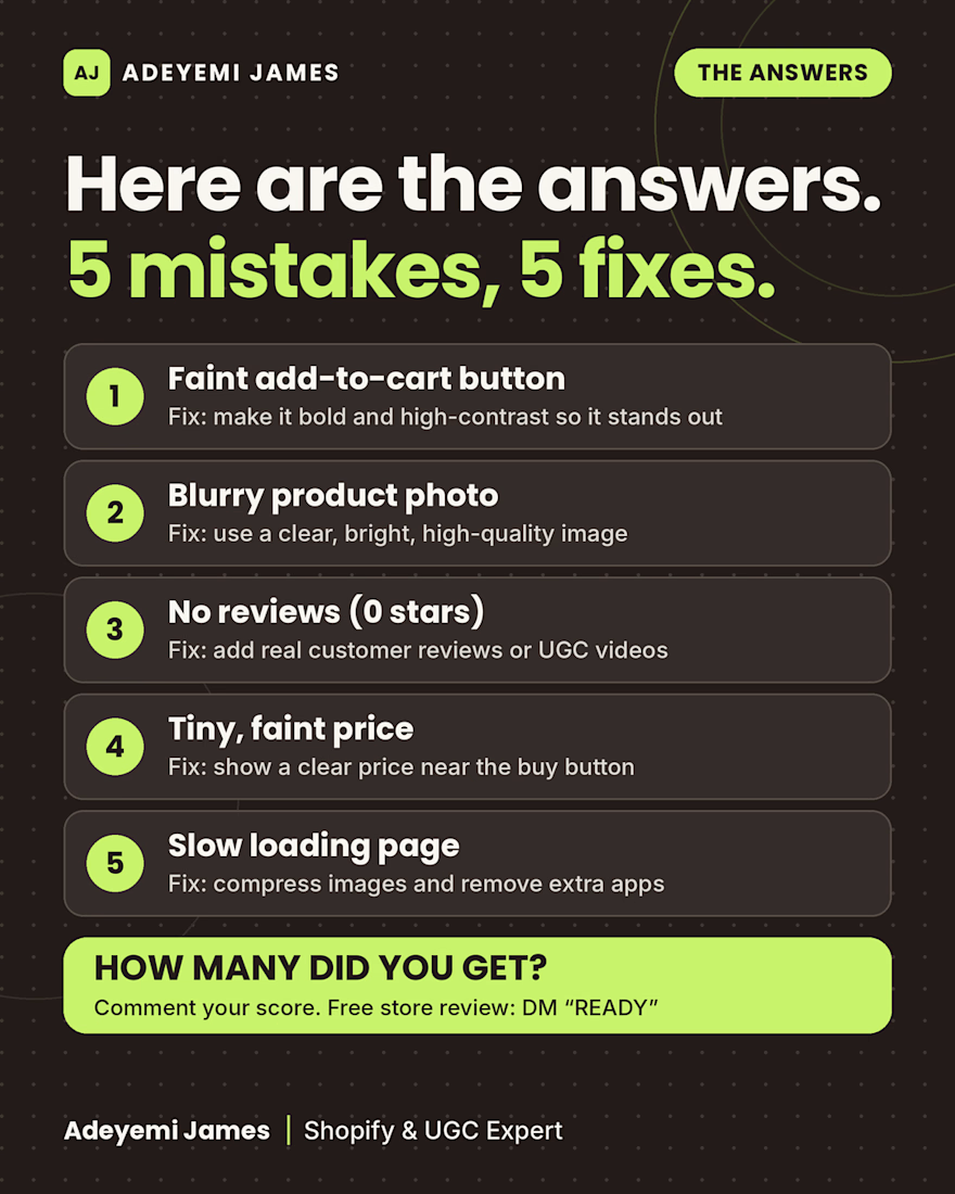
Here are the answers to the “Spot the 5 Mistakes” product page puzzle, and how to fix each one:
A faint add-to-cart button. Make it bold and high-contrast so it stands out.
A blurry product photo. Use a clear, bright, high-quality image.
No reviews. Add real customer reviews or UGC videos to build trust.
A tiny, faint price. Show a clear price near the buy button.
A slow-loading page. Compress images and remove extra apps.
Small details like these are easy to miss when you look at your own store every day, but shoppers decide in seconds whether to trust it.
I’m Adeyemi James, a Shopify and UGC expert. This week I’m offering free store reviews to 5 Shopify stores. Send me a message with your store link and I’ll look it over and send you my notes.
How many did you spot? Comment your score from 0 to 5.