The network for creativity
Join 1.25M professional creatives like you
Connect with clients, get discovered, and run your business 100% commission-free
Creatives on Contra have earned over $150M and we are just getting started
Back to feedPost


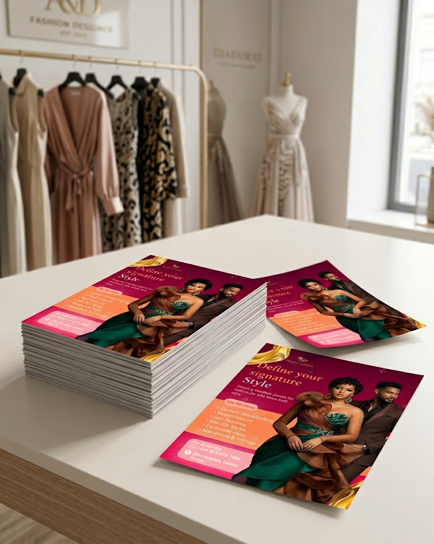
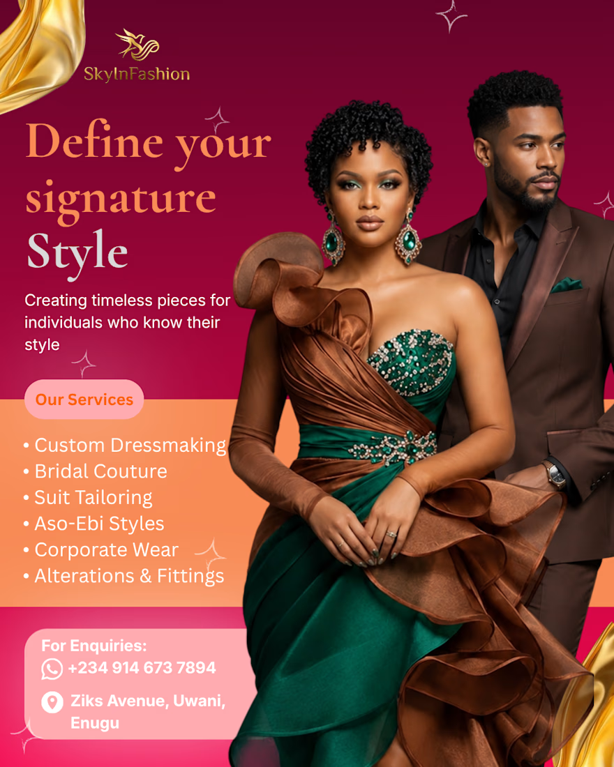
The brief for SkyInFashion was three words: luxurious, intentional, editorial.
That's the kind of brief that sounds simple until you're choosing between eight shades of wine red and none of them feel right.
A few decisions that drove the final result:
The deep wine and gold palette wasn't decoration, those tones carry a subconscious weight. Richness, longevity, ceremony. For a brand selling bridal couture and custom tailoring, that association does half the selling before anyone reads a word.
Serif for the headline, clean sans-serif for the service list. Not because it "looks good" but because the hierarchy needs to shift between feeling and function, the headline pulls emotion, the list answers questions.
The image placement was intentional too. Fashion design lives in texture and fabric movement. If you crop that out or compress it badly, you've already failed the client.
Good fashion brand design doesn't just look expensive. It makes the viewer feel like they already trust the quality, before they've even read the contact details.
What's your process when a client gives you a mood-based brief with no visual references?


For mood-only briefs I ask for three things they'd never want it confused with — the negative space of a brief is usually sharper than its adjectives, since "luxurious" means nothing until you know whether they mean not-Instagram-loud or not-old-money-stuffy. On the wine red: my...
The network for creativity
Join 1.25M professional creatives like you
Connect with clients, get discovered, and run your business 100% commission-free
Creatives on Contra have earned over $150M and we are just getting started
Related posts

New on Contra, not new to design.
I draw logos by hand, then build everything around them: the brand, the website, the store. Lately I also make product films and ads with AI.
Recent work: an RY monogram and site for a Koreatown law firm, a winged W for a defense firm, and my family's golf eyewear brand, from the mascot to Shopify.
Starting a brand, or have one that doesn't feel like you yet? Show me what you're building.

The logo-led system reads tight because the wordmark sits clean in the negative space instead of fighting the emblem — when a brand has that kind of restraint, the Shopify store usually carries the same hierarchy into the product grid and checkout without inventing new rules....

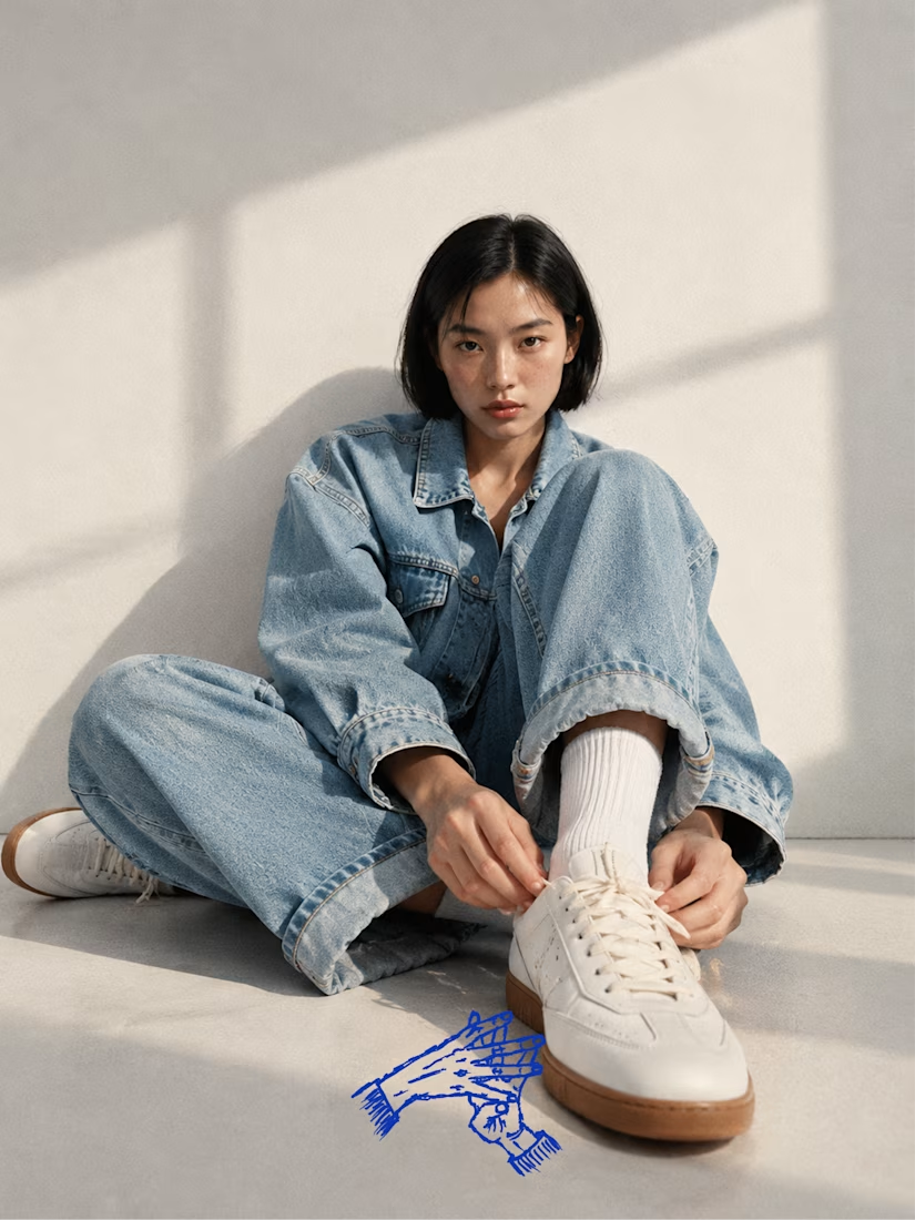
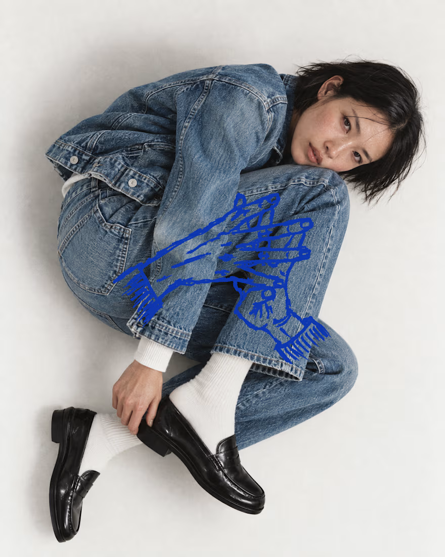
What if indigo is just ink that got patient?
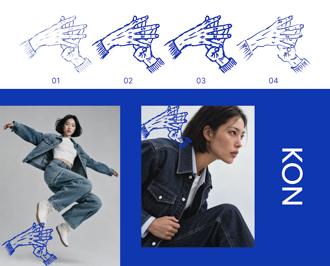
KON is a denim and streetwear label for people who live in hip hop and care how things are made. For Inktober’s final stretch, I took its hand mark through four ink passes, from a fine line to a heavy stroke to a dry brush. Each one sits on the last, the way cloth gets dipped again and again until the color holds.
Swipe to see the passes, then the mark out in the world on denim.
The full KON case study is coming soon.
Which part of your process do you repeat until it hits? Show me yours.

That's really great specially the photography

