The network for creativity
Join 1.25M professional creatives like you
Connect with clients, get discovered, and run your business 100% commission-free
Creatives on Contra have earned over $150M and we are just getting started
Back to feedPost
You don't need to be afraid of shating BTS of your work because that's what real designing is all about.
It's a mess until it's beautiful
I believe the one thing you can be obsessed in your dashboard concepts is to be breaking down information and see what the end result look like?
Whenever I have Saas B2B designs or mainly dashboard designs to work on. I am the happiest.



The annotated dashboard breakdown is especially helpful—the yellow progress block creates an immediate focal point, while the row of colorful challenge icons adds a friendly rhythm without overwhelming the data. That balance between scanability and personality feels right for a student-facing SaaS product.

Yess!!! It was a good starting point, it did transformed a lot afterwards. but Yellow was my favorite part of this dashboard
The network for creativity
Join 1.25M professional creatives like you
Connect with clients, get discovered, and run your business 100% commission-free
Creatives on Contra have earned over $150M and we are just getting started

Challenges
View all


Related posts


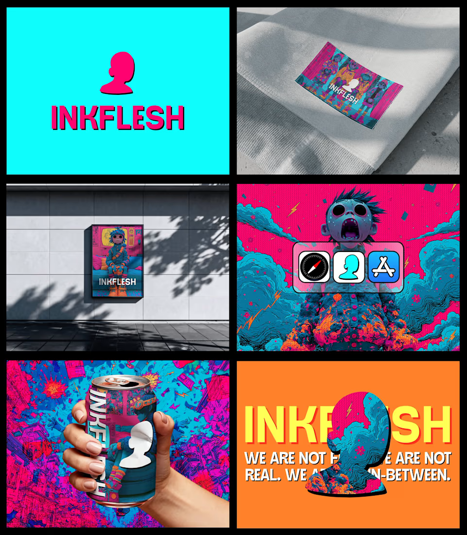
In my INKFLESH identity work, the wordmark runs off the can's curve and gets partly hidden behind artwork on posters. That crop asks the rest of the identity to carry more recognition. The mark has a job when the name is only partly there.

Luxury Lighting E-commerce Website Design for Modern Home Decor
A modern luxury lighting e-commerce website concept crafted to showcase premium statement pieces through a refined, immersive, and editorial-inspired digital experience. The design combines warm ambient lighting, bold typography, cinematic imagery, and clean minimalist layouts to create a sophisticated online presence for a high-end home decor brand. Every element is thoughtfully designed to enhance product storytelling, improve user engagement, and deliver a seamless shopping experience across all devices.


really nice design

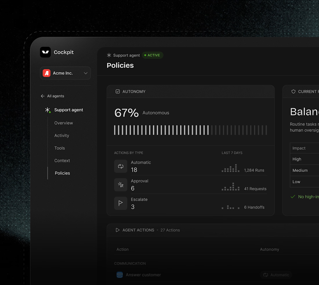

I can easily say this is a black diamond. wonderful execution