The network for creativity
Join 1.25M professional creatives like you
Connect with clients, get discovered, and run your business 100% commission-free
Creatives on Contra have earned over $150M and we are just getting started
Back to feedPost
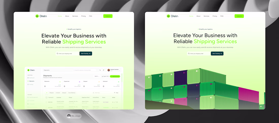
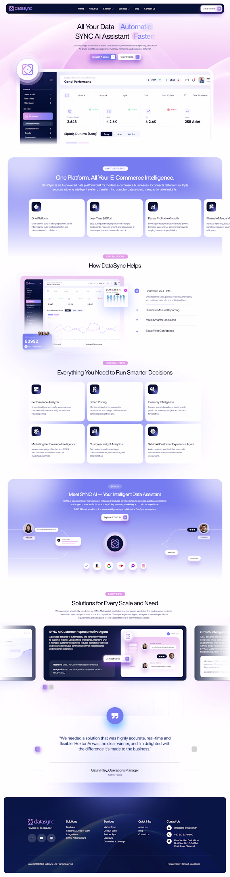
Which hero section works better for Ofelin?
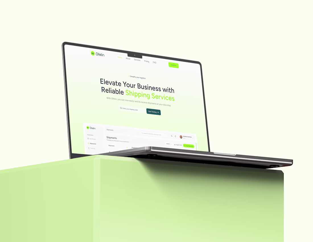
1️⃣ Left: Uses a preview of the shipment admin dashboard, giving users an immediate look at the platform and its capabilities.
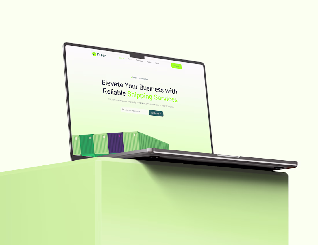
2️⃣ Right: Uses a shipment container illustration, creating a stronger visual connection to the logistics industry.
Which approach would you choose, and why? I'd love to hear your thoughts. 🚢💡
#uiux #designthinking #userresearch #uidesigner #uxdesigner #shipment #shipmentdashboard #shipmentwebsite
This is a solid piece of work 🔥 You can really see the skill and dedication behind it. Keep building and improving excited to see what you create next
Thank you Bolu, i appreciate it man
The right version builds curiosity without excessive data.
Thank you Shiivi
Very well done.
Thank you Abdul
Its super amazing
Thank you so much
Thank you so much
The network for creativity
Join 1.25M professional creatives like you
Connect with clients, get discovered, and run your business 100% commission-free
Creatives on Contra have earned over $150M and we are just getting started
Related posts
🎨 Design Challenge
Which version catches your attention first?
Now I need your opinion 👇
✅ Left
✅ Right
23 voted
23%
78 voted
77%
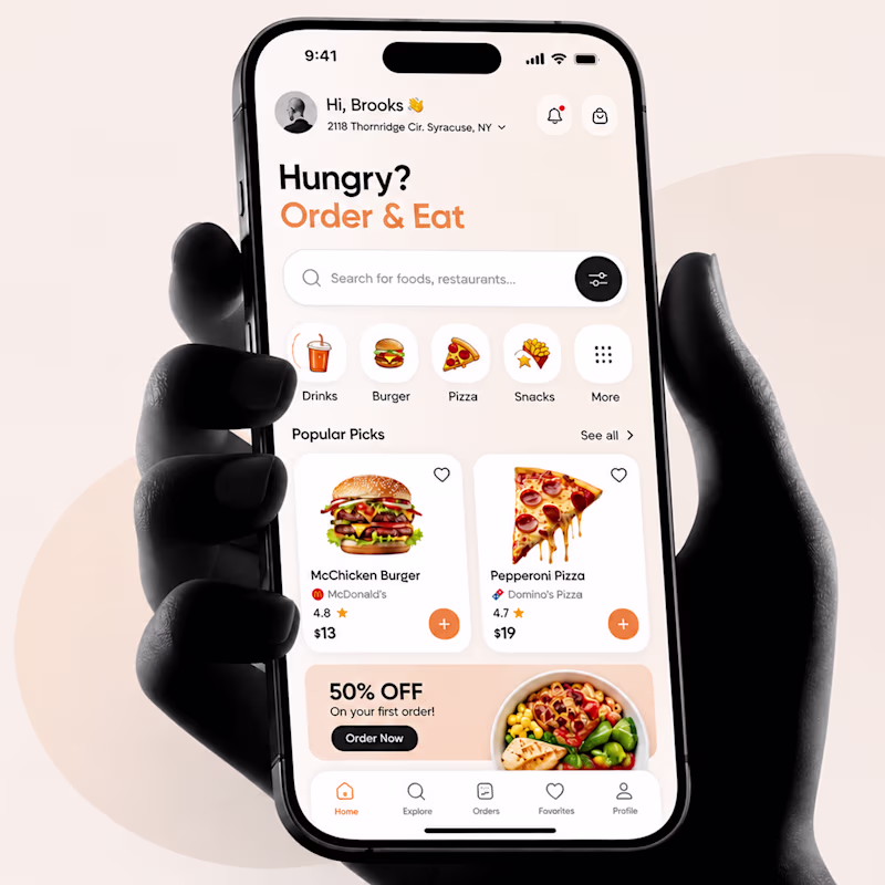
101 votes
Closed
This is a great reminder that design isn't just about functionality—it's also about creating a feeling.
I’m exploring two hero directions for a Ferrari-inspired fashion landing page concept and testing which visual direction feels stronger.
Direction 1 uses the classic Ferrari red as the main brand moment. It feels bold, energetic, and instantly recognizable, with a cleaner fashion editorial layout.
Direction 2 shifts the experience into a darker, more luxury-driven direction. The black background makes the red feel sharper and gives the page a more premium, high-fashion feel.
Both directions have a different impact:
Direction 1: bold, iconic, energetic
Direction 2: luxury, dramatic, fashion-forward
I’m leaning toward Direction 2 because it feels more elevated and editorial, but I’d love to hear which one feels stronger at first glance.
12 voted
48%
13 voted
52%
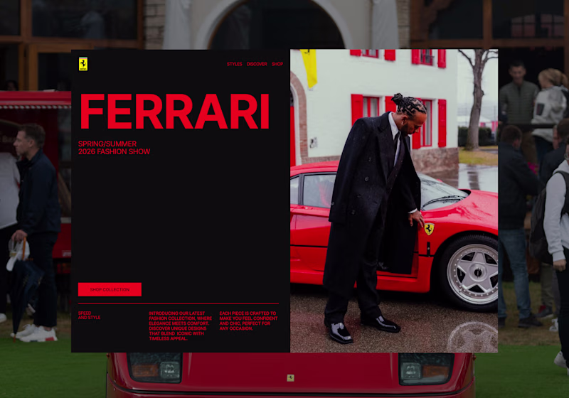
25 votes
Closed
its actually a tough choice to make ngl. But i have to go with direction 2 as the colors are much more influenced by the main image
Rich & Detailed all day!
Trending
Claude
Claude has entered the design space. How are you using Claude Design?
Contra University
Learn from expert creatives how to earn more using next-gen AI tools.
MagicPath
The canvas is infinite, and exploration is becoming the workflow. How are you using MagicPath?
creativeaiflow
Creative AI workflows are evolving. What tools do you use, and what are their strengths and weaknesses?
freelancerlife
Freelancer life is wins, pivots, and everything in between. What’s yours right now?