The network for creativity
Join 1.25M professional creatives like you
Connect with clients, get discovered, and run your business 100% commission-free
Creatives on Contra have earned over $150M and we are just getting started
Back to feedPost
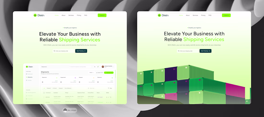
Which hero section works better for Ofelin?
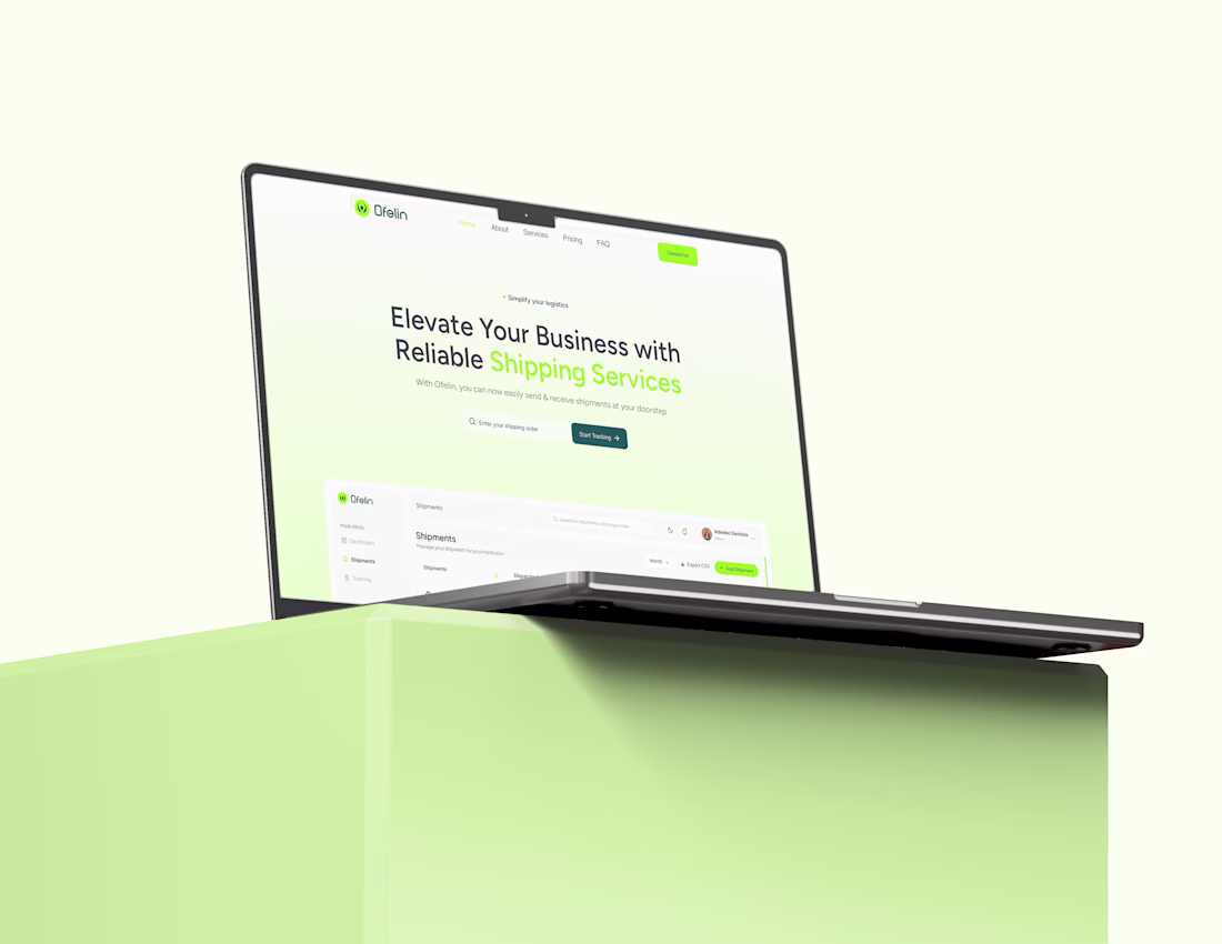
1️⃣ Left: Uses a preview of the shipment admin dashboard, giving users an immediate look at the platform and its capabilities.
2️⃣ Right: Uses a shipment container illustration, creating a stronger visual connection to the logistics industry.
Which approach would you choose, and why? I'd love to hear your thoughts. 🚢💡
#uiux #designthinking #userresearch #uidesigner #uxdesigner #shipment #shipmentdashboard #shipmentwebsite
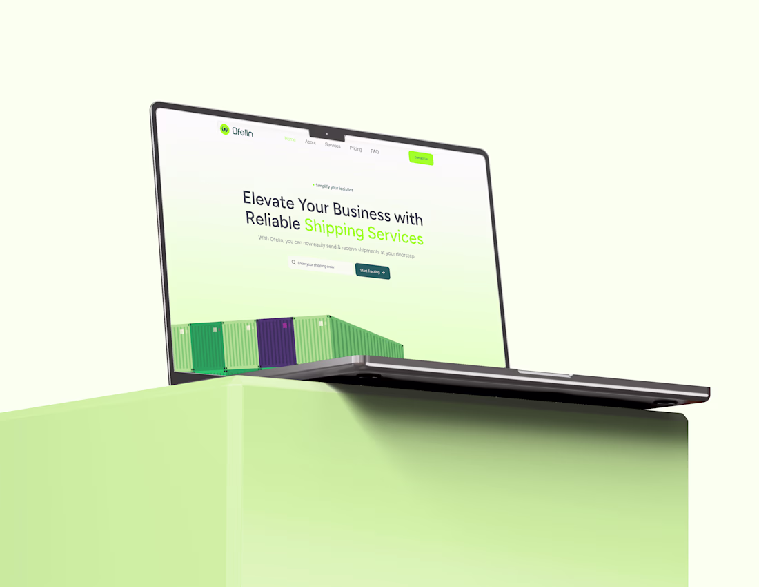
The right version builds curiosity without excessive data.
The network for creativity
Join 1.25M professional creatives like you
Connect with clients, get discovered, and run your business 100% commission-free
Creatives on Contra have earned over $150M and we are just getting started
Related posts
Pip is a zero-friction health companion built to turn tracking your health (SYMPTOMS, DIET AND MORE) into clinical clarity. It abandons rigid 0–10 numeric scales and replaces them with a compassionate, glanceable interface.
❤ Why It Was Built
Pip was born out of pure personal necessity. I built it because it was something I desperately needed, and something a few close friends and someone incredibly close to my heart needed too. I wanted to strip away the clinical coldness of modern software and create something beautifully simple that could be truly, deeply helpful on someone's hardest days
⚠️ The Problem
Traditional health apps suffer from "Data Collection Theater." They force users suffering from chronic illness or fatigue to rate dozens of variables daily, causing severe decision fatigue.
Worse, they act as data sinks, dumping raw, chaotic charts onto doctors. In a high-stakes, 15-minute medical consultation, physicians don't have the time to audit raw logs. They need high-yield, synthesized clinical signals, not noise. Pip bridges this gap by assuming "bad days are the default," capturing symptoms effortlessly, and compiling them into a clean, one-page summary sheet.
🛠 The Figma Workflow Pipeline
To bring Pip to life, I leveraged the Figma ecosystem:
Figma Weave: Used to iterate and generate the visual asset layers for Pip’s mascot.
Figma Agent: Brainstormed layouts directly on the canvas, instantly pairing elegant fonts and organizing simple, stress-free forms.
Figma Make: Instantly turned those canvas designs and components into a live, fully working, and responsive web application while allowing rapid iteration.
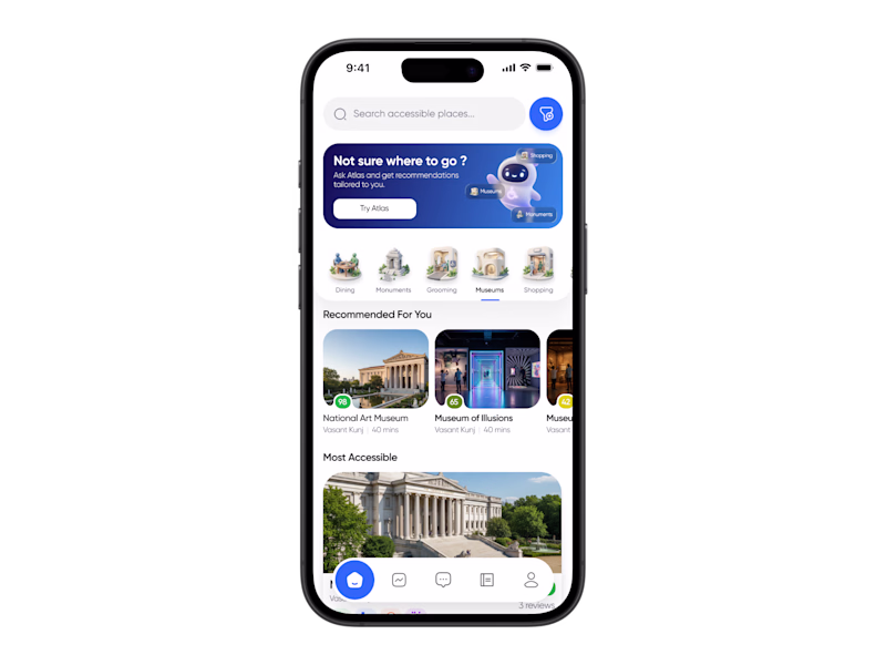
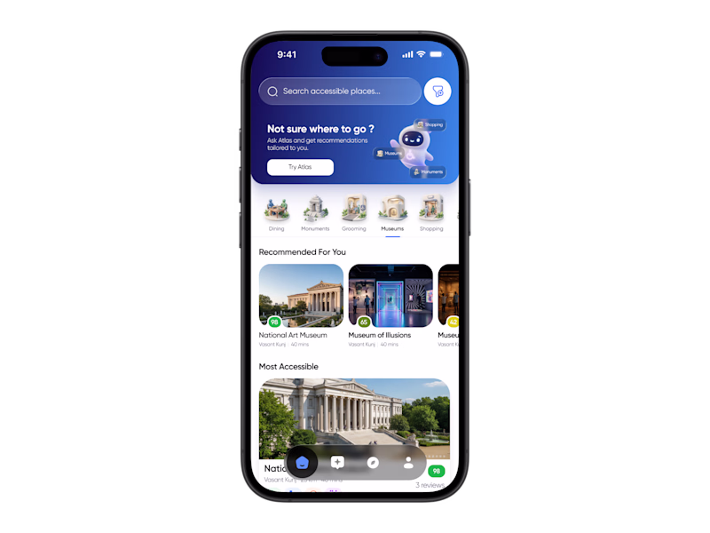
Working on the home screen for a project and exploring a few different directions 👀
The goal is to make discovery feel more personal and intuitive while keeping accessibility at the center of the experience. Right now I’m testing different layouts for recommendations, AI interactions, and overall information hierarchy.
Would love some fresh feedback ✨
Which variation do you like the most and why?
Your feedback could genuinely shape the final direction.
9 voted
60%
6 voted
40%
15 votes
Closed
I like 1st one
Bloom Lab is a cozy virtual plant-breeding mini game where users can choose a seed, plant it, care for it, help it bloom, and create new hybrid plants by combining traits.
The idea started with a simple thought:
What if a plant-care game could feel calm, expressive, and a little magical?
In the game, each plant reacts through mood changes, care meters, facial expressions, and small interactions. Users can water the plant, give it sunlight, watch it grow, and eventually discover hybrid plants like Glowleaf, Honeybloom, and Dreamberry.
This project was also special for me because it was my first time using Figma Make, along with other AI-assisted tools/models during the process. It was exciting, but also challenging. I had to learn how to work with prompts, fix broken flows, manage component states, refine animations, and make sure the final experience still felt intentional as a design.
Some things I focused on:
Building a soft and cozy visual style
Creating reusable components and plant assets
Designing smooth micro-interactions
Making the care screen feel alive through plant expressions and idle animations
Creating branching outcomes based on seed and hybrid choices
This project taught me a lot about designing with AI tools not just generating screens, but guiding, correcting, and shaping the experience until it felt like my own.
It was a challenging but really fun learning experience, and I’m happy I pushed myself to participate.
Check it out here: https://pad-flyer-18166722.figma.site
Highly captivating novel experience.
Trending
Claude
Claude has entered the design space. How are you using Claude Design?
Contra University
Learn from expert creatives how to earn more using next-gen AI tools.
MagicPath
The canvas is infinite, and exploration is becoming the workflow. How are you using MagicPath?
creativeaiflow
Creative AI workflows are evolving. What tools do you use, and what are their strengths and weaknesses?
freelancerlife
Freelancer life is wins, pivots, and everything in between. What’s yours right now?