The network for creativity
Join 1.25M professional creatives like you
Connect with clients, get discovered, and run your business 100% commission-free
Creatives on Contra have earned over $150M and we are just getting started
Back to feedPost
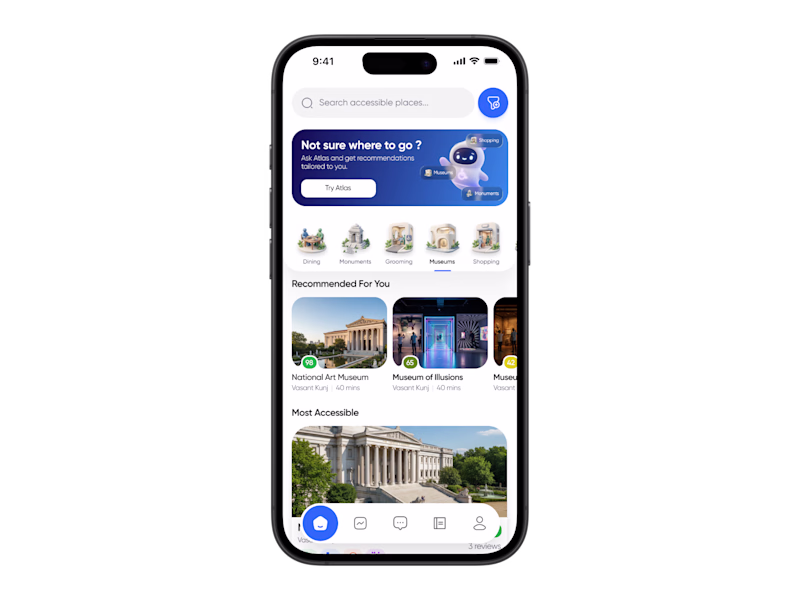
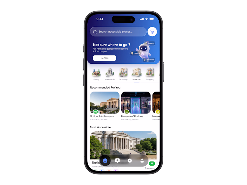
Taste Test
Working on the home screen for a project and exploring a few different directions 👀
The goal is to make discovery feel more personal and intuitive while keeping accessibility at the center of the experience. Right now I’m testing different layouts for recommendations, AI interactions, and overall information hierarchy.
Would love some fresh feedback ✨
Which variation do you like the most and why?
Your feedback could genuinely shape the final direction.
15 votes
Ends in 39m
I like 1st one
Variation 1 for me.
The lighter bottom navigation creates better visual hierarchy and makes the content feel more open and approachable.
Variant 1 feels more appealing
Varient 2 to the wayyyyyyy
ver 1 looks more friendly
Variation 1 looks premium for a seamless experience.
Great attention to spacing and layout — looks very polished ✨
Love Variation 1
The network for creativity
Join 1.25M professional creatives like you
Connect with clients, get discovered, and run your business 100% commission-free
Creatives on Contra have earned over $150M and we are just getting started
Related posts
For my Figma Makeathon submission, I built The Postcard, a web app that transforms ordinary messages into personalized digital postcards.
Users can customize their postcard with fonts, colors, stamps, and photos, then instantly generate a unique link to share with friends and family. The goal was to make digital communication feel more expressive while keeping the experience simple and accessible.
Built using Figma Make, the project explores how customization and thoughtful interaction design can turn a basic message into something worth sharing.
✨ Personalize it. 🔗 Share it. 💌 Deliver it.
Figma site link: thepostcard.figma.site
Try it out and send your first postcard!!
✨ Designing experiences that feel futuristic, bold, and unforgettable.
This concept blends vibrant visuals, sleek UI elements, and immersive interactions to create a modern digital experience that captures attention instantly.
Every detail was crafted to balance aesthetics, usability, and visual storytelling.
🎨 UI/UX Design | Web Design | Creative Direction | Figma
Available for freelance projects and collaborations.
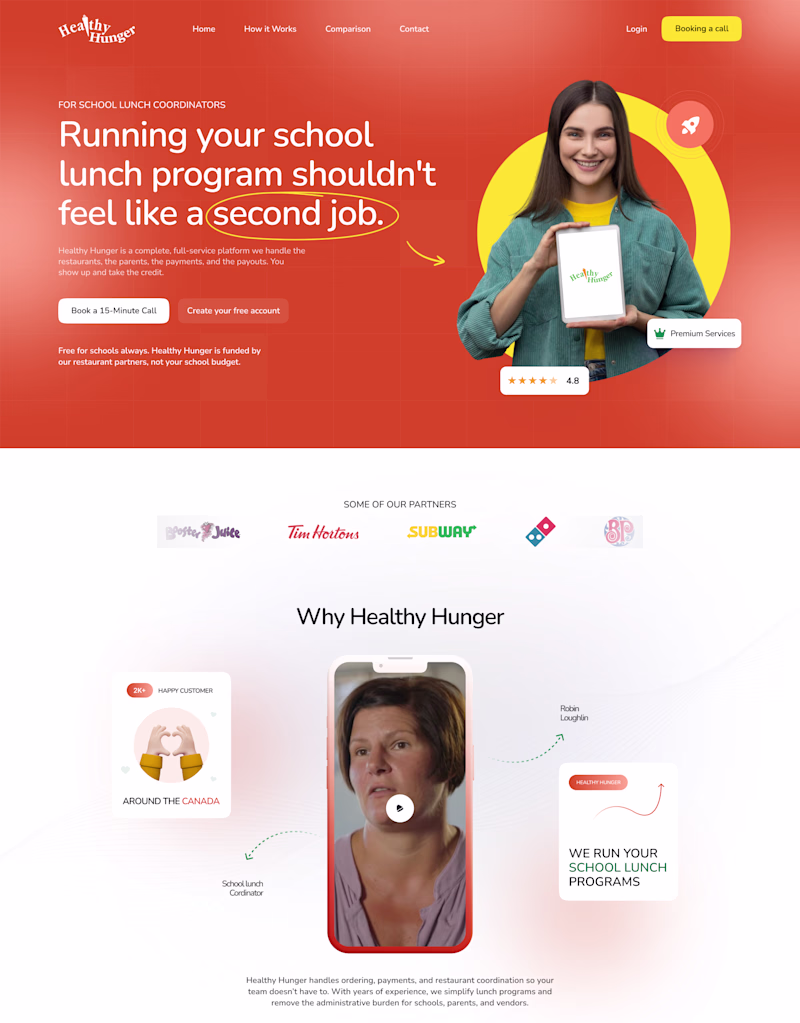
🎨 Design Poll: The Power of Color
It's interesting how a simple color change can completely shift the perception of a brand.
I designed the same hero section in two different color directions:
🟠 Orange Version: Bold, energetic, and attention-grabbing.
🟢 Green Version: Fresh, modern, and growth-oriented.
Everything else remains the same, yet each version tells a slightly different story and creates a different first impression.
If you were launching this brand today, which direction would you choose and why?
89 voted
78%
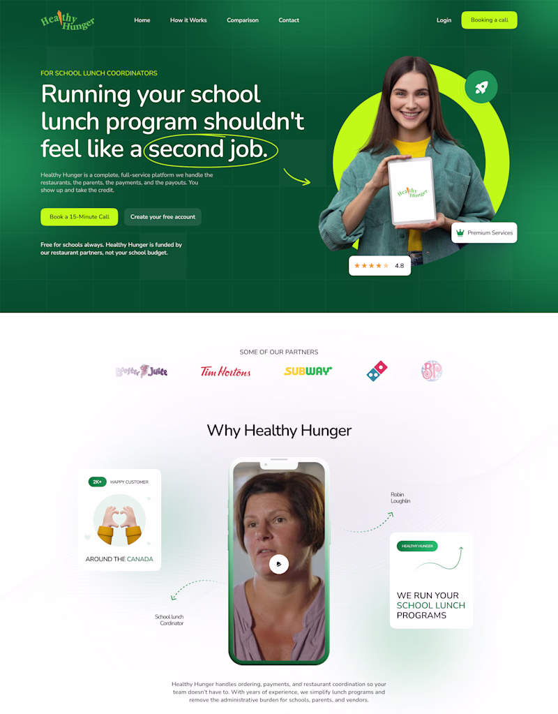
25 voted
22%
114 votes
Closed
Voted Green
Challenges
View allTrending
Claude
Claude has entered the design space. How are you using Claude Design?
Contra University
Learn from expert creatives how to earn more using next-gen AI tools.
MagicPath
The canvas is infinite, and exploration is becoming the workflow. How are you using MagicPath?
creativeaiflow
Creative AI workflows are evolving. What tools do you use, and what are their strengths and weaknesses?
freelancerlife
Freelancer life is wins, pivots, and everything in between. What’s yours right now?