The network for creativity
Join 1.25M professional creatives like you
Connect with clients, get discovered, and run your business 100% commission-free
Creatives on Contra have earned over $150M and we are just getting started
Back to feedPost
Taste Test
Which one would you put on the shelf?
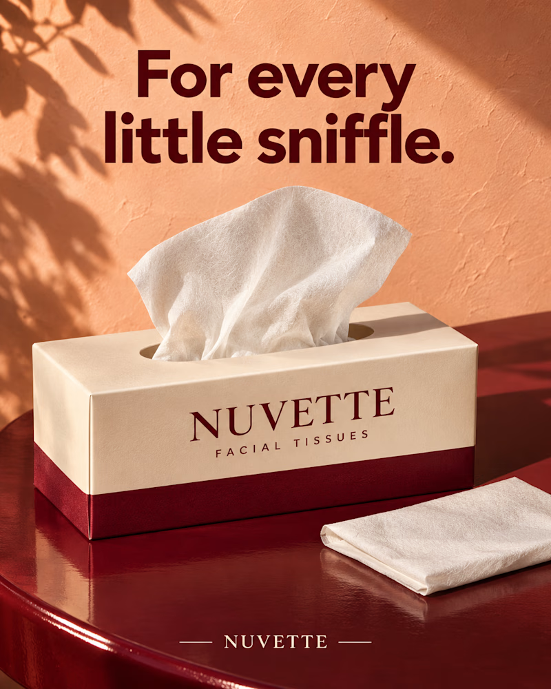
The first is a cream tissue box with a wine band on a glossy wine red side table, a tissue rising from the top and one folded beside it, leaf shadow across a peach plaster wall, heavy maroon sans headline.
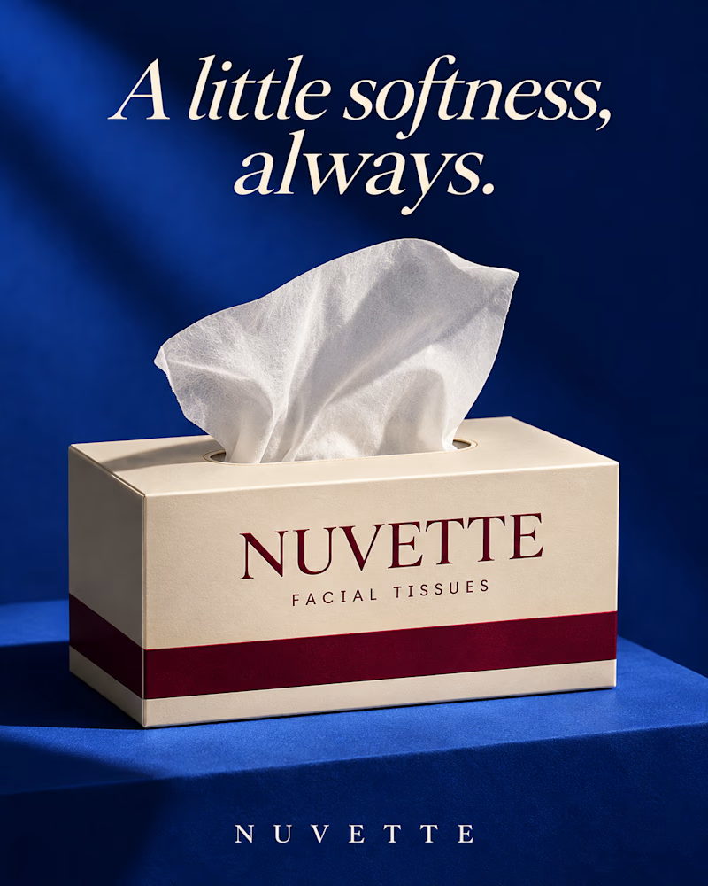
The second is the same box on a cobalt block against cobalt, one tissue lifting from the opening, a single shaft of light across the wall, the headline in cream italic serif.
One sells the comfort. The other sells the object.
👇 #packagingdesign #brandconcept #productphotography
2 voted
100%
0 voted
0%
2 votes
Closed

Little Sniffle for me, the headline has charm 🤧 The cream box with the wine band looks premium.
The network for creativity
Join 1.25M professional creatives like you
Connect with clients, get discovered, and run your business 100% commission-free
Creatives on Contra have earned over $150M and we are just getting started





Related posts


Which one would you put in the fridge door?
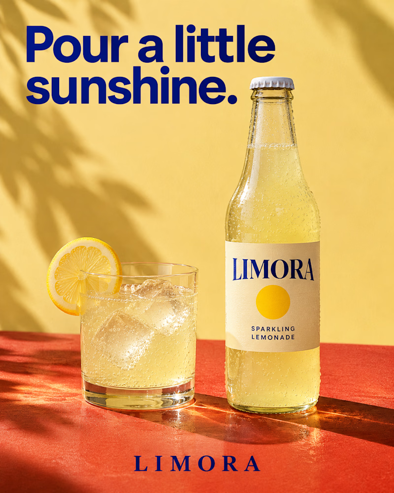
The first is a clear glass bottle with a cream label and a yellow sun mark on a terracotta ledge, a tumbler of lemonade beside it with ice and a lemon wheel on the rim, palm shadow across a butter yellow wall, heavy navy sans headline.
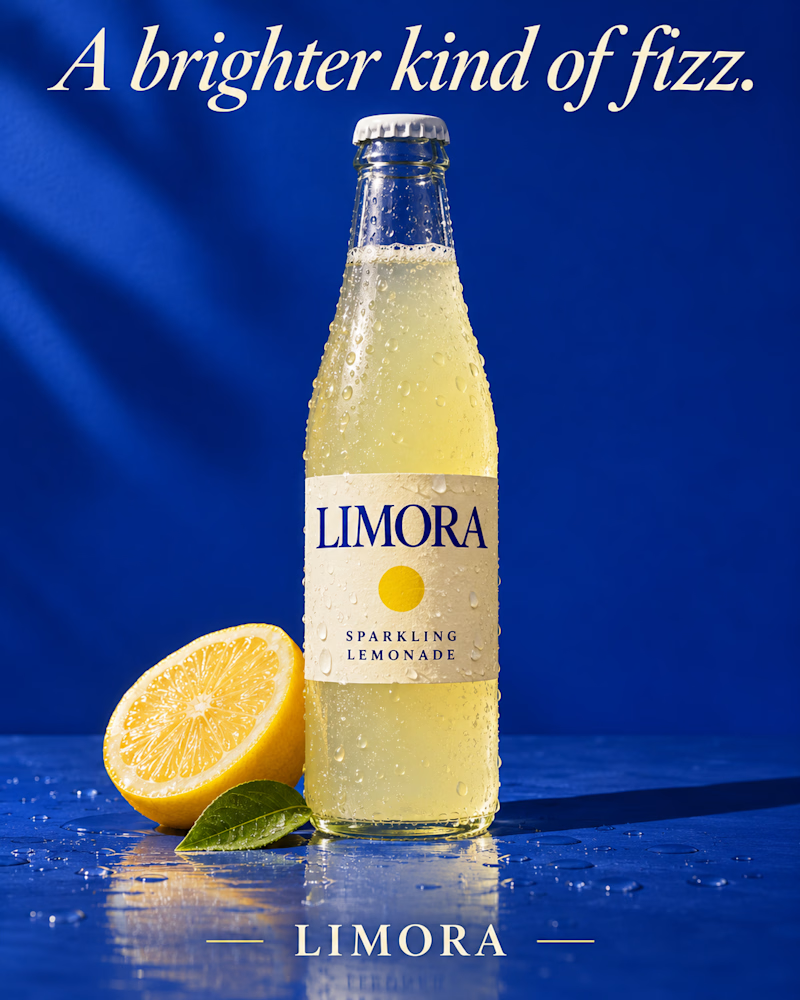
The second is the same bottle beaded with cold on wet cobalt, half a lemon and one green leaf at its base, droplets scattered across the surface, a soft streak of light on the wall, the headline in cream italic serif.
One sells the afternoon. The other sells the chill.
👇 #packagingdesign #brandconcept #beveragedesign
13 voted
68%
6 voted
32%
19 votes
Closed

The one on the left feels so fresh and summery. Actually made me thirsty haha 😁
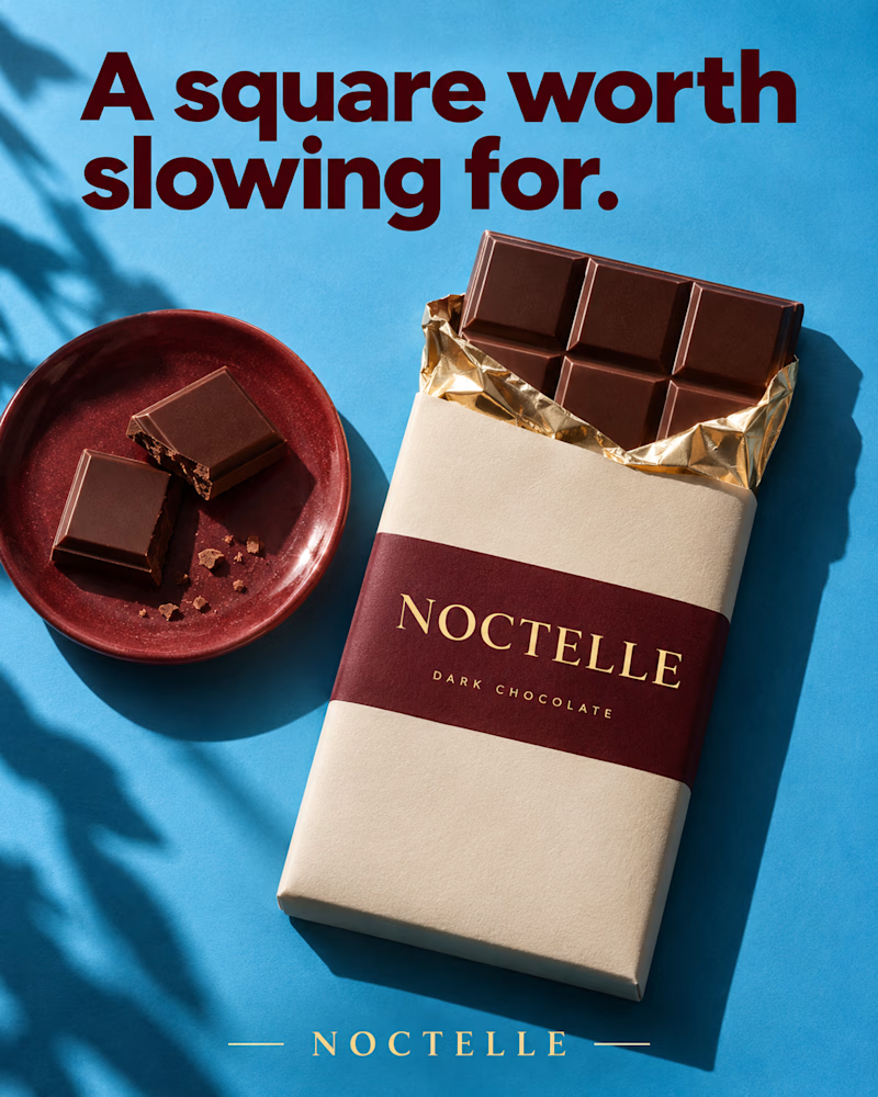
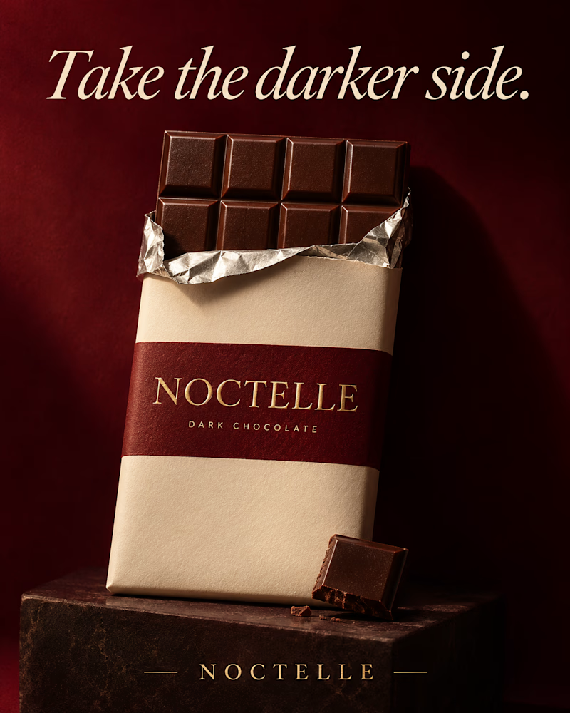
Which one would you put in the gift box?
The first is shot from above on sky blue, a cream wrapper with a wine band and gold type, gold foil peeled back from the bar, two broken squares on a glazed red plate beside it, leaf shadow along the left edge, heavy maroon sans headline.
The second is the same bar standing on a dark stone block against deep wine red, silver foil open at the top, one broken square leaning at its base, low warm light, the headline in cream italic serif.
One sells the afternoon. The other sells the indulgence.
👇 #packagingdesign #brandconcept #foodphotography
2 voted
29%
5 voted
71%
7 votes
Closed

Slow Square 🔥

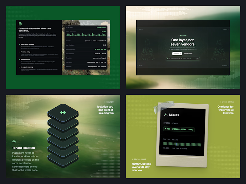
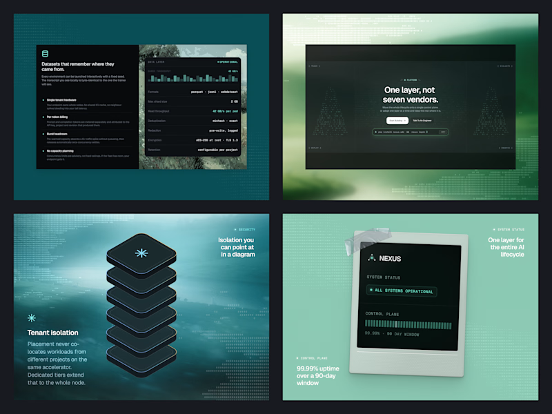
Same Nexus layout, two color moods. 🎨
A: Forest Green 🌿 feels fresh, natural, and calm.
B: Ocean Teal 🌊 feels cool, deep, and techy.
Which one are you picking? Drop A or B below! 👇
#ColorExploration #UIDesign #BrandColor #DesignPoll
0 voted
0%
2 voted
100%
2 votes
Closed

B, Ocean Teal. It sits more calmly against the dark panels, the green gets a bit loud.