The network for creativity
Join 1.25M professional creatives like you
Connect with clients, get discovered, and run your business 100% commission-free
Creatives on Contra have earned over $150M and we are just getting started
Back to feedPost
⚠️Most activation problems aren’t UI problems…
They’re decision problems.
If users don’t activate, it’s rarely because the interface looks bad. It’s because the first steps feel heavy:
- too many choices
- unclear outcome
- no obvious starting point
When users have to think too much, they drop.
Quick example: In a healthcare SaaS product I worked on, 80% of users dropped during onboarding.
I analyzed the funnel, reviewed session recordings, simplified the first step, and clarified the value.
✅Result: +12% activation (A/B tested).
What actually works:
- reduce upfront decisions
- guide users to a single clear entry point
- show value before asking for effort
Make the next step obvious. Not flexible. Not “feature-rich”. Obvious.
Better UI wouldn’t solve this. Better decisions would.
The network for creativity
Join 1.25M professional creatives like you
Connect with clients, get discovered, and run your business 100% commission-free
Creatives on Contra have earned over $150M and we are just getting started
Related posts
If your launch video could swap your logo with 75 other startups and still work, that's the problem.
Mitchell from Shownmedia came on the pod and broke down how they do it differently. Now, if you want to take away three things, here is what you should keep in mind:
Every script gets run through the "mom test." If his mom can't follow it, it's not ready.
Copy gets pulled straight from Reddit and X complaint threads. Not prompted out of AI, lifted from actual people venting about the actual problem.
Every launch runs 20+ different angles, formats, and influencers. Not one big swing, twenty small sharp ones. That's what hits millions of views.
Want the full X Launch Framework Mitchell breaks down? Drop a comment and I'll send it over.
Nice!
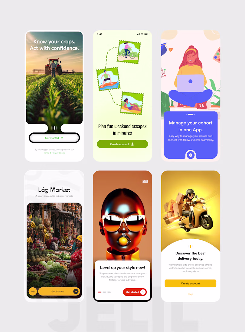
Onboarding UI Design - 6 Products, One Philosophy: Details Drive Conversion.
Your first screen is your first handshake with a user. If it's weak, they leave. If it's sharp, they stay.
These are splash and onboarding screens I designed across six different products, each built around a deliberate visual and UX strategy:
— Smart farming app: full-bleed hero image, bold headline, frictionless single CTA
— Travel & adventure app: stamp-style illustration system that sets a playful, exploratory tone
— Cohort learning platform: trust-first copy hierarchy with a clear value proposition above the fold
— Lág Market (Lagos market guide): culture-led visual identity that resonates before a word is read
— Fashion app: identity-driven imagery designed to make the user see themselves in the product
— Delivery app: high-energy 3D visual with warm, action-oriented copy built for fast decisions
The details I obsess over on every onboarding screen:
— CTA button contrast & placement
— Headline weight & emotional tone
— Micro-copy that reduces friction and builds trust
— Visual language that matches the product's core audience
— Colour and imagery that create the right first feeling
These aren't aesthetic choices. They're conversion decisions.
What I offer:
— Mobile app UI/UX design (iOS & Android)
— Splash screens, onboarding flows & empty states
— Design systems & component libraries
— Web apps, landing pages & Web3 interfaces
Currently available for new projects.
If your product's onboarding isn't converting — let's change that.
Trending
Claude
Claude has entered the design space. How are you using Claude Design?
Contra University
Learn from expert creatives how to earn more using next-gen AI tools.
creativeaiflow
Creative AI workflows are evolving. What tools do you use, and what are their strengths and weaknesses?
portfolioreview
The best portfolios tell a story, not just show a grid. Share yours for feedback.
freelancerlife
Freelancer life is wins, pivots, and everything in between. What’s yours right now?