The network for creativity
Join 1.25M professional creatives like you
Connect with clients, get discovered, and run your business 100% commission-free
Creatives on Contra have earned over $150M and we are just getting started
Back to feedPost

Back in January, I came across Soul & Skin on Instagram and immediately fell in love with the brand. Their visual identity was beautiful, so I visited their website to learn more.
While exploring it, I noticed a few opportunities to improve the hero section particularly around messaging, visual hierarchy, and guiding users toward action.
I reached out to the founder hoping to share some ideas, but I never got a response. Rather than let the idea go, I decided to redesign it as a personal UX exercise
The result is a hero experience that keeps the premium feel of the brand while improving clarity, trust, and user flow.
I just published the case study, and I'd love to hear what you think. Feedback is always welcome.


The network for creativity
Join 1.25M professional creatives like you
Connect with clients, get discovered, and run your business 100% commission-free
Creatives on Contra have earned over $150M and we are just getting started
Related posts

Update on Building in Public • 6-month challenge 🚀
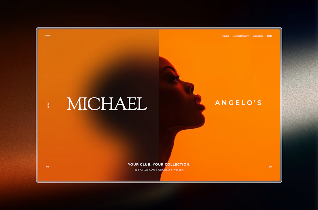
Decided to go with this direction for the hero section of my first Framer template.
Lots of iterations ahead, but I'm excited to see where this goes.
More updates coming soon. 👨💻


This is living rent-free in my head.

✨ Base44 × Contra #GiveItAGlow Challenge
I’m excited to share my submission for the Base44 × Contra #GiveItAGlow Challenge!
For this project, I redesigned the website of a real local Ju-Jutsu school, focusing on creating real value for both future members and the business itself.
Rather than changing the club’s identity, I modernized the overall experience while preserving its original branding and recognizable character.
Before
• Confusing navigation
• Information-heavy pages
• No online booking
• Contact form was difficult to find
• No AI assistance
• Difficult for first-time visitors to know where to start
After
• Modern visual redesign while preserving the original branding and identity
• Cleaner information architecture with a much clearer user journey
• Fully responsive experience across desktop and mobile
• Interactive schedule dashboard with filtering by location and training type
• Online trial booking, allowing visitors to register without calling or sending emails
• Clearly accessible contact form instead of hidden contact information
• Bilingual AI Assistant (German & English) that answers FAQs and helps visitors choose the right training
• Faster, simpler, and more intuitive experience for both visitors and the business
The goal wasn’t simply to redesign the website.
It was to create a solution that helps the club welcome new members more efficiently, reduces manual communication, and makes booking a training session as simple as possible.
🎥 Below are the Before & After walkthrough videos.
Original website:
https://www.ju-jutsu-plus.de/index.php
Redesign:
https://jujutsu-plus.base44.app/



Super😍

Giving a Local Business the Digital Glow Up It Deserves
For the #GiveItAGlow challenge, I chose FACE FOUNDRIÉ, a beauty and skincare business with an existing online presence, and reimagined how customers experience the brand online.
Before
(https://facefoundrie.com/)
Their website shared the right information but left room for a more modern, streamlined customer journey. Visitors had to navigate through multiple pages to find treatments, compare services, and book appointments, with little personalized guidance along the way.
Using Base44, I designed and built a fully responsive website focused on simplicity, elegance, and conversion.
The new experience includes:
✨ A premium, mobile first design
✨ Clear service discovery for facials, brows, lashes, and skincare
✨ A redesigned membership experience
✨ Faster and more intuitive appointment booking
✨ An AI powered Skin Expert that helps customers choose the right treatment based on their skincare goals
Automation
To create real business value, I implemented an AI Superagent that answers frequently asked questions, recommends treatments, guides customers through the booking process, and reduces repetitive customer support. I also added automated appointment confirmations and lead capture to streamline communication and improve the customer experience.
This project demonstrates how thoughtful design and automation can help local businesses save time, improve customer engagement, and create a more memorable digital experience.
Thanks to @Base44 and Contra for creating a challenge that encourages builders to solve real world problems for local businesses.
#GiveItAGlow #Base44 #Contra #WebDesign #UIDesign #Automation #ArtificialIntelligence #SmallBusiness #CustomerExperience #NoCode #AI #UXDesign


nice one








Trending

Claude
Claude has entered the design space. How are you using Claude Design?

Contra University
Learn from expert creatives how to earn more using next-gen AI tools.
fifaworldcup2026
The World Cup is here and the whole world's watching. How are you designing for the world stage?
creativeaiflow
Creative AI workflows are evolving. What tools do you use, and what are their strengths and weaknesses?
freelancerlife
Freelancer life is wins, pivots, and everything in between. What’s yours right now?