The network for creativity
Join 1.25M professional creatives like you
Connect with clients, get discovered, and run your business 100% commission-free
Creatives on Contra have earned over $150M and we are just getting started
Back to feedPost


Built a Zeplin design into WordPress for Nowhere Networks last year and somehow never got around to posting it.
One of those projects where the goal was to keep things clean, fast, and easy to navigate while making the brand feel credible from the first click.
From the structure to the user experience, every page was designed to communicate what they do clearly and help visitors take action.


The network for creativity
Join 1.25M professional creatives like you
Connect with clients, get discovered, and run your business 100% commission-free
Creatives on Contra have earned over $150M and we are just getting started






Related posts


Good work!

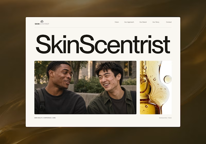
I’m exploring two homepage hero directions for SkinScentrist, a skincare brand focused on helping young men feel more confident in their skin.
Both concepts use the same imagery but take very different approaches to storytelling and visual hierarchy.
Direction 1 feels more emotional, immersive, and lifestyle-driven. The full-screen photography and bold messaging create a stronger connection to confidence and self-care.
Direction 2 feels more minimal, editorial, and brand-focused. The oversized typography, clean layout, and product imagery give it a more refined, contemporary skincare feel.
Direction 1: immersive, personal, emotional
Direction 2: minimal, editorial, premium
Which direction feels stronger for a modern skincare brand?

14 voted
93%

1 voted
7%
15 votes
Closed

Direction one — the full-screen photo feels warmer.

Founders, if you need a website done by someone who has already worked with YC, A16z backed startups...well, I’m here. Send me a message.
I will help you figure out how to present your product and get your message across to the right people.
Great work!