The network for creativity
Join 1.25M professional creatives like you
Connect with clients, get discovered, and run your business 100% commission-free
Creatives on Contra have earned over $150M and we are just getting started
Back to feedPost

Overview
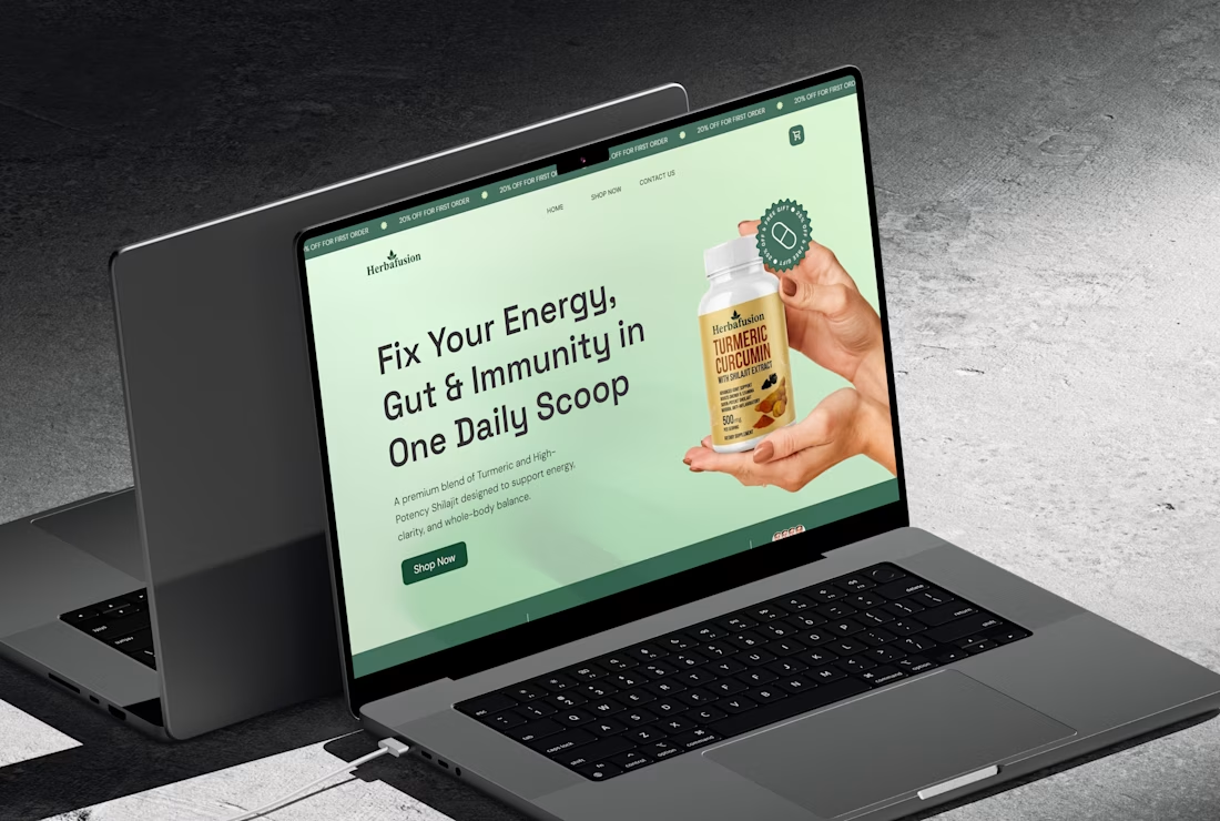
Redesigned the Herbal Nutrition website from a basic product catalog into a conversion-focused experience that clearly communicates value and drives user action.
Problem
The original site lacked:
Clear value proposition
Structured user journey
Strong trust signals
Conversion-focused product pages
Users could browse, but not confidently purchase.
Approach
Shifted messaging from products to health outcomes
Built a clear homepage funnel (problem → solution → CTA)
Simplified navigation into problem-based categories
Redesigned product pages with benefits, proof, and FAQs
Added trust elements and lead capture (quiz + email)
Result
The new structure improves clarity, builds trust, and guides users toward action, turning the website into a scalable sales system rather than just a storefront.


The network for creativity
Join 1.25M professional creatives like you
Connect with clients, get discovered, and run your business 100% commission-free
Creatives on Contra have earned over $150M and we are just getting started









Related posts


🌲 Nordhaus | Prefab Timber Homes Website (Framer)
Homes that grow quietly with the forest, now on the web. 🏡
Nordhaus is a website for a Latvian builder of prefabricated timber homes, created in Figma and built in Framer as a responsive site for desktop, tablet and mobile. It brings the brand's calm Nordic character through full-screen photography, a scroll-driven process story, a horizontal model gallery and interactive testimonials.
✨ Template coming soon to Framer.


Wonderful design man

I created a brand identity concept for Velora, an AI productivity platform. I explored the logo, colors, typography, and how the brand could look across a website, mobile app, and everyday products. I wanted everything to feel consistent, modern, and easy to recognize.


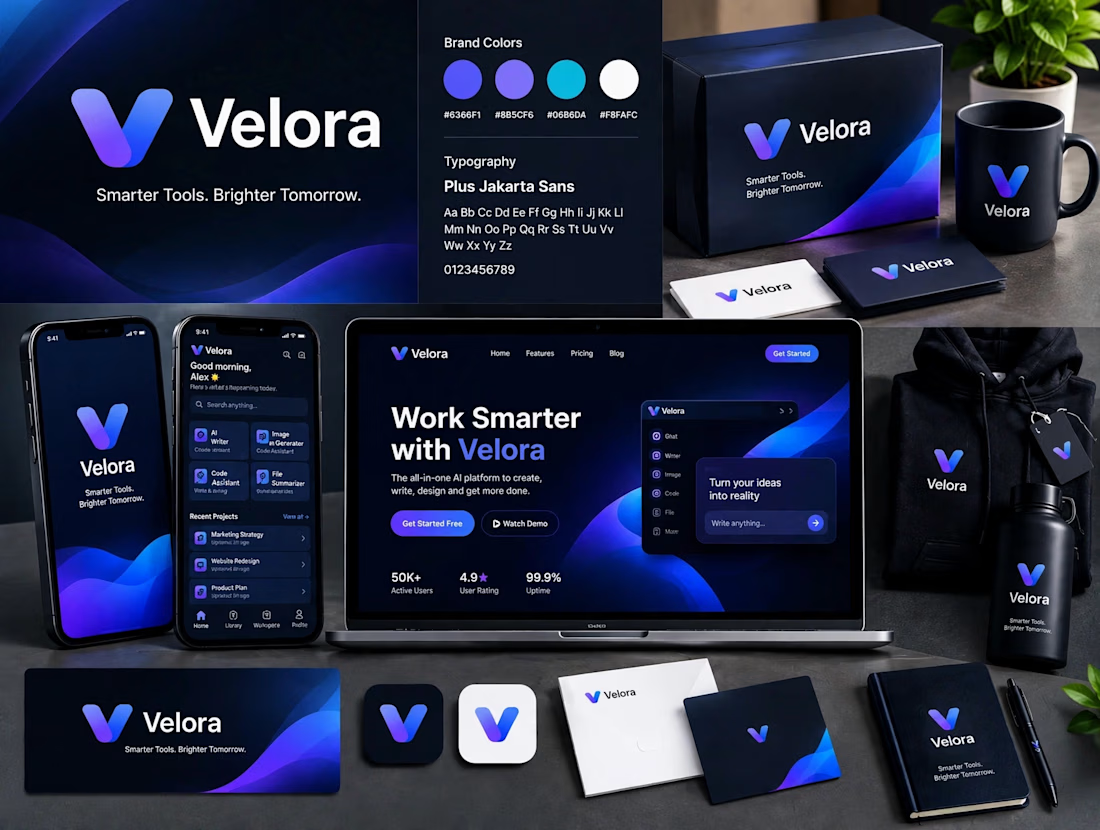

The blue is perfect for this. I’ve seen so many AI brands do boring black/white but this gradient gives it energy. And Plus Jakarta Sans was a great choice, keeps it friendly.

