The network for creativity
Join 1.25M professional creatives like you
Connect with clients, get discovered, and run your business 100% commission-free
Creatives on Contra have earned over $150M and we are just getting started
Back to feedPost
Taste Test
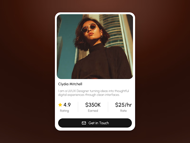
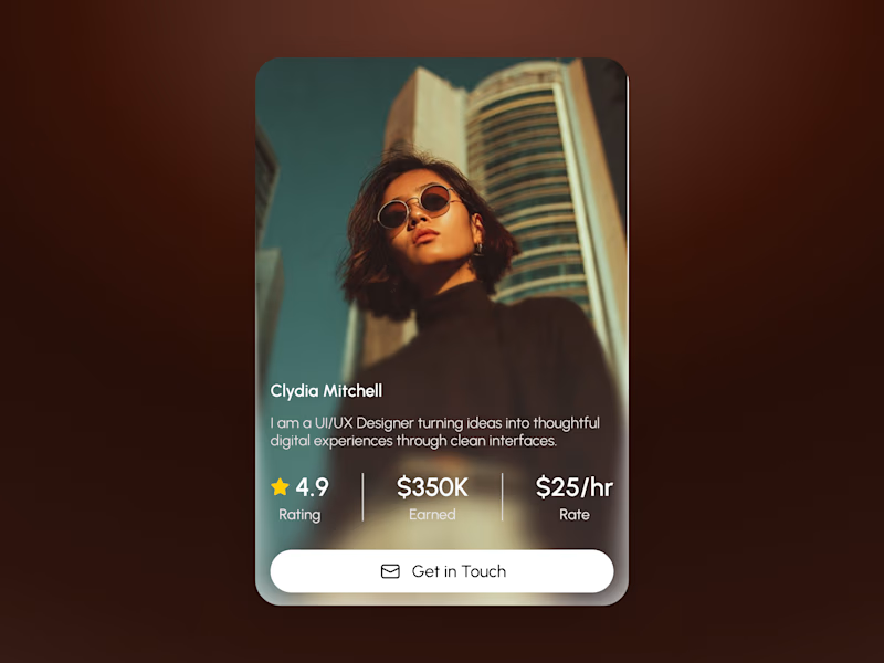
Two takes on the same profile card — which one's better?
Left = classic framed card, photo up top, info below on white.
Right = full-bleed photo with text overlaid on a dark gradient.
Honestly both have their place:
📸 Full-bleed looks way more premium and eye-catching on its own the photo just hits harder.
📋 Framed wins on readability and plays nicer in a grid no fighting with busy photo backgrounds for contrast.
My take: full-bleed for hero sections / standalone spots, framed for anything that needs to repeat consistently (like a team page or listings).
Which one would you pick? 👇

5 voted
50%
5 voted
50%
10 votes
Closed

The framing choice maps nicely to context: full-bleed makes the profile feel editorial, while the framed version gives the details a steadier scan path. I’d use full-bleed for a hero moment and framed for a directory—great comparison.

Exactly that's the split I landed on too. Full-bleed for the "wow" moment, framed when people actually need to scan and compare. Appreciate you putting it that well 🙌


The full-bleed look feels bold. The photo fills the card really well.
Thanks! Yeah, letting the photo breathe edge-to-edge does a lot of the heavy lifting makes it feel more premium without adding any extra design elements.

Classic for me, stays readable in a grid where full-bleed can get noisy.
Totally agree — readability wins once you're looking at a whole grid of these, not just one.

Rather than a Classic , Full-Bleed feels more immersive
Fair point full-bleed does pull you in more, especially for a single standout card. It's really a trade-off: immersive and bold in isolation vs. steadier when it's sitting next to a dozen others.

full bleed is looking good and bold.
Thank you


Fantastic work !
Thanks

Full-bleed wins for me. That dark gradient photo treatment just commands attention in a way the classic card can't. Your breakdown on use cases is spot on though - readability matters when it repeats.
Appreciate that yeah, that gradient treatment does a lot of work for attention-grabbing. Good to see the split holding up: bold and immersive for a single moment, steadier once it has to repeat. Thanks for engaging with it 👍

Exactly right full bleed for marketing punch classic framed for scalable design systems. Classic wins whenever user photos are not curated.
That's a really useful line to add full-bleed only works as well as the photo behind it, and marketing shots are curated while user-uploaded ones rarely are. Classic's white background is basically insurance against bad lighting/crops/whatever gets uploaded. Good distinction.

Classic for a team directory. I’d test both with a longer name and bio too; that’s where the layout really gets tested.
Good call that's exactly where a lot of card designs quietly break. Worth stress-testing both with edge cases before locking anything in.
The network for creativity
Join 1.25M professional creatives like you
Connect with clients, get discovered, and run your business 100% commission-free
Creatives on Contra have earned over $150M and we are just getting started





Related posts

Which hero visual feels right for this brand?
While working on the homepage for Halfspace, a website design and SEO agency, I explored two different hero visuals for the same headline and layout. Same message, same structure, just a different visual metaphor and mood.
Option 1 - Rocket Launch. Bold, literal, and energetic, visually reinforcing the "launch your business" message with motion and fire.
Option 2 - Glass Cube. Abstract, sleek, and premium, giving a more refined, tech-forward feel without relying on a literal metaphor.
Would love your honest UX/UI take, which direction feels more impactful, memorable, and aligned with a web design/SEO brand, and why?
11 voted
41%
16 voted
59%
27 votes
Closed

Both design are great; it's hard to choose one




Option B feels nothing but premium

Two cuts of the same Outlier promo. 24 seconds each, one framed wide, one framed for the phone. 1 or 2. Why?🤔
8 voted
50%
8 voted
50%
16 votes
Closed
Going with 2. Most people will watch it on their phone anyway and the tighter framing feels punchier. 1 looks more cinematic though.