The network for creativity
Join 1.25M professional creatives like you
Connect with clients, get discovered, and run your business 100% commission-free
Creatives on Contra have earned over $150M and we are just getting started
Back to feedPost

About the Project:
A custom social media poster created for YM Audio Musical.
The Challenge: Social media feeds are crowded, so the design needed to stop the scroll immediately.
The Solution: I utilized heavy negative space (the white background) to make the dynamic subject and the bold blue typography pop. The design uses a strong visual hierarchy: the eye goes first to the jumping figure, then to the bold "TGIF" text, and finally down to the contact details and social handles. The inclusion of floating 3D elements (like the audio jack) and musical notes adds depth and keeps the design playful and engaging. It is perfectly optimized for Instagram and Facebook.


The network for creativity
Join 1.25M professional creatives like you
Connect with clients, get discovered, and run your business 100% commission-free
Creatives on Contra have earned over $150M and we are just getting started



Related posts



The attention to detail here is excellent. Keep up the great work.

Amazing!

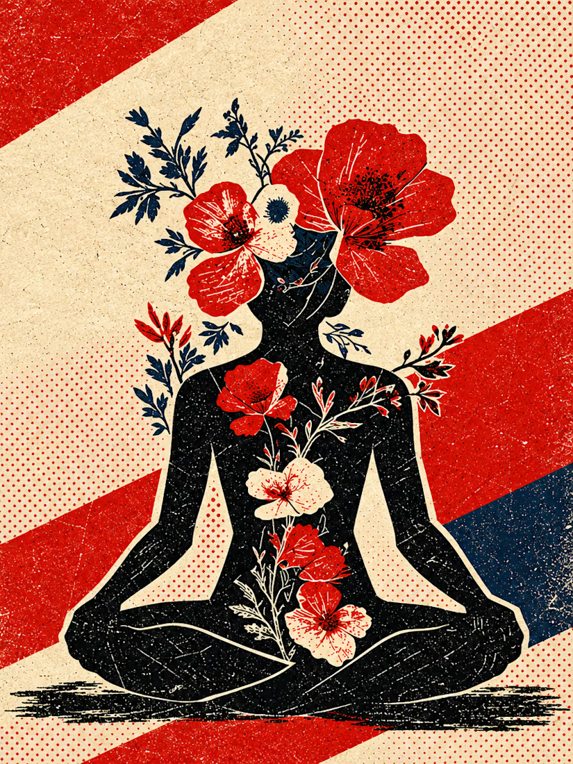
What happens when propaganda designed to erase the self gets pointed at the self instead?
Soviet propaganda spent 70 years trying to erase the individual soul in favour of the collective machine. I pointed that exact visual language at the thing it was built to suppress.
I kept...




Good branding isn’t just about how a logo looks. It’s about what it represents.
Sharing one of our recent projects: NEXU, a fintech brand identity built around connection, trust, and opportunity.
The idea was to create a visual identity that makes finance feel more human and approachable. The symbol brings together the gesture of reaching out and the strength of a bridge, representing the connection between people, capital, and opportunity.
From the logo concept to the broader visual identity, every detail was designed to communicate confidence, clarity, and progress.
It’s always rewarding to see how a simple visual idea can tell a much bigger story.
Would love to hear what you think!
Check it out
#BrandIdentity #LogoDesign #Fintech #BrandDesign #ContraCommunity


Such a thoughtful concept! Making finance feel more human and approachable through design is a great way to build connection and trust.


