The network for creativity
Join 1.25M professional creatives like you
Connect with clients, get discovered, and run your business 100% commission-free
Creatives on Contra have earned over $150M and we are just getting started
Back to feedPost
Taste Test
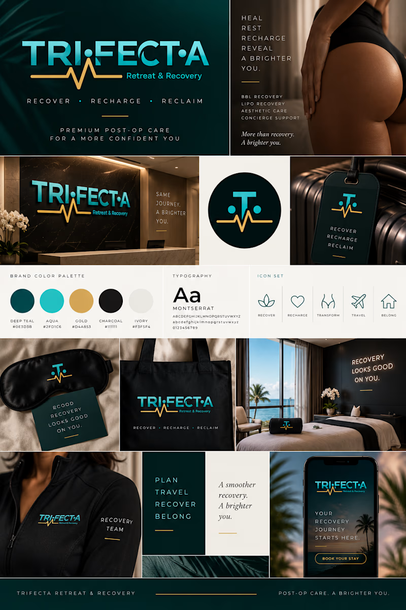
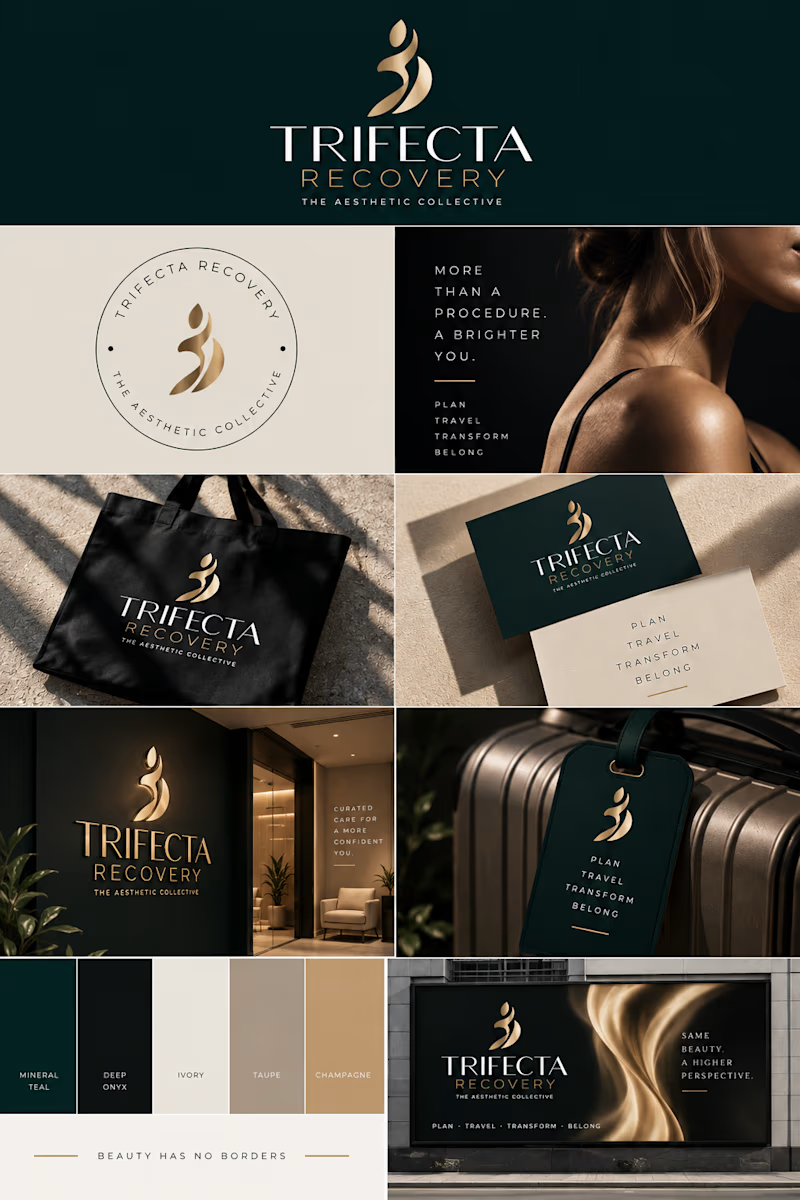
I designed this logo when I had just started learning graphic design. A few weeks ago, my client reached out wanting a rebrand because the business has grown and the old identity no longer reflects where the brand is headed.
Trifecta has evolved from a post-op recovery brand into a more elevated aesthetic concierge experience, so I wanted the new identity to feel more refined, feminine, and luxurious while still keeping a connection to the original brand.
This was such a good reminder that design should grow with the business, not just look good.
Which one do you prefer: the original logo or the rebrand?
2 voted
33%
4 voted
67%
6 votes
Closed

definitely the new design, it feels much more premium.

Thank you! That was exactly the goal. I wanted the new identity to feel more premium and aligned with how the business has evolved, rather than just giving the old logo a facelift.

The rebrand, and not because it's prettier. The heartbeat line in the old mark kept saying 'clinic' no matter how much gold sat around it, and a concierge client doesn't want to be reminded of the surgery - so carrying the deep green forward was a smarter continuity move than keeping any part of the symbol.
Exactly! That was one of the biggest things I wanted to move away from. Keeping the green family gave the brand some continuity, but removing the clinical cues gave Trifecta room to grow into the luxury concierge space it’s becoming. Love that you caught that 👏🏽


the dark green and gold work well

The new logo design looks nice

Rebranding your own early work must hit differently than doing it for someone else's business. Are you expecting the redesign to run away with the poll, or does the original still have people rooting for it out of nostalgia?
It was fun to do, first the feeling of the my client trusting me again to do the rebrand but it was also bitter sweet as it was one of the irst set of logos i designed as a newbie that started my career. not sure how the polls will go but i'm happy with both logos either wayt and while i'm still learning open to feedback.
That mix of pride and vulnerability makes sense, revisiting a newbie project for a client who trusts you now is a different kind of pressure than a totally fresh brief. If the poll leans toward keeping the original, would that feel like people rooting for nostalgia, or would part of you still push for the update anyway?
I would be happy that my earlier work esonated even when i was fresh but i'd push for the new design as it matches the new brand direction. i've learnt that its not what we like but what matters most fo the brand and target audience.
The network for creativity
Join 1.25M professional creatives like you
Connect with clients, get discovered, and run your business 100% commission-free
Creatives on Contra have earned over $150M and we are just getting started











Related posts


One letter. Eight personalities. 🔤
I explored the letter S in 8 different directions: soft and rounded, sharp and angular, bold and blocky, and fast like a bolt.
Same letter, same white-on-black treatment. The only thing that changes is the character.
Each mark could suit a different kind of brand, from tech and sports to fintech and lifestyle.
Which S would you pick, and what kind of brand would it belong to? Drop the number below. 👇
Looking for a logo mark or a full brand identity? My services are on my profile.

S letter designs is the best ❤️
Great job Shahwaiz🔥🔥


A little excerpt from the brand guidelines for a recent project


The APS mark built from the four small symbols reads like a map legend, which suits a psychology service. Nice that the guidelines page shows it on the dark teal, most would have played it safe on white.

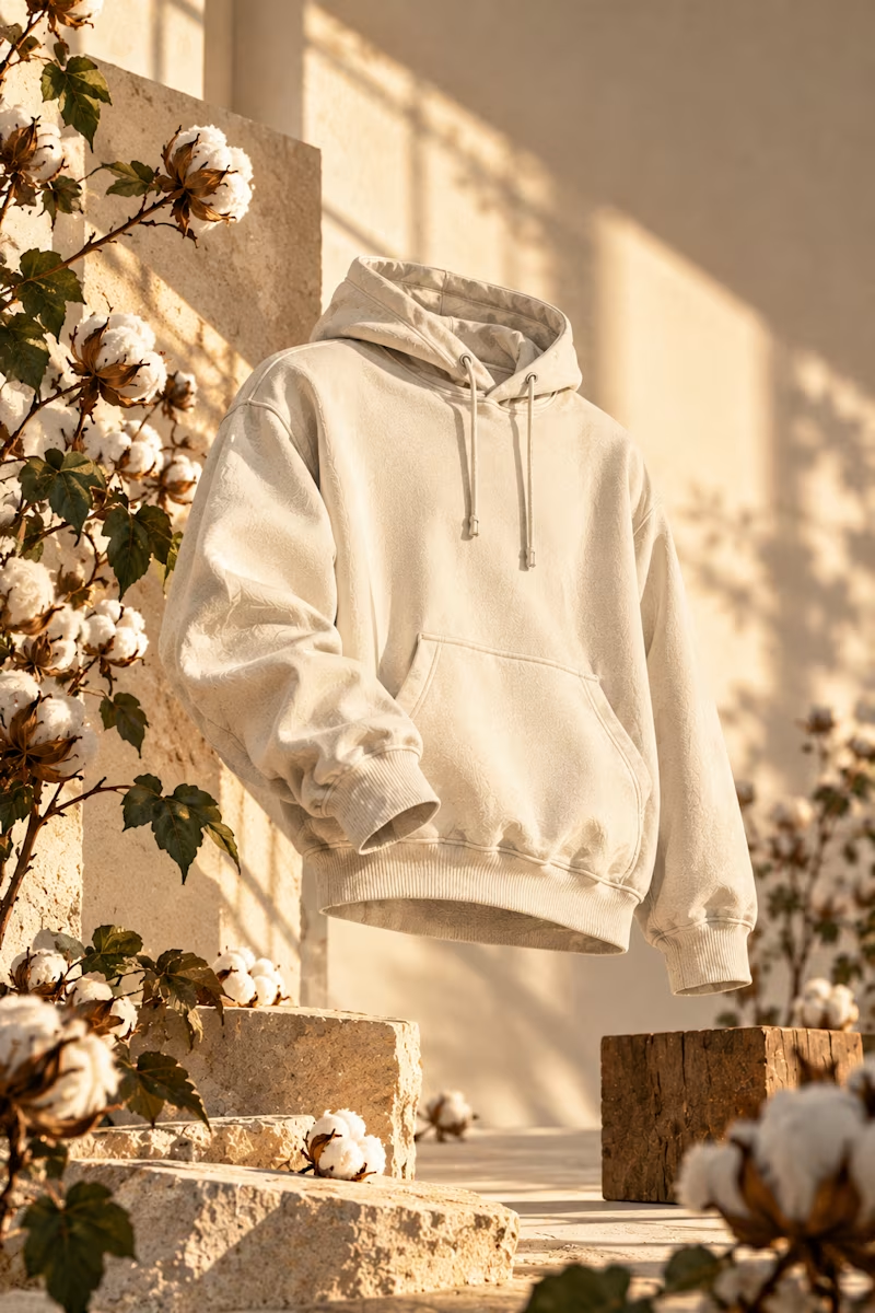
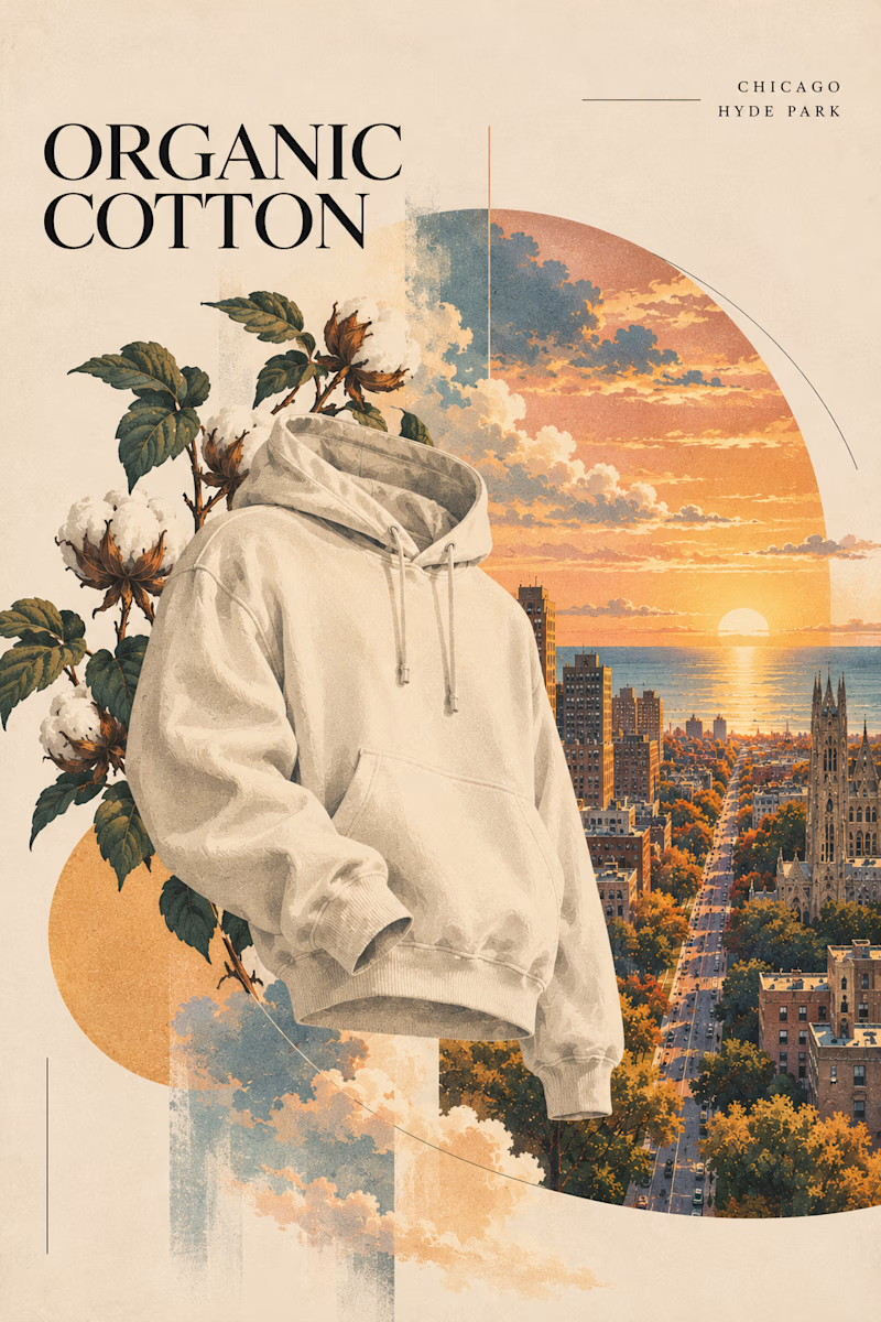
Two directions for an organic cotton apparel campaign. Which style works better?

6 voted
60%
4 voted
40%
10 votes
Closed
Sunlight studio is more stunning 🔥🔥
great job Mitchell❤️