The network for creativity
Join 1.25M professional creatives like you
Connect with clients, get discovered, and run your business 100% commission-free
Creatives on Contra have earned over $150M and we are just getting started
Back to feedPost
Taste Test
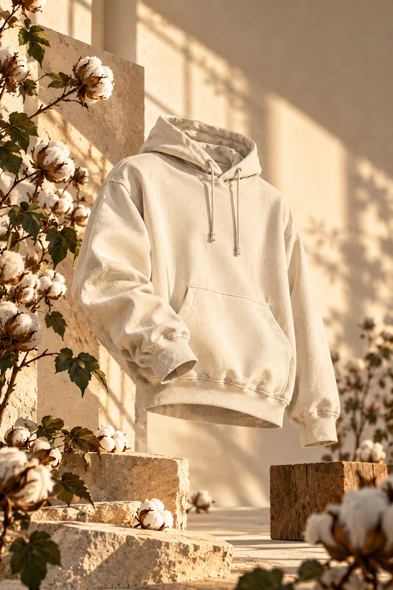
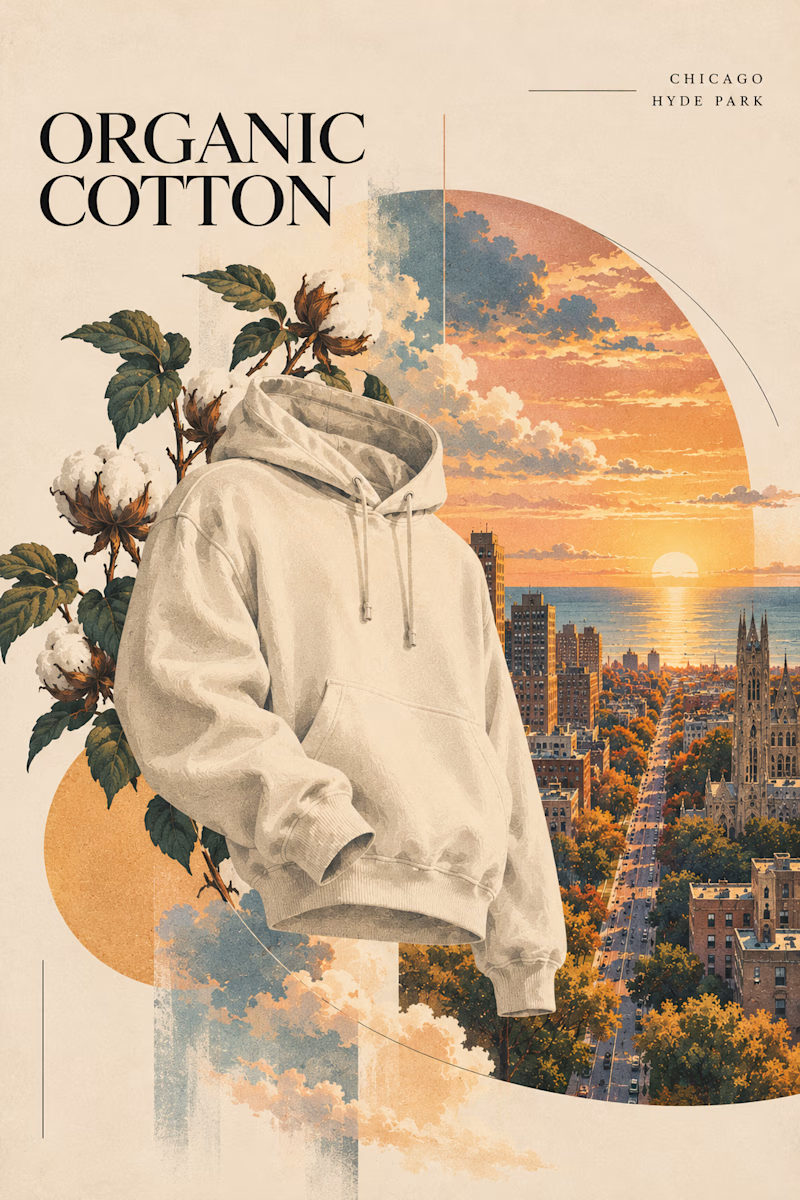
Two directions for an organic cotton apparel campaign. Which style works better?

6 voted
60%
4 voted
40%
10 votes
Closed

Sunlight studio is more stunning 🔥🔥
great job Mitchell❤️

Thank you sir 💪🏽
Pardon Mitchell ❤️

Looking beautiful 🤩
Thank you VIMAL

Vintage editorial

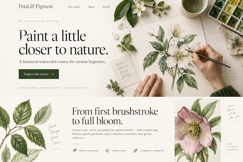
I lean toward vintage editorial for a campaign, because the serif headline and the arched crop give you a layout that can stretch across posters and social. The sunlit one is lovely but reads closer to a product shot.
Thank you Artur agreed
The network for creativity
Join 1.25M professional creatives like you
Connect with clients, get discovered, and run your business 100% commission-free
Creatives on Contra have earned over $150M and we are just getting started










Related posts

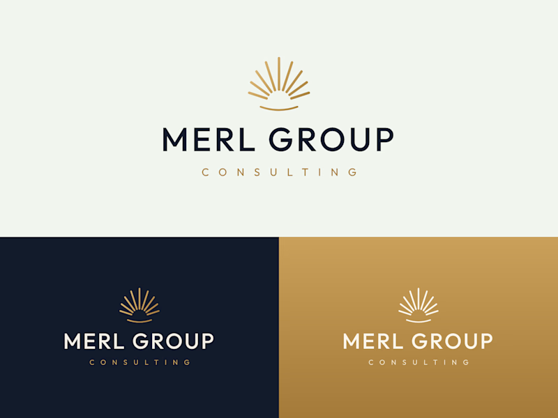
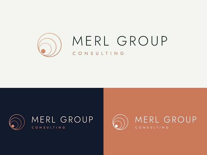
Two logo directions for Merl Group Consulting. Which one would you trust with your business? 👇

22 voted
69%
10 voted
31%
32 votes
Closed

I would go with Rising Sun Mark!


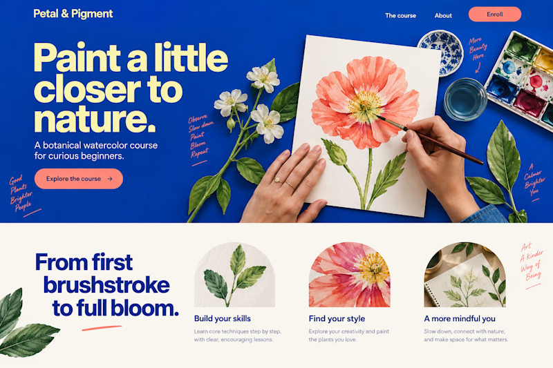
Which design would make you more likely to join this botanical watercolor course?
Two new AI-generated Kajabi landing-page concepts for Petal & Pigment: soft editorial or bold studio. Same course, two different first impressions. Pick your favorite below—what made the difference?

18 voted
39%
28 voted
61%
46 votes
Closed

Same brand. Same copy. Two completely different ways to move.
A scrolls like a title sequence.
B snaps like a train arriving.
Taste test: which one would you ship?
15 voted
32%
32 voted
68%
47 votes
Closed

Option 2 stands out more for me!