The network for creativity
Join 1.25M professional creatives like you
Connect with clients, get discovered, and run your business 100% commission-free
Creatives on Contra have earned over $150M and we are just getting started
Back to feedPost


A selection of recent-ish marks. Some ended up on beer labels, fancy watch boxes, buildings, and some never saw the light of day until now. 👀
The network for creativity
Join 1.25M professional creatives like you
Connect with clients, get discovered, and run your business 100% commission-free
Creatives on Contra have earned over $150M and we are just getting started











Related posts

Little did I know this logo I designed would be seen billions of times.
And that kids would walk on the street rocking the logo on their chest 🤯

Seeing kids wear your logo on the street must be such a surreal feeling. Amazing work Tim!

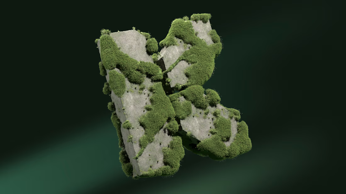
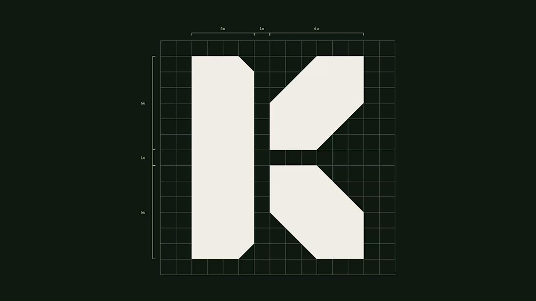
A mark for a financial app spends most of its life very small: an app icon, a tab, a notification.
So the Keystone K is drawn on a strict grid, as one solid shape with no thin details to lose. It holds on a billboard and still reads at app-icon size.
Do you design the small version first, or the big one?

Brutal logo mark. really like this direction

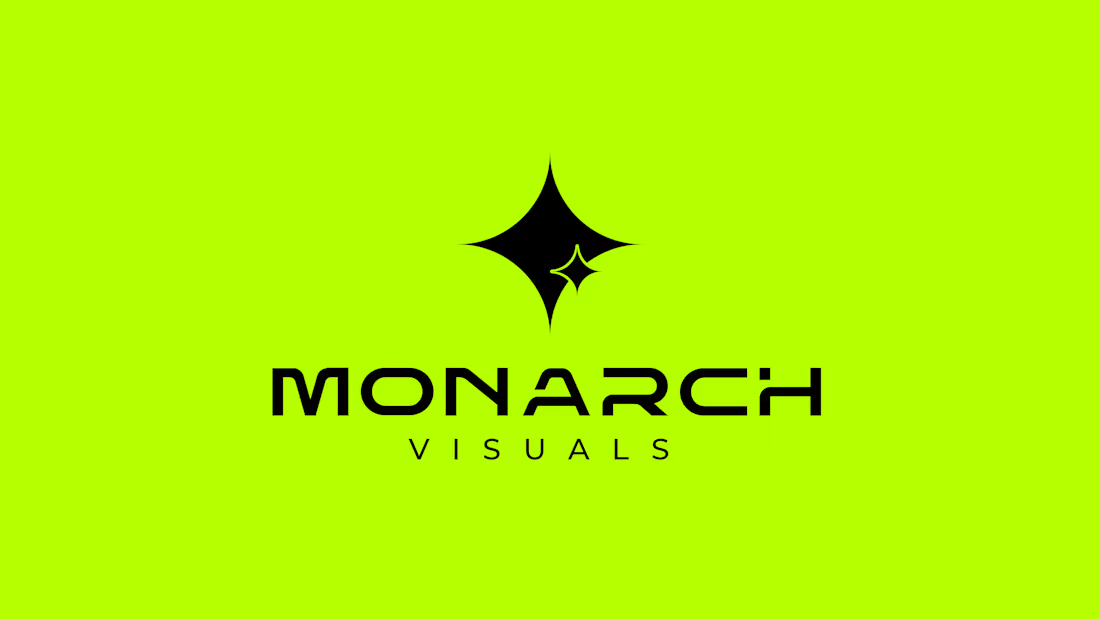
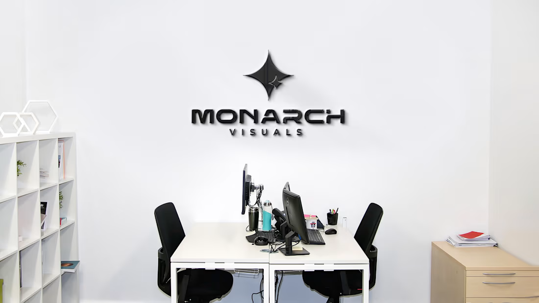
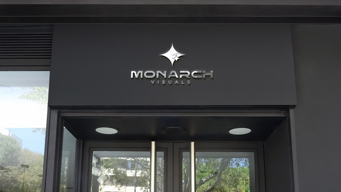
Logo Design for Monarch Visuals ✨
A bold, electric, and futuristic Logo designed to command attention.
The Vision: Clean typography paired with an eye-catching, star-inspired emblem that stands out across digital screens, neon palettes, and physical spaces.
Looking to elevate your brand’s visual presence? Drop a message or hire me directly through my Contra profile! 📩



Strong mark, Vijay. The star-inspired emblem on that neon lime feels electric without losing legibility, and the black inverted version proves it holds up across contexts. Clean work.