The network for creativity
Join 1.25M professional creatives like you
Connect with clients, get discovered, and run your business 100% commission-free
Creatives on Contra have earned over $150M and we are just getting started
Back to feedPost
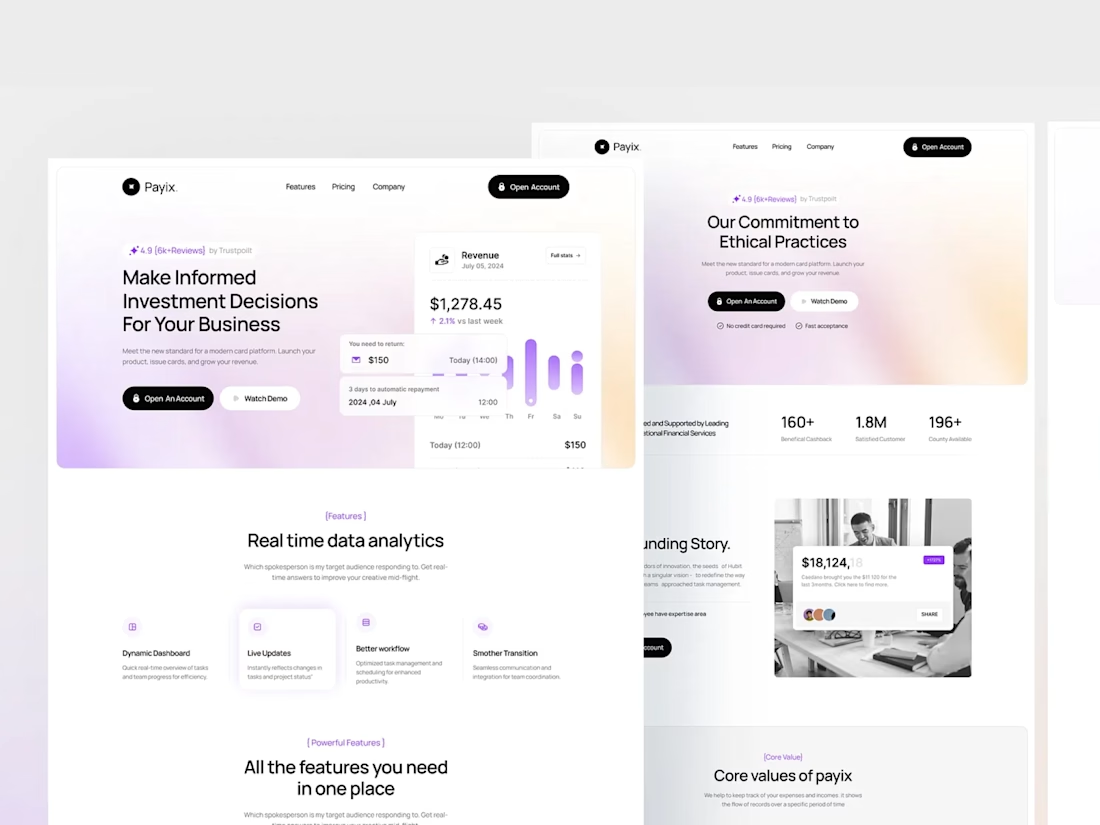
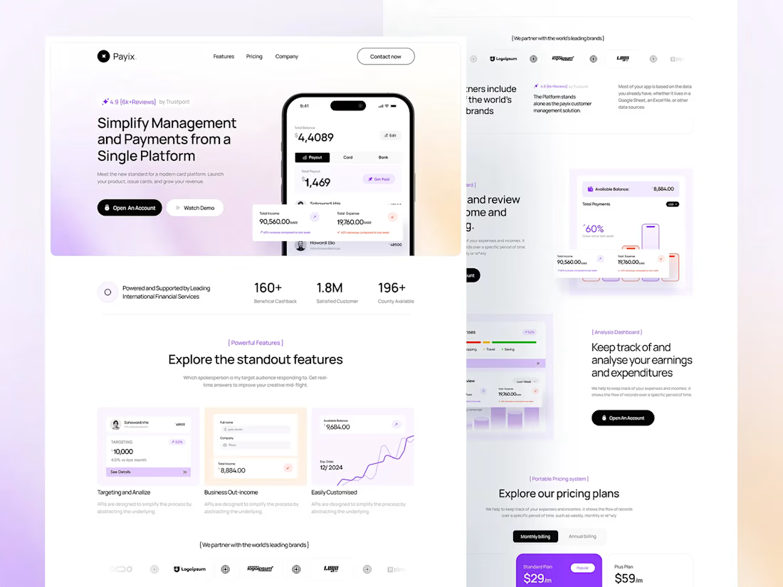
🚀 𝐏𝐚𝐲𝐢𝐱 : 𝐒𝐚𝐚𝐒 𝐖𝐞𝐛𝐬𝐢𝐭𝐞 & 𝐏𝐫𝐨𝐝𝐮𝐜𝐭 𝐃𝐞𝐬𝐢𝐠𝐧
When a finance product has too much to say, the interface should not say it all at once.
For Payix, I focused on giving the product room to breathe: clear hierarchy, softer visual treatment, focused data sections, and a consistent UI across the website and product screens.
The goal wasn’t to make finance look complicated or overly “techy.”
It was to make a complex product feel surprisingly simple.
Payix · SaaS · UI/UX · Web Design · Figma




Thanks! 🙌 Really appreciate you taking the time to check it out!
The network for creativity
Join 1.25M professional creatives like you
Connect with clients, get discovered, and run your business 100% commission-free
Creatives on Contra have earned over $150M and we are just getting started
Trending
retrofuturism
Share your favorite designs from the past exploring the distant future. Or your own take on the aesthetic 🚀
halftone
Dots. Texture. Grain. Let's see your designs using the halftone technique.

Midjourney
Creatives are showing off what they're making with Midjourney.
colorgrade
Video editors sound off: How do you enhance the mood of your video in color grading?
Related posts

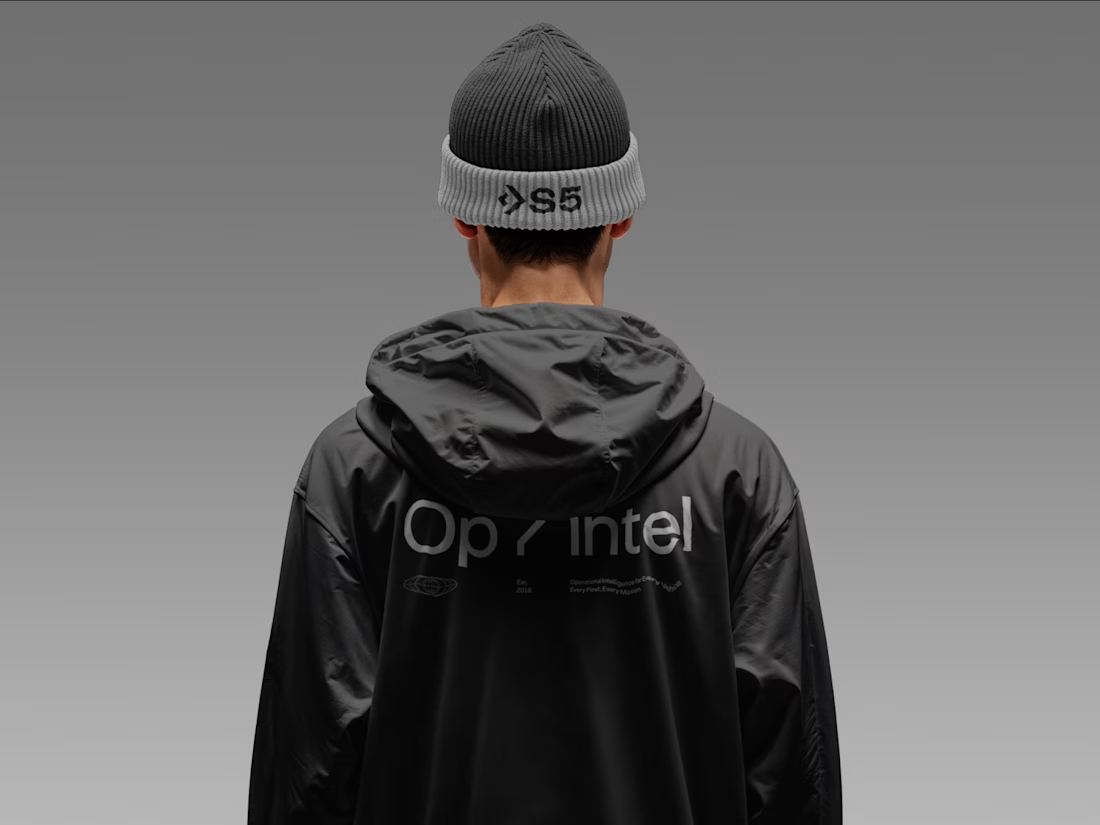
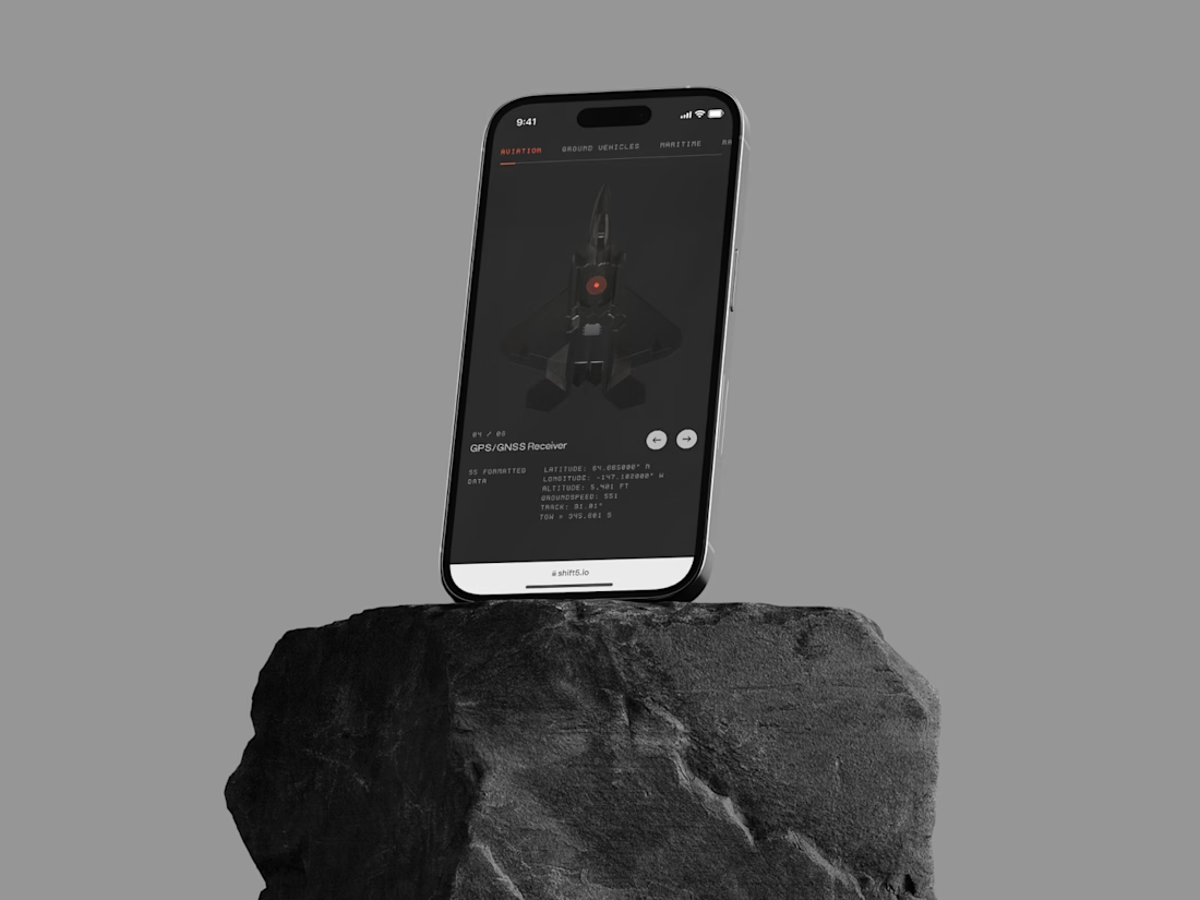
Recent Branding, Website Design, and Development for Shift5 — www.shift5.io



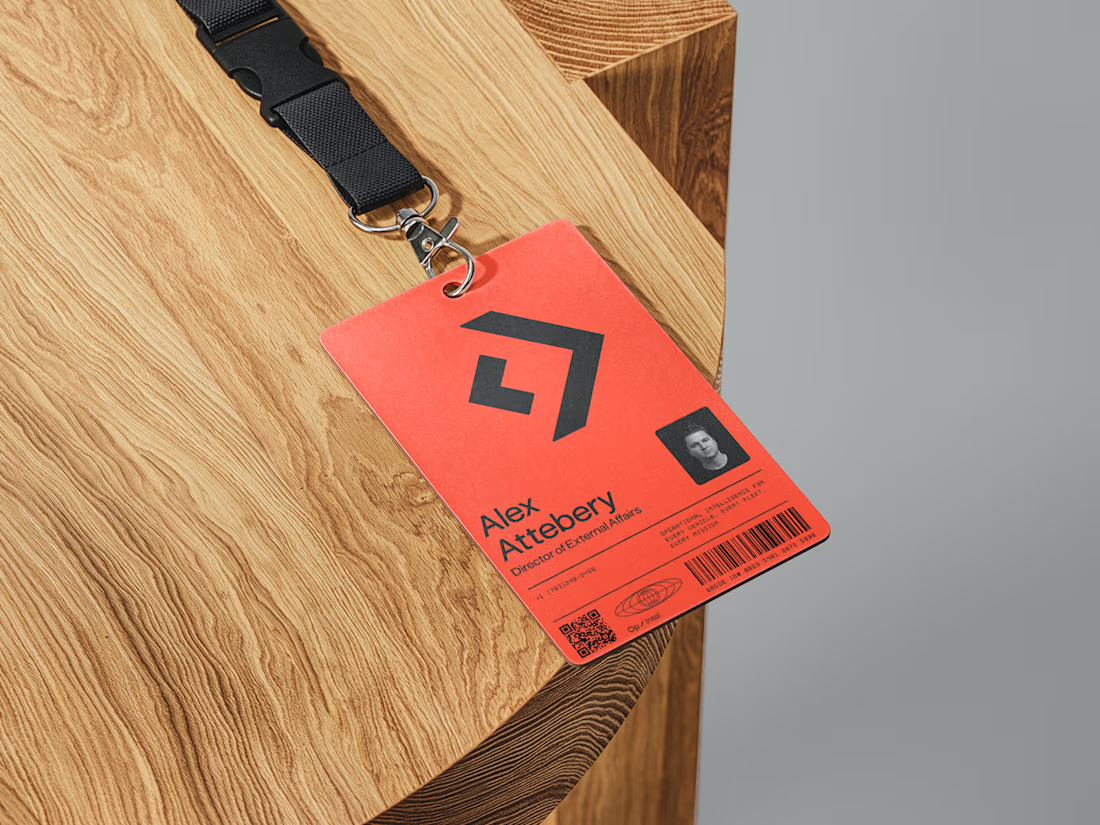

That is a sexy design! 🔥 😍
New Personal Portfolio — www.quintinlodge.com

excellent work, you really redefined initial minimalism's expectations with this one!


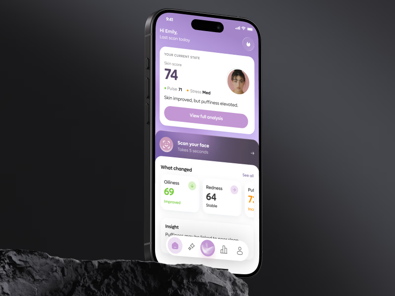
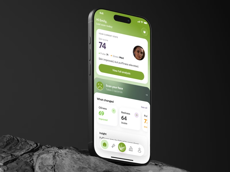
SAME AI SKIN APP.
SAME DATA.
DIFFERENT PERCEPTION.
Which version makes the result feel more trustworthy?
🟣 A - Purple
🟢 B -Green
At first glance, this looks like a color choice.
But in a health product, color can change more than aesthetics.
It can change what users believe the product is.
🟣 One direction feels closer to premium skincare and self-care.
🟢 Another feels closer to health monitoring and measurable progress.
That matters because each category creates different expectations.
If it feels too cosmetic, AI results may feel less credible.
If it feels too clinical, it may lose emotional comfort.
The real UX question is not:
“Which color looks better?”
It is:
Which visual system makes you trust the result enough to scan again tomorrow?
👇 Vote below:

41 voted
55%
34 voted
45%
75 votes
Closed

Interesting how quickly “health” can shift into “beauty” just through visual language.