The network for creativity
Join 1.25M professional creatives like you
Connect with clients, get discovered, and run your business 100% commission-free
Creatives on Contra have earned over $150M and we are just getting started
Back to feedPost
Taste Test
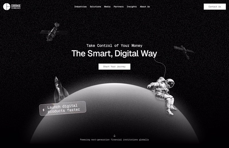
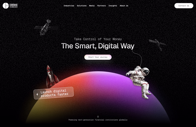
Great work👌
Thank you 🙌
I'd go with the colored. I think there is no need to turn the beautiful palette into monochrome, it looks balanced, pops out well and stands out.
Very true. Thank you 👍
Noted, thanks
I like the coloured version. The gradient adds more visual energy and helps the hero section stand out while still keeping the futuristic theme.
True. You are absolutely right
The network for creativity
Join 1.25M professional creatives like you
Connect with clients, get discovered, and run your business 100% commission-free
Creatives on Contra have earned over $150M and we are just getting started
Related posts
👀 Need your feedback!
If you landed on this page for the first time, which design would make you stay longer?
Left or 💜 Right?
Tell me your choice below!
52 voted
37%
89 voted
63%
141 votes
Closed
The right looks more okay to me 😊
Had a fun weekend building Merisole ☀️
Designed with Google Stitch.
I'm a senior product designer working on e-commerce sites every day, so my real question going into this challenge was practical: how easily does Stitch slot into my actual workflow? Could I use it to spin up a polished, client-ready option in a single sitting or even take it all the way to a shippable site?
To test that, I asked AI to create a fictional footwear brand, Merisole, and treated it like a real client project from brief to launch.
How Stitch fit into the workflow
Before generating anything, I wrote a custom design.md. Type scale, color tokens, spacing rhythm, the editorial tone I wanted Merisole to carry and uploaded it into Stitch as a design system. That single step is what made the rest of the build feel coherent.
Every screen Stitch streamed onto the canvas already spoke the brand's language, so I wasn't fighting drift between sections. This is exactly the part of my normal e-com workflow that usually eats hours! Getting AI tools to respect a brand spec was something that Stitch handled cleanly.
By the way, the stream on canvas feature was one of the coolest interactions I've seen so far! It was like having a designer design on your screen remotely through AnyDesk!
From there I worked mostly through in-place AI edits: clicking a section, telling Stitch "to add it to another variation," or "add a hover animation on the cards," and getting changes in seconds. The streaming generations meant I was reacting to a real interface taking shape instead of waiting for a static result.
The motion work is where Stitch surprised me most. Native hover states, shader backgrounds, and scroll-linked animation. All authored inside the tool, no handoff to a separate motion app, no code wrestling. Then I exported the build out to Netlify in one step.
New features I leaned on
Custom design.md - design system applied across the whole project (kept every screen on-brand from the first generation)
Streaming generations to canvas (the whole first pass)
In-place AI edits via prompts + point-and-click (most of the polish phase)
Native motion, hover states, and shaders on HTML canvas
Netlify export (final deploy)
Feedback on the platform
Coming at this from a daily e-com design seat: Stitch genuinely shortens the distance between brief and client-ready.
The design.md - design system flow is the underrated hero, uploading a brand spec once and having Stitch honor it across every streamed generation is the closest I've felt to "AI that respects a brand."
The streaming canvas is amazing to say the least!
It collapses the "describe - wait - judge - re-prompt" loop into something closer to direct manipulation. In-place edits felt the most like real design work. I stopped writing long prompts and just pointed at things. Two things I'd love next: An option to tweak elements without having to prompt it. And a way to save in-place edit "recipes" so I can reapply a vibe across sections without re-describing it.
Stitch didn't feel like an AI tool I was wrangling. It felt like a canvas that happened to understand what I meant. Merisole came together in a single sitting because of that, and I'm walking away convinced Stitch has a real place in how I'll pitch and build e-commerce work going forward.
Check it out:
Live site (really fun to click around): https://merisole.netlify.app
Stitch project: https://stitch.withgoogle.com/projects/834230787052196219
Amazing!
UFAB numericals + motion system for logo and numericals,
via Ebb Scandinavia.
The new logotype symbolized their mastery in CNC manufacturing.
Based on client feedback on early numeral explorations, I redesigned the set to feel coherent with the final logotype.
The numerals are now used on factory signage.
But the brand needed more ways to express smart connected manufacturing.
I built a motion system inspired by their CNC & measurement machines, where the same movement could carry across both letters and numbers.
This made the identity easier to extend without losing coherence.
Logotype: Ebb Scandinavia
Numericals: 1 AD, 1 designer (me)
Motion: me
Superb
Challenges
View allTrending
Claude
Claude has entered the design space. How are you using Claude Design?
Contra University
Learn from expert creatives how to earn more using next-gen AI tools.
creativeaiflow
Creative AI workflows are evolving. What tools do you use, and what are their strengths and weaknesses?
portfolioreview
The best portfolios tell a story, not just show a grid. Share yours for feedback.
freelancerlife
Freelancer life is wins, pivots, and everything in between. What’s yours right now?