The network for creativity
Join 1.25M professional creatives like you
Connect with clients, get discovered, and run your business 100% commission-free
Creatives on Contra have earned over $150M and we are just getting started
Back to feedPost
I’m working on a series of vertical animated loops that aim to convey calm, peace, and positive emotions, using minimalist scenes and very simple visual elements. I call them “Zen Cards.”
This is one of them. It’s called “A Perfect Sunset.”
More will be coming soon.
What do you think?
Does it feel peaceful?
Do you like it?
Animation2danimationmotiongraphics2D AnimationIllustrationVisual DesignAdobe After EffectsAdobe IllustratorAdobe Premiere Pro


Damn this is very peaceful. Mesmerizing!

Thank you! Glad to hear that. More like this are coming soon.
The network for creativity
Join 1.25M professional creatives like you
Connect with clients, get discovered, and run your business 100% commission-free
Creatives on Contra have earned over $150M and we are just getting started

Challenges
View all


Related posts

some visuals from iki, a matcha shop i’m currently working on 🍵
one of the most interesting parts of this project has been figuring out how to turn an abstract concept into something people can actually see and feel.
from the typography to the illustrations and overall visual language, every element is an opportunity to give the brand more personality and make it feel like its own world.
still exploring, but i’m really enjoying where this is going.
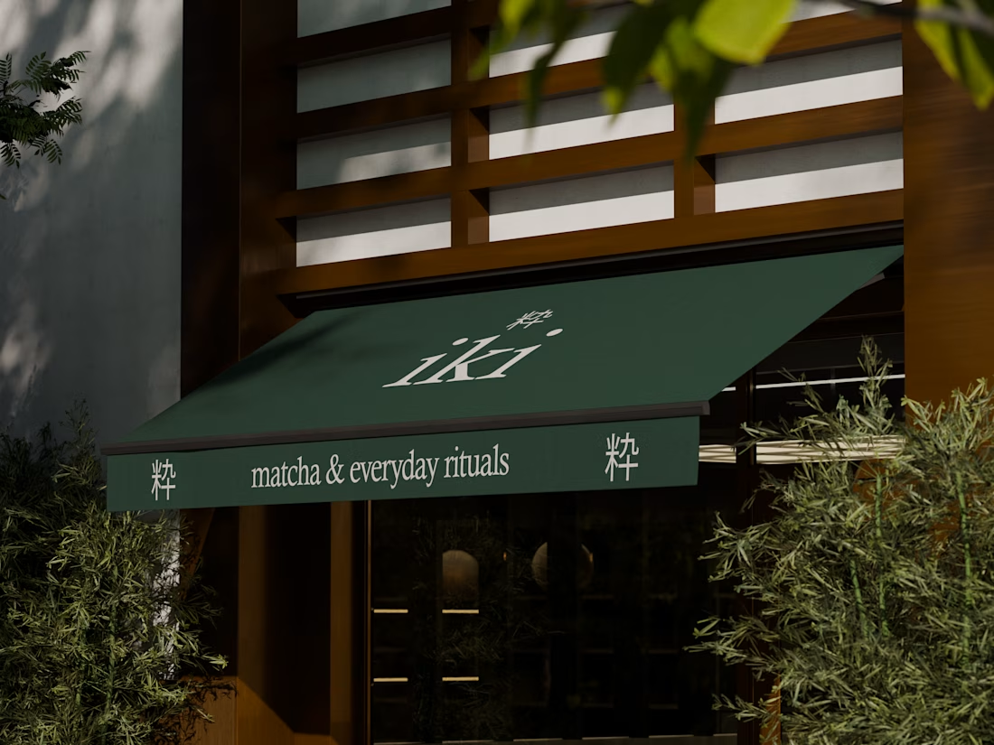
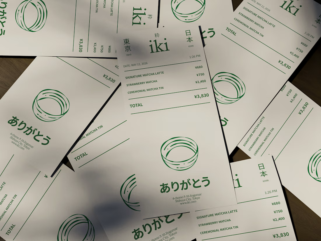
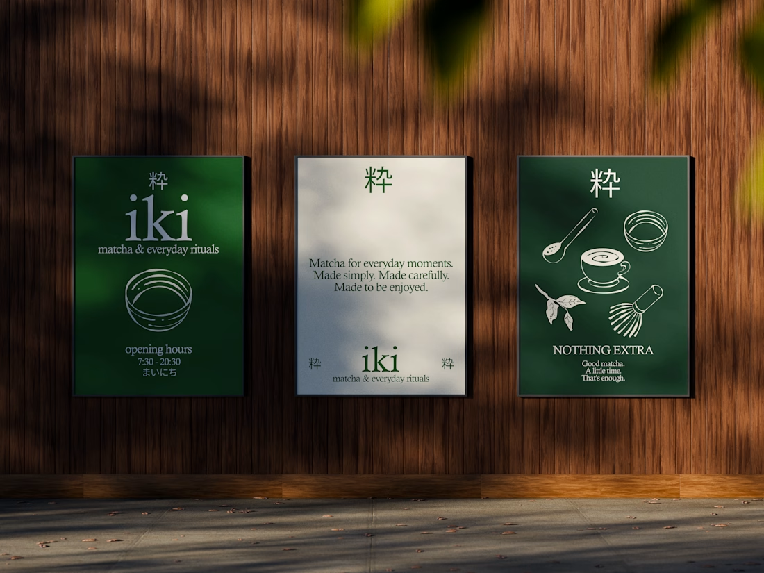
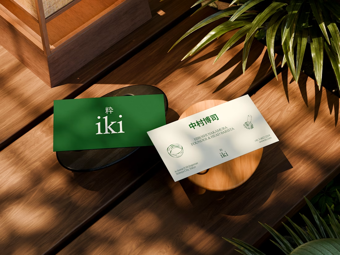


the illustration direction feels like it could take over the whole shop interior, not just the cups. thats usually where these projects fall apart


Hear the sound 🎧
An experimental exploration of bringing AI conversations to life through motion. ✨
Tool stack: Figma × Claude × After Effects


Really impressive

A space built just to create in 🎨
Spent a few evenings in Blender on this one — an artist's studio, light pouring in exactly where it should, everything in its place like someone just stepped out mid-thought.
No brief, no deadline — just wanted to build a room that felt like it was waiting for someone to walk back in. ✨


That's stunning from details colors lightning that's very accurate 🔥🔥😎😎