The network for creativity
Join 1.25M professional creatives like you
Connect with clients, get discovered, and run your business 100% commission-free
Creatives on Contra have earned over $150M and we are just getting started
Back to feedPost
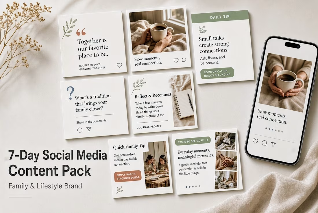
7-Day Social Media Content Pack



So nice and cool

Thank you
The network for creativity
Join 1.25M professional creatives like you
Connect with clients, get discovered, and run your business 100% commission-free
Creatives on Contra have earned over $150M and we are just getting started






Related posts

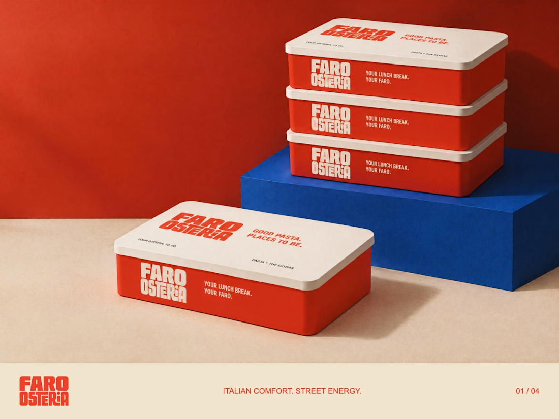
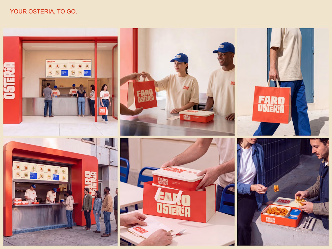
FARO OSTERIA — Italian comfort. Street energy.
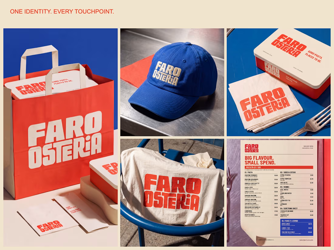
A brand and takeaway concept built around the entire meal: bold packaging, a clear digital menu and a street presence that carries the same identity from counter to customer.
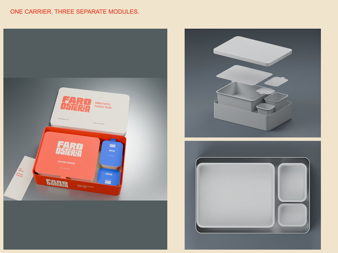
The packaging study uses one carrier with separate pasta, bread and cheese modules. The visual system extends through a $5–$7 pasta menu, uniforms, bags and editorial campaign imagery.
Creative Direction — Mauricio Pontual.
Concept study. Packaging modelled in Blender; campaign imagery developed with AI-assisted tools and art direction.
Explore the complete project:
https://www.behance.net/gallery/255879863/Faro-Osteria-Food-Branding-Packaging-Design



Amazing🙌

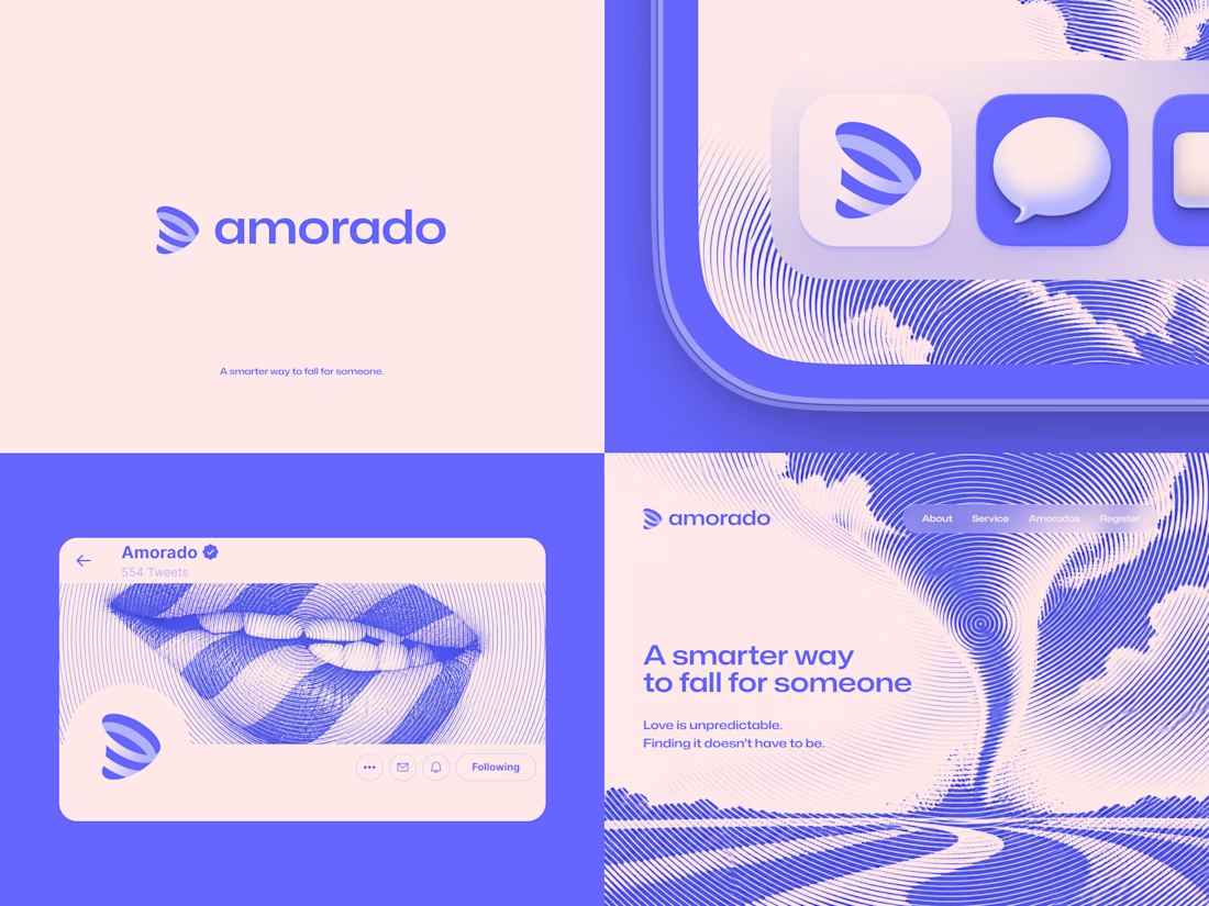
Amorado is a fictional AI dating app concept exploring how technology could make dating more intentional without taking away the romance.
The name blends "amor" and "tornado". The symbol combines a tornado, a heart and an arrow in one shape.
The visual identity pairs a soft romantic palette with bold typography, circular halftone imagery and playful digital applications.
A self-initiated concept made just for fun by Lepisov Branding.




ARU — Technology for Native Peoples
Speculative Design · Brand Identity · Web Design
ARU is a speculative design project exploring how technology could be imagined through territory, ancestral knowledge and contemporary digital infrastructure.
The project combines brand strategy, visual identity, digital interfaces and motion into a fictional technology ecosystem designed around autonomy, knowledge and territorial connection.
Built with:
→ Affinity — Visual Identity, typography, graphic system & social media
→ Framer — Website design & development
→ Canva — Lightweight motion graphics & dynamic content
From an abstract concept to a tangible digital ecosystem. ARU is an exploration of how branding can make speculative futures feel real.
Academic / experimental project. Fictional concept, created for portfolio and design exploration.


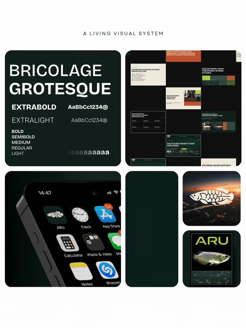
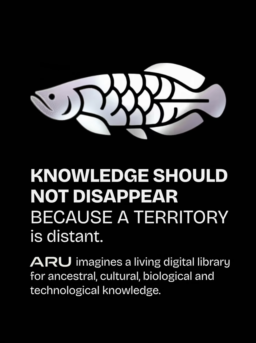
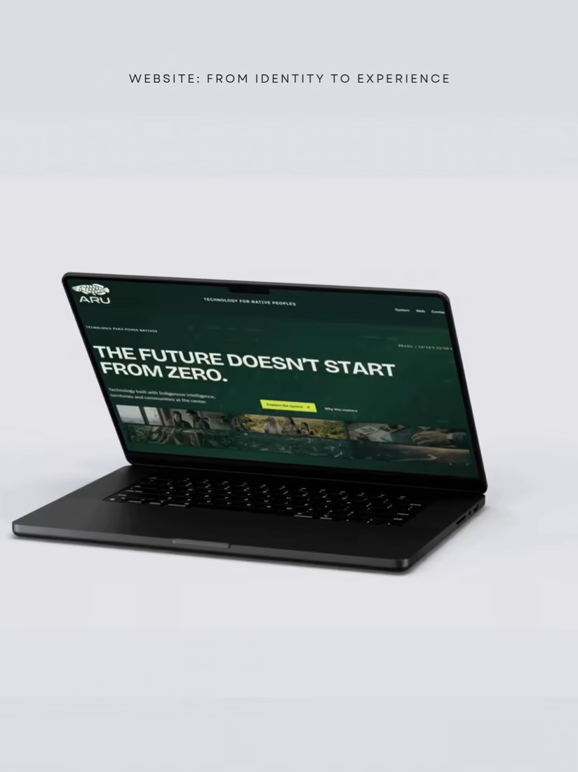
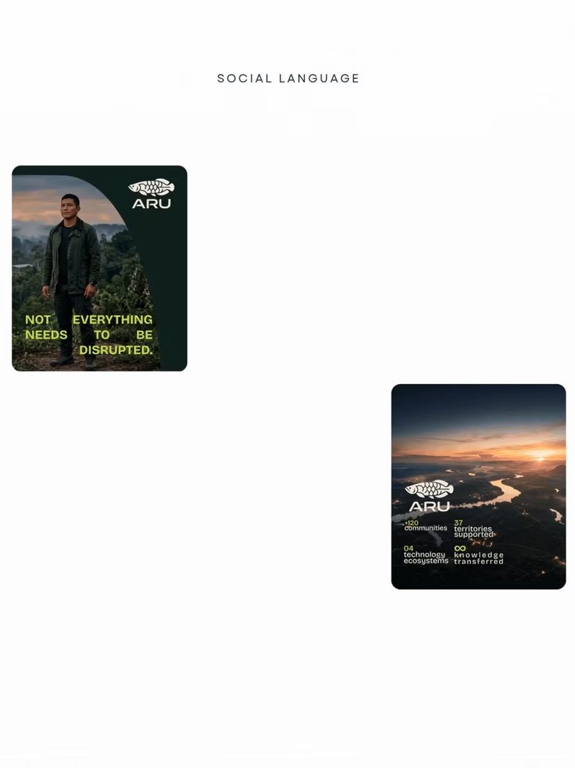

The strongest part is how the identity carries through the whole ecosystem, from the typography and dark green palette to the device screens and motion-ready web language. It feels cohesive without losing the project's sense of place and purpose.