The network for creativity
Join 1.25M professional creatives like you
Connect with clients, get discovered, and run your business 100% commission-free
Creatives on Contra have earned over $150M and we are just getting started
Back to feedPost

We do more than product and web design 👀
My team and I also work on branding and graphic design.
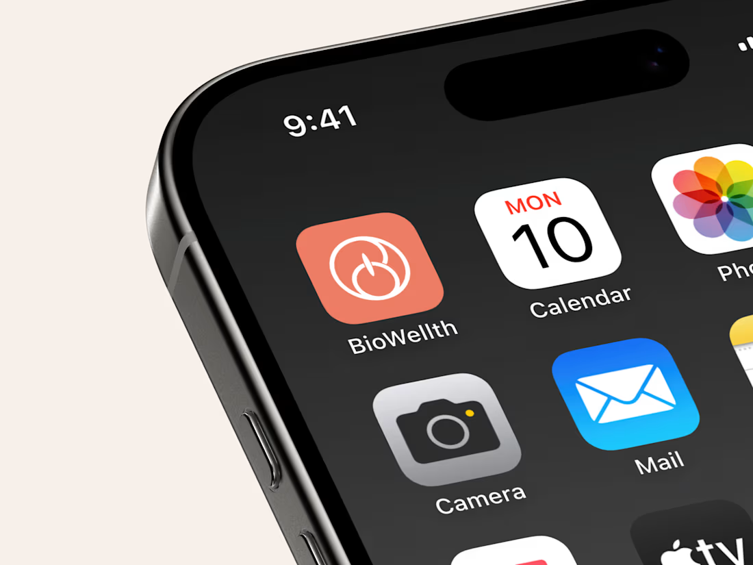
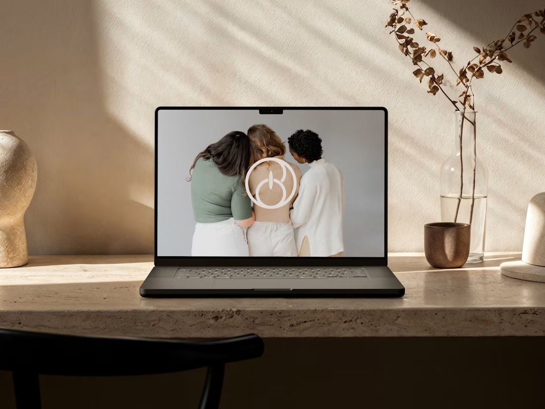
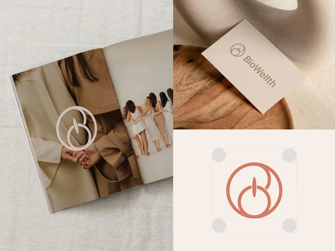
For BioWellth, a wellness app for women, we redesigned the app and built the brand identity too, including this logo.
What do you think of it? Would love to hear your thoughts!
And if you need help with design, my DMs are open ✨

That logo is lovely. The intertwined B monogram has such a soft, organic feel, perfect for a women's wellness brand. Seeing it on the phone screen next to the calendar and camera icons sells how naturally it sits in a daily routine. Since you did both the app and the identity,...
The network for creativity
Join 1.25M professional creatives like you
Connect with clients, get discovered, and run your business 100% commission-free
Creatives on Contra have earned over $150M and we are just getting started








Related posts

How can branding make people feel part of a community?
When working on Strawberry Health, we explored how visual identity could make women’s health feel more approachable and collective.
One of the ways was through supporting brand elements: stickers, badges and phrases that could live beyond the logo and become expressions of belonging.
These elements turned the identity into something people could interact with, share and make their own.
It’s a small detail, but I think it’s an important part of building brands around communities: the identity shouldn’t only identify the brand. It should give people something to identify with.
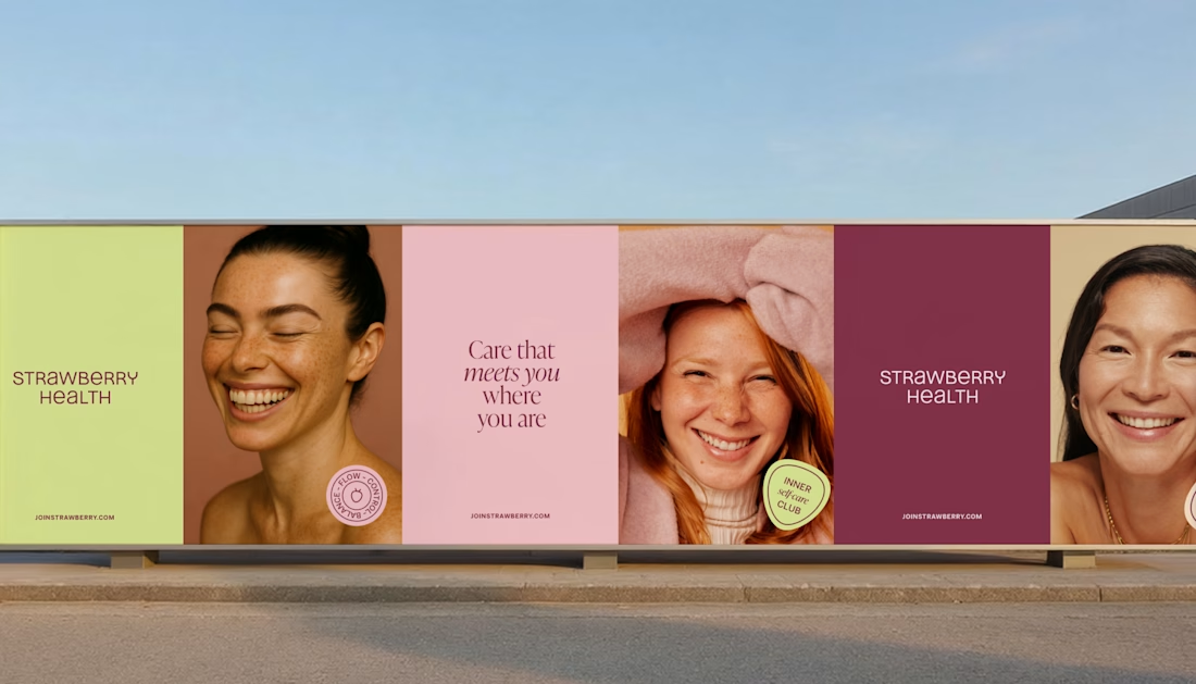
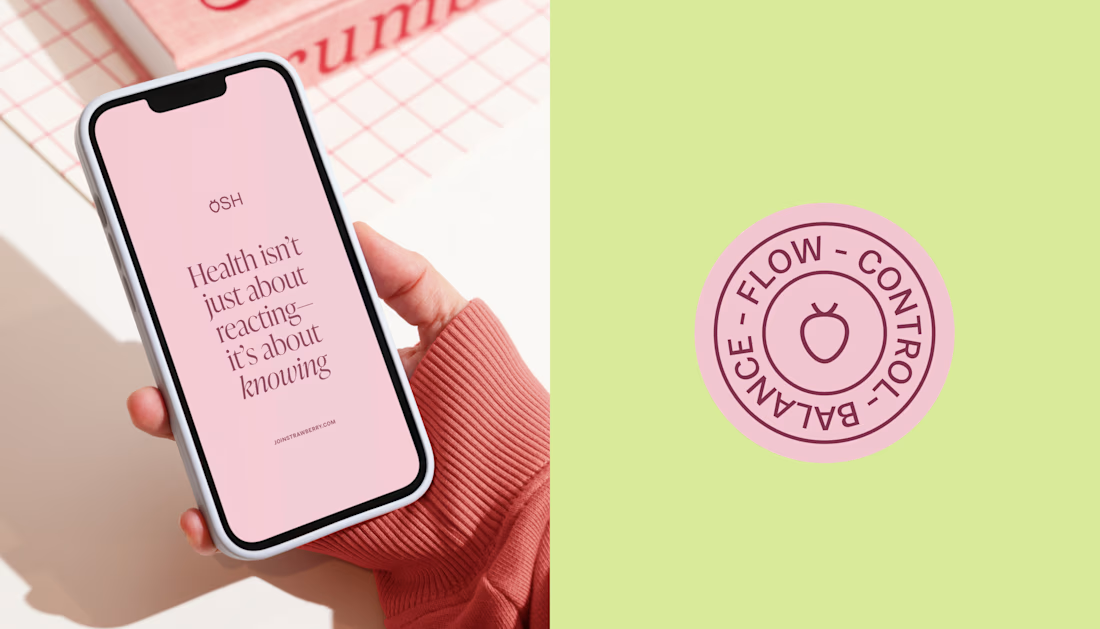
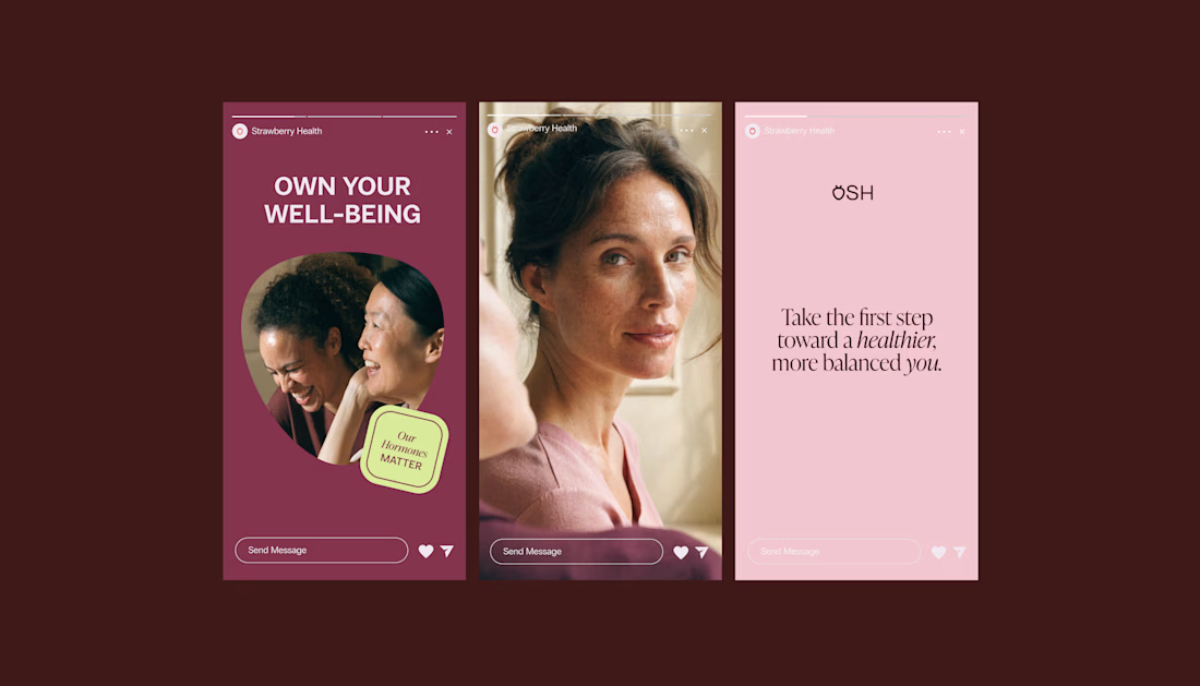
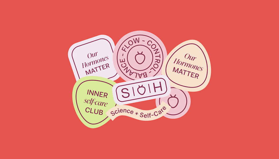

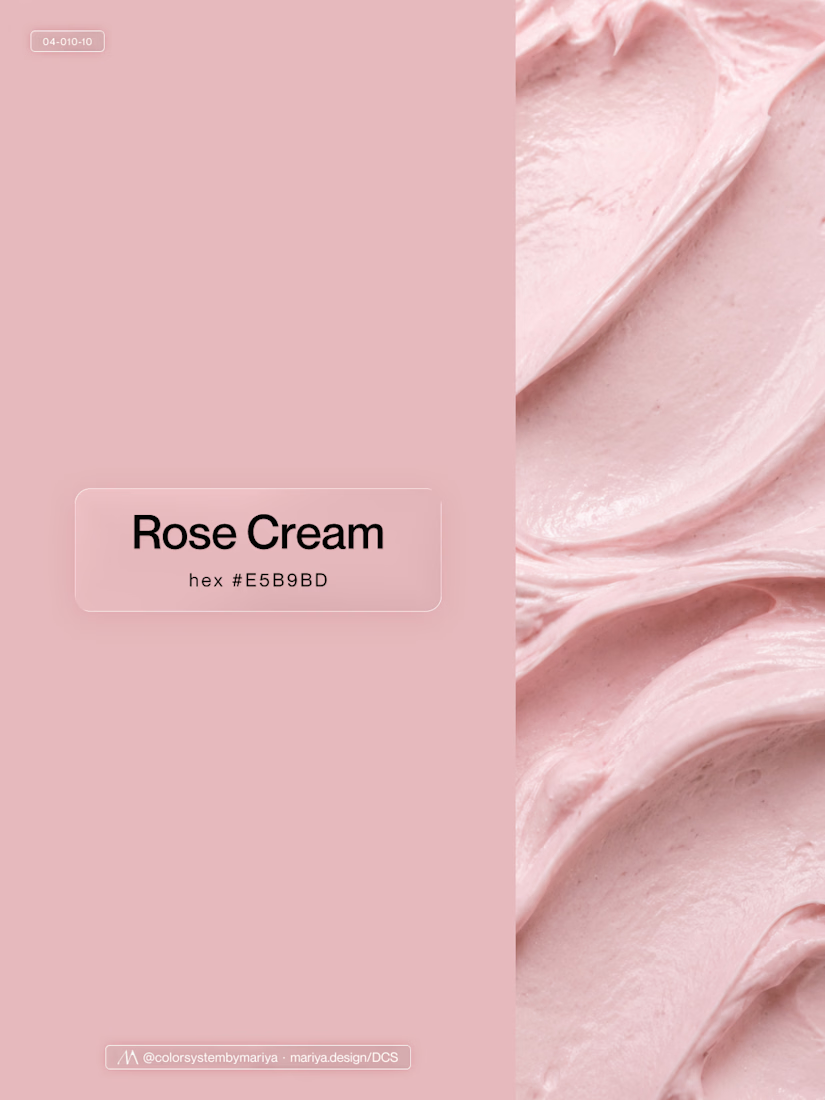
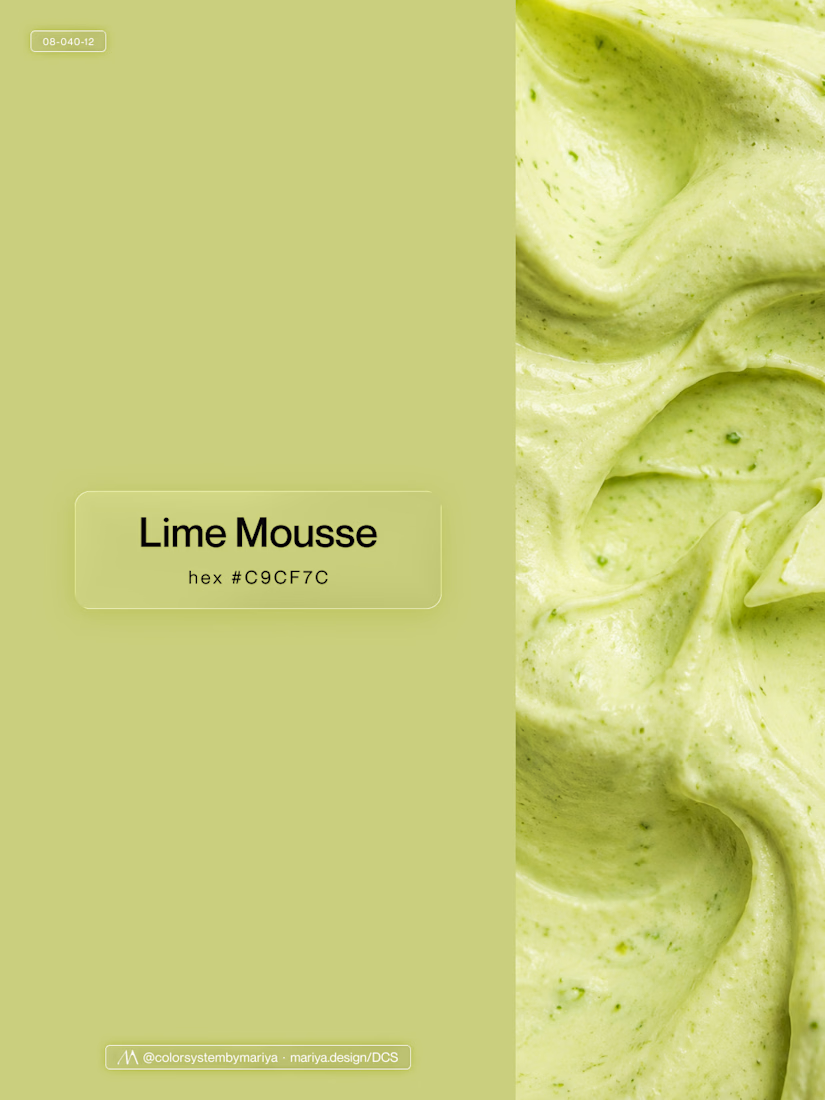
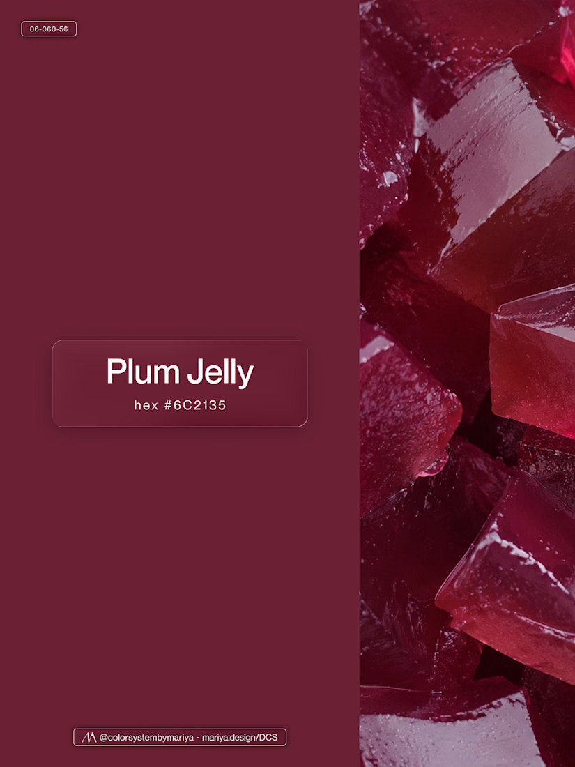
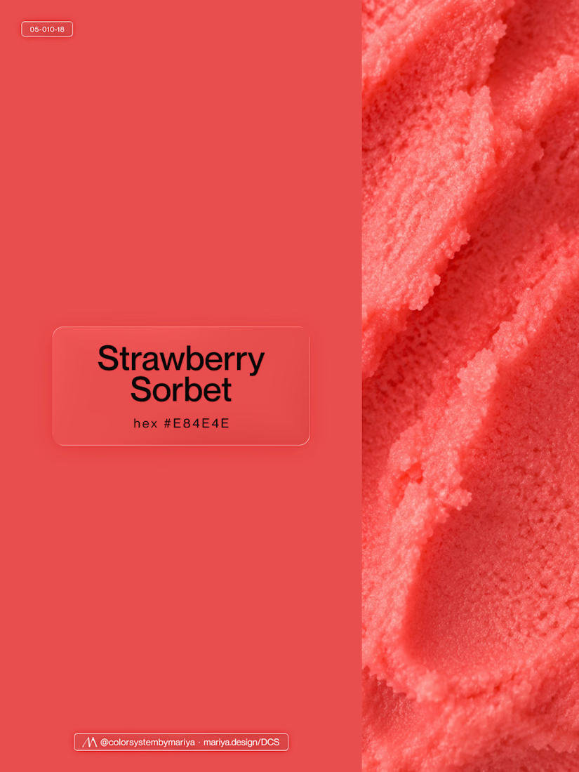
Love, love, love the colors. My mind goes: Rose Cream, Lime Mousse and Plum, hmmmm, which Plum... Plum Jelly. And of course, Strawberry Sorbet.
Let me match the vibe using my delicious swatches 😊


Recent Flyer and Social Media Designs I made.
Happy Thursday and have a great day!
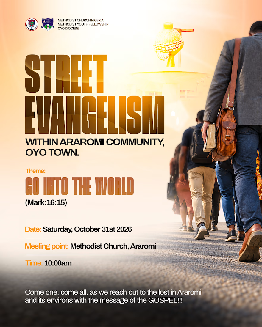
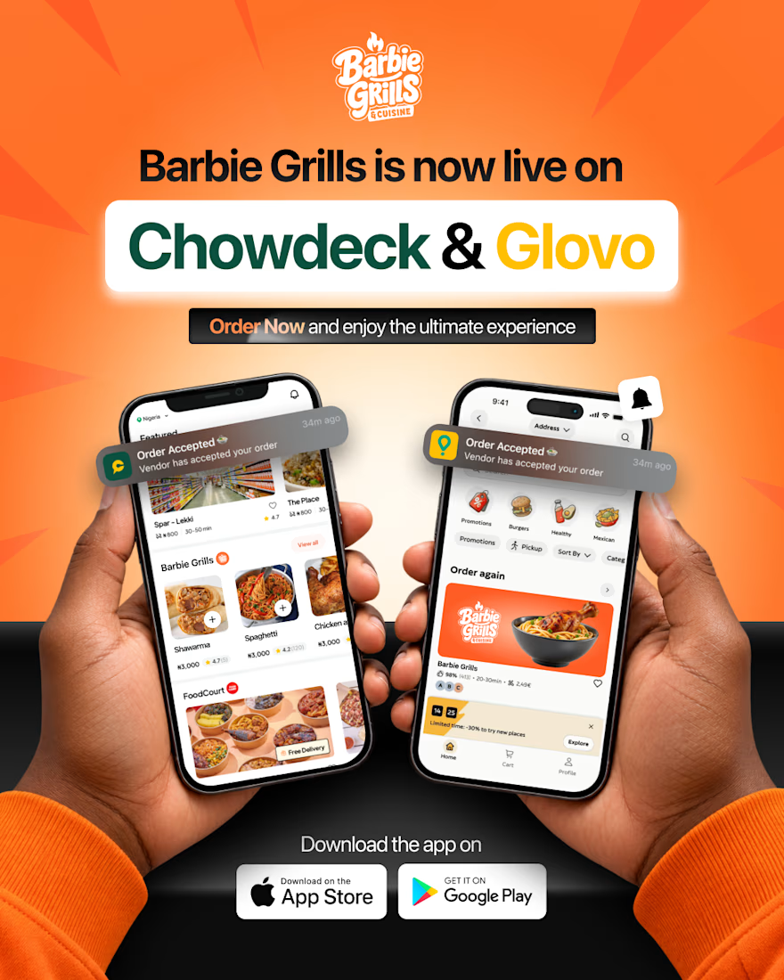



That's really great social media poster designs 🔥🔥🔥

New case study added!
Crahhy is a speciality coffee brand rooted in the relatable human psychology of coffee cravings.
The objective was to design a brand that is minimal on the outside yet delightfully chaotic on the inside, blending specialty coffee aesthetics with honest, humorous storytelling.


minimal outside chaotic inside is the right brief for coffee