The network for creativity
Join 1.25M professional creatives like you
Connect with clients, get discovered, and run your business 100% commission-free
Creatives on Contra have earned over $150M and we are just getting started
Back to feedPost
Hot Beans is a playful coffee brand I developed from the ground up, covering brand identity, packaging, and visual direction. The concept is built around energy, optimism, and everyday rituals.
I crafted a bold and expressive visual language using vibrant colors, loose typography, and a simple grid system to balance structure with spontaneity, like a good morning that doesn’t try too hard.
From packaging to in-store touchpoints, every detail was designed to feel approachable, a bit quirky, and instantly recognizable. A small reminder to start the day on a lucky note ☕️


Love thissss!

Hot Beans is such a vibe. The bold orange packaging with that loose hand type makes it feel so alive and grab-off-the-shelf good

Nice!💯

Great work.

such a fun project! You did a great job, Alia!


Thank you all 🫶
The network for creativity
Join 1.25M professional creatives like you
Connect with clients, get discovered, and run your business 100% commission-free
Creatives on Contra have earned over $150M and we are just getting started



Related posts

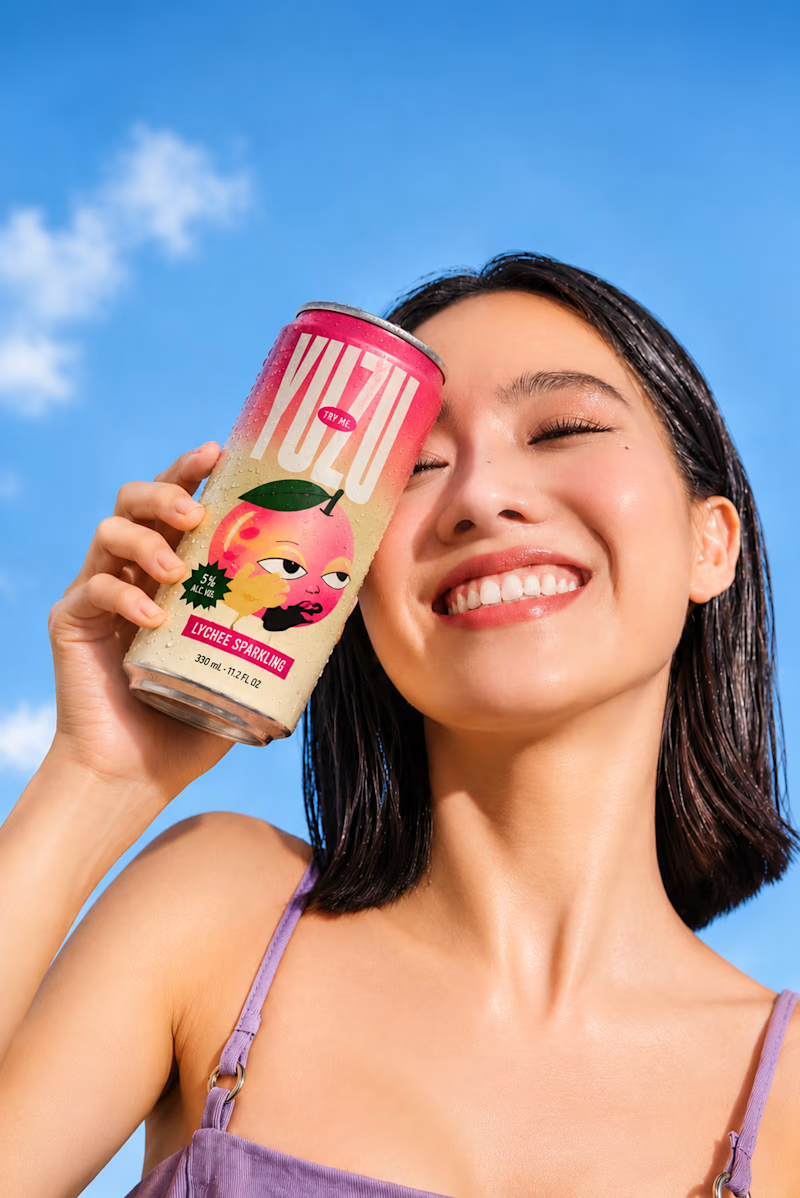
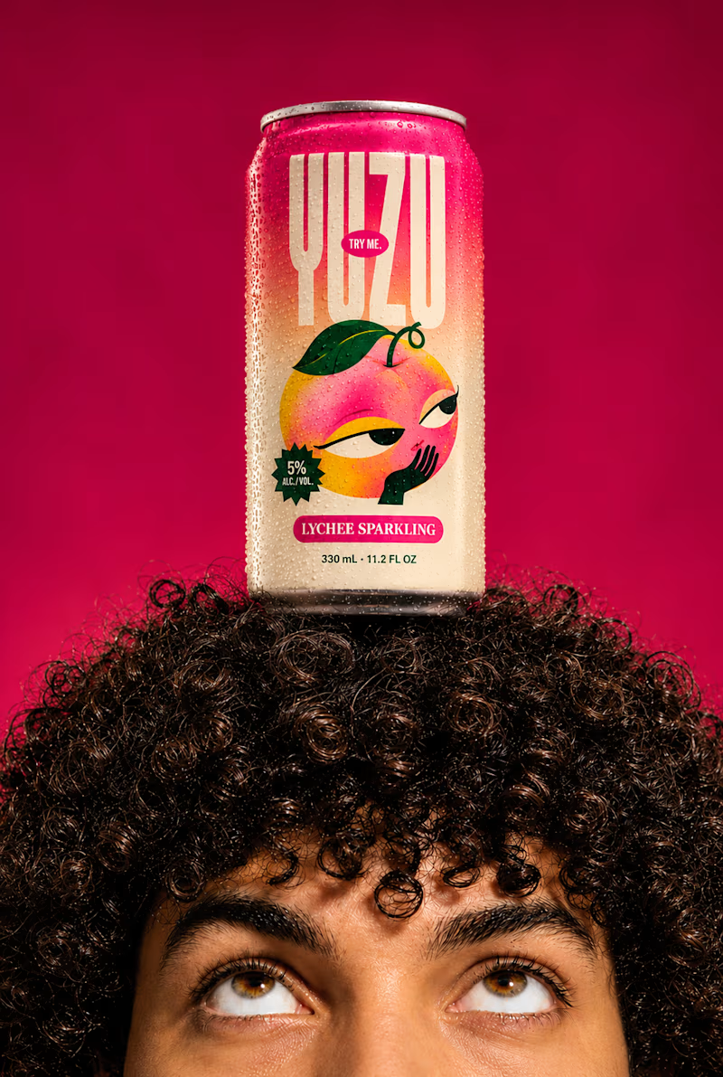
YUZU Flavor Face-Off — Which One Wins?
39 voted
48%
43 voted
52%
82 votes
Closed

Fresh & Bold gets my vote. That deep red makes the can impossible to miss, and the design lets the product do the talking instead of the lifestyle shot around it. Sweet & Playful is lovely photography, but on a shelf I think the red one is the one you'd actually pick up first.



Nice!

Motion Design & Art Direction
I design motion from the first composition to the final frame, combining typography, graphic design and animation.
This self-initiated series shows how I work with timing, weight and visual hierarchy. Letters stretch and rebound, geometric forms trigger chain reactions, and transitions carry one composition into the next. Each movement follows the same graphic language while giving each film a distinct pace.
My focus is on how a design behaves over time: where the eye goes, how an element arrives, and when a transition needs to hold or accelerate.


Nice!