The network for creativity
Join 1.25M professional creatives like you
Connect with clients, get discovered, and run your business 100% commission-free
Creatives on Contra have earned over $150M and we are just getting started
Back to feedPost
You don’t really understand your money until you see where it’s quietly disappearing.
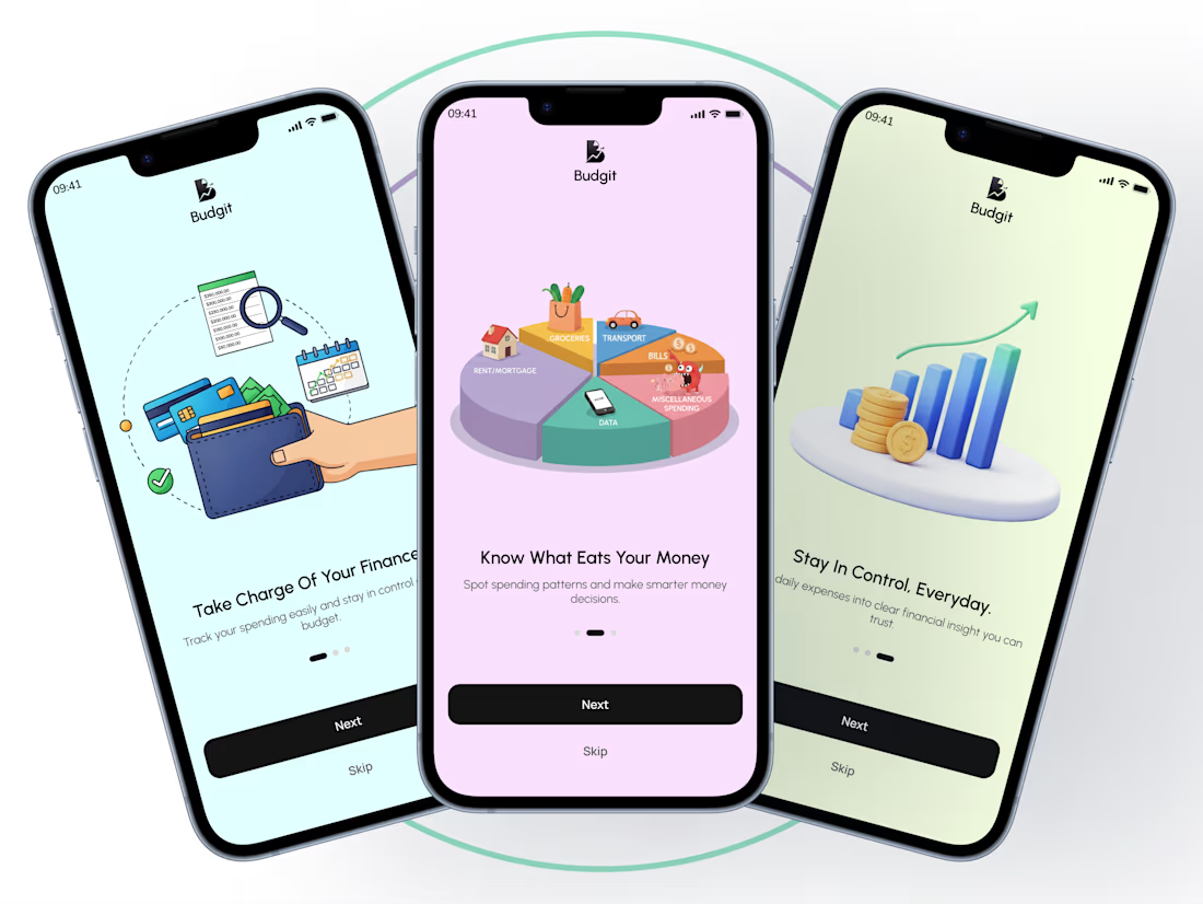
A few days ago I shared the onboarding screens for Budgit, a personal budget tracker designed to help users see their spending clearly.
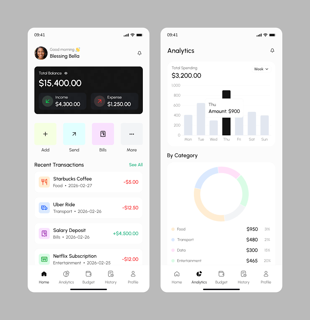
Today I worked on the home screen, the screen users return to every day.
The quick balance check before making a purchase.
The silent “hmm” when expenses are higher than expected.
It’s not just about tracking numbers, but helping users feel in control every single time they open the app.
Designing this part challenged me to think deeper:
How do you present financial information without making it feel heavy?
How do you simplify data without oversimplifying reality?
Because when people can clearly see their money, they make better decisions, not out of fear, but from confidence.
Good Design
Thank you
Love how you focus on clarity without fear. That’s the kind of design that turns numbers into confidence.
Thank you
Good job
Thank you
The network for creativity
Join 1.25M professional creatives like you
Connect with clients, get discovered, and run your business 100% commission-free
Creatives on Contra have earned over $150M and we are just getting started
Related posts
Most lending apps focus so much on functionality that they forget how stressful financial decisions already feel.
For Kraving, we designed a softer mobile experience with card-based UX, cleaner user flows, and subtle 3D animation that adds warmth without distracting from usability.
Built to make finance feel more approachable and human.
This was created with a design subscription from FANCY — and yes, we’re currently open to new projects.
Wow, great design!
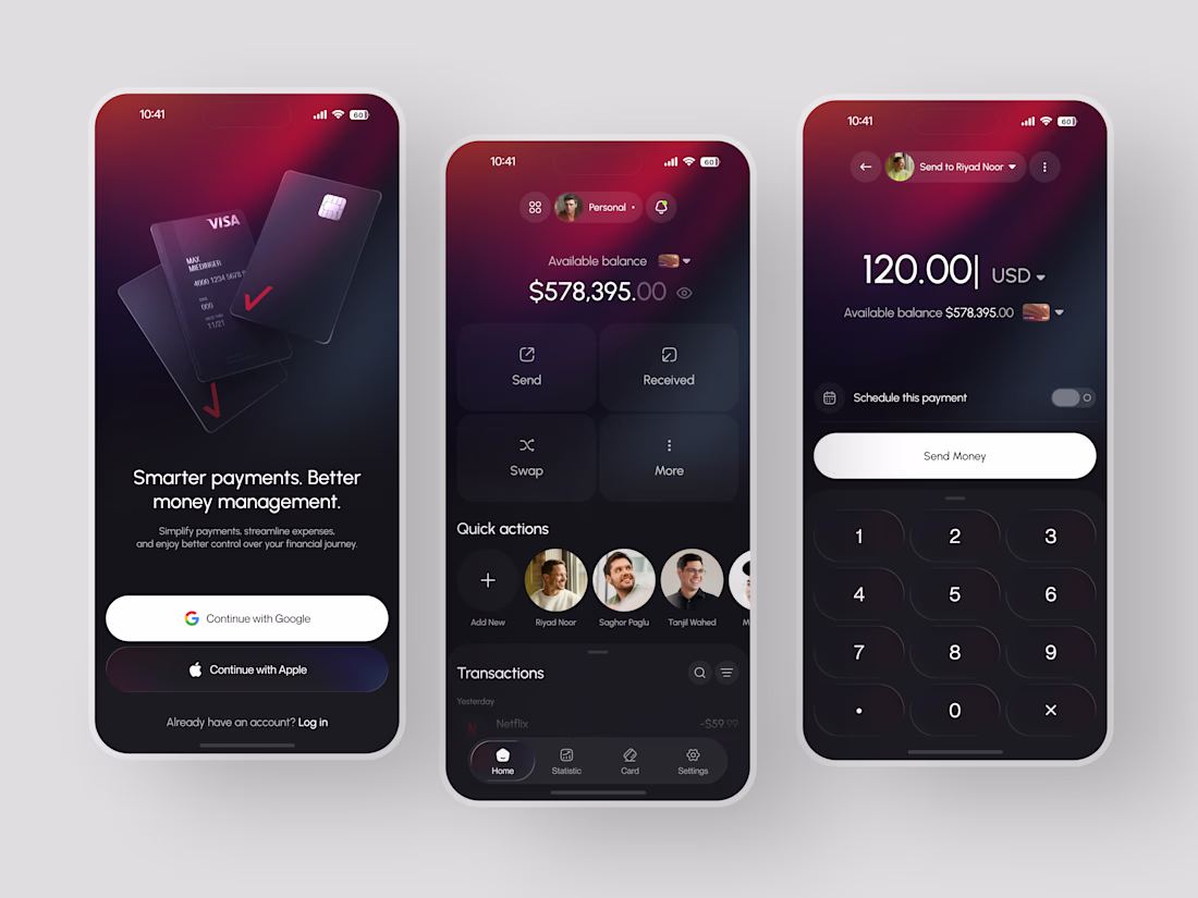
Smarter payments. Better money management. That wasn't just the onboarding tagline; it was the entire design brief.
That was the thinking behind this dark-mode fintech wallet a payment and money management experience designed to make sending, receiving, and swapping feel as premium as the card sitting in your physical wallet.
Most payment apps feel transactional in the worst possible way, with clinical white interfaces, generic typography, and a send flow that makes moving money feel like filling out a form.
This app built the premium experience into every screen.
A deep crimson and dark charcoal splash screen opening with floating VISA cards before a single account exists Google and Apple sign-in as the only friction between a user and their first session.
The home dashboard puts available balance front and center, Send, Received, Swap, and More in a clean four-quadrant action grid, quick access contacts Riyad Noor, Saghor Paglu, and Tanjil Wahed, and transaction history beginning immediately below.
The send flow closes the journey with zero hesitation recipient selected, amount entered on a dark numeric keypad, schedule payment toggle for future transfers, and a single Send Money CTA that makes the whole process feel considered rather than rushed.
Because money deserves an interface that takes it as seriously as the person sending it.
What's the one design detail that makes a dark UI fintech app feel trustworthy rather than just dramatic? 👇
Another masterpiece UI perfection.
Looks great 👌
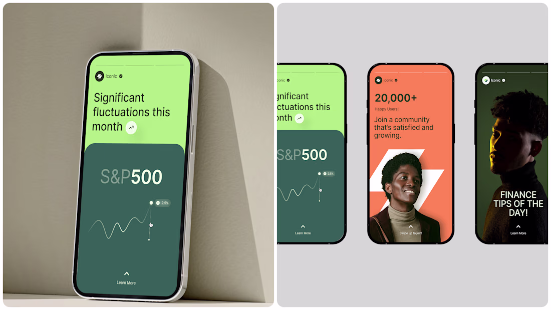
Trending
Claude
Claude has entered the design space. How are you using Claude Design?
Contra University
Learn from expert creatives how to earn more using next-gen AI tools.
creativeaiflow
Creative AI workflows are evolving. What tools do you use, and what are their strengths and weaknesses?
portfolioreview
The best portfolios tell a story, not just show a grid. Share yours for feedback.
freelancerlife
Freelancer life is wins, pivots, and everything in between. What’s yours right now?