Blessing Uwah
UI/UX Designer
Ready for work
Blessing is ready for their next project!
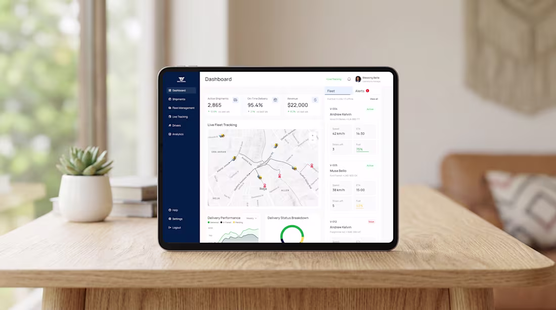
Happy new week
Wishing you more growth and opportunities this week. Explored a logistics dashboard
2
2
64
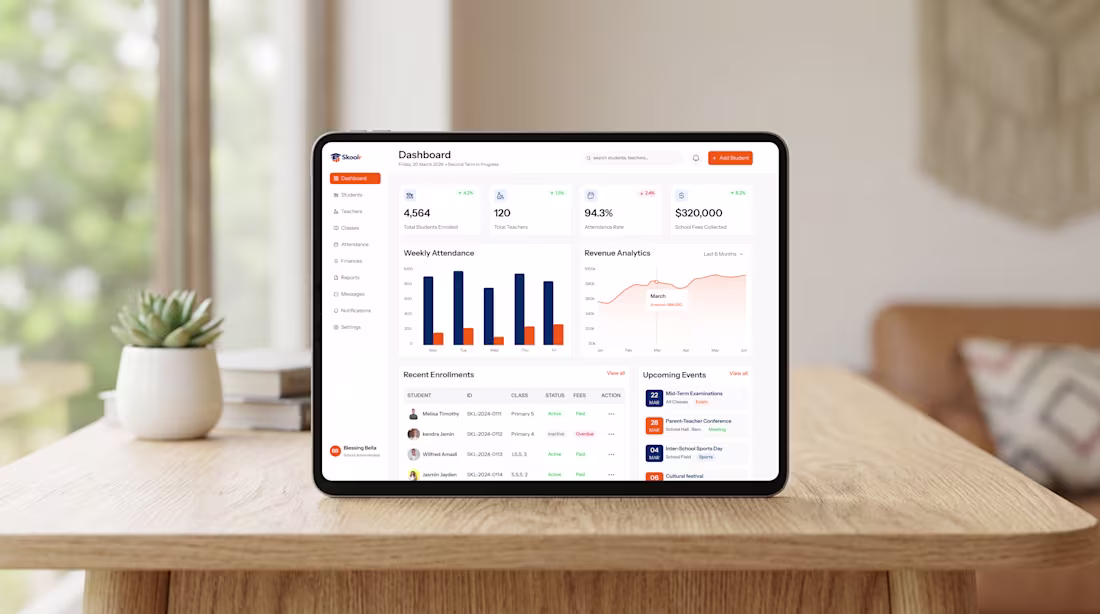
School admins deal with a lot - students, staff, payments, attendance, all at once.
I designed Skoolr, a School Admin Dashboard that brings everything into one clear, easy-to-manage system.
The main goal of Skoolr is to help administrators manage their schools better, from tracking student population to monitoring daily activities and overall performance.
2
33
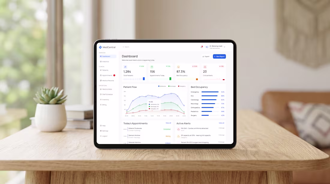
What if a single dashboard could help save a life in under 10 seconds?
That’s the thought that guided me while designing this Health Analytics Dashboard for MedCentral. It answers the most important questions instantly:
-How many patients are currently in care?
-What’s the bed occupancy across departments?
-Where are the critical alerts that need immediate action?
-How is patient flow trending throughout the day?
Every section is designed to help healthcare professionals:
-Prioritize faster
-Reduce errors
-Act with confidence
This isn’t just a dashboard.
It’s a tool that supports doctors, administrators, and hospital staff in making decisions that truly matter.
1
19
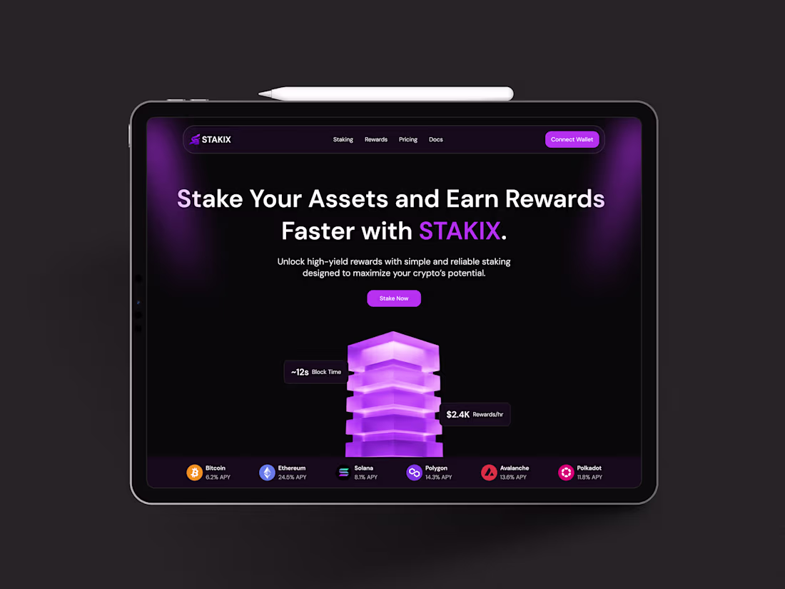
Crypto Staking Platform
Today I worked on designing a hero section for STAKIX, a platform that allows users to stake tokens and earn rewards.
I explored a clean, modern layout that balances trust (security) with growth (rewards), while keeping the experience simple, intuitive and easy to navigate.
Your feedback is welcome.
2
30
Happy new week
Hope your week kicks off with energy, creativity, and growth.
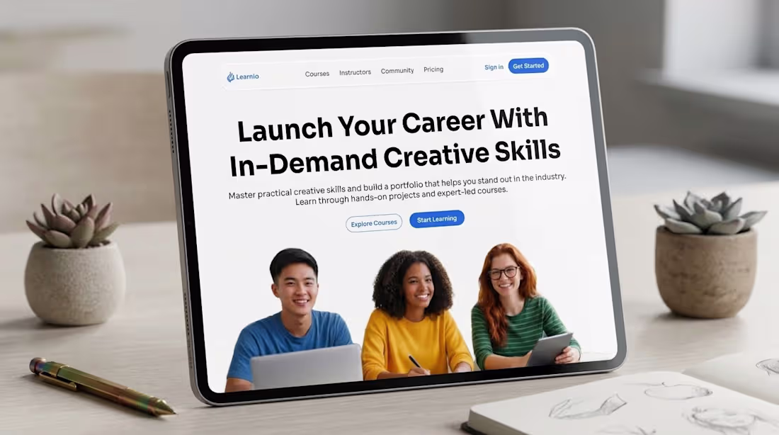
Starting the week with the hero section design for Learnio, a platform dedicated to helping learners develop in-demand creative skills. My focus was on creating a space where students feel excited, motivated, and confident to begin their journey.
I wanted this section to capture the energy and curiosity of learners, making the platform feel not only professional but also approachable and inspiring.
4
3
48
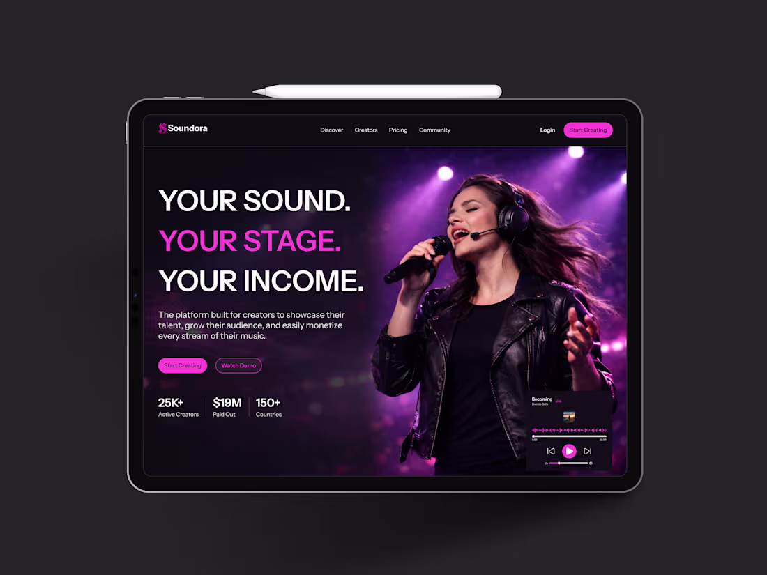
Designing for Music Creators
Worked on the hero section design for a music streaming platform for creators that helps them share their music and get rewarded for their talent.
6
4
49
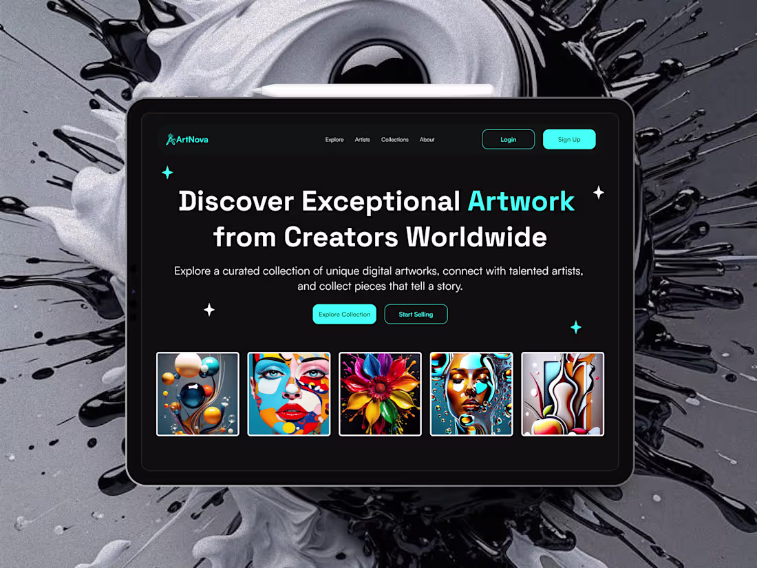
First impressions can make or break a product.
When someone lands on a digital art marketplace, they should instantly feel inspired to explore, collect, or even sell their own creations.
I designed a hero section concept for ArtNova, a digital art marketplace.
The goal was simple:
-Make it clear at first glance what the platform is about
-Guide users toward the core actions: exploring artworks or selling their own
-Keep the interface minimal and focused
As an artist or art lover, would you use this platform?
Happy new week!
2
4
66
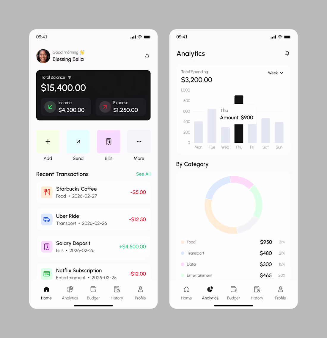
You don’t really understand your money until you see where it’s quietly disappearing.
A few days ago I shared the onboarding screens for Budgit, a personal budget tracker designed to help users see their spending clearly.
Today I worked on the home screen, the screen users return to every day.
The quick balance check before making a purchase.
The silent “hmm” when expenses are higher than expected.
It’s not just about tracking numbers, but helping users feel in control every single time they open the app.
Designing this part challenged me to think deeper:
How do you present financial information without making it feel heavy?
How do you simplify data without oversimplifying reality?
Because when people can clearly see their money, they make better decisions, not out of fear, but from confidence.
6
4
58
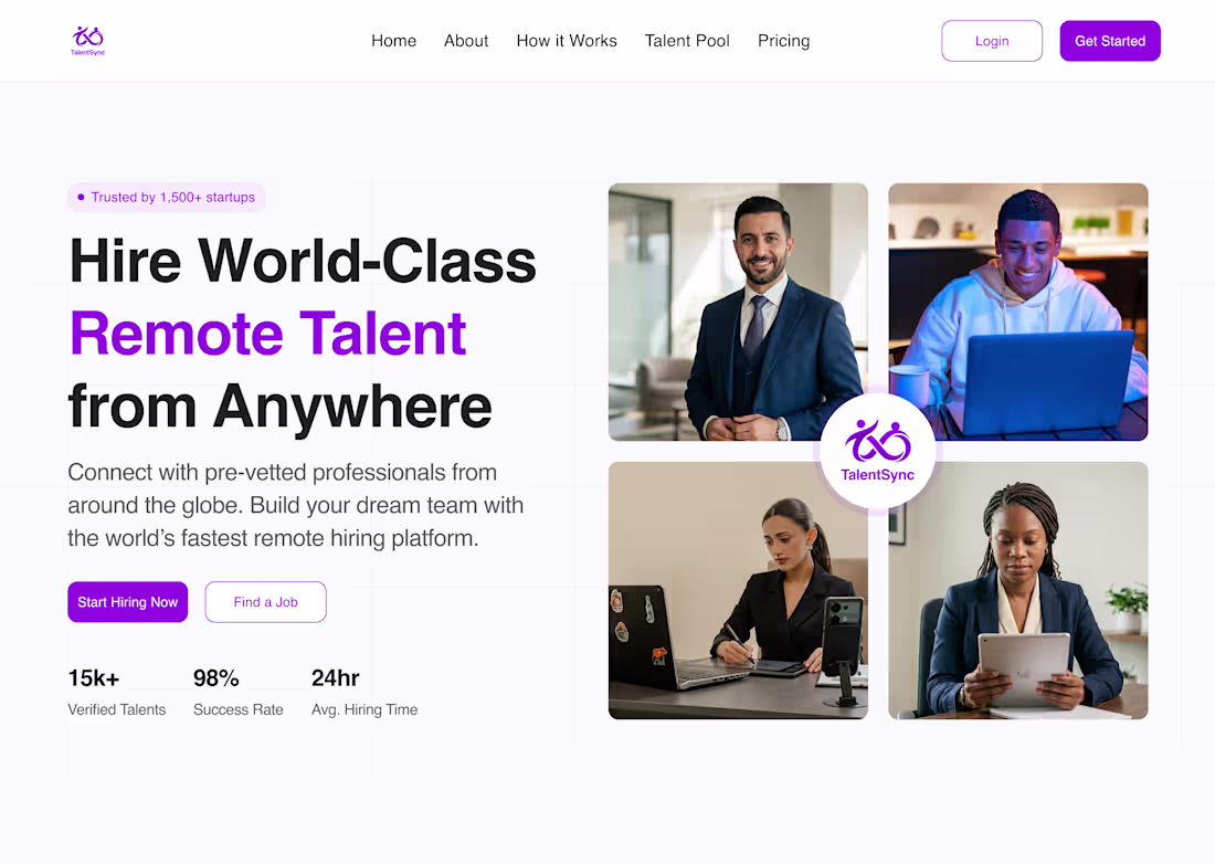
The future of work is global and the best talent is just a click away.
I worked on the hero section for TalentSync, a platform that helps startups hire top remote talent from anywhere in the world.
This design showcases founders connecting with talent worldwide and building teams that thrive, even across continents.
The goal is to make the hiring process easy and efficient for every startup.
2
23
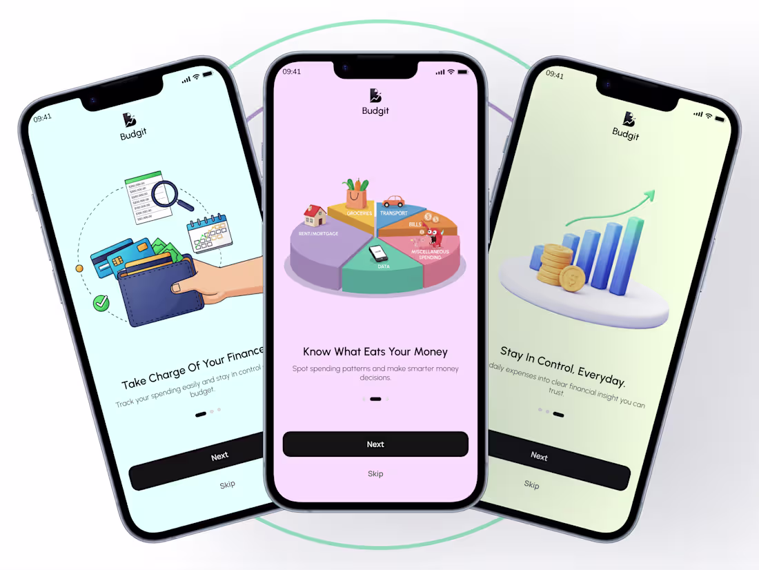
Most people don’t struggle with money because they’re careless.
They struggle because they don’t see it clearly.
I designed the onboarding screens for a personal budget tracker app called Budgit, to help users track expenses without feeling overwhelmed.
The goal of the onboarding was simple:
help users understand their spending and stay in control.
Had a lot of fun designing this.
2
20
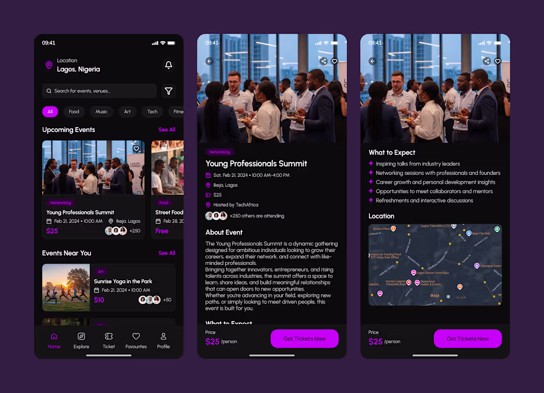
More UI screens from my event app
Just wrapped up the Home Screen design focused on clarity, discoverability, and making events easy to explore at a glance. Designed to help users quickly find what’s happening around them.
3
44
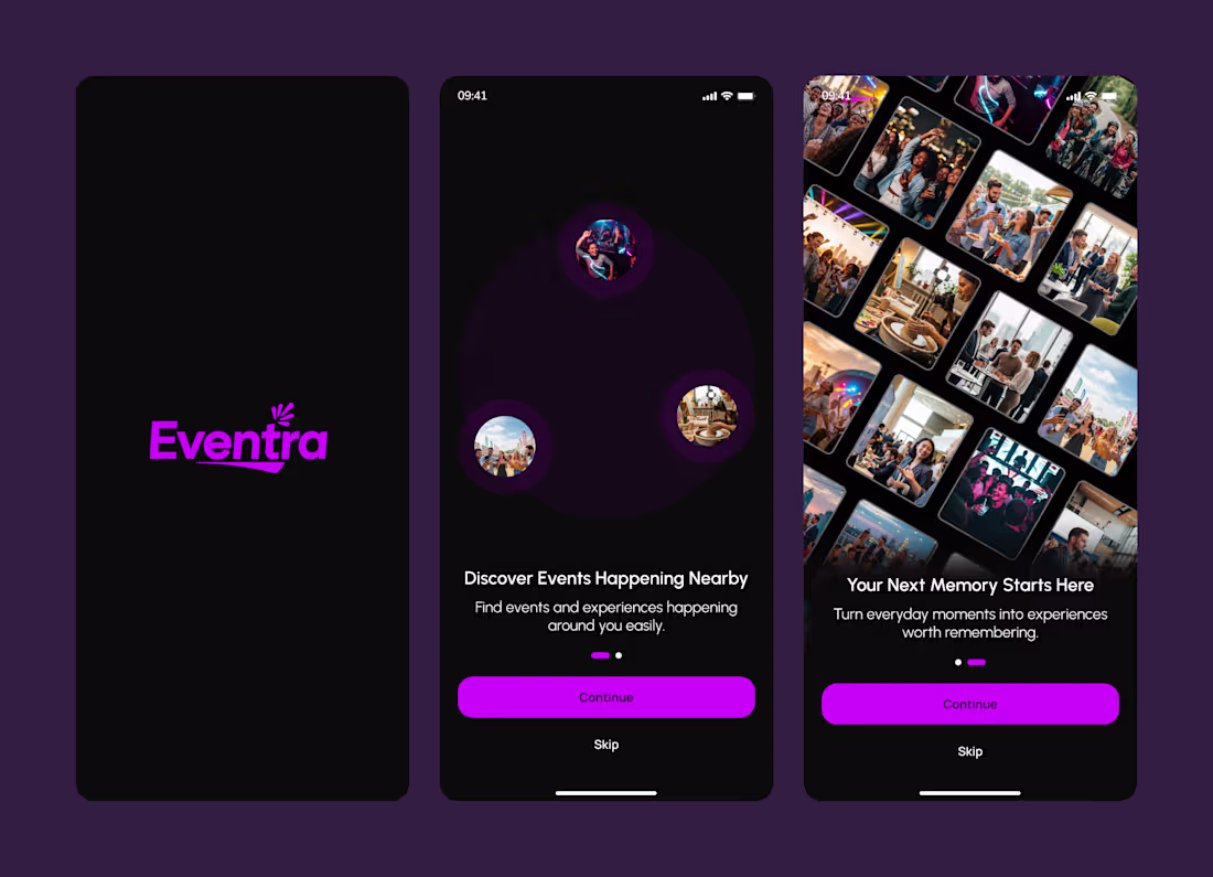
Onboarding experience for an Event Discovery App designed to communicate value instantly, reduce friction, and drive user activation from the first interaction.
2
39

ADII EVENT MANAGEMENT PLATFORM :: Behance
0
0
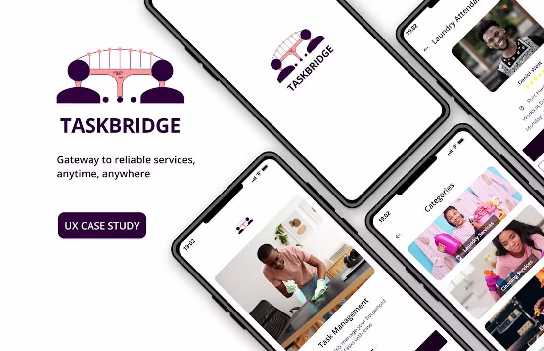
A UX Case Study of an App for Hiring a Service Provider :: Beha…
0
1
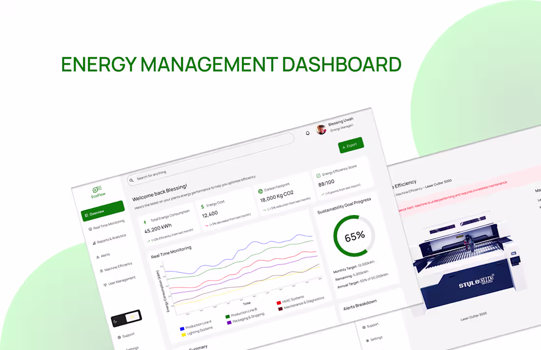
ECOFLOW ENERGY MANAGEMENT DASHBOARD :: Behance
0
2