The network for creativity
Join 1.25M professional creatives like you
Connect with clients, get discovered, and run your business 100% commission-free
Creatives on Contra have earned over $150M and we are just getting started
Back to feedPost

New branding case study now live.
Ora — Coffee Roasters
A brand designed not just around coffee, but around the space, the people, and the ideas that happen within it.
Built on contrast: structured yet expressive, functional yet fluid.
Would love your thoughts.

Thank you for the thoughtful feedback Yunus, I really appreciate it!
You're absolutely right that the distressed, sketch-style illustrations introduce a different visual tone. This contrast was intentional, aiming to introduce a more human layer. That said, I understand your...
The network for creativity
Join 1.25M professional creatives like you
Connect with clients, get discovered, and run your business 100% commission-free
Creatives on Contra have earned over $150M and we are just getting started


Related posts

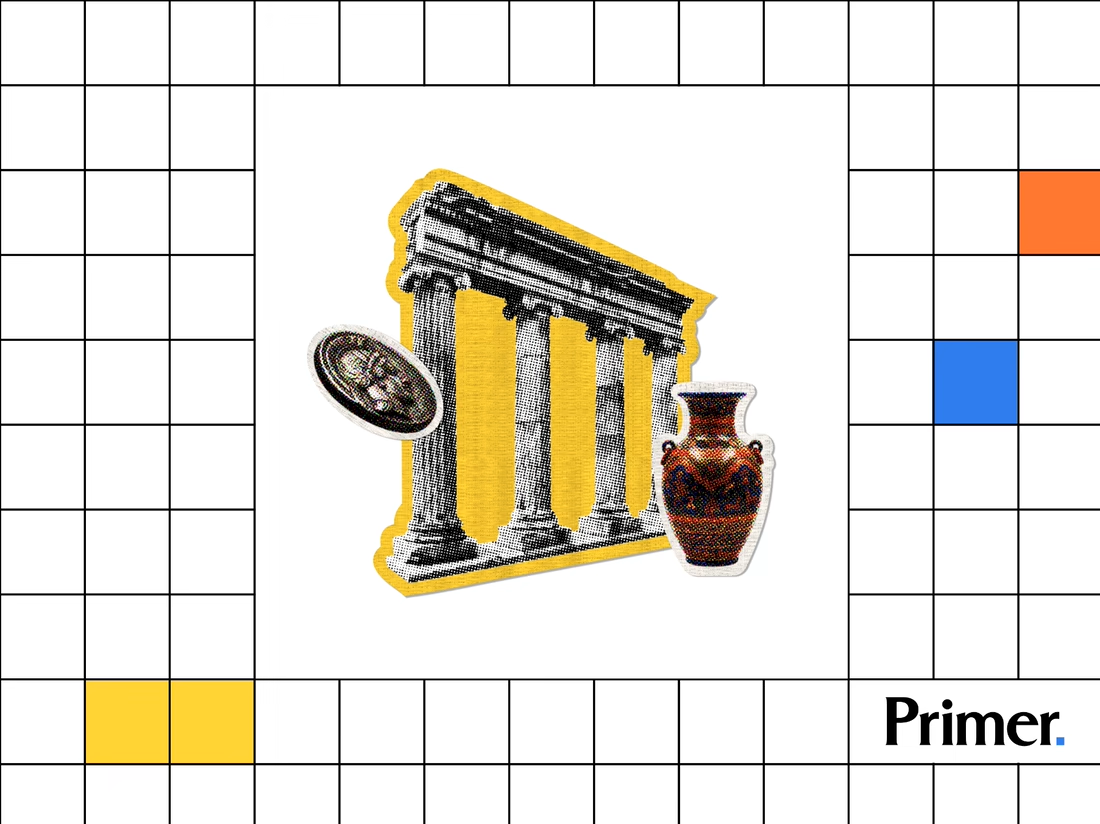
Just posted a new case study featuring the thumbnail artwork I designed for Primer.com. Check it out! 📚


Nice! Thumbnail artwork can make such a difference in how content catches attention. Looking forward to seeing how you approached this project!

Most assistants talk. I wanted one that answers.
Muted Winter: a voice assistant that replies in three words, shows what it is doing with six petals, and dims itself after midnight.
Case study live
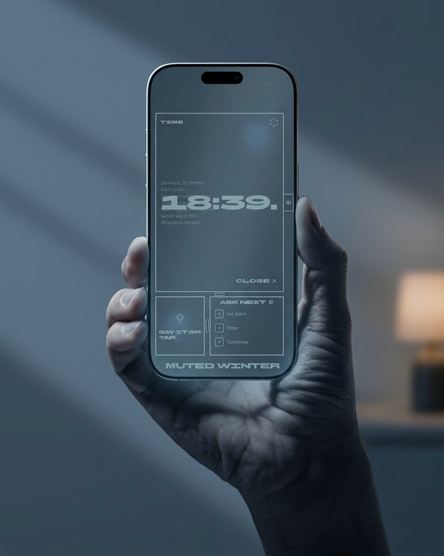
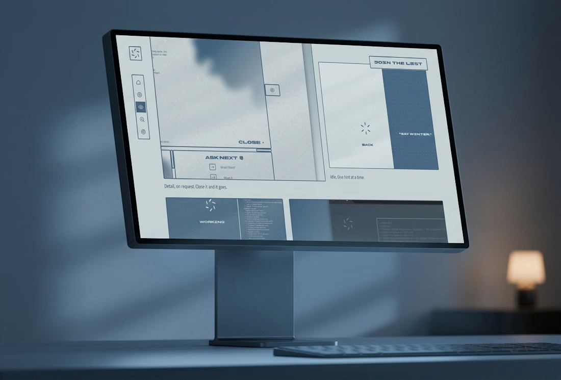

Three word replies is a smart constraint. The petals showing what it's doing is a nice touch.


The Bright Method newsletter just passed 1,000 subscribers on LinkedIn. Didn't expect that when I started it. Thanks to everyone reading.
Read this weeks issue on Linkedin: https://www.linkedin.com/pulse/your-site-said-3-6-7-8-daniel-bright-pvucc
linkedin.com
Your site said 3, 6, 7 and 8
In June, a founder I work with opened his visitor analytics on our call. Qualified enterprise buyers were landing on the site, reading, and leaving.