The network for creativity
Join 1.25M professional creatives like you
Connect with clients, get discovered, and run your business 100% commission-free
Creatives on Contra have earned over $150M and we are just getting started
Back to feedPost
FÈVE — Artisan Chocolate Packaging Direction
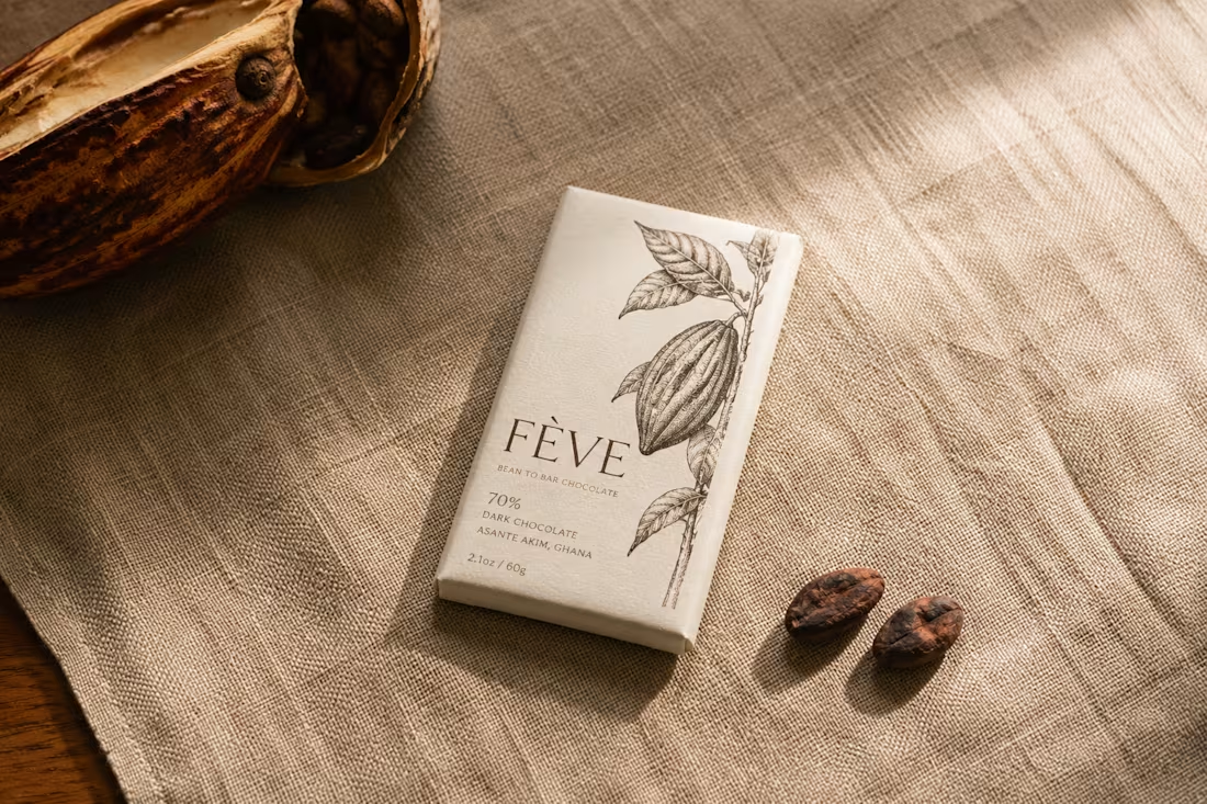
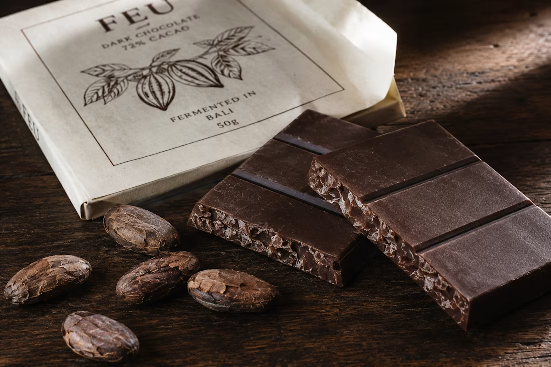
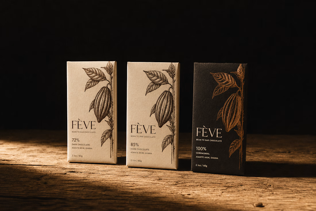
FÈVE is a packaging direction for a bean-to-bar chocolate brand built on a single refusal: to blend. One farm. One fermentation. One bar. The brief required packaging that could hold that integrity without performing it — design that is honest rather than clever.
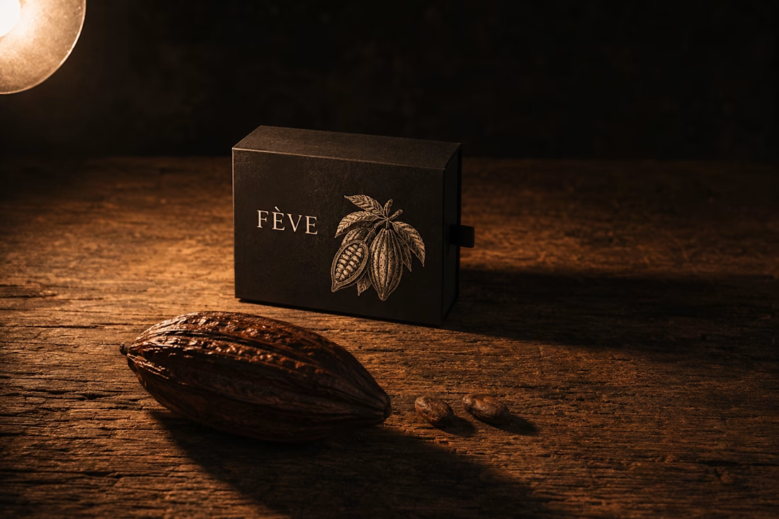
The mark is a botanical illustration of the cacao pod, drawn with the precision of an 18th-century natural history atlas. It is not decorative. It is a species record. The plant earns the shelf before the wordmark speaks.
The Atmosphere Lock across all five AI frames: Kodak Portra 400 in medium format, diffuse window light from the upper right, Karl Blossfeldt's specimen dignity married to Wolfgang Tillmans' material intimacy. The packaging materials — uncoated 300gsm ivory paper, two-colour offset in Pod brown and Coppice amber — are chosen because they age like the product they contain. They accumulate time honestly.
The color world runs on four tones extracted directly from the pod's lifecycle: Ferment black for the transformation, Pod brown for the fruit's exterior, Coppice amber for the dried and processed, Ivory for the pulp that started everything.
M N LOKESHWAR REDDY, Creative Director.

Link to the full project:
https://www.behance.net/gallery/249956439/FEVE-Artisan-Chocolate-Packaging-Direction
The network for creativity
Join 1.25M professional creatives like you
Connect with clients, get discovered, and run your business 100% commission-free
Creatives on Contra have earned over $150M and we are just getting started
Related posts


Dither and Particle UI representing Brain waves.
Card on the right are Gamma wave (30–100 Hz) state, with high-end Beta waves (12–30 Hz) mixed in.
Combined its rhythmic, synchronized electrical impulses generated by millions of neurons communicating simultaneously.




The formatting toolbar is the most opinionated rectangle in any writing app.
Every icon, tooltip delay, and shortcut hierarchy is a tiny argument about how you write. Here's how we settled ours for Blank Page.

This is very well thought out. You can clearly see both strategy and design working together.
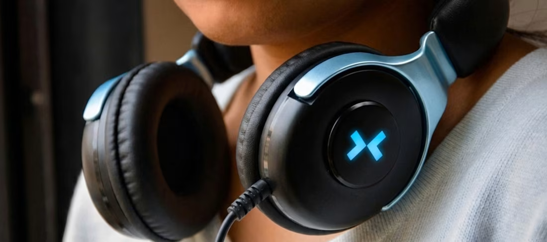
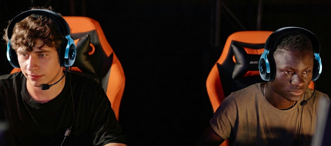
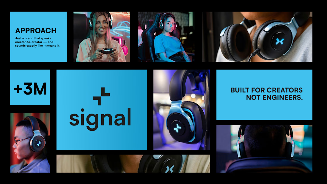
SIGNAL is a conceptual project focused on creating a premium gaming headset that bridges the gap between high-end industrial design and modern e-sports lifestyle. My goal was to create a brand identity that feels both professional and approachable, characterized by clean lines, custom alloy supports, and a distinctive, minimalist light branding.
Brand DesignProduct Design3D ModelingAdobe PhotoshopBlenderAdobe After Effectsfreelancerlifeproductdesignerportfolioreview



Brilliant work!



Trending

Claude
Claude has entered the design space. How are you using Claude Design?

Contra University
Learn from expert creatives how to earn more using next-gen AI tools.
creativeaiflow
Creative AI workflows are evolving. What tools do you use, and what are their strengths and weaknesses?
portfolioreview
The best portfolios tell a story, not just show a grid. Share yours for feedback.
freelancerlife
Freelancer life is wins, pivots, and everything in between. What’s yours right now?