The network for creativity
Join 1.25M professional creatives like you
Connect with clients, get discovered, and run your business 100% commission-free
Creatives on Contra have earned over $150M and we are just getting started
Back to feedPost

another clip from my new youtube video! 🎥
(link: https://youtu.be/XVF-oEVG0jM)
among other stages, i go pretty deep into the logo design process ✍️🗒️
a logo is never just about making something that looks good.
the thinking, positioning, and strategy behind it are what give the logo a reason to exist in the first place.
the visual is just the result of all that thinking.

The logos that hold up are the ones where every curve traces back to a positioning call, so when a client asks to just make it pop I can point to why the restraint is the strategy. Good to see someone showing the thinking and not just the final mark.

Nice to see the pen and paper stage get screen time, most process videos jump straight to the vector. In the full video, what part of the strategy work ended up changing the logo the most?
The network for creativity
Join 1.25M professional creatives like you
Connect with clients, get discovered, and run your business 100% commission-free
Creatives on Contra have earned over $150M and we are just getting started




Related posts

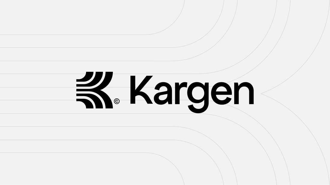
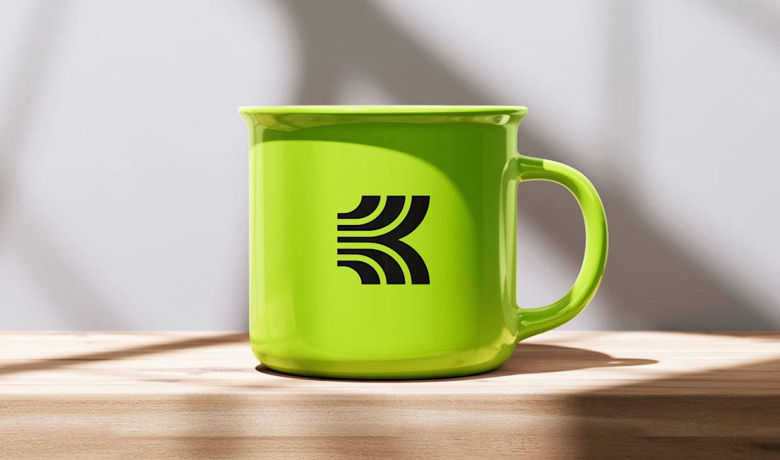
One of the directions I explored for Kargen. It didn't make the final cut, but I think it holds up. We decided to go totally different route.
Kargen is an AI that books freight on its own. It reads the email, quotes the load, and books the truck, day or night. The brand had to feel as fast as the product, but calm with the pace.





Sick 🔥

Brand Identity delivered by paper.


Love it🙌


A logo that only works in color isn't a logo. It's a poster.
Test it in plain white on a bad background before you fall in love with it.



This belongs on every design school wall. A logo that dies in single color is a costume, not an identity. The plain white on a bad background test has saved me from so many gradients I was briefly in love with.