The network for creativity
Join 1.25M professional creatives like you
Connect with clients, get discovered, and run your business 100% commission-free
Creatives on Contra have earned over $150M and we are just getting started
Back to feedPost
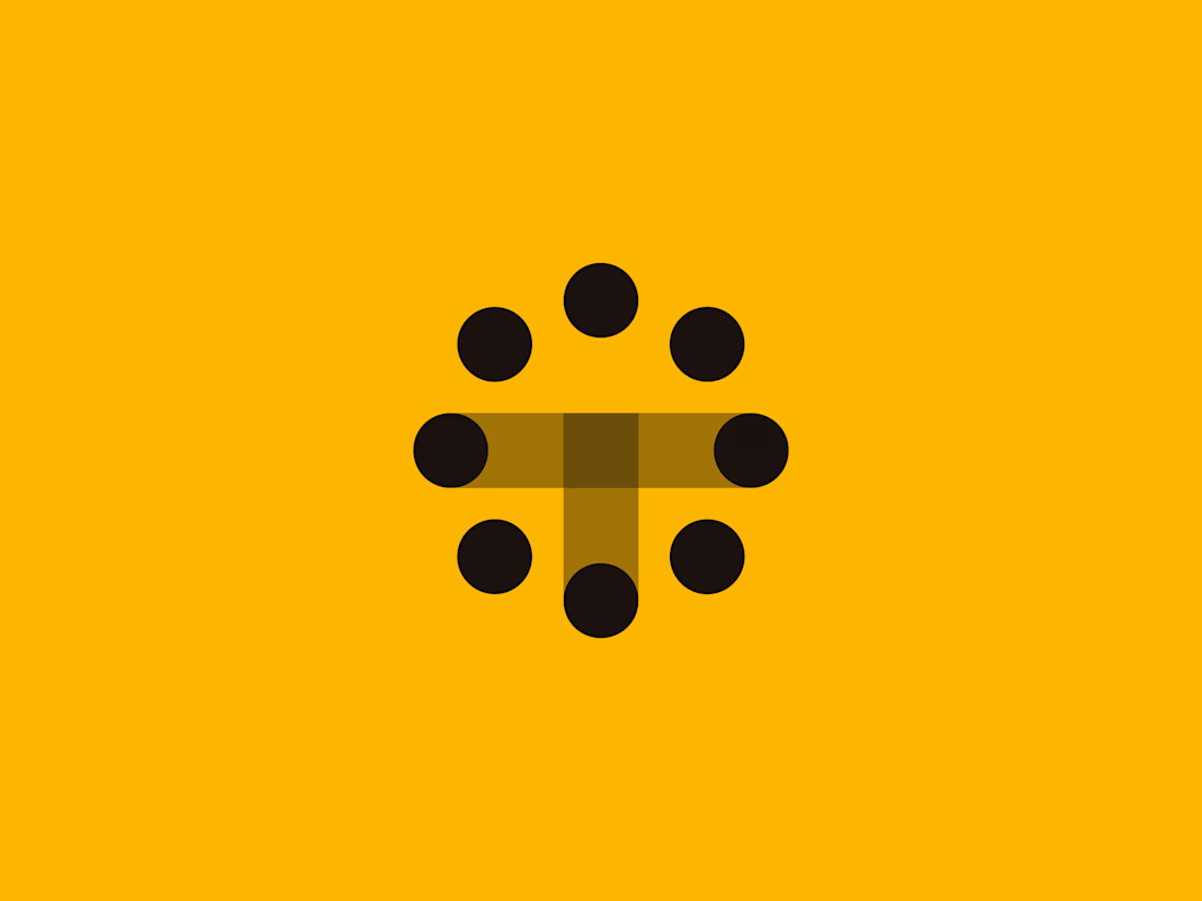
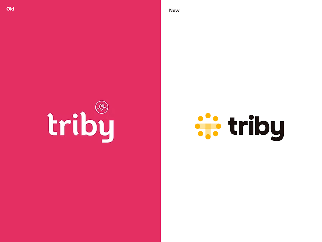
A new identity for Triby.
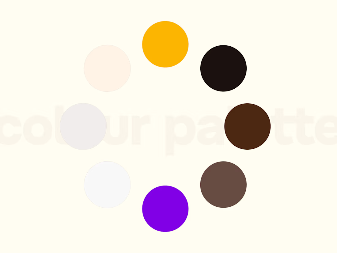
The previous identity didn’t quite match the brand behind it, so we rebuilt it. A warmer colour palette, friendlier typography and a more approachable visual language, designed around connection, inclusivity and trust.


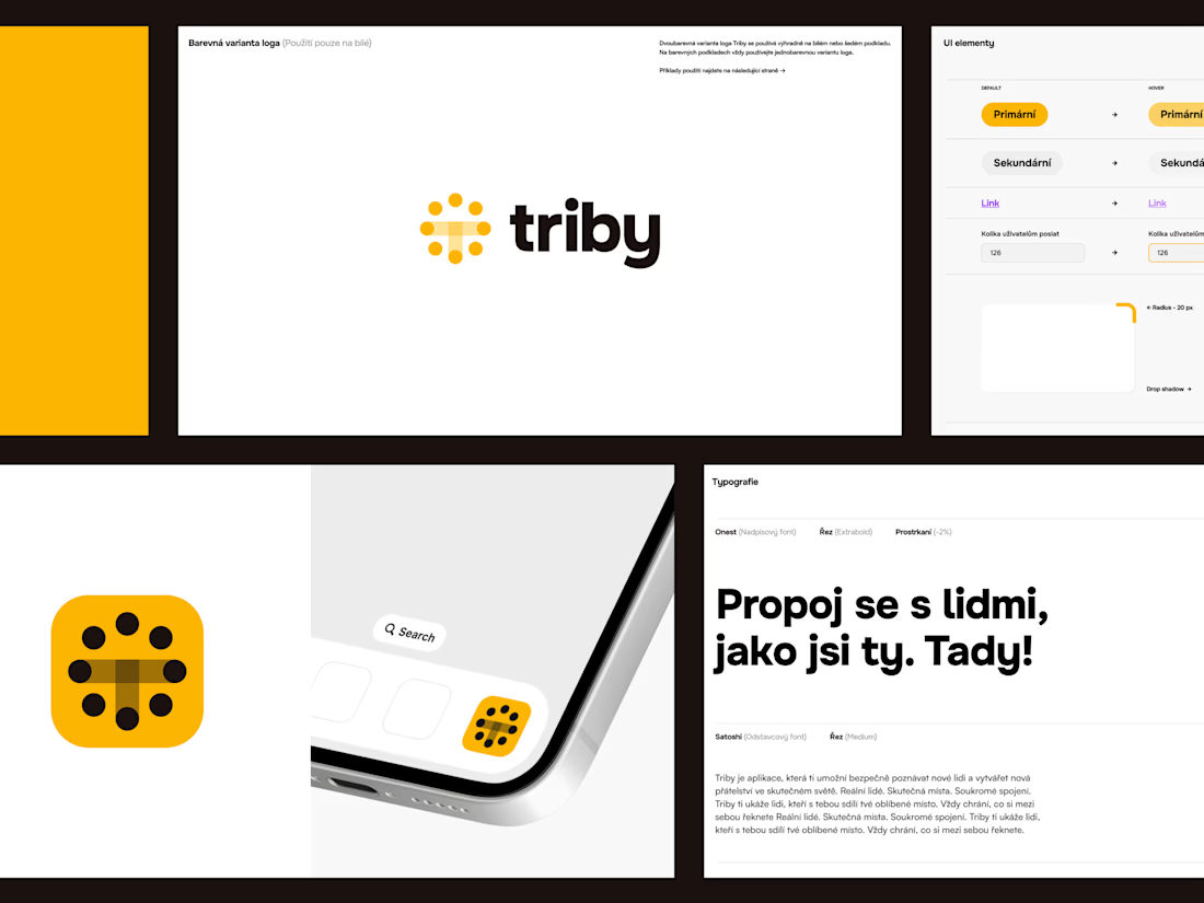
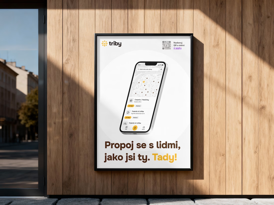

A rebrand where the old identity isn't broken, only wrong for the company behind it, is the hardest kind to get signed off — there's no obvious failure to point at. What made the case in the end: customer reaction, or the old system falling apart once it hit new channels?

Well, the founders knew that the old identity wasn’t communicating the brand values or what the brand was all about very well. They were also using pink as the main colour, and customers often thought Triby was a dating app. Visually, they wanted something warmer, more playful...
The network for creativity
Join 1.25M professional creatives like you
Connect with clients, get discovered, and run your business 100% commission-free
Creatives on Contra have earned over $150M and we are just getting started







Related posts

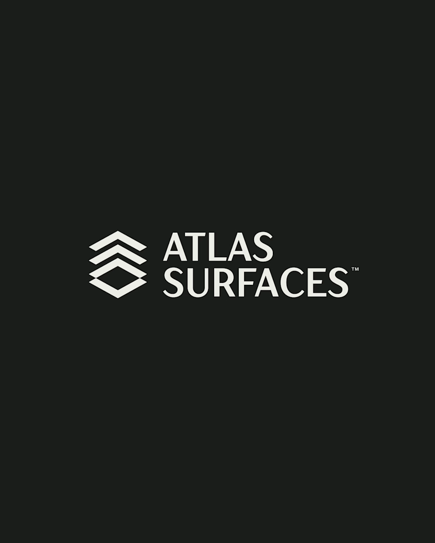
A closer look at Atlas Surfaces, from the final logo to the structure behind its design.
Brand identity developed in collaboration with Pedro Lopes (Griffo).

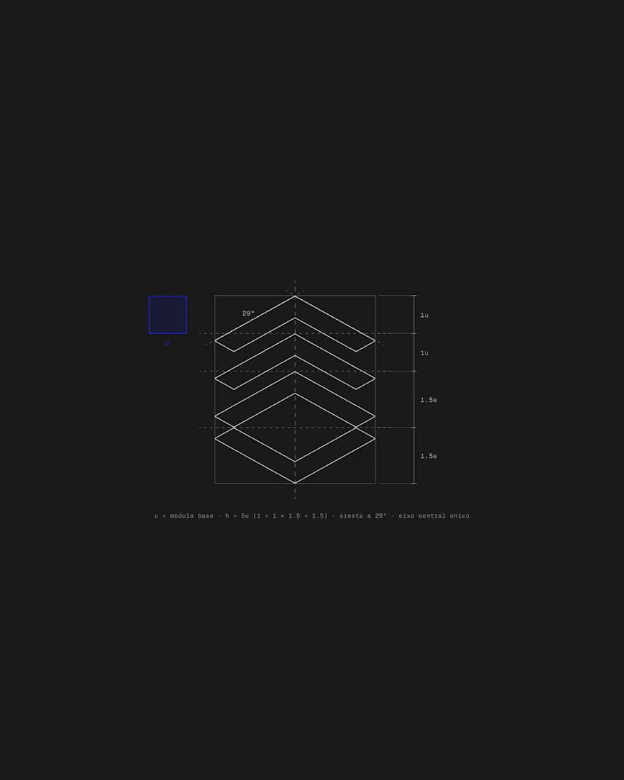
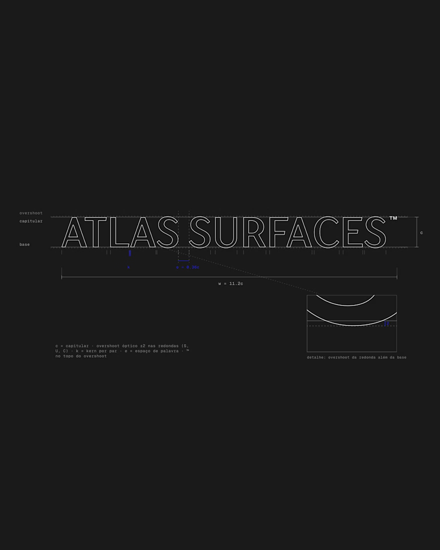
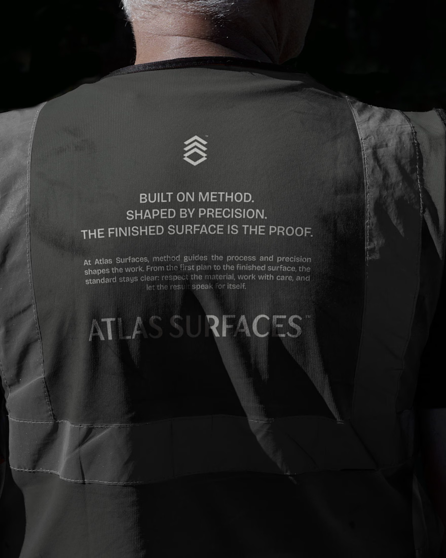


the structure breakdown is more interesting than the final mark tbh

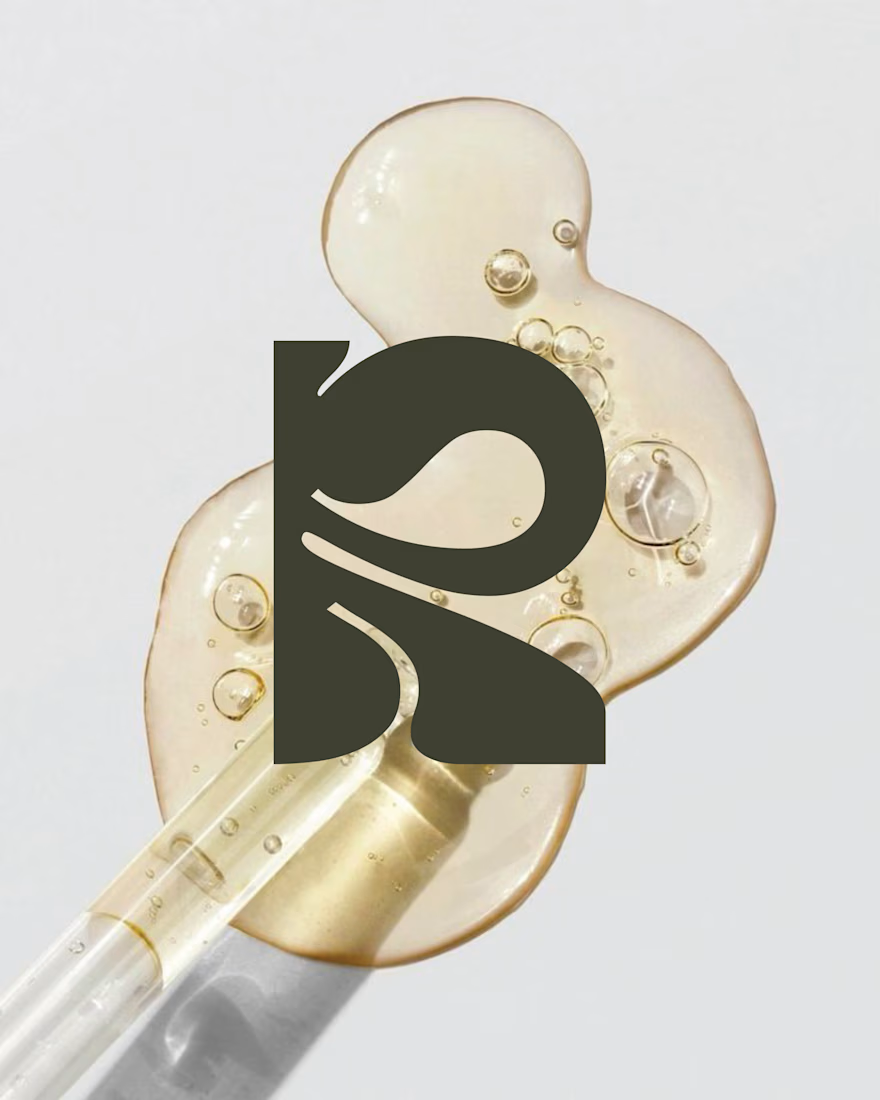
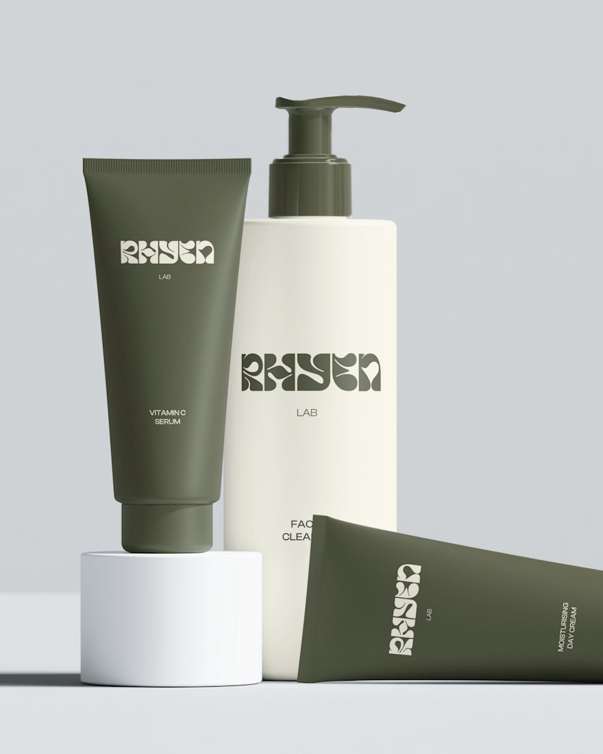
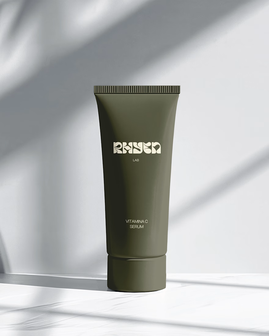
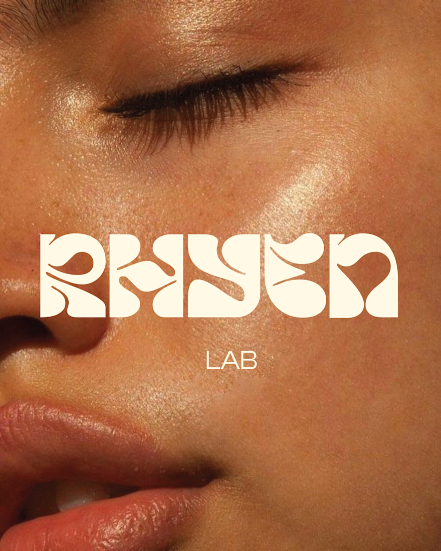
Rhyen Lab: Brand Identity & Packaging for a Skincare Brand
Rhyen Lab is a skincare brand built around science-backed formulas and a sensorial, human approach to beauty. The challenge was to create an identity that feels clinical enough to be trusted, yet warm and expressive enough to stand out in a crowded market.
I designed a custom wordmark with fluid, organic letterforms that echo the texture of serums and oils, paired with a bold monogram “R” for compact applications. A palette of deep olive green and soft cream keeps the brand grounded, natural and premium, while macro photography of skin and product textures reinforces the sensorial tone.
The system was applied across packaging for the Vitamin C Serum, Facial Cleanser and Moisturising Day Cream, ensuring consistency across tubes and bottles.
Deliverables: Logo & monogram · Visual identity · Color palette · Packaging design · Art direction

Ramen Brand Identity
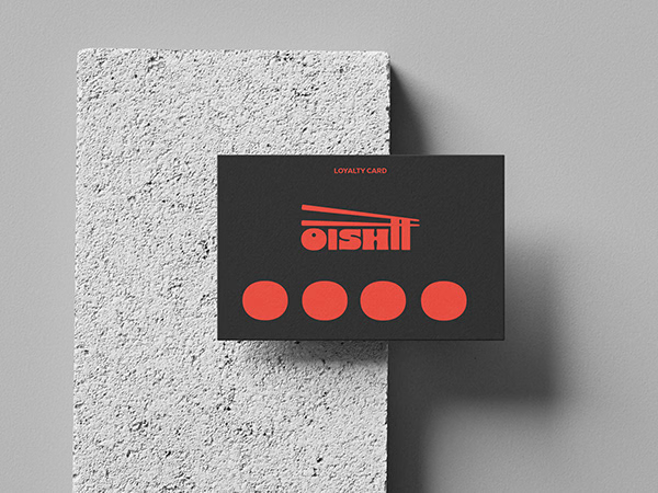
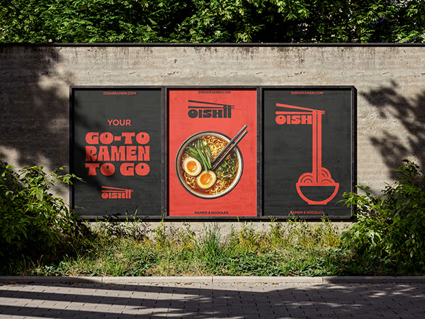
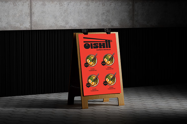
Oishii is a self-initiated branding project exploring the visual identity of a modern ramen brand. The concept combines Japanese-inspired aesthetics with a contemporary visual approach, creating a distinctive and cohesive identity across brand applications.
The project explores visual direction, typography, colour, and brand elements to build a memorable identity for a food brand.

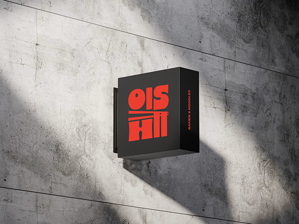


Love the mix of Japanese-inspired style and modern branding. The identity feels cohesive and memorable.