The network for creativity
Join 1.25M professional creatives like you
Connect with clients, get discovered, and run your business 100% commission-free
Creatives on Contra have earned over $150M and we are just getting started
Back to feedPost

AI won't replace designers. But it's changing what great design means.
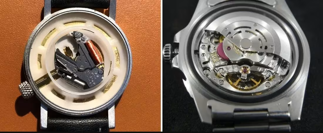
Think about two watches.
One runs on a battery. Machine made. Perfectly accurate. Costs very little.
The other no battery. Just gears and springs, assembled by human hands. Loses a few seconds every day. A Rolex. A Patek Philippe. Sells for hundreds of thousands.
The imperfection is not the flaw. The imperfection is the point.
Design in 2026 is facing the exact same moment. AI-generated visuals are fast, perfect, and everywhere. But brands built with human creativity and artistic judgment? Those are the mechanical watches of the design world.
Here's my design process:
Research, AI assisted:
Competitor analysis, human psychology, market trends, audience behavior, visual references. AI handles the heavy information lifting so I can walk into every project fully informed.
Execution, human hands only:
The creative decisions, the cultural nuance, the artistic judgment, the craft. Every design I deliver has been thought through, felt, and made by a person not generated by a prompt.
Because anyone can generate. Not everyone can create.
Are you building a battery-powered brand or a mechanical one? 👇
The network for creativity
Join 1.25M professional creatives like you
Connect with clients, get discovered, and run your business 100% commission-free
Creatives on Contra have earned over $150M and we are just getting started











Related posts

🚀 Instead of just applying for a job, I decided to build something first.
I recently came across an opportunity from ORDRE, a company looking for an AI Product UX Designer to help create a better AI image-generation experience for luxury fashion brands.
The role caught my attention, so I thought, why not demonstrate what I can actually build?
💻 I created an interactive AI Studio website demo inspired by their requirements.
My goal was to bring together luxury-inspired design, practical workflows, and a clean user experience.
Here's what I focused on:
✦ A premium, minimal interface for luxury fashion brands
✦ AI-powered creative workflow concepts
✦ Virtual model casting and product imagery experiences
✦ Image review and approval interfaces
✦ A dashboard that makes complex tasks feel simple
🌐 Explore my live demo:
https://yashvinodbhaipatel.github.io/ordre-ai-studio-demo/dist/
🎥 I've also attached a video walkthrough showing the design and experience.
This is an independent concept demo, not ORDRE's official platform.
I don't know if I'll get hired for this opportunity, but I believe showing your work is more powerful than simply talking about your skills.
I'm actively looking for remote opportunities and freelance projects in web development, UI/UX implementation, and AI-powered web applications.
If you're a founder, startup, agency, or business looking for someone who takes initiative and builds real solutions, I'd love to connect.
💬 I'd genuinely appreciate your feedback!
How does the design look? Is the experience intuitive? What would you improve?
And if you're hiring, I'd be happy to discuss how I can bring the same energy to your project.
#WebDevelopment #UIUXDesign #AI #ReactJS #ProductDesign #OpenToWork #Contra


For image review, keeping feedback attached to a specific variant can prevent approval decisions from getting lost in chat. Do reviewers compare versions side by side before approving?

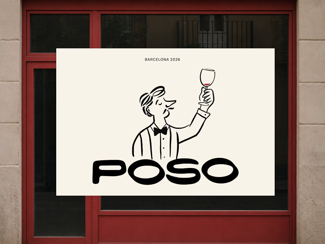
A couple months ago I shared some thoughts on hand drawn logos, with a few images from a project I worked on. It wasn’t a finished case study and I didn’t even consider it among my strongest work.
It now has more than 50k views, 84 goats and 300 likes.
I’m very intentional about what I share and when, so this one caught me off guard. But it reminded me that we never really know how our work is going to land for someone else. As long as it’s thoughtful, sharing it is better than nothing. Keep going, keep perfecting your craft and keep showing your point of view.
And thank you to everyone who interacts and appreciates what I share. It never goes unnoticed. And of course to Contra for building a space where this kind of work finds its people.
I do wonder though, did this get traction because it was hand drawn in an era where everything is AI generated? Curious what you think.

lovelyy absolutely lovee it


AI Ops first is a bold thesis to lead with. The dark cinematic teaser with the floating refund resolver card sells the ambition without giving everything away.