The network for creativity
Join 1.25M professional creatives like you
Connect with clients, get discovered, and run your business 100% commission-free
Creatives on Contra have earned over $150M and we are just getting started
Back to feedPost

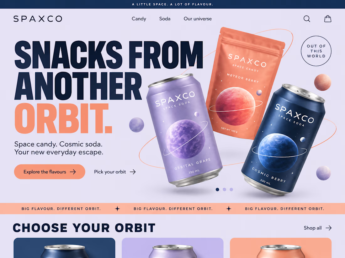
Nimbus is a modern CRM landing page exploration created to streamline the way teams manage customers, projects, and daily operations.
The network for creativity
Join 1.25M professional creatives like you
Connect with clients, get discovered, and run your business 100% commission-free
Creatives on Contra have earned over $150M and we are just getting started



Related posts

First impressions happen in seconds. We made them count.
A landing page should do more than look good. It should tell a story, build trust, and make the next step feel natural.
We brought together bold visuals, thoughtful layouts, and clear messaging to create an experience that keeps visitors engaged from the first scroll to the final click.
Good design catches the eye. Great design gives people a reason to stay.
What's your next big idea?


Halden - Landing Page Concepts
Halden sells to grid operators, and there were two good ways to pitch it: tell them what's coming, or show them everything happening now. Rather than pick one on instinct, I designed the landing page as an A/B test so real traffic decides.
The two pages share one 12-column grid, the same section order, type system and components. Each variant changes only its message, its hero visual and its light color, so any difference in demo requests comes from the pitch and not the layout.
The work was building a system flexible enough to carry two different stories without either one feeling like the backup version.
Forecasting (act before demand spikes) vs metering (see and bill every kilowatt)
Primary metric: Demo requests from the hero CTA
4 voted
57%
3 voted
43%
7 votes
Closed

I'd pick Forecasting. "From meter reading to early action" tells a grid operator what they get in one line. Did you write both hero lines before designing the visuals?

🚀 Old vs. New - Which Website Experience Wins?
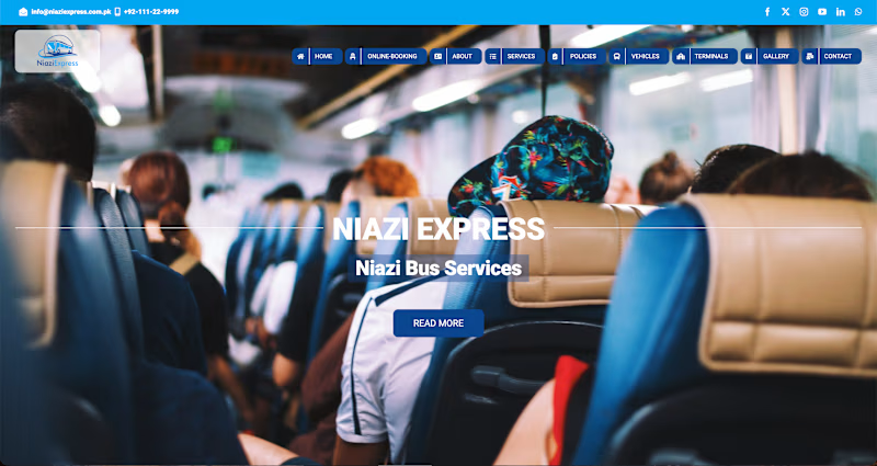
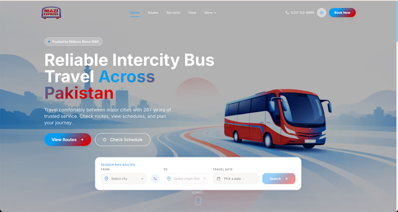
I'm currently leading the website modernization and booking experience redesign for Niazi Express, transforming a traditional transport website into a modern, user-focused digital platform.
The redesign focuses on:
🎨 Modern UI/UX and stronger visual hierarchy
🚌 Simplified route discovery and a guided booking experience
⚡ Cleaner navigation and more intuitive interactions
💻 Business-focused web development
Now it's your turn! 👇
🅰️ Original Website
🅱️ Redesigned Experience
Which one creates a better first impression, and why?
🚧 Work in progress - your feedback is welcome!
0 voted
0%
2 voted
100%
2 votes
Closed

The booking focus makes sense.