The network for creativity
Join 1.25M professional creatives like you
Connect with clients, get discovered, and run your business 100% commission-free
Creatives on Contra have earned over $150M and we are just getting started
Back to feedPost
Taste Test
🚀 Old vs. New - Which Website Experience Wins?
I'm currently leading the website modernization and booking experience redesign for Niazi Express, transforming a traditional transport website into a modern, user-focused digital platform.
The redesign focuses on:
🎨 Modern UI/UX and stronger visual hierarchy
🚌 Simplified route discovery and a guided booking experience
⚡ Cleaner navigation and more intuitive interactions
💻 Business-focused web development
Now it's your turn! 👇
🅰️ Original Website
🅱️ Redesigned Experience
Which one creates a better first impression, and why?
🚧 Work in progress - your feedback is welcome!
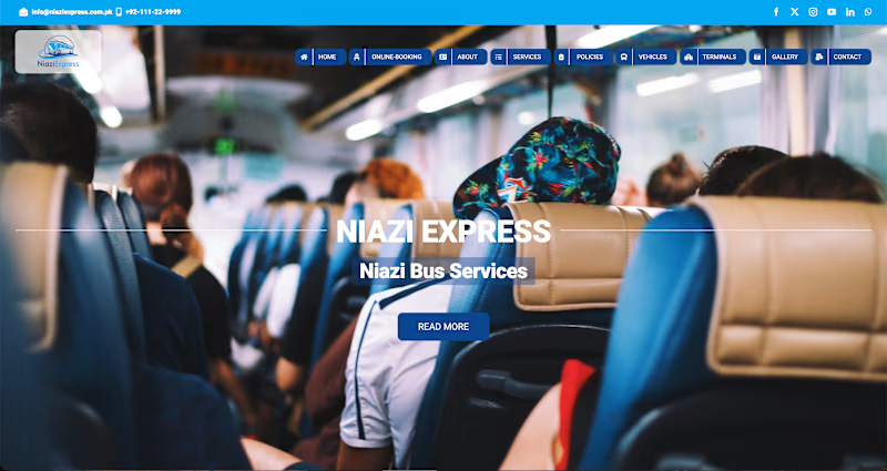
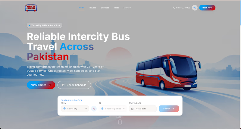
2 votes
Ends in 8h

Redesigned wins the first impression: the headline says what you sell, the bus shows it, and the booking bar sits right below. The current photo is warm but hides the main action. Is the booking search the first thing on mobile?

Thanks,Ivan!
Appreciate the thoughtful feedback. Yes, the booking search is directly accessible on mobile, just below the hero content, with a prominent “Book Now” CTA in the header.
I've attached the mobile preview for context. Would love your perspective on the placement from a UX and conversion standpoint!
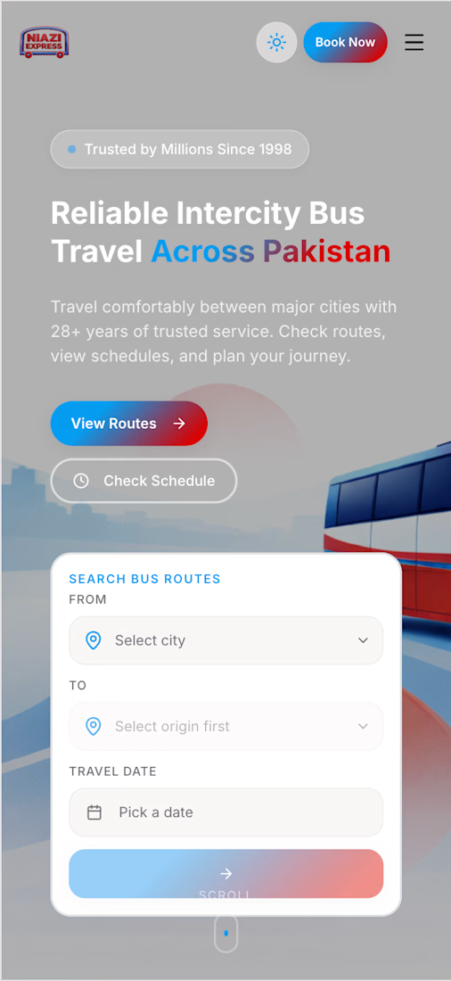

The booking focus makes sense.
Thanks, Vansita! The goal is to make booking feel more intuitive, with fewer distractions and a clearer journey from route selection to payment. Appreciate your feedback! 🙌
The network for creativity
Join 1.25M professional creatives like you
Connect with clients, get discovered, and run your business 100% commission-free
Creatives on Contra have earned over $150M and we are just getting started



Related posts


We are testing two ways to browse a large template library.
Load More
Users initially see 9 cards. After clicking the button, 9 more are added while the previous results remain visible. Browsing feels continuous, but the page gradually becomes longer.
Pagination
The catalog is divided into numbered groups. When users select the next page, the current 9 cards are replaced with a new set. They can jump to a specific part of the catalog and easily return to where they were.
Load More creates a smoother browsing experience, while pagination offers greater control.
Which option would you choose for a template library?

17 voted
68%
8 voted
32%
25 votes
Closed

Load more

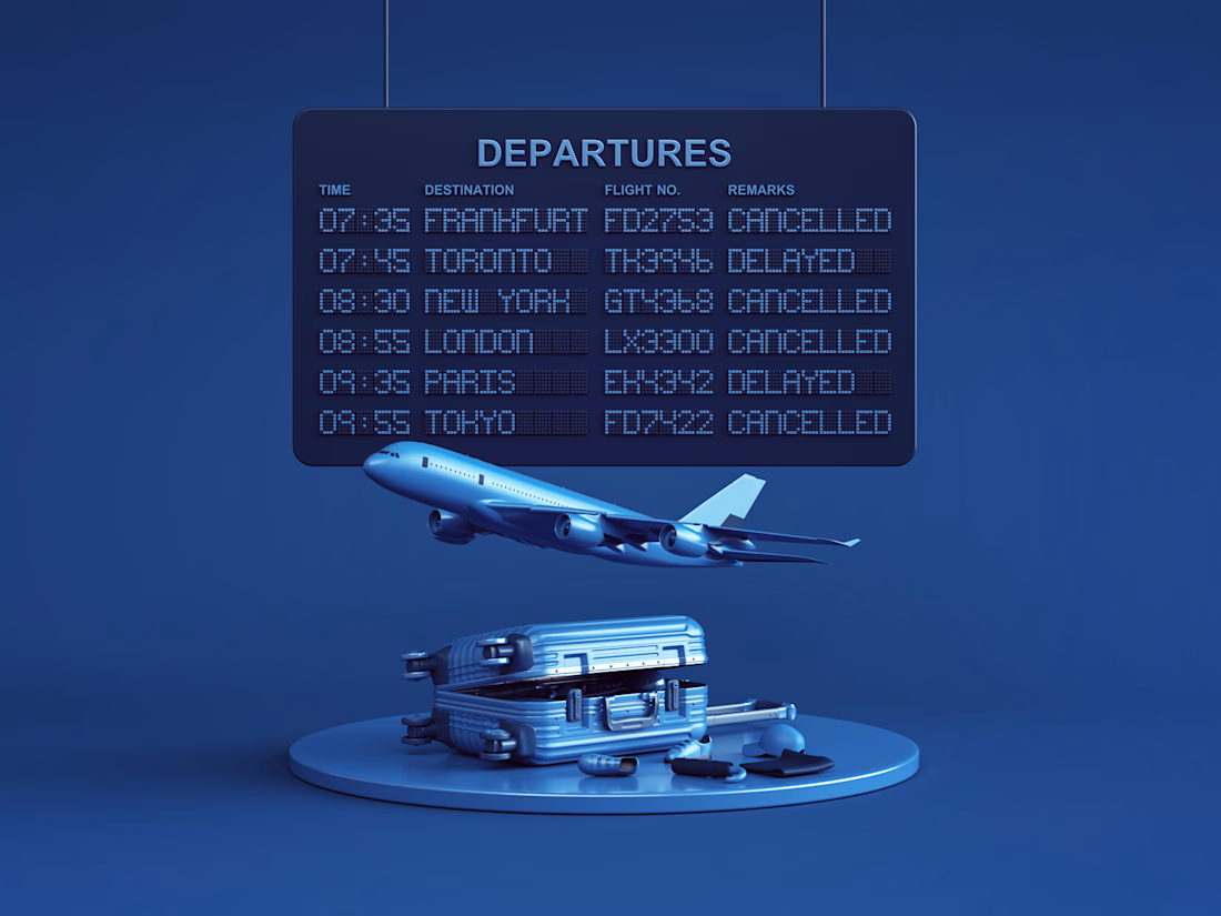

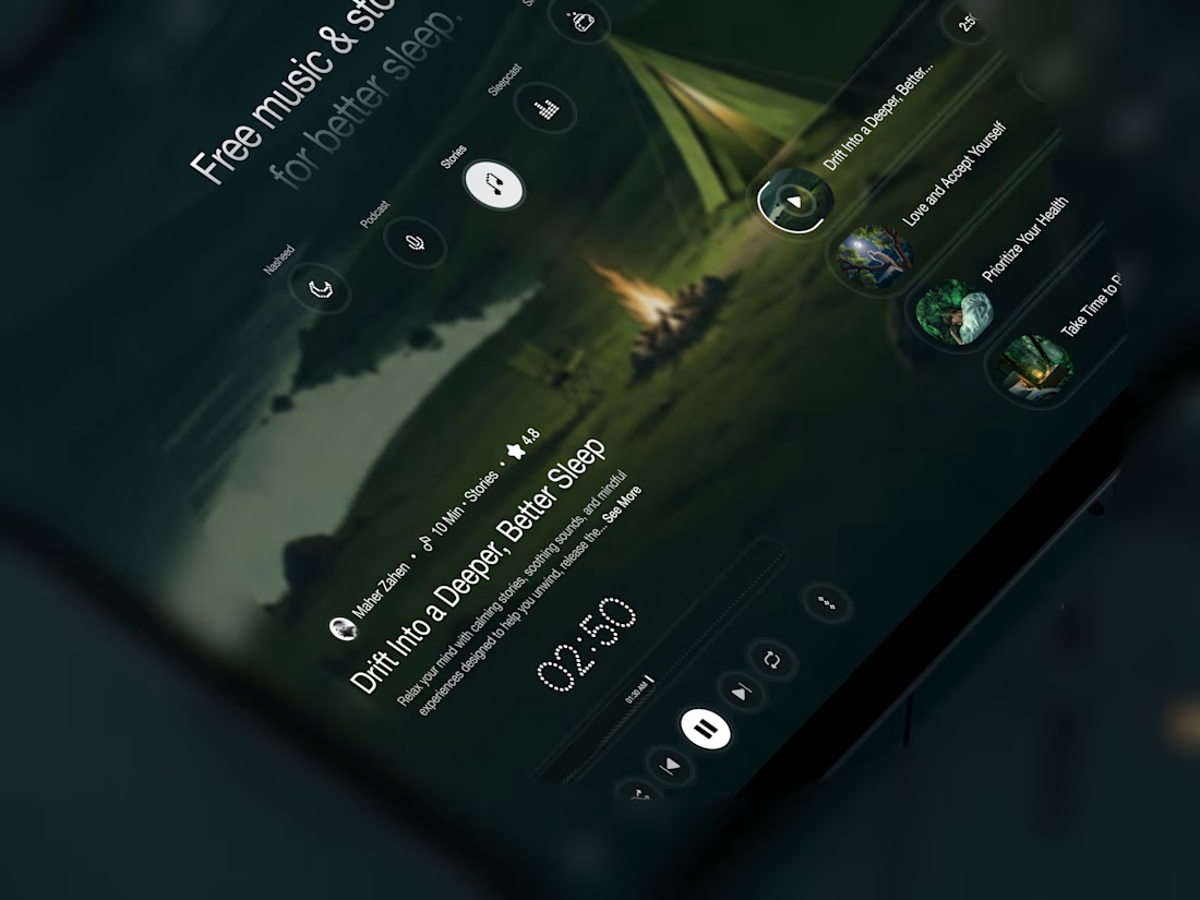
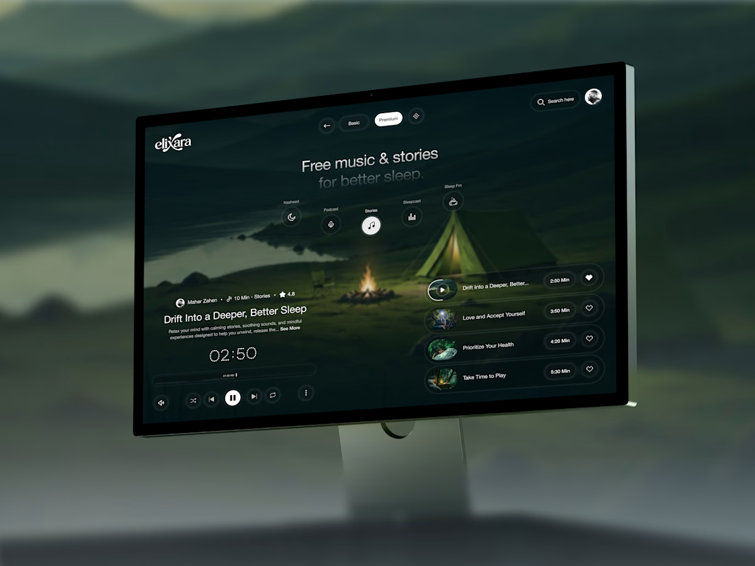
Your body is ready for sleep. But is your mind ready to switch off?
That’s the moment Elivara is designed for.
Instead of another endless scroll, imagine opening an experience that makes slowing down feel natural.
Because better rest starts with how you end your day.
Would you trade 20 more minutes of scrolling for 20 minutes of peace?
#SleepApp #UIUXDesign #ProductDesign #WebDesign #MotionDesign



Great UX understands the user's state of mind, not just what they want to click.